Money
Interactive Map: U.S. Property Taxes by State
Article/Editing:
!function(){“use strict”;window.addEventListener(“message”,(function(a){if(void 0!==a.data[“datawrapper-height”]){var e=document.querySelectorAll(“iframe”);for(var t in a.data[“datawrapper-height”])for(var r=0;r<e.length;r++)if(e[r].contentWindow===a.source){var i=a.data["datawrapper-height"][t]+"px";e[r].style.height=i}}}))}();
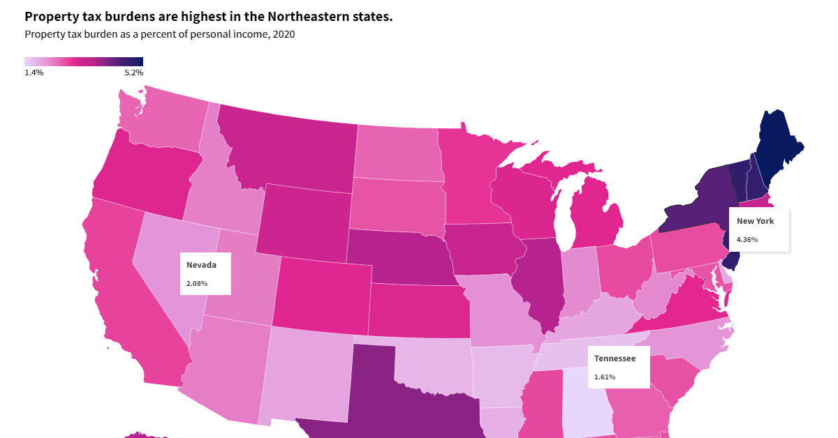
Mapped: U.S. Property Taxes by State
Almost $600 billion in revenue was generated from U.S. state and local property tax revenue in 2020, a figure that has gradually risen over the last several decades.
Yet these taxes, and how much people feel their effects, vary meaningfully across states based on factors like median incomes, effective property tax rates, and home values.
The above interactive graphic from USAFacts shows the states with the highest and lowest property tax burdens as a percentage of personal income in 2020.
Which U.S. States Have the Highest Property Tax Burdens?
Overall, Maine collects the most burdensome property taxes, at 5.21% of personal income. That means that, for every $100,000 in annual salary earned by a Maine resident, $5,210 would go towards property taxes on average.
Below, we show how much people pay in property tax as a portion of their personal income, based on data from the Census Bureau and the Bureau of Economic Analysis as of 2020:
| Rank | State | Property Tax (% Personal Income) |
|---|---|---|
| 1 | Maine | 5.21% |
| 2 | Vermont | 4.82% |
| 3 | New Jersey | 4.80% |
| 4 | New Hampshire | 4.79% |
| 5 | District of Columbia | 4.73% |
| 6 | New York | 4.36% |
| 7 | Connecticut | 4.20% |
| 8 | Rhode Island | 4.09% |
| 9 | Texas | 3.99% |
| 10 | Illinois | 3.65% |
| 11 | Nebraska | 3.64% |
| 12 | Alaska | 3.63% |
| 13 | Iowa | 3.39% |
| 14 | Massachusetts | 3.37% |
| 15 | Montana | 3.34% |
| 16 | Wyoming | 3.29% |
| 17 | Wisconsin | 3.07% |
| 18 | Kansas | 3.06% |
| 19 | Oregon | 3.04% |
| 20 (tie) | Colorado | 2.99% |
| 20 (tie) | Michigan | 2.99% |
| 22 | Virginia | 2.94% |
| 23 | Minnesota | 2.85% |
| 24 | California | 2.77% |
| 25 | Mississippi | 2.73% |
| 26 (tie) | Ohio | 2.72% |
| 26 (tie) | Hawaii | 2.72% |
| 28 | Pennsylvania | 2.71% |
| 29 | Florida | 2.69% |
| 30 | South Carolina | 2.68% |
| 31 (tie) | South Dakota | 2.66% |
| 31 (tie) | Maryland | 2.66% |
| 33 | Georgia | 2.57% |
| 34 (tie) | North Dakota | 2.53% |
| 34 (tie) | Washington | 2.53% |
| 36 | Utah | 2.32% |
| 37 | Arizona | 2.31% |
| 38 | Idaho | 2.28% |
| 39 | West Virginia | 2.22% |
| 40 | Indiana | 2.19% |
| 41 | Missouri | 2.14% |
| 42 (tie) | North Carolina | 2.08% |
| 42 (tie) | Nevada | 2.08% |
| 44 | New Mexico | 1.92% |
| 45 | Kentucky | 1.91% |
| 46 | Delaware | 1.86% |
| 47 | Louisiana | 1.80% |
| 48 | Oklahoma | 1.75% |
| 49 | Arkansas | 1.69% |
| 50 | Tennessee | 1.61% |
| 51 | Alabama | 1.37% |
At third, people living in New Jersey pay 4.8% of their income on property tax. The state not only has high property tax rates but some of the most expensive housing in the country, causing property taxes to feel elevated.
Falling in the middle of the pack is Hawaii, with 2.7% of personal income paid to property taxes. While the state has the lowest effective property tax rate at 0.3%, soaring home prices have led the actual tax costs to increase.
The lowest tax costs were seen in Alabama, making up 1.4% of a person’s income.
The Highest Property Taxes per Person
Breaking down the property tax revenues of different states by person, instead of by income, reveals a slightly different ranking:
On a per-capita basis, many populous Northeastern states rank higher. At the top, New Jersey had the highest per capita property tax revenues at $3,580 in 2020, followed by New Hampshire and Connecticut at $3,300.
Once again falling at the end of the pack are Southern states with smaller populations. Alabama saw $647 paid per person in property taxes—or less than a fifth of New Jersey’s tax costs.
Role in Education Funding
Today, the vast majority of public education funding comes from local property tax revenue.
It’s no surprise that higher local tax revenues have been tied with improved levels of public education including better access to advanced curriculum, higher quality buildings, stronger student achievement, and a decrease in disciplinary problems.
Meanwhile, residents in lower-income neighborhoods have been shown to pay higher effective property tax rates than residents in affluent ones. For instance, Silicon Valley's Palo Alto had the lowest effective property tax rate in California in 2015 thanks to soaring property values, since houses in California are taxed on assessed values from when homes are sold.
Overall, we can see that wide disparities in property taxes exist by each state. This is seen not only in their percent of personal income, but on total tax collected, and local tax rates.

This article was published as a part of Visual Capitalist's Creator Program, which features data-driven visuals from some of our favorite Creators around the world.


Money
Charted: Which City Has the Most Billionaires in 2024?
Just two countries account for half of the top 20 cities with the most billionaires. And the majority of the other half are found in Asia.


Charted: Which Country Has the Most Billionaires in 2024?
This was originally posted on our Voronoi app. Download the app for free on iOS or Android and discover incredible data-driven charts from a variety of trusted sources.
Some cities seem to attract the rich. Take New York City for example, which has 340,000 high-net-worth residents with investable assets of more than $1 million.
But there’s a vast difference between being a millionaire and a billionaire. So where do the richest of them all live?
Using data from the Hurun Global Rich List 2024, we rank the top 20 cities with the highest number of billionaires in 2024.
A caveat to these rich lists: sources often vary on figures and exact rankings. For example, in last year’s reports, Forbes had New York as the city with the most billionaires, while the Hurun Global Rich List placed Beijing at the top spot.
Ranked: Top 20 Cities with the Most Billionaires in 2024
The Chinese economy’s doldrums over the course of the past year have affected its ultra-wealthy residents in key cities.
Beijing, the city with the most billionaires in 2023, has not only ceded its spot to New York, but has dropped to #4, overtaken by London and Mumbai.
| Rank | City | Billionaires | Rank Change YoY |
|---|---|---|---|
| 1 | 🇺🇸 New York | 119 | +1 |
| 2 | 🇬🇧 London | 97 | +3 |
| 3 | 🇮🇳 Mumbai | 92 | +4 |
| 4 | 🇨🇳 Beijing | 91 | -3 |
| 5 | 🇨🇳 Shanghai | 87 | -2 |
| 6 | 🇨🇳 Shenzhen | 84 | -2 |
| 7 | 🇭🇰 Hong Kong | 65 | -1 |
| 8 | 🇷🇺 Moscow | 59 | No Change |
| 9 | 🇮🇳 New Delhi | 57 | +6 |
| 10 | 🇺🇸 San Francisco | 52 | No Change |
| 11 | 🇹🇭 Bangkok | 49 | +2 |
| 12 | 🇹🇼 Taipei | 45 | +2 |
| 13 | 🇫🇷 Paris | 44 | -2 |
| 14 | 🇨🇳 Hangzhou | 43 | -5 |
| 15 | 🇸🇬 Singapore | 42 | New to Top 20 |
| 16 | 🇨🇳 Guangzhou | 39 | -4 |
| 17T | 🇮🇩 Jakarta | 37 | +1 |
| 17T | 🇧🇷 Sao Paulo | 37 | No Change |
| 19T | 🇺🇸 Los Angeles | 31 | No Change |
| 19T | 🇰🇷 Seoul | 31 | -3 |
In fact all Chinese cities on the top 20 list have lost billionaires between 2023–24. Consequently, they’ve all lost ranking spots as well, with Hangzhou seeing the biggest slide (-5) in the top 20.
Where China lost, all other Asian cities—except Seoul—in the top 20 have gained ranks. Indian cities lead the way, with New Delhi (+6) and Mumbai (+3) having climbed the most.
At a country level, China and the U.S combine to make up half of the cities in the top 20. They are also home to about half of the world’s 3,200 billionaire population.
In other news of note: Hurun officially counts Taylor Swift as a billionaire, estimating her net worth at $1.2 billion.

-

 Education1 week ago
How Hard Is It to Get Into an Ivy League School?
-

 Technology2 weeks ago
Ranked: Semiconductor Companies by Industry Revenue Share
-

 Markets2 weeks ago
Ranked: The World’s Top Flight Routes, by Revenue
-

 Demographics2 weeks ago
Population Projections: The World’s 6 Largest Countries in 2075
-

 Markets2 weeks ago
The Top 10 States by Real GDP Growth in 2023
-

 Demographics2 weeks ago
The Smallest Gender Wage Gaps in OECD Countries
-

 Economy2 weeks ago
Where U.S. Inflation Hit the Hardest in March 2024
-

 Green2 weeks ago
Top Countries By Forest Growth Since 2001