Chart of the Week
These Charts Put the Historic U.S. Job Losses in Perspective
These Charts Put the Historic U.S. Job Losses in Perspective
When recessions hit, it’s not unusual to see millions of jobs lost.
Such episodes are a regular part of the business cycle and when they occur, most businesses do their best to tough things out. Then, as time progresses, it gradually becomes clear that spending must be curtailed, budget cuts must be made, and workers must unfortunately be sent home.
This economic process normally takes months, or even years, to unwind.
But, the COVID-19 pandemic has thrown a wrench into the economic status quo, creating a situation that is incomparable to any previous downturn. Instead of a gradual economic transition to slower growth prospects, business operations have suddenly screeched to a halt with no clear window to resume.
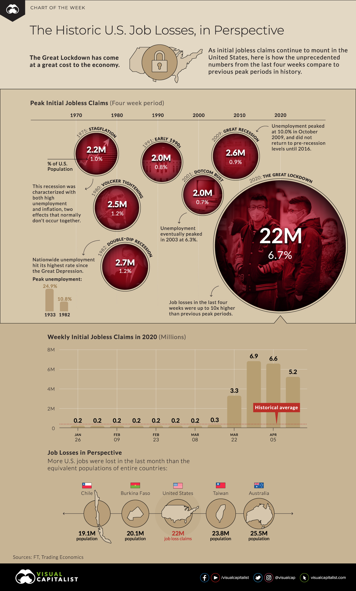
Beyond Comparison
The Great Lockdown of the economy has been completely unprecedented, both in terms of the speed of the shutdown and its impact on jobs.
As a result, the statistics being released are completely surreal. Perhaps the best example of this is number for initial jobless claims in the U.S., which tops 22 million over the last four weeks.
Worst U.S. Job Losses on Record (Four Week Period)
| Year | Description | Peak Jobless claims (4-wk total) | % of U.S. Population |
|---|---|---|---|
| 1975 | Stagflation | 2.24 million | 1.0% |
| 1980 | Fed tightening (Volcker) | 2.52 million | 1.1% |
| 1982 | Double-dip recession | 2.70 million | 1.2% |
| 1991 | Early 1990s recession | 2.00 million | 0.8% |
| 2001 | Dotcom Bust | 1.96 million | 0.7% |
| 2009 | Great Recession | 2.64 million | 0.9% |
| 2020 | The Great Lockdown | 22.03 million | 6.7% |
Source: FT
As you can see above, the number is 10x higher than many of the worst four-week job losses on record, so historical comparisons don’t come close.
In other words, if you were using recent recessions as a potential barometer of how bad things could get for jobless claims, the numbers coming from COVID-19 crisis just blew up your model.
The Recession Time Machine
To get further context on the numbers above, it’s worth jumping in a time machine to revisit what happened to job numbers in previous recessions:
- Stagflation and Oil Shocks (1973-75)
This recession put an end to the Post WWII global economic expansion, and was characterized by the 1973 oil embargo, the aftermath of the Nixon Shock, and the collapse of the Bretton Woods system of international finance. Unemployment and inflation were both high (stagflation), and the unemployment rate in the U.S. reached 9.0% in May 1975. - The Double-Dip Recession (1980, 1981-1982)
This “W-shaped” recession saw economic contraction first in 1980, only to return again in 1981. This corresponded with the Iranian Revolution, as well as Fed chair Paul Volcker’s aggressive policy to rein in inflation with high interest rates. Unemployment peaked at 10.8% in 1982 — the highest rate seen since the Great Depression. - The Great Recession (2009)
The most recent recession in memory peaked with 10.0% in unemployment in October 2009. It took until 2016 for unemployment to fall back to pre-recession levels.
Finally, it’s worth noting that during the Great Depression (1929-1933), unemployment reached a historic high of 24.9%. To get to a comparable equivalent in modern times, there would need to be 41 million Americans out of work permanently.
Room for Optimism
Although the initial jobless claims are staggering and clearly without modern precedent, there is a case to be made for cautious optimism.
Many of the aforementioned recessions took months or years to culminate, with peak job losses occurring at the tail end of each recession. The current crisis, now being called “The Great Lockdown”, caused many businesses to shut doors suddenly and against their will. It also corresponded with unexpected closures of national borders and the halting of regular trade activity around the world.
When and if normal economic activity resumes, it’ll be interesting to see how much of the damage is temporary.
Editor’s note: While we show the figure for peak unemployment during the Great Depression in both the chart and article, there is no comparable number available for weekly jobless claims. According to Federal Reserve data, it appears that the weekly data series on initial jobless claims started in the 1960s.


Chart of the Week
The Road to Recovery: Which Economies are Reopening?
We look at mobility rates as well as COVID-19 recovery rates for 41 economies, to see which countries are reopening for business.
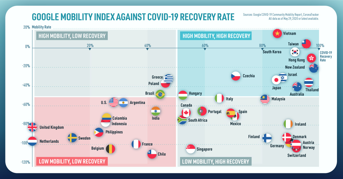
The Road to Recovery: Which Economies are Reopening?
COVID-19 has brought the world to a halt—but after months of uncertainty, it seems that the situation is slowly taking a turn for the better.
Today’s chart measures the extent to which 41 major economies are reopening, by plotting two metrics for each country: the mobility rate and the COVID-19 recovery rate:
- Mobility Index
This refers to the change in activity around workplaces, subtracting activity around residences, measured as a percentage deviation from the baseline. - COVID-19 Recovery Rate
The number of recovered cases in a country is measured as the percentage of total cases.
Data for the first measure comes from Google’s COVID-19 Community Mobility Reports, which relies on aggregated, anonymous location history data from individuals. Note that China does not show up in the graphic as the government bans Google services.
COVID-19 recovery rates rely on values from CoronaTracker, using aggregated information from multiple global and governmental databases such as WHO and CDC.
Reopening Economies, One Step at a Time
In general, the higher the mobility rate, the more economic activity this signifies. In most cases, mobility rate also correlates with a higher rate of recovered people in the population.
Here’s how these countries fare based on the above metrics.
| Country | Mobility Rate | Recovery Rate | Total Cases | Total Recovered |
|---|---|---|---|---|
| Argentina | -56% | 31.40% | 14,702 | 4,617 |
| Australia | -41% | 92.03% | 7,150 | 6,580 |
| Austria | -100% | 91.93% | 16,628 | 15,286 |
| Belgium | -105% | 26.92% | 57,849 | 15,572 |
| Brazil | -48% | 44.02% | 438,812 | 193,181 |
| Canada | -67% | 52.91% | 88,512 | 46,831 |
| Chile | -110% | 41.58% | 86,943 | 36,150 |
| Colombia | -73% | 26.28% | 25,366 | 6,665 |
| Czechia | -29% | 70.68% | 9,140 | 6,460 |
| Denmark | -93% | 88.43% | 11,512 | 10,180 |
| Finland | -93% | 81.57% | 6,743 | 5,500 |
| France | -100% | 36.08% | 186,238 | 67,191 |
| Germany | -99% | 89.45% | 182,452 | 163,200 |
| Greece | -32% | 47.28% | 2,906 | 1,374 |
| Hong Kong | -10% | 97.00% | 1,067 | 1,035 |
| Hungary | -49% | 52.31% | 3,816 | 1,996 |
| India | -65% | 42.88% | 165,386 | 70,920 |
| Indonesia | -77% | 25.43% | 24,538 | 6,240 |
| Ireland | -79% | 88.92% | 24,841 | 22,089 |
| Israel | -31% | 87.00% | 16,872 | 14,679 |
| Italy | -52% | 64.99% | 231,732 | 150,604 |
| Japan | -33% | 84.80% | 16,683 | 14,147 |
| Malaysia | -53% | 80.86% | 7,629 | 6,169 |
| Mexico | -69% | 69.70% | 78,023 | 54,383 |
| Netherlands | -97% | 0.01% | 45,950 | 3 |
| New Zealand | -21% | 98.01% | 1,504 | 1,474 |
| Norway | -100% | 91.87% | 8,411 | 7,727 |
| Philippines | -87% | 23.08% | 15,588 | 3,598 |
| Poland | -36% | 46.27% | 22,825 | 10,560 |
| Portugal | -65% | 58.99% | 31,596 | 18,637 |
| Singapore | -105% | 55.02% | 33,249 | 18,294 |
| South Africa | -74% | 52.44% | 27,403 | 14,370 |
| South Korea | -4% | 91.15% | 11,344 | 10,340 |
| Spain | -67% | 69.11% | 284,986 | 196,958 |
| Sweden | -93% | 13.91% | 35,727 | 4,971 |
| Switzerland | -101% | 91.90% | 30,796 | 28,300 |
| Taiwan | 4% | 95.24% | 441 | 420 |
| Thailand | -36% | 96.08% | 3,065 | 2,945 |
| U.S. | -56% | 28.20% | 1,768,346 | 498,720 |
| United Kingdom | -82% | 0.05% | 269,127 | 135 |
| Vietnam | 15% | 85.02% | 327 | 278 |
Mobility data as of May 21, 2020 (Latest available). COVID-19 case data as of May 29, 2020.
In the main scatterplot visualization, we’ve taken things a step further, assigning these countries into four distinct quadrants:
1. High Mobility, High Recovery
High recovery rates are resulting in lifted restrictions for countries in this quadrant, and people are steadily returning to work.
New Zealand has earned praise for its early and effective pandemic response, allowing it to curtail the total number of cases. This has resulted in a 98% recovery rate, the highest of all countries. After almost 50 days of lockdown, the government is recommending a flexible four-day work week to boost the economy back up.
2. High Mobility, Low Recovery
Despite low COVID-19 related recoveries, mobility rates of countries in this quadrant remain higher than average. Some countries have loosened lockdown measures, while others did not have strict measures in place to begin with.
Brazil is an interesting case study to consider here. After deferring lockdown decisions to state and local levels, the country is now averaging the highest number of daily cases out of any country. On May 28th, for example, the country had 24,151 new cases and 1,067 new deaths.
3. Low Mobility, High Recovery
Countries in this quadrant are playing it safe, and holding off on reopening their economies until the population has fully recovered.
Italy, the once-epicenter for the crisis in Europe is understandably wary of cases rising back up to critical levels. As a result, it has opted to keep its activity to a minimum to try and boost the 65% recovery rate, even as it slowly emerges from over 10 weeks of lockdown.
4. Low Mobility, Low Recovery
Last but not least, people in these countries are cautiously remaining indoors as their governments continue to work on crisis response.
With a low 0.05% recovery rate, the United Kingdom has no immediate plans to reopen. A two-week lag time in reporting discharged patients from NHS services may also be contributing to this low number. Although new cases are leveling off, the country has the highest coronavirus-caused death toll across Europe.
The U.S. also sits in this quadrant with over 1.7 million cases and counting. Recently, some states have opted to ease restrictions on social and business activity, which could potentially result in case numbers climbing back up.
Over in Sweden, a controversial herd immunity strategy meant that the country continued business as usual amid the rest of Europe’s heightened regulations. Sweden’s COVID-19 recovery rate sits at only 13.9%, and the country’s -93% mobility rate implies that people have been taking their own precautions.
COVID-19’s Impact on the Future
It’s important to note that a “second wave” of new cases could upend plans to reopen economies. As countries reckon with these competing risks of health and economic activity, there is no clear answer around the right path to take.
COVID-19 is a catalyst for an entirely different future, but interestingly, it’s one that has been in the works for a while.
Without being melodramatic, COVID-19 is like the last nail in the coffin of globalization…The 2008-2009 crisis gave globalization a big hit, as did Brexit, as did the U.S.-China trade war, but COVID is taking it to a new level.
—Carmen Reinhart, incoming Chief Economist for the World Bank
Will there be any chance of returning to “normal” as we know it?

-

 Debt1 week ago
How Debt-to-GDP Ratios Have Changed Since 2000
-

 Markets2 weeks ago
Ranked: The World’s Top Flight Routes, by Revenue
-

 Countries2 weeks ago
Population Projections: The World’s 6 Largest Countries in 2075
-

 Markets2 weeks ago
The Top 10 States by Real GDP Growth in 2023
-

 Demographics2 weeks ago
The Smallest Gender Wage Gaps in OECD Countries
-

 United States2 weeks ago
Where U.S. Inflation Hit the Hardest in March 2024
-

 Green2 weeks ago
Top Countries By Forest Growth Since 2001
-

 United States2 weeks ago
Ranked: The Largest U.S. Corporations by Number of Employees