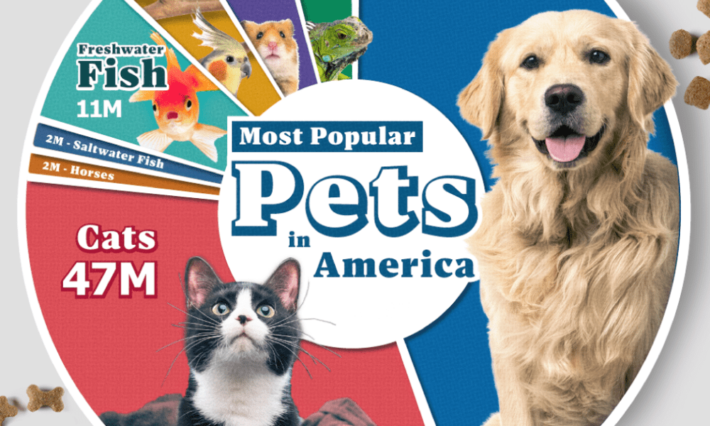

Lions, tigers, and bears, oh my!—these animals do not feature on this list of popular American household pets.
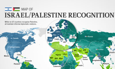

In this visualization, we look at how international recognition of Israel and Palestine breaks down among the 193 UN member states.
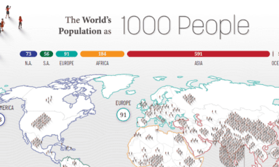

How would all the people in the world be spread out if there were only 1,000 people on Earth? This interactive map examines the breakdown.
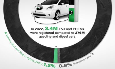

Although sales have been climbing, EV market share in the U.S. remains low as a percentage of all vehicles registered on the road.
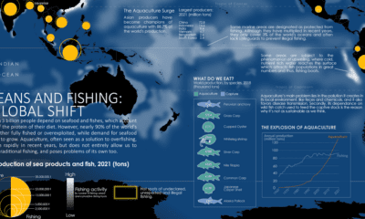

Where do our fish come from? This map charts ocean fishing activity and the amount of fish coming from aquaculture.
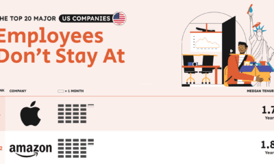

Top tech giants such as Apple, Amazon, and Meta lead the list of companies with the worst employee retention in the U.S.
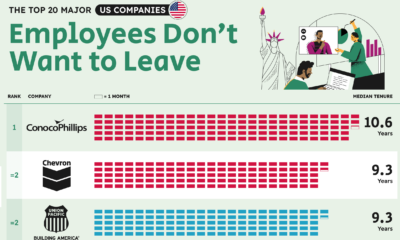

Which companies excel in employee retention? Here are the companies that have the longest tenured employees in both the U.S. and UK.
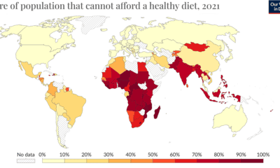

The wash of red in Africa, South Asia, and Southeast Asia indicates the regions where food unaffordability is at its peak.
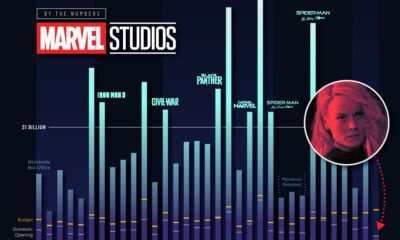

How poorly did 'The Marvels' perform in its opening weekend, and how do other Marvel box office returns compare?
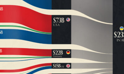

This graphic visualizes the top donors to Ukraine between January 2022, and July 2023.
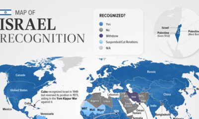

Belize is the latest country to suspend relations with Israel as of November. In this graphic we map the recognition of Israel by country.


 Creator Program