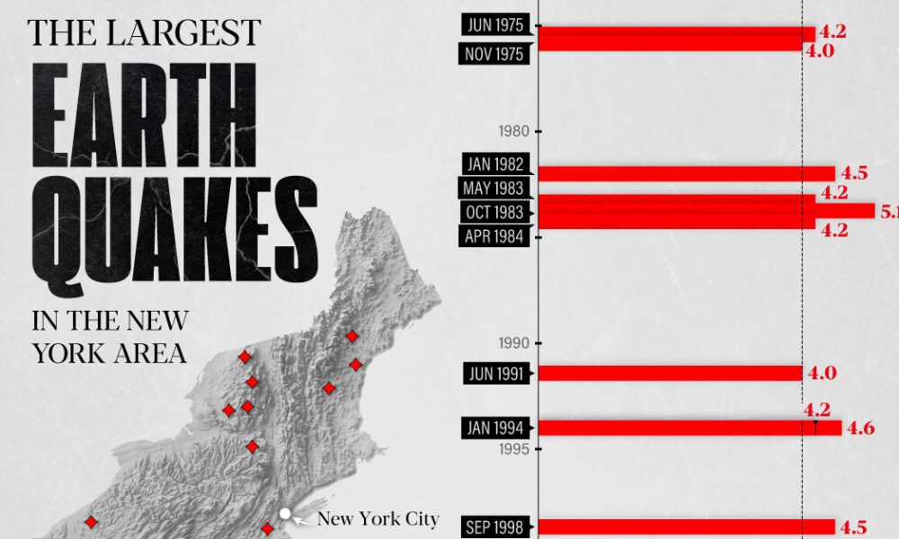
The earthquake that shook buildings across New York in April 2024 was the third-largest quake in the Northeast U.S. over...
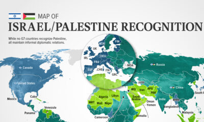

In this visualization, we look at how international recognition of Israel and Palestine breaks down among the 193 UN member states.
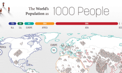

How would all the people in the world be spread out if there were only 1,000 people on Earth? This interactive map examines the breakdown.
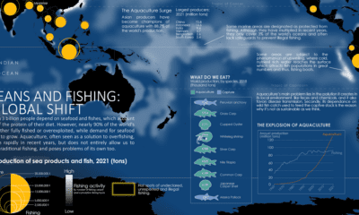

Where do our fish come from? This map charts ocean fishing activity and the amount of fish coming from aquaculture.
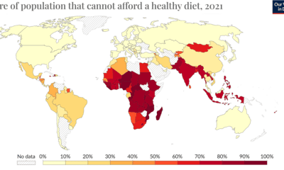

The wash of red in Africa, South Asia, and Southeast Asia indicates the regions where food unaffordability is at its peak.
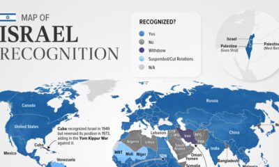

Belize is the latest country to suspend relations with Israel as of November. In this graphic we map the recognition of Israel by country.
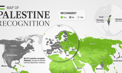

As of November 2023, 138 of the 193 UN members recognized Palestine. This map shows the recognition of the State of Palestine by country.
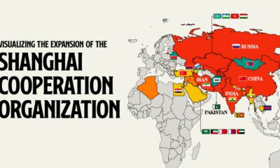

Established by China, Russia, and former Soviet states, the SCO serves as a counterbalance to Western influence in Eurasia.
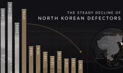

Why are the number of North Korean defectors decreasing? We cover the number of defectors by year and map their perilous escape routes.
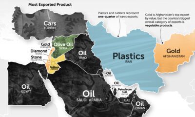

It's more than just oil. This map of Middle East exports shows the top global product of each country by value.
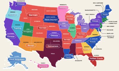

While 78% of Americans speak only English at home, between 350 and 430 languages can be found in the United States.


 Creator Program