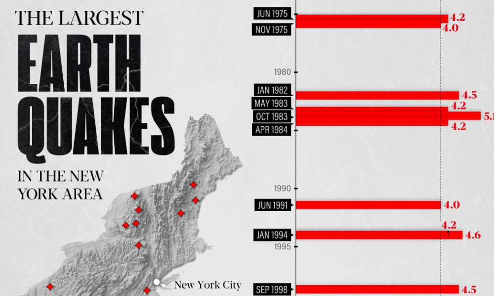
The earthquake that shook buildings across New York in April 2024 was the third-largest quake in the Northeast U.S. over...

How safe is small town America? This map reveals the safest cities in the U.S. in terms of the total crime rate per every 1,000 residents.

War in Europe has caused Ukraine's military spend to jump up by 640%. How do the world's largest military budgets compare?
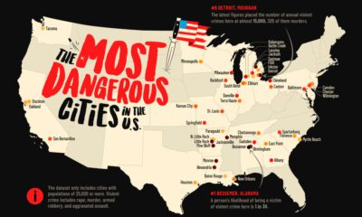

This map shows the most dangerous cities in the U.S. in terms of the violent crime rate per 1,000 residents.


Rivers and lakes have played important roles throughout history. This Vintage Viz looks at these bodies of water from the viewpoint of 1850.
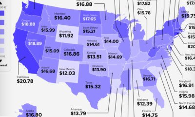

Which states and industries in the U.S. pay a good internship salary? Which pay the worst, or none at all?
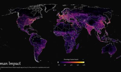

How far has humanity spread, and where haven't we gone? This graphic maps the extent of humanity’s impact on the world from 1993 to 2009.
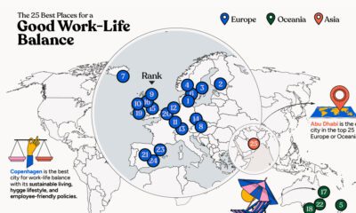

In this infographic, we explore which cities around the world excel in prioritizing work–life balance.
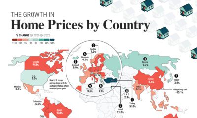

Global house prices were resilient in 2022, rising 6%. We compare nominal and real price growth by country as interest rates surged.
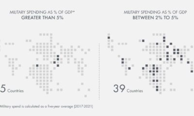

Which countries have the highest military spend relative to their economy? This visual breaks down the amount spent in each country by GDP.
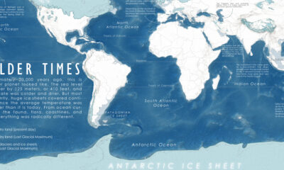

A map of the Earth 20,000 years ago, at the peak of the last ice age, when colder temperatures transformed the planet we know so well.


 Creator Program