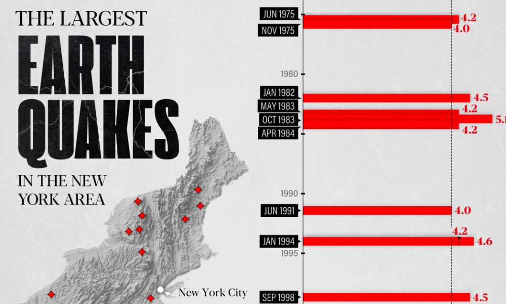
The earthquake that shook buildings across New York in April 2024 was the third-largest quake in the Northeast U.S. over...
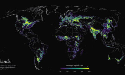

Where are the world's croplands located? This detailed map highlights the world’s cropland cover as of 2019.
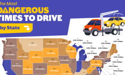

When is the most dangerous time to drive on American roads? We break down the data by hour, day, month, and state.
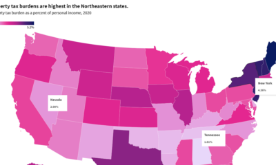

This interactive graphic shows property taxes by state in the U.S. as a percentage of personal income in 2020.
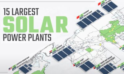

Solar power has grown rapidly over the last decade, and so have solar plants. This map shows the world's 15 largest solar power plants.
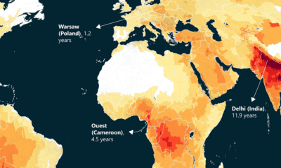

This world map of life expectancy gains shows how much longer people could potentially live by reducing pollution.
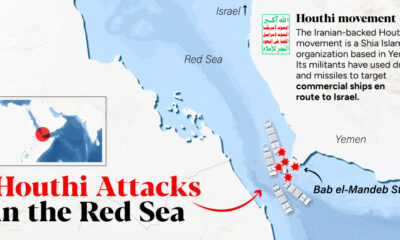

The Iranian-backed group is using drones to attack vessels that they believe are delivering goods to Israel, forcing shipping companies cancel routes passing through the Red...
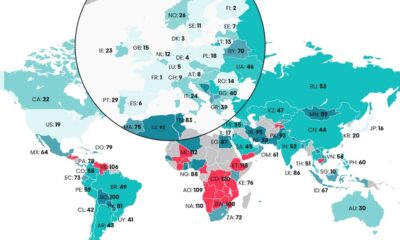

The Digital Quality of Life Index shows which countries are doing a better job than others in providing accessible and affordable internet.
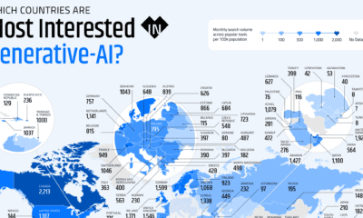

These graphics highlight interest in generative AI by country, covering interest in text, image, video, or audio generation.
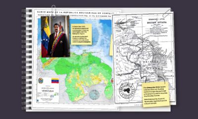

In this series of maps, we explain the dispute that has spanned nearly two centuries over the vast Essequibo region.
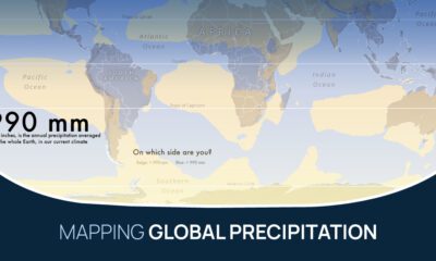

What does the global precipitation map look like if we split it in two, one half with below average rainfall and the other above?


 Creator Program