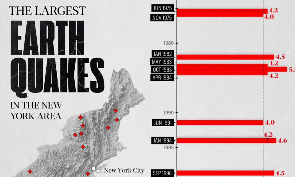
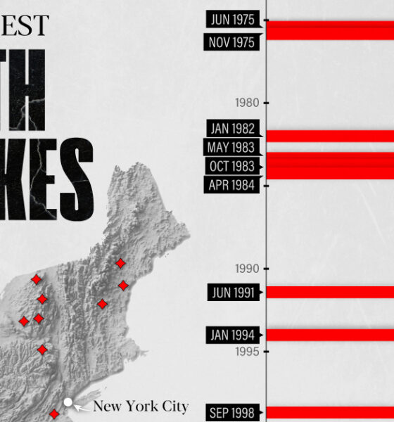
The earthquake that shook buildings across New York in April 2024 was the third-largest quake in the Northeast U.S. over...

Over 700,000 Californians moved from the Golden State to other parts of U.S. between 2020–21. But where did they go?

The U.S. provides over $50 billion in aid to more than 150 countries and territories annually.


In this graphic, we visualize the destinations that saw the biggest influx of seasonal centi-millionaire residents in 2022.


This map explainer looks at the Gaza Strip from a structural point of view, delving into geography, infrastructure, demographics, and more.
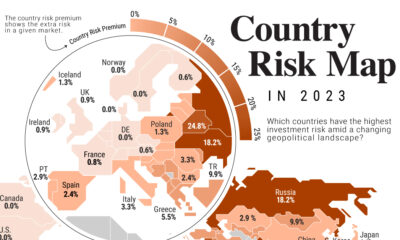

Where are some of the riskiest countries to invest in the world? Where are some of the safest? This graphic shows country risk in 2023.
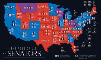

How old is the country's political establishment? We map the age of U.S. senators in every U.S. state to find out.
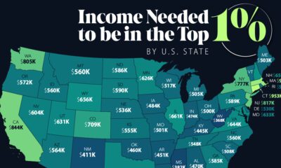

An annual income anywhere between $360,000-$950,000 can grant entry into the top 1%—depending on where you live in America.
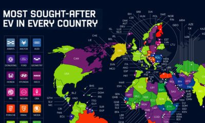

Industry stars, new entrants, and local models all populate this map of the most searched-for electric vehicles by country in 2022.
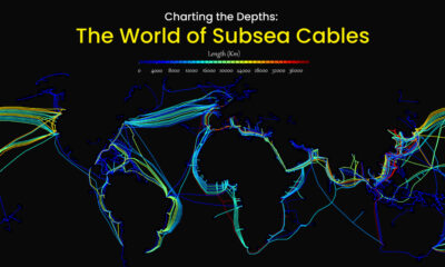

Hidden beneath the waves and sprawling along the ocean floor, subsea cables account for approximately 95% of international data transmitted.


Check out the Fra Mauro Mappa Mundi (c. 1450s), a historical map that formed a bridge between medieval and renaissance worldviews.


 Creator Program