Misc
Visualizing the Average Commute Time in U.S. States and Cities
View a high resolution version of this graphic
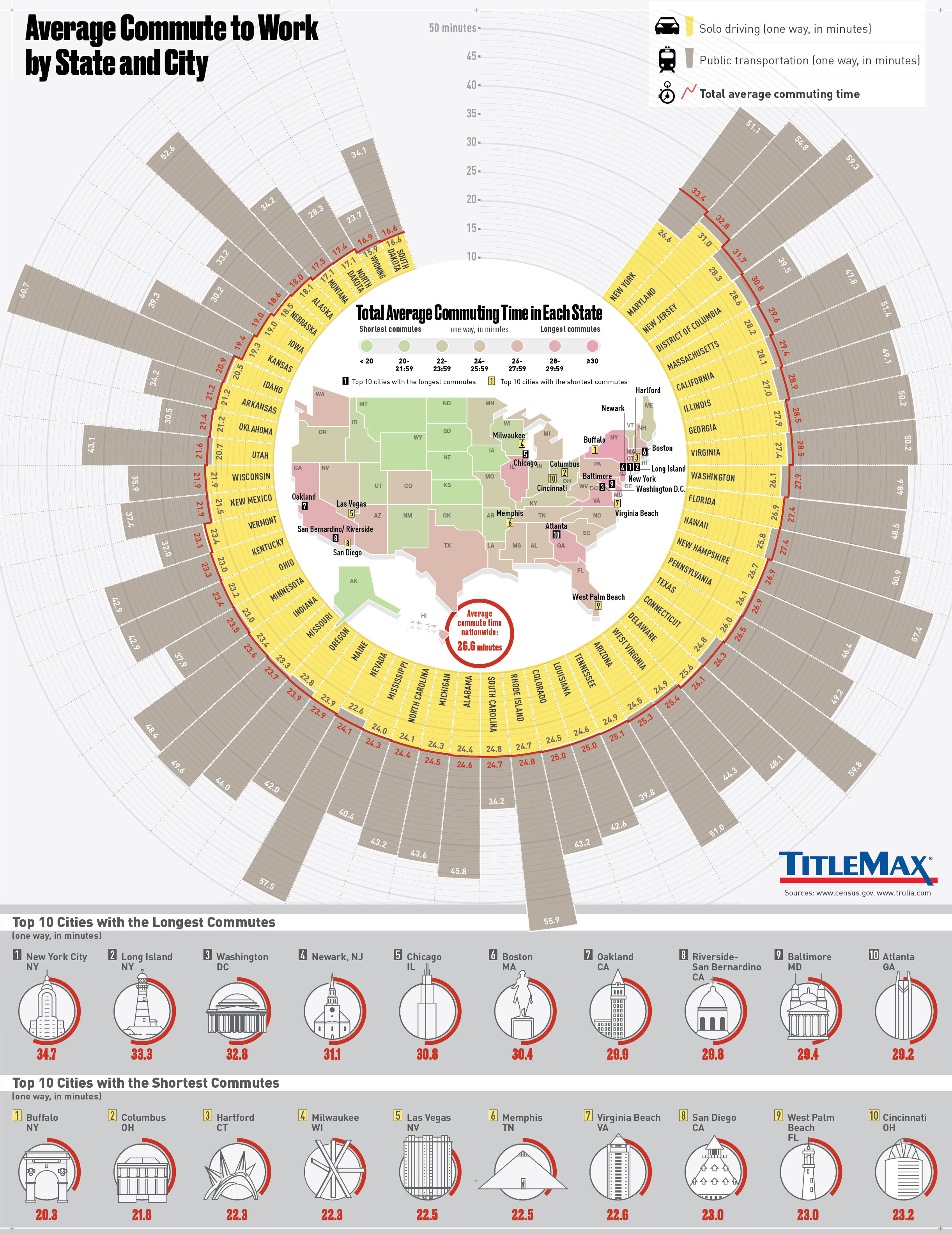
Average Commute Time in U.S. States and Cities
View the high resolution version of today’s graphic by clicking here.
The average person is awake for 15.5 hours per day, but once you subtract hours committed to work, eating, chores, personal care, and errands, there’s only so little much free time leftover.
That’s why the amount of time spent commuting, either in a car or via transit, can be a massive difference maker towards a person’s quality of life.
The Average Commute
Throughout the United States, the average commute time works out to about 26 minutes one-way.
However, as today’s infographic from TitleMax shows, the average commute varies considerably between individual states, and also between major cities as well.
In South Dakota, a state with fewer than one million people, congestion is not a problem for most. The state is home to the shortest average commute in the country at just 16.6 minutes one-way.
Meanwhile, as you may imagine, New York is the polar opposite of South Dakota for getting to work. The Empire State has the longest average commute in the country, which is double the length at 33.6 minutes.
Commutes by City
Every city is different, which means that data can have high amounts of variability within each state.
New York again is a great example for this: NYC has the longest average commute in the nation at 34.7 minutes, but go upstate and Buffalo actually has the shortest average commute for all major cities at 20.3 minutes per trip.
Here are the 10 shortest commutes in the country, for major cities:
| Rank | City | State or District | Avg. Commute (Mins) |
|---|---|---|---|
| #1 | Buffalo | NY | 20.3 |
| #2 | Columbus | OH | 21.8 |
| #3 | Hartford | CT | 22.3 |
| #4 | Milwaukee | WI | 22.3 |
| #5 | Las Vegas | NV | 22.5 |
| #6 | Memphis | TN | 22.5 |
| #7 | Virginia Beach | VA | 22.6 |
| #8 | San Diego | CA | 23.0 |
| #9 | West Palm Beach | FL | 23.0 |
| #10 | Cincinnati | OH | 23.2 |
Many people living in places like Buffalo or San Diego are able to hop to their place of the work in 20 minutes or less, giving them a little extra flexibility with their free time in comparison to bigger cities in the country.
Here are the 10 longest commutes in the country, for major cities:
| Rank | City | State or District | Avg. Commute (Mins) |
|---|---|---|---|
| #1 | New York City | NY | 34.7 |
| #2 | Long Island | NY | 33.3 |
| #3 | Washington | DC | 32.8 |
| #4 | Newark | NJ | 31.1 |
| #5 | Chicago | IL | 30.8 |
| #6 | Boston | MA | 30.4 |
| #7 | Oakland | CA | 29.9 |
| #8 | Riverside-San Bernardino | CA | 29.8 |
| #9 | Baltimore | MD | 29.4 |
| #10 | Atlanta | GA | 29.2 |
While it’s surprising to see that Los Angeles didn’t make it onto the list of cities with ultra-long commutes, the largest city in California does have the distinction of being the most congested city in the world.
It’s there that citizens spend an unfortunate 104 hours each year stuck in traffic jams.


Misc
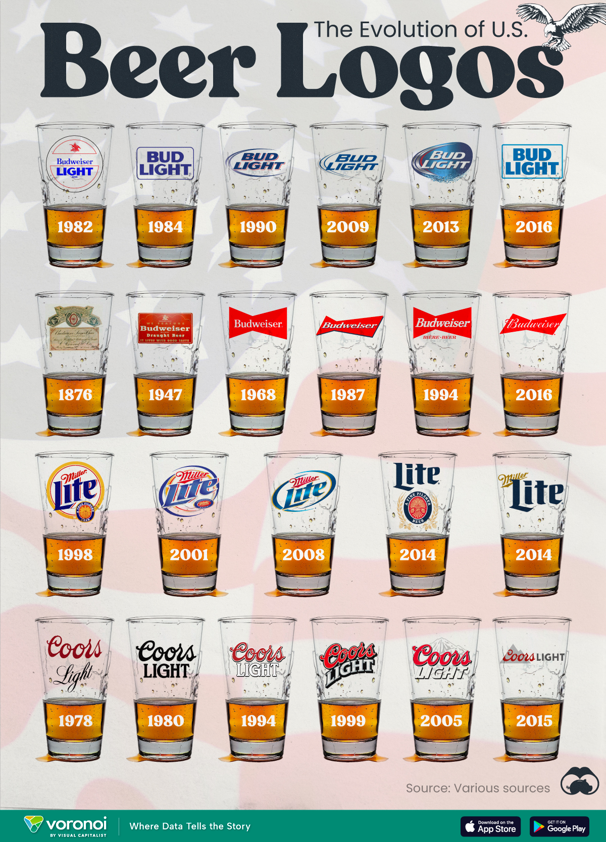
The Evolution of U.S. Beer Logos
In this graphic, we analyze the evolution of popular U.S. beer logos like Budweiser, Coors Light, Bud Light, and more.

The Evolution of U.S. Beer Logos
This was originally posted on our Voronoi app. Download the app for free on iOS or Android and discover incredible data-driven charts from a variety of trusted sources.
Despite selling a popular product, beer companies have to be creative to stand out in a competitive market.
In this graphic, we analyze the evolution of some U.S. beer logos based on various sources. We chose brands based on a mixture of criteria, including popularity (based on YouGov surveys), availability of logo assets, and those with interesting developments.
Bud Light Back to the ’80s
Despite recent backlash and calls for a boycott after sending a commemorative can to transgender influencer Dylan Mulvaney, Bud Light remains one of America’s best-selling beers.
The brand of light beer, owned by the Anheuser-Busch company, has switched from its more circular logo with italic letters adopted in the 1990s back to the Bud Light badge of the 1980s. It is composed of heavy uppercase lettering, written in two levels in a shade of blue with the inscription placed on a solid white background and enclosed in a thin rectangular frame.
Miller Lite Goes Old School
After following a similar approach to Bud Light’s branding throughout the 2000s, Miller Lite decided to undergo a major rebranding in 2014.
The company returned to its 1970s roots, once again combining a white can with its original blue, gold, and red logo. The redesign was largely considered a success, given that Miller Lite sales immediately increased following the change.
A Symbol of American Brewing
The oldest brand on our U.S. beer list, the Budweiser logo, has undergone more than 15 changes over the years.
The design of two connected triangles represents a red bow tie, as a symbol of American brewing.
The colors of the Budweiser logo include a vibrant red, which helps the logo stand out and be easily recognizable from a distance. Studies also suggest that the color red stimulates appetite. Meanwhile, the white inscription symbolizes purity and cleanliness.
Curious to learn more about the beer market? Check out this graphic about global beer consumption.

-

 Markets6 days ago
Visualized: Interest Rate Forecasts for Advanced Economies
-

 Economy2 weeks ago
Economic Growth Forecasts for G7 and BRICS Countries in 2024
-

 Wealth2 weeks ago
Charted: Which City Has the Most Billionaires in 2024?
-

 Technology2 weeks ago
All of the Grants Given by the U.S. CHIPS Act
-

 Green2 weeks ago
The Carbon Footprint of Major Travel Methods
-

 United States1 week ago
Visualizing the Most Common Pets in the U.S.
-

 Culture1 week ago
The World’s Top Media Franchises by All-Time Revenue
-

 voronoi1 week ago
Best Visualizations of April on the Voronoi App