Agriculture
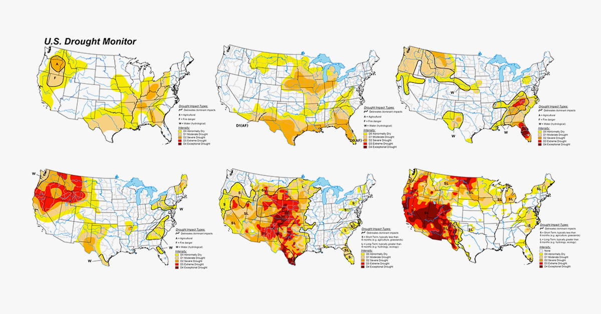
Animated Map: U.S. Droughts Over the Last 20 Years
Animated Map: U.S. Droughts Over the Last 20 Years
The Western U.S. is experiencing one of the worst recorded droughts in the last 20 years.
Temperatures from California to the Dakotas are currently hovering around 9-12°F above average—but how bad is the situation compared to past years?
This animated map by reddit user /NothingAbnormalHere provides a historical look at droughts in the U.S. since 1999, using data and graphics from the U.S. Drought Monitor (USDM).
What is the U.S. Drought Monitor?
Over the last two decades, the USDM has been tracking, measuring, and comparing droughts across America.
While droughts can be difficult to classify and standardize, there are various factors that can be used to gauge when a region is experiencing drought. These include measurements of snowpack levels, soil moisture, and recent precipitation.
To track these conditions (and make sense of them), the USDM synthesizes data from a plethora of meteorological sources, including the Palmer Drought Severity Index and the Standardized Precipitation Index.
From there, conditions are broken down into categories, ranging from D0 (abnormally dry) to D4 (Exceptional Drought). A map is released each week that shows which states are experiencing drought, and to what degree.
Where Are The Most Drought-Prone Areas?
According to a map created by climatologist Becky Bolinger (which is published on Drought.gov), Arizona and Nevada are the most historically drought-prone states—the two have experienced drought more than 50% of the time tracked by the USDM.
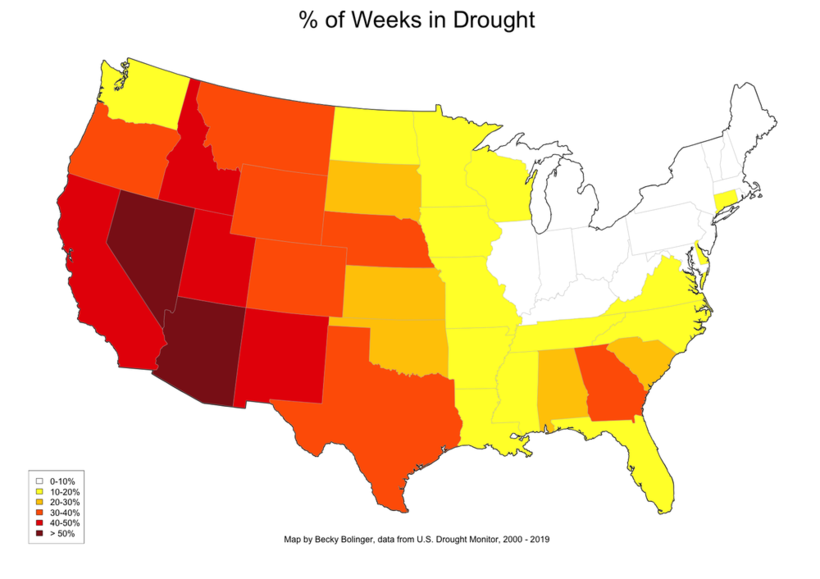
California is high on the list as well, with the state experiencing drought at least 40% of the time.
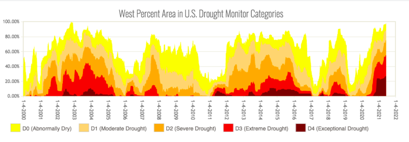
As the historical data shows, the West is no stranger to droughts. However, this year’s drought has become particularly worrisome because of its intensity and breadth.
Right now, more than a quarter of the West is experiencing a D4 level drought—a new record. To help put things into perspective, here’s a look at how much overall land area in the West has been in drought, since 2000:
When a region is experiencing a D4 drought, possible impacts include:
- Water Scarcity
Lower reservoirs, combined with decreased snowpack lead to water shortages. - Crop losses
Water shortages mean less water for fields, which can lead to acres of fallow (unused) farmland. - Wildfires
Dry conditions and lack of moisture increase the risk of wildfires.
Is This the New Norm?
This record-breaking drought is wreaking havoc across the West. In California, reservoirs have about half as much water as they usually do, and crop failures are happening across Colorado.
The worst part? Some experts believe that this could be the new normal if human-driven climate change continues to increase average temperatures across the globe.


Agriculture
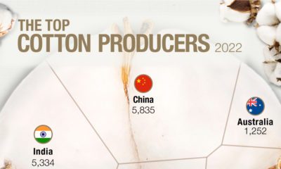
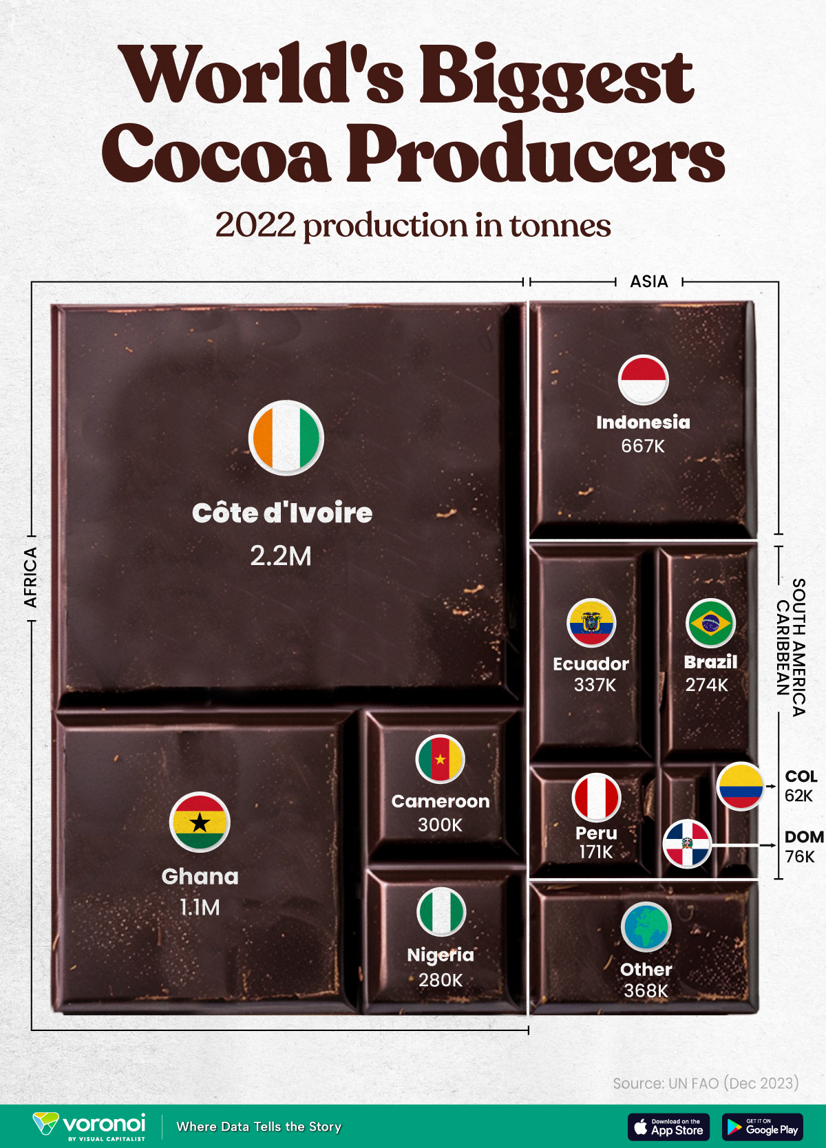
The World’s Top Cocoa Producing Countries
Here are the largest cocoa producing countries globally—from Côte d’Ivoire to Brazil—as cocoa prices hit record highs.
The World’s Top Cocoa Producing Countries
This was originally posted on our Voronoi app. Download the app for free on iOS or Android and discover incredible data-driven charts from a variety of trusted sources.
West Africa is home to the largest cocoa producing countries worldwide, with 3.9 million tonnes of production in 2022.
In fact, there are about one million farmers in Côte d’Ivoire supplying cocoa to key customers such as Nestlé, Mars, and Hershey. But the massive influence of this industry has led to significant forest loss to plant cocoa trees.
This graphic shows the leading producers of cocoa, based on data from the UN FAO.
Global Hotspots for Cocoa Production
Below, we break down the top cocoa producing countries as of 2022:
| Country | 2022 Production, Tonnes |
|---|---|
| 🇨🇮 Côte d'Ivoire | 2.2M |
| 🇬🇭 Ghana | 1.1M |
| 🇮🇩 Indonesia | 667K |
| 🇪🇨 Ecuador | 337K |
| 🇨🇲 Cameroon | 300K |
| 🇳🇬 Nigeria | 280K |
| 🇧🇷 Brazil | 274K |
| 🇵🇪 Peru | 171K |
| 🇩🇴 Dominican Republic | 76K |
| 🌍 Other | 386K |
With 2.2 million tonnes of cocoa in 2022, Côte d’Ivoire is the world’s largest producer, accounting for a third of the global total.
For many reasons, the cocoa trade in Côte d’Ivoire and Western Africa has been controversial. Often, farmers make about 5% of the retail price of a chocolate bar, and earn $1.20 each day. Adding to this, roughly a third of cocoa farms operate on forests that are meant to be protected.
As the third largest producer, Indonesia produced 667,000 tonnes of cocoa with the U.S., Malaysia, and Singapore as major importers. Overall, small-scale farmers produce 95% of cocoa in the country, but face several challenges such as low pay and unwanted impacts from climate change. Alongside aging trees in the country, these setbacks have led productivity to decline.
In South America, major producers include Ecuador and Brazil. In the early 1900s, Ecuador was the world’s largest cocoa producing country, however shifts in the global marketplace and crop disease led its position to fall. Today, the country is most known for its high-grade single-origin chocolate, with farms seen across the Amazon rainforest.
Altogether, global cocoa production reached 6.5 million tonnes, supported by strong demand. On average, the market has grown 3% annually over the last several decades.

-

 Debt1 week ago
How Debt-to-GDP Ratios Have Changed Since 2000
-

 Markets2 weeks ago
Ranked: The World’s Top Flight Routes, by Revenue
-

 Countries2 weeks ago
Population Projections: The World’s 6 Largest Countries in 2075
-

 Markets2 weeks ago
The Top 10 States by Real GDP Growth in 2023
-

 Demographics2 weeks ago
The Smallest Gender Wage Gaps in OECD Countries
-

 United States2 weeks ago
Where U.S. Inflation Hit the Hardest in March 2024
-

 Green2 weeks ago
Top Countries By Forest Growth Since 2001
-

 United States2 weeks ago
Ranked: The Largest U.S. Corporations by Number of Employees