Misc
50 Cognitive Biases in the Modern World
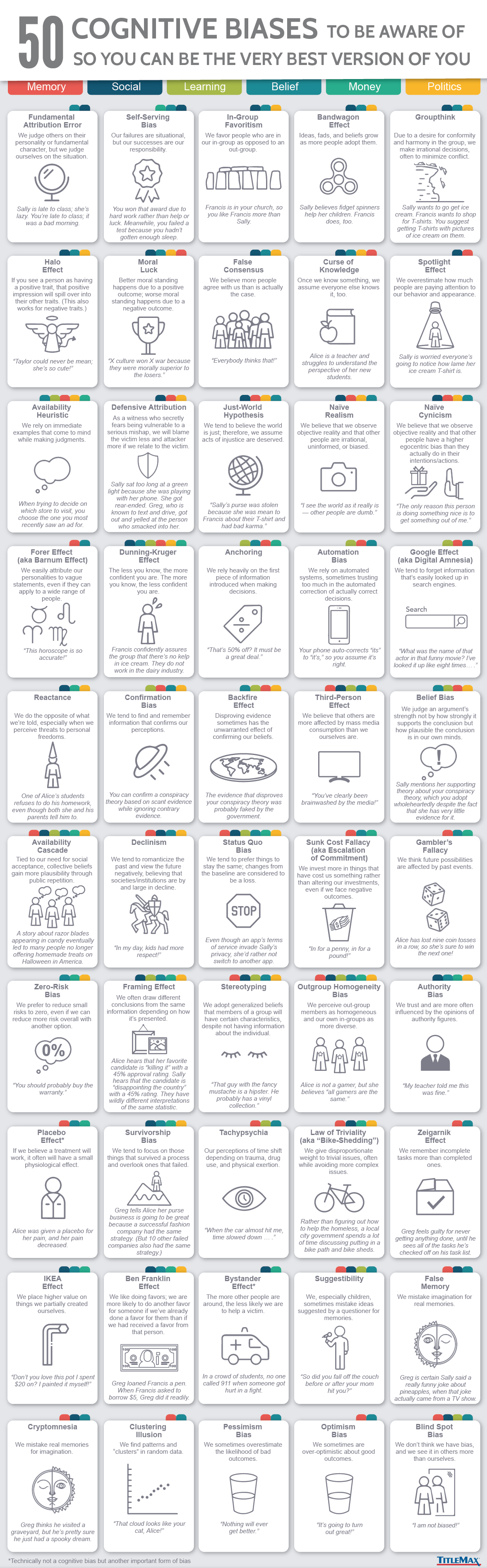
50 Cognitive Biases in the Modern World
Cognitive biases are widely accepted as something that makes us human.
Every day, systematic errors in our thought process impact the way we live and work. But in a world where everything we do is changing rapidly—from the way we store information to the way we watch TV—what really classifies as rational thinking?
It’s a question with no right or wrong answer, but to help us decide for ourselves, today’s infographic from TitleMax lists 50 cognitive biases that we may want to become privy to.
In the name of self-awareness, here’s a closer look at three recently discovered biases that we are most prone to exhibiting in the modern world.
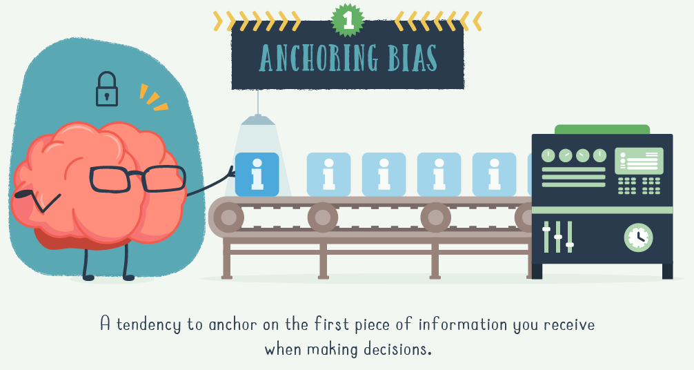
Automation Bias
AI-infused applications are becoming incredibly good at “personalizing” our content, but will there come a time when we let algorithms make all of our decisions?
Automation bias refers to the tendency to favor the suggestions of automated systems.
Take Netflix, for example. Everything we see on the platform is the result of algorithms—even the preview images that are generated. Then, to harness the power of data and machine learning, Netflix categorizes its content into tens of thousands of micro-genres. Pairing these genre tags with a viewer’s history allows them to assign several of over 2,000 “taste profiles” to each user.
And while there’s nothing wrong with allowing Netflix to guide what we watch, there’s an enormous sea of content standing by. Estimates from 2015 claimed it would take nearly four years to watch all of Netflix’s content. Thousands more hours of content have since been added.
If we want to counter this cognitive bias, finding a new favorite series on platforms like Netflix may require some good old-fashioned human curiosity.
The Google Effect
Also known as “digital amnesia”, the aptly named Google Effect describes our tendency to forget information that can be easily accessed online.
First described in 2011 by Betsy Sparrow (Columbia University) and her colleagues, their paper described the results of several memory experiments involving technology.
In one experiment, participants typed trivia statements into a computer and were later asked to recall them. Half believed the statements were saved, and half believed the statements were erased. The results were significant: participants who assumed they could look up their statements did not make much effort to remember them.
Because search engines are continually available to us, we may often be in a state of not feeling we need to encode the information internally. When we need it, we will look it up.
– Sparrow B, et al. Science 333, 777 (2011)
Our modern brains appear to be re-prioritizing the information we hold onto. Notably, the study doesn’t suggest we’re becoming less intelligent—our ability to learn offline remains the same.
The IKEA Effect
Identified in 2011 by Michael Norton (Harvard Business School) and his colleagues, this cognitive bias refers to our tendency to attach a higher value to things we help create.
Combining the Ikea Effect with other related traits, such as our willingness to pay a premium for customization, is a strategy employed by companies seeking to increase the intrinsic value that we attach to their products.
For instance, American retailer Build-A-Bear Workshop is anchored around creating a highly interactive customer experience. With the help of staff, children (or adults) can assemble their stuffed animals from scratch, then add clothing and accessories at extra cost.
Nike also incorporates this bias into its offering. The footwear company offers a Nike By You line of customizable products, where customers pay a premium to design bespoke shoes with an extensive online configurator.
While there’s nothing necessarily wrong with our susceptibility to the Ikea Effect, understanding its significance may help us make more appropriate decisions as consumers.
What Can We Do?
As we navigate an increasingly complex world, it’s natural for us to unconsciously adopt new patterns of behavior.
Becoming aware of our cognitive biases, and their implications, can help us stay on the right course.


Misc
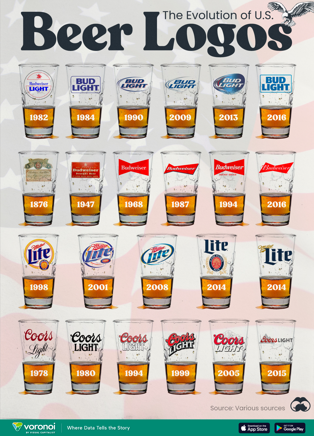
The Evolution of U.S. Beer Logos
In this graphic, we analyze the evolution of popular U.S. beer logos like Budweiser, Coors Light, Bud Light, and more.

The Evolution of U.S. Beer Logos
This was originally posted on our Voronoi app. Download the app for free on iOS or Android and discover incredible data-driven charts from a variety of trusted sources.
Despite selling a popular product, beer companies have to be creative to stand out in a competitive market.
In this graphic, we analyze the evolution of some U.S. beer logos based on various sources. We chose brands based on a mixture of criteria, including popularity (based on YouGov surveys), availability of logo assets, and those with interesting developments.
Bud Light Back to the ’80s
Despite recent backlash and calls for a boycott after sending a commemorative can to transgender influencer Dylan Mulvaney, Bud Light remains one of America’s best-selling beers.
The brand of light beer, owned by the Anheuser-Busch company, has switched from its more circular logo with italic letters adopted in the 1990s back to the Bud Light badge of the 1980s. It is composed of heavy uppercase lettering, written in two levels in a shade of blue with the inscription placed on a solid white background and enclosed in a thin rectangular frame.
Miller Lite Goes Old School
After following a similar approach to Bud Light’s branding throughout the 2000s, Miller Lite decided to undergo a major rebranding in 2014.
The company returned to its 1970s roots, once again combining a white can with its original blue, gold, and red logo. The redesign was largely considered a success, given that Miller Lite sales immediately increased following the change.
A Symbol of American Brewing
The oldest brand on our U.S. beer list, the Budweiser logo, has undergone more than 15 changes over the years.
The design of two connected triangles represents a red bow tie, as a symbol of American brewing.
The colors of the Budweiser logo include a vibrant red, which helps the logo stand out and be easily recognizable from a distance. Studies also suggest that the color red stimulates appetite. Meanwhile, the white inscription symbolizes purity and cleanliness.
Curious to learn more about the beer market? Check out this graphic about global beer consumption.

-

 Money6 days ago
Charted: Which Country Has the Most Billionaires in 2024?
-

 Energy2 weeks ago
Ranked: The Top 10 EV Battery Manufacturers in 2023
-

 Countries2 weeks ago
Countries With the Largest Happiness Gains Since 2010
-

 Economy2 weeks ago
VC+: Get Our Key Takeaways From the IMF’s World Economic Outlook
-

 Demographics2 weeks ago
The Countries That Have Become Sadder Since 2010
-

 Money2 weeks ago
Charted: Who Has Savings in This Economy?
-

 Technology1 week ago
Visualizing AI Patents by Country
-

 Economy1 week ago
Economic Growth Forecasts for G7 and BRICS Countries in 2024