Markets
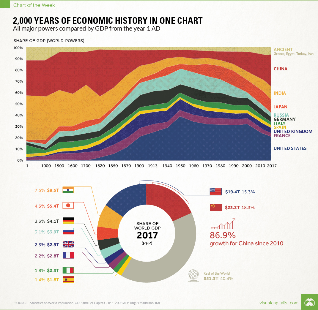
2,000 Years of Economic History in One Chart
Over 2,000 Years of Economic History in One Chart
All major powers compared by GDP from the year 1 AD
The Chart of the Week is a weekly Visual Capitalist feature on Fridays.
Long before the invention of modern day maps or gunpowder, the planet’s major powers were already duking it out for economic and geopolitical supremacy.
Today’s chart tells that story in the simplest terms possible. By showing the changing share of the global economy for each country from 1 AD until now, it compares economic productivity over a mind-boggling time period.
Originally published in a research letter by Michael Cembalest of JP Morgan, we’ve updated it based on the most recent data and projections from the IMF. If you like, you can still find the original chart (which goes to 2008) at The Atlantic. It’s also worth noting that the original source for all the data up until 2008 is from the late Angus Maddison, a famous economic historian that published estimates on population, GDP, and other figures going back to Roman times.
A Major Caveat
If you looked at the chart in any depth, you probably noticed a big problem with it. The time periods between data points aren’t equal – in fact, they are not close at all.
The first gap on the x-axis is 1,000 years and the second is 500 years. Then, as we get closer to modernity, the chart uses mostly 10 year intervals. Changing the scale like this is a big data visualization “no no”, as rightly pointed out in a blog post by The Economist.
While we completely agree, we have a made an exception in this case. Why? Because getting good economic data from the early 20th century is already difficult enough – and so trying to find data in regular intervals before then seems like a fool’s errand. Likewise, a stacked bar chart with different years also doesn’t really do this story justice.
We encountered similar historical data issues in our Richest People of Human History graphic, and at the end of the day decided it was primarily for fun. Like today’s chart, it has its share of imperfections – but ultimately, it provides a great amount of context and serves as a conversation starter.
Our Interpretation
Caveats aside, there are many stories that materialize from this simple chart. They include the colossal impact of the Industrial Revolution on the West, as well as the momentum behind the re-emergence of Asia.
But there’s one other story that ties it all together: the exponential rate of human economic growth that occurred over the last century.
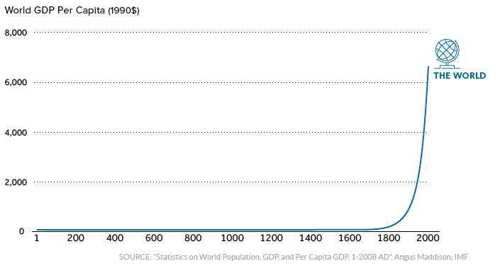
For thousands of years, economic progress was largely linear and linked to population growth. Without machines or technological innovations, one person could only produce so much with their time and resources.
More recently, innovations in technology and energy allowed the “hockey stick” effect to come into play.
It happened in Western Europe and North America first, and now it’s happening in other parts of the world. As this technological playing field evens, economies like China and India – traditionally some of the largest economies throughout history – are now making their big comeback.
Editor’s note: We have adjusted the main graphic as of Sep 10, 2017 to change the description of the chart. It now says “Share of GDP (World Powers)” instead of the previous “Share of world GDP”, which was technically an inaccurate description.


Markets
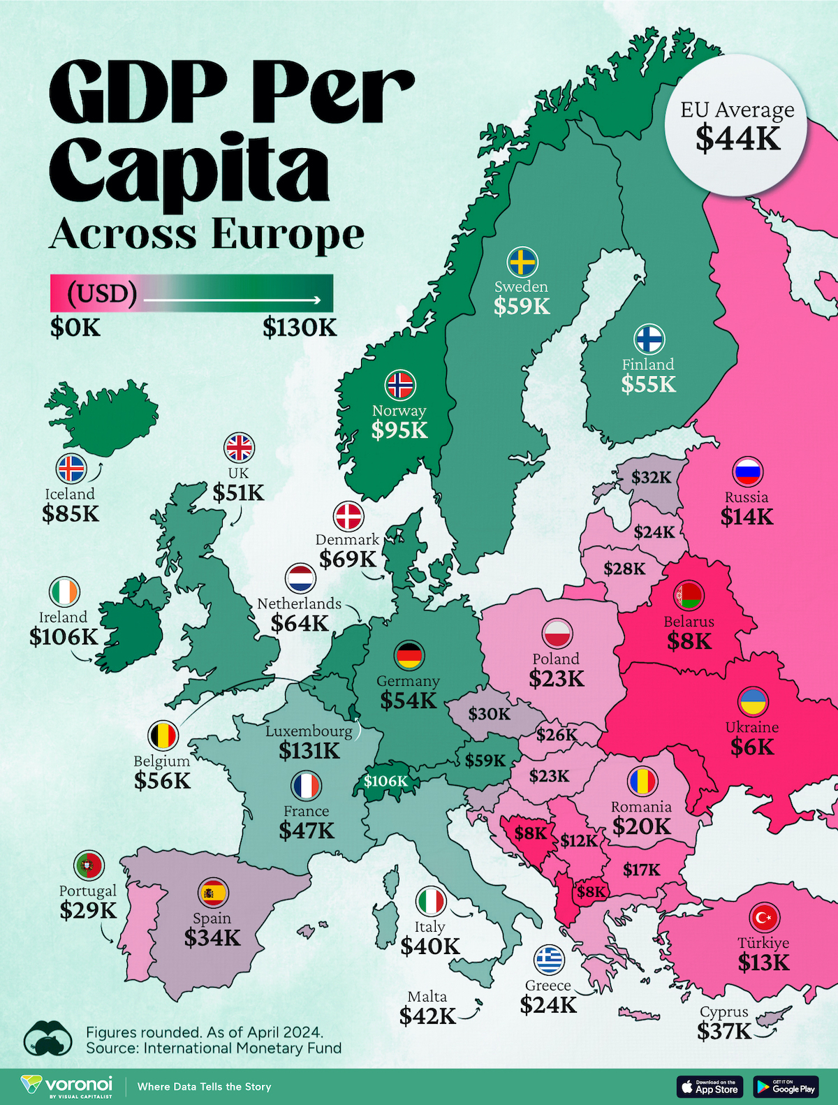
Mapped: Europe’s GDP Per Capita, by Country
Which European economies are richest on a GDP per capita basis? This map shows the results for 44 countries across the continent.
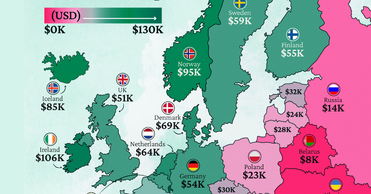
Mapped: Europe’s GDP Per Capita, by Country (2024)
This was originally posted on our Voronoi app. Download the app for free on iOS or Android and discover incredible data-driven charts from a variety of trusted sources.
Europe is home to some of the largest and most sophisticated economies in the world. But how do countries in the region compare with each other on a per capita productivity basis?
In this map, we show Europe’s GDP per capita levels across 44 nations in current U.S. dollars. Data for this visualization and article is sourced from the International Monetary Fund (IMF) via their DataMapper tool, updated April 2024.
Europe’s Richest and Poorest Nations, By GDP Per Capita
Luxembourg, Ireland, and Switzerland, lead the list of Europe’s richest nations by GDP per capita, all above $100,000.
| Rank | Country | GDP Per Capita (2024) |
|---|---|---|
| 1 | 🇱🇺 Luxembourg | $131,380 |
| 2 | 🇮🇪 Ireland | $106,060 |
| 3 | 🇨🇭 Switzerland | $105,670 |
| 4 | 🇳🇴 Norway | $94,660 |
| 5 | 🇮🇸 Iceland | $84,590 |
| 6 | 🇩🇰 Denmark | $68,900 |
| 7 | 🇳🇱 Netherlands | $63,750 |
| 8 | 🇸🇲 San Marino | $59,410 |
| 9 | 🇦🇹 Austria | $59,230 |
| 10 | 🇸🇪 Sweden | $58,530 |
| 11 | 🇧🇪 Belgium | $55,540 |
| 12 | 🇫🇮 Finland | $55,130 |
| 13 | 🇩🇪 Germany | $54,290 |
| 14 | 🇬🇧 UK | $51,070 |
| 15 | 🇫🇷 France | $47,360 |
| 16 | 🇦🇩 Andorra | $44,900 |
| 17 | 🇲🇹 Malta | $41,740 |
| 18 | 🇮🇹 Italy | $39,580 |
| 19 | 🇨🇾 Cyprus | $37,150 |
| 20 | 🇪🇸 Spain | $34,050 |
| 21 | 🇸🇮 Slovenia | $34,030 |
| 22 | 🇪🇪 Estonia | $31,850 |
| 23 | 🇨🇿 Czech Republic | $29,800 |
| 24 | 🇵🇹 Portugal | $28,970 |
| 25 | 🇱🇹 Lithuania | $28,410 |
| 26 | 🇸🇰 Slovakia | $25,930 |
| 27 | 🇱🇻 Latvia | $24,190 |
| 28 | 🇬🇷 Greece | $23,970 |
| 29 | 🇭🇺 Hungary | $23,320 |
| 30 | 🇵🇱 Poland | $23,010 |
| 31 | 🇭🇷 Croatia | $22,970 |
| 32 | 🇷🇴 Romania | $19,530 |
| 33 | 🇧🇬 Bulgaria | $16,940 |
| 34 | 🇷🇺 Russia | $14,390 |
| 35 | 🇹🇷 Türkiye | $12,760 |
| 36 | 🇲🇪 Montenegro | $12,650 |
| 37 | 🇷🇸 Serbia | $12,380 |
| 38 | 🇦🇱 Albania | $8,920 |
| 39 | 🇧🇦 Bosnia & Herzegovina | $8,420 |
| 40 | 🇲🇰 North Macedonia | $7,690 |
| 41 | 🇧🇾 Belarus | $7,560 |
| 42 | 🇲🇩 Moldova | $7,490 |
| 43 | 🇽🇰 Kosovo | $6,390 |
| 44 | 🇺🇦 Ukraine | $5,660 |
| N/A | 🇪🇺 EU Average | $44,200 |
Note: Figures are rounded.
Three Nordic countries (Norway, Iceland, Denmark) also place highly, between $70,000-90,000. Other Nordic peers, Sweden and Finland rank just outside the top 10, between $55,000-60,000.
Meanwhile, Europe’s biggest economies in absolute terms, Germany, UK, and France, rank closer to the middle of the top 20, with GDP per capitas around $50,000.
Finally, at the end of the scale, Eastern Europe as a whole tends to have much lower per capita GDPs. In that group, Ukraine ranks last, at $5,660.
A Closer Look at Ukraine
For a broader comparison, Ukraine’s per capita GDP is similar to Iran ($5,310), El Salvador ($5,540), and Guatemala ($5,680).
According to experts, Ukraine’s economy has historically underperformed to expectations. After the fall of the Berlin Wall, the economy contracted for five straight years. Its transition to a Western, liberalized economic structure was overshadowed by widespread corruption, a limited taxpool, and few revenue sources.
Politically, its transformation from authoritarian regime to civil democracy has proved difficult, especially when it comes to institution building.
Finally, after the 2022 invasion of the country, Ukraine’s GDP contracted by 30% in a single year—the largest loss since independence. Large scale emigration—to the tune of six million refugees—is also playing a role.
Despite these challenges, the country’s economic growth has somewhat stabilized while fighting continues.

-

 Markets6 days ago
Visualized: Interest Rate Forecasts for Advanced Economies
-

 Markets2 weeks ago
Economic Growth Forecasts for G7 and BRICS Countries in 2024
-

 Wealth2 weeks ago
Charted: Which City Has the Most Billionaires in 2024?
-

 Technology2 weeks ago
All of the Grants Given by the U.S. CHIPS Act
-

 Green2 weeks ago
The Carbon Footprint of Major Travel Methods
-

 United States1 week ago
Visualizing the Most Common Pets in the U.S.
-

 Culture1 week ago
The World’s Top Media Franchises by All-Time Revenue
-

 voronoi1 week ago
Best Visualizations of April on the Voronoi App