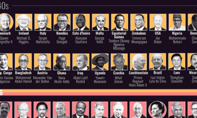

This graphic visualizes the ages of every country’s head of state, and compares them with the median population of their respective states.
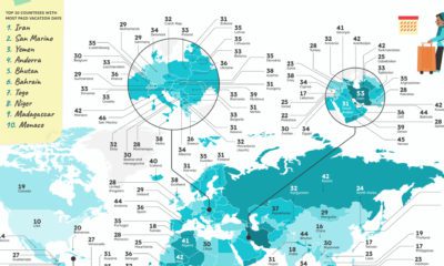

Which countries have the most vacation days, or the most public holidays? These graphics reveal how many paid vacation days each country mandates.
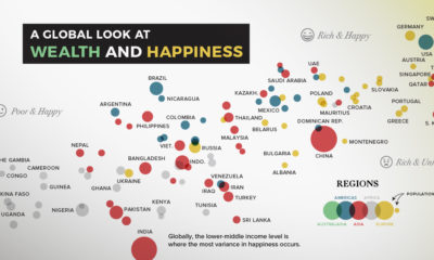

Can money really buy happiness? In this chart, we compare most of the world's countries to examine the relationship between wealth and happiness.
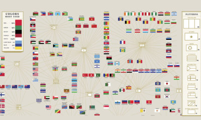

Flags of countries around the world use many common colors, patterns, and elements to convey symbolic meanings.
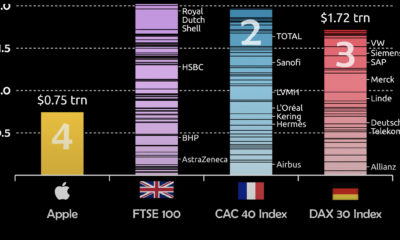

Apple's market cap recently hit $3 trillion. To put that scale into context, this visualization compares Apple to European indexes.
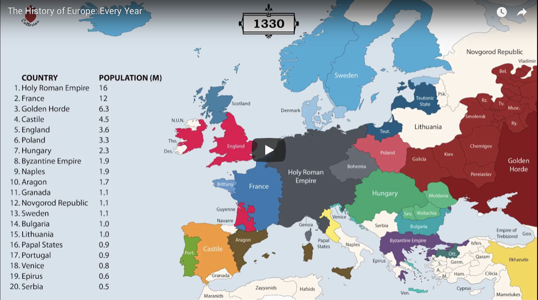
The history of Europe is breathtakingly complex, but this animation helps makes sense of 2,400 years of change on the European map.

The world map you know is totally wrong. Check out this clever graphic, which helps put into perspective the true size of countries.
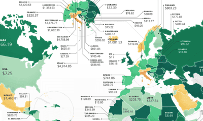

These maps show the most (and least) costly countries for starting a business by relative costs.
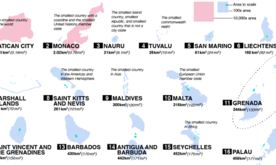

From Vatican City to Fiji, take a closer look at the world’s 100 smallest countries and their spheres of influence.
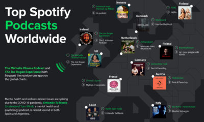

Podcasting is now a billion dollar industry, attracting big names and audiences to match. Here's a global look at the top podcasts on Spotify.


 Creator Program