Graphic Design
Visualizing Design: 196 Flags of Countries Around the World
Article/Editing:
View the full-size version of this visualization
Visualizing Design: 196 Flags of Countries Around the World
Historically, flags primarily served as means of identification in warfare, but today, national flags are flown to represent a country both on the international stage and domestically.
Every flag incorporates design elements and colors that symbolize certain aspects of each country’s history and identity. And as you’ve likely noticed, many of them fall under similar color conventions or patterns, with the exception of a few rare outliers.
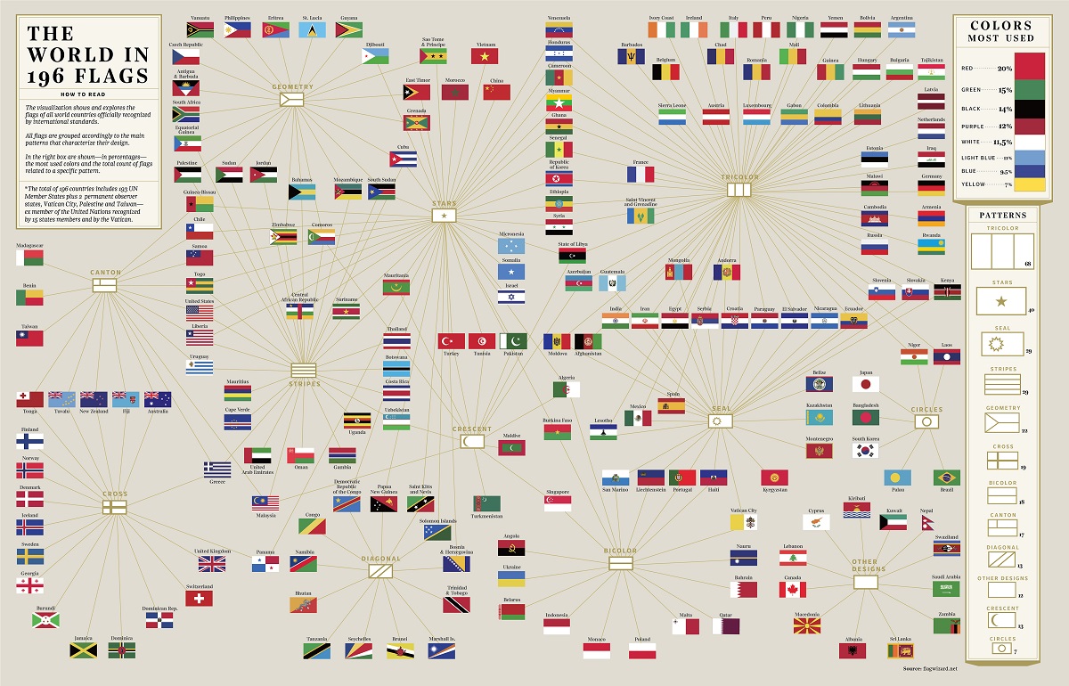
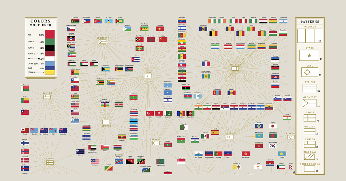
This visualization by Giulia De Amicis shows flags of 196 countries recognized by international standards, grouped according to the main design characteristics—color and pattern.
It includes 193 United Nations Member States, two permanent non-member observer states—Vatican City and Palestine, and Taiwan, a self-ruled democracy and an ex-member of the UN.
Flags of Countries: Common Shapes and Aspect Ratio
Most countries have flags in a quadrilateral shape—a four-sided polygon with four edges and four corners—mainly with a 2:3 or 1:2 aspect ratio.
In contrast, the flag of Nepal stands out with its unique layout. It consists of two triangular shapes with a white moon on the top and a white sun on the bottom section.

The unusual flag’s design has at times caused difficulties for large-scale reproduction.
In the 2016 Summer Olympics, for example, the Nepalese flag was placed on a white rectangular cloth shaped the same as other flags.
What are the Most Popular Colors in Flags?
By far, the most popular color used in national flags is red, with 20% of listed countries featuring it in their flag design. In vexillology—the study of flags—it is believed that red is a symbol of power, bravery, revolution, and vibrancy, as well as war in reference to past bloodshed.
Green comes as the second most used flag color with 15% of countries incorporating it, followed by black (14%), purple (12%), white (11.5%), light blue (11%), and blue (9.5%). Yellow was the least popular with just 7% of countries using it in their national flags.
Certain regions share a distinct mix of colors that neighboring countries have adopted. For example, red, white, green, and black are seen in several Arab nation flags. Similarly, green, red, and yellow combinations are often symbolic of Pan-African countries.
Patterns and Symbolism Behind Flag Designs
A simple tricolor design, in either a vertical and horizontal orientation, is the most frequent pattern with 68 countries displaying it on their flags. Stars follow with 40 country flags, while 29 flags had either a seal or stripes.
But there are many other flag designs to consider, such as the geometrical designs used by Cuba and South Africa, crosses like the Union Jack of the UK, and circles like those of Japan and South Korea. And not every flag fits one single design category, such as Pakistan’s white and green flag with a crescent and star, or the many flags that include a Union Jack within their design.
Symbolism ascribed to flag design can range from abstract to more literal explanations. The meaning of flag designs can change over time, too, often influenced by major political shifts.

For example, the red flag of the People’s Republic of China has one prominent yellow star, which used to stand for the Chinese Communist Party, while the smaller stars were previously associated with the four social classes making up the society. Today, the large star represents China itself, while the smaller stars stand for the country’s many national minorities.
In a similar manner, other nations have made changes to their flag designs to reflect major political changes, or people have ascribed their own revised meanings to the elements depicted in their country’s flag.
Which nation’s flag catches your eye? Are there any other flags that are memorable or unique but not featured on this list?

This article was published as a part of Visual Capitalist's Creator Program, which features data-driven visuals from some of our favorite Creators around the world.


Misc
5 Megatrends Fueling the Rise of Data Storytelling
This era of data abundance should be propelling humankind forward, but valuable insights are often lost in the noise. Data storytelling holds the key.
Infographic: The Rise of Data Storytelling
Humanity is creating more data than ever before, and more of that data is publicly accessible.
While “data is the new oil” has almost become a cliché, the impact that data abundance is having on the world is undeniable. All of the world’s most valuable companies are heavily reliant on data for their continued success. Even oil giant Saudi Aramco, the world’s most valuable company, runs a 6,000 m² data center, and is partnering with Google Cloud.
In a world where nearly everything is quantified, communicating insights from that data becomes a massive opportunity. This is where data storytelling comes in. In simple terms, it’s the difference between simply making a chart, and actually explaining what it means, why it’s important, and how it fits into the broader context. This style of data-driven communication is cropping up everywhere, from newsrooms to corporate communications.
Here, we examine five megatrends fueling the rise of data storytelling.
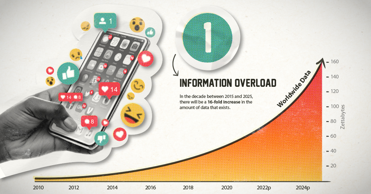
① Information Overload
It’s estimated that between 2015 and 2025, the world will see a 16-fold increase in data.
- The bad news: The rising tide of information is growing faster than our ability to harness it
- The good news: This growing universe of data holds the promise of more insight, if properly utilized
Thankfully, data storytelling is an emerging field that thrives on information abundance.
As our society and economy grow more complex, more high-quality, actionable information is critical for today’s decision makers.
② Declining Trust in Media
Trust in news media has been declining for decades, and in many countries around the world, the majority of people don’t feel that media is a trustworthy source of information.
Trust in social media is similarly shaky. Only one-third of people surveyed around the world believe that social media is a trustworthy source of information. As well, a recent poll found that 75% of U.S. adults felt that political views were likely being censored by social media platforms.
The mass media ecosystem as it currently exists is facing a crisis of confidence. When a system is no longer adequately serving the needs of its users, that system is ripe for disruption.
③ Winner-Take-All Dynamics
This information abundance should be propelling humankind forward, but more often than not, valuable insights are lost in the noise—either poorly presented or pushed to the margins by clickbait and other distractions.
Today, most of us rely on algorithms and aggregators to deliver information to us. Over time, those systems become very good at feeding us information that is generally what we’re looking for. The downside, however, is that engagement-driven algorithms reward only the most compelling narratives. The handful of stories you see are the result of fierce, darwinistic competition on platforms like Twitter or Medium.
This hyper-competitive environment is part of the reason there are so many problems with media today—clickbait and tabloidization being two prominent examples.
Data storytelling takes potentially dry, complex topics and makes them more accessible, compelling, and more likely to win the battle for people’s attention.
④ Moving Beyond Text
Many of our existing systems look the way they do in part because of past technological limitations.
Search engines, for example, are still largely driven by text-based considerations. This makes sense as the early internet was essentially a collection of pages with text and hyperlinks.
Today, search engines are much better taking other forms of information into consideration, and technological advancements are breaking new ground in analyzing video and data visualizations. Advancements in AI could soon allow users to search for visualizations in ways that don’t even involve text keywords.
In a future where searching for information in a visual format is as intuitive as a Google search today, the utility and reach of data storytelling will increase dramatically.
⑤ Democratization of Data Storytelling
Even as the number of people with professional credentials in data analytics, data science, and other similar professions is on the rise, it’s never been easier for laypersons to create and publish high quality visualizations.
Free tools which are usable on almost any device have broken down barriers of access for millions of people around the world. There is now a universe of resources for people and organizations looking to convert data into a compelling visual format.
Below is a shortlist of data storytelling resources ranging from the intuitive design tools to powerful coding language libraries:
| Resources for getting started | |||
|---|---|---|---|
| Visualization selection | Data Viz Project | From Data to Viz | Storytelling With Data |
| Color selection | Adobe Color CC | Paletton | Colors on the Web |
| Beginner friendly | Infogram | Piktochart | Venngage |
| Bringing data to life | |||
|---|---|---|---|
| Classic | Microsoft Excel | Adobe Creative Suite | Google Data Studio |
| BI-focused | PowerBI | Tableau | Domo |
| Web apps | RAW Graphs | Flourish | Datawrapper |
| Powerful, specialized resources | |||
|---|---|---|---|
| JavaScript libraries | d3.js | Chart.js | HighCharts |
| Mapping | ArcGis | MapBox | Polymaps |
| Programming languages | R | Python | Matlab |
Of course there are many more resources out there, and we’ll be covering this more comprehensively in the future.
The Last Mile
The concept of “the last mile” is typically associated with e-commerce. Fulfillment can be centralized in massive hubs and delivery can be optimized with uniform trucks and precise routes, but neighborhoods and residences refuse to conform to rigid standards. The last mile is where the orderly world of logistics fragments into randomness, making this leg of the journey the thorniest problem for companies like Amazon to solve.
This last mile analogy lends itself to communication as well. Analytics and datasets can be polished and made publicly accessible, but the real world is messy. Humans are unpredictable, each with their own style of learning and varying levels of data literacy.
Also, unlike e-commerce—which begins with a defined request—insight comes in unexpected flashes. Those moments of serendipity need the right conditions to occur, and the fact of the matter is, most sources of high quality information (databases, white papers, reports, etc.) are only accessed by the small number of people who conduct research for a living.
This is the great opportunity presented by data storytelling. High quality information is distilled into a form that is more digestible, memorable, and sharable, allowing more people to benefit from this era of information abundance.
Put simply: data storytelling bridges the gap between under-utilized knowledge and the growing number of people who are striving to separate the signal from the noise.

-

 Mining2 weeks ago
Charted: The Value Gap Between the Gold Price and Gold Miners
-

 Real Estate1 week ago
Ranked: The Most Valuable Housing Markets in America
-

 Business1 week ago
Charted: Big Four Market Share by S&P 500 Audits
-

 AI1 week ago
The Stock Performance of U.S. Chipmakers So Far in 2024
-

 Misc1 week ago
Almost Every EV Stock is Down After Q1 2024
-

 Money2 weeks ago
Where Does One U.S. Tax Dollar Go?
-

 Green2 weeks ago
Ranked: Top Countries by Total Forest Loss Since 2001
-

 Real Estate2 weeks ago
Visualizing America’s Shortage of Affordable Homes