Demographics
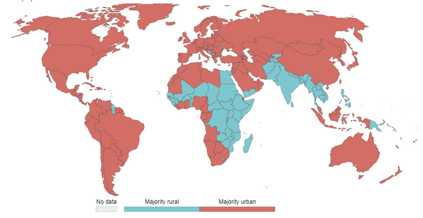
Mapping the World’s Urban Population in 2050
Click on any part of the map to see individual country breakdowns.
Mapping the World’s Urban Population from 1500 – 2050
In 133 BC, Rome was the first city to hit a population of one million people.
While that number might seem small now, the truth is that modern megacities are just a blip in the long timeline of human history.
Today’s interactive data visualization from Our World in Data maps out how many people have lived in urban areas over time, as well as the powerful economic pull of cities after the Industrial Revolution.
Shifting Human Geography
The stages of urbanization can be roughly broken into two parts.
1500s – 1900s
Most people lived an agrarian life until the first Industrial Revolution. The urban population quadrupled over this lengthy timeframe, from 4.1% to 16.4%.
Urbanization accompanied the moves away from agricultural employment, but it was still a slow burn until the 20th century.
1900s – Present
The expansion of the global economy and population saw urbanization skyrocket along with it. The urban public leaped from 16% to 55% today, a trend which comes from both births within urban areas and rising human migration out of rural areas.
This turning point between the centuries becomes pretty clear when we look at the population shifts relative to each other:
What Defines An Urban Area?
While this widely cited data comes from the United Nations, many researchers suggest that the actual numbers are much more dramatic.
Why is there a discrepancy? It turns out that the definition of an urban population varies widely around the world. The UN figures are based on nationally-defined urban shares – but the thresholds and metrics used to calculate these are not uniform. Here are just a few examples:
| Country | Definition |
|---|---|
| Argentina | Localities with 2,000 inhabitants or more. |
| Australia | Significant Urban Centres representing concentrations of urban development with 10,000 inhabitants or more. |
| Belgium | Communes with 5,000 inhabitants or more. |
| Canada | Areas with 1,000 inhabitants or more and at least 400 inhabitants per square kilometre. |
| Iceland | Localities with 200 inhabitants or more. |
| Japan | Cities defined as shi (A municipality that is 50,000 inhabitants or more); 60 per cent or more of the population engaged in urban type of business. |
| Netherlands | In the present publication, municipalities with 20,000 inhabitants or more. |
| Singapore | Entire population. |
| United States of America | Territory that meets minimum population density requirements and with 2,500 inhabitants or more. |
Cities That Never Sleep
In 1950, two-thirds of the global population lived in rural areas, but this distribution will be reversed in a matter of decades. Almost 70% of the world will live in urban areas by 2050.
In total, 2.5 billion people could be added to global urban areas by 2050, and a whopping 90% of this increase will take place in Asia and Africa.
By the time the dust has settled, large portions of the urban population will be concentrated in megacities, which are areas defined as having 10 million or more inhabitants. These are projected to be the top 10 megacities by the middle of the 21st century:
| City | Country | 2010 Population (millions) | 2050 Population (millions) |
|---|---|---|---|
| Mumbai | India | 20.1 | 42.4 |
| Delhi | India | 17 | 36.2 |
| Dhaka | Bangladesh | 14.8 | 35.2 |
| Kinshasa | DR Congo | 9 | 35 |
| Kolkata | India | 15.6 | 33 |
| Lagos | Nigeria | 10.6 | 32.6 |
| Tokyo | Japan | 36.1 | 32.6 |
| Karachi | Pakistan | 13 | 31.7 |
| New York | U.S. | 19.4 | 24.8 |
| Mexico City | Mexico | 20.1 | 24.3 |


Demographics
The Countries That Have Become Sadder Since 2010
Tracking Gallup survey data for more than a decade reveals some countries are witnessing big happiness declines, reflecting their shifting socio-economic conditions.


The Countries That Have Become Sadder Since 2010
This was originally posted on our Voronoi app. Download the app for free on iOS or Android and discover incredible data-driven charts from a variety of trusted sources.
Can happiness be quantified?
Some approaches that try to answer this question make a distinction between two differing components of happiness: a daily experience part, and a more general life evaluation (which includes how people think about their life as a whole).
The World Happiness Report—first launched in 2012—has been making a serious go at quantifying happiness, by examining Gallup poll data that asks respondents in nearly every country to evaluate their life on a 0–10 scale. From this they extrapolate a single “happiness score” out of 10 to compare how happy (or unhappy) countries are.
More than a decade later, the 2024 World Happiness Report continues the mission. Its latest findings also include how some countries have become sadder in the intervening years.
Which Countries Have Become Unhappier Since 2010?
Afghanistan is the unhappiest country in the world right now, and is also 60% unhappier than over a decade ago, indicating how much life has worsened since 2010.
In 2021, the Taliban officially returned to power in Afghanistan, after nearly two decades of American occupation in the country. The Islamic fundamentalist group has made life harder, especially for women, who are restricted from pursuing higher education, travel, and work.
On a broader scale, the Afghan economy has suffered post-Taliban takeover, with various consequent effects: mass unemployment, a drop in income, malnutrition, and a crumbling healthcare system.
| Rank | Country | Happiness Score Loss (2010–24) | 2024 Happiness Score (out of 10) |
|---|---|---|---|
| 1 | 🇦🇫 Afghanistan | -2.6 | 1.7 |
| 2 | 🇱🇧 Lebanon | -2.3 | 2.7 |
| 3 | 🇯🇴 Jordan | -1.5 | 4.2 |
| 4 | 🇻🇪 Venezuela | -1.3 | 5.6 |
| 5 | 🇲🇼 Malawi | -1.2 | 3.4 |
| 6 | 🇿🇲 Zambia | -1.2 | 3.5 |
| 7 | 🇧🇼 Botswana | -1.2 | 3.4 |
| 8 | 🇾🇪 Yemen | -1.0 | 3.6 |
| 9 | 🇪🇬 Egypt | -1.0 | 4.0 |
| 10 | 🇮🇳 India | -0.9 | 4.1 |
| 11 | 🇧🇩 Bangladesh | -0.9 | 3.9 |
| 12 | 🇨🇩 DRC | -0.7 | 3.3 |
| 13 | 🇹🇳 Tunisia | -0.7 | 4.4 |
| 14 | 🇨🇦 Canada | -0.6 | 6.9 |
| 15 | 🇺🇸 U.S. | -0.6 | 6.7 |
| 16 | 🇨🇴 Colombia | -0.5 | 5.7 |
| 17 | 🇵🇦 Panama | -0.5 | 6.4 |
| 18 | 🇵🇰 Pakistan | -0.5 | 4.7 |
| 19 | 🇿🇼 Zimbabwe | -0.5 | 3.3 |
| 20 | 🇮🇪 Ireland | -0.5 | 6.8 |
| N/A | 🌍 World | +0.1 | 5.5 |
Nine countries in total saw their happiness score drop by a full point or more, on the 0–10 scale.
Noticeably, many of them have seen years of social and economic upheaval. Lebanon, for example, has been grappling with decades of corruption, and a severe liquidity crisis since 2019 that has resulted in a banking system collapse, sending poverty levels skyrocketing.
In Jordan, unprecedented population growth—from refugees leaving Iraq and Syria—has aggravated unemployment rates. A somewhat abrupt change in the line of succession has also raised concerns about political stability in the country.

-

 Energy1 week ago
The World’s Biggest Nuclear Energy Producers
-

 Money2 weeks ago
Which States Have the Highest Minimum Wage in America?
-

 Technology2 weeks ago
Ranked: Semiconductor Companies by Industry Revenue Share
-

 Markets2 weeks ago
Ranked: The World’s Top Flight Routes, by Revenue
-

 Demographics2 weeks ago
Population Projections: The World’s 6 Largest Countries in 2075
-

 Markets2 weeks ago
The Top 10 States by Real GDP Growth in 2023
-

 Demographics2 weeks ago
The Smallest Gender Wage Gaps in OECD Countries
-

 Economy2 weeks ago
Where U.S. Inflation Hit the Hardest in March 2024