Markets
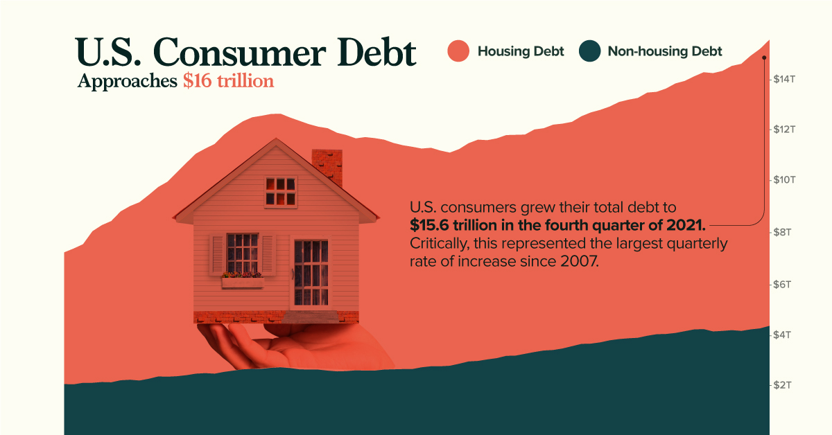
Charted: U.S. Consumer Debt Approaches $16 Trillion


Charted: U.S. Consumer Debt Approaches $16 Trillion
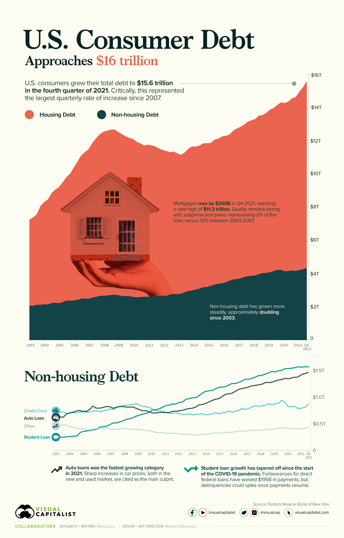
According to the Federal Reserve (Fed), U.S. consumer debt is approaching a record-breaking $16 trillion. Critically, the rate of increase in consumer debt for the fourth quarter of 2021 was also the highest seen since 2007.
This graphic provides context into the consumer debt situation using data from the end of 2021.
Housing Vs. Non-Housing Debt
The following table includes the data used in the above graphic. Housing debt covers mortgages, while non-housing debt covers auto loans, student loans, and credit card balances.
| Date | Housing Debt (USD trillions) | Non-Housing Debt (USD trillions) | Total Consumer Debt (USD trillions) |
|---|---|---|---|
| Q1 2003 | 5.18 | 2.05 | 7.23 |
| Q2 2003 | 5.34 | 2.04 | 7.38 |
| Q3 2003 | 5.45 | 2.10 | 7.55 |
| Q4 2003 | 5.96 | 2.10 | 8.06 |
| Q1 2004 | 6.17 | 2.13 | 8.30 |
| Q2 2004 | 6.34 | 2.12 | 8.46 |
| Q3 2004 | 6.64 | 2.20 | 8.84 |
| Q4 2004 | 6.83 | 2.22 | 9.05 |
| Q1 2005 | 7.01 | 2.19 | 9.20 |
| Q2 2005 | 7.23 | 2.26 | 9.49 |
| Q3 2005 | 7.45 | 2.35 | 9.80 |
| Q4 2005 | 7.67 | 2.34 | 10.01 |
| Q1 2006 | 8.02 | 2.36 | 10.38 |
| Q2 2006 | 8.35 | 2.40 | 10.75 |
| Q3 2006 | 8.65 | 2.46 | 11.11 |
| Q4 2006 | 8.83 | 2.48 | 11.31 |
| Q1 2007 | 9.03 | 2.46 | 11.49 |
| Q2 2007 | 9.33 | 2.53 | 11.86 |
| Q3 2007 | 9.56 | 2.58 | 12.14 |
| Q4 2007 | 9.75 | 2.63 | 12.38 |
| Q1 2008 | 9.89 | 2.65 | 12.54 |
| Q2 2008 | 9.95 | 2.65 | 12.60 |
| Q3 2008 | 9.98 | 2.69 | 12.67 |
| Q4 2008 | 9.97 | 2.71 | 12.68 |
| Q1 2009 | 9.85 | 2.68 | 12.53 |
| Q2 2009 | 9.77 | 2.63 | 12.40 |
| Q3 2009 | 9.65 | 2.62 | 12.27 |
| Q4 2009 | 9.55 | 2.62 | 12.17 |
| Q1 2010 | 9.53 | 2.58 | 12.11 |
| Q2 2010 | 9.38 | 2.55 | 11.93 |
| Q3 2010 | 9.28 | 2.56 | 11.84 |
| Q4 2010 | 9.12 | 2.59 | 11.71 |
| Q1 2011 | 9.18 | 2.58 | 11.76 |
| Q2 2011 | 9.14 | 2.58 | 11.72 |
| Q3 2011 | 9.04 | 2.62 | 11.66 |
| Q4 2011 | 8.90 | 2.63 | 11.53 |
| Q1 2012 | 8.80 | 2.64 | 11.44 |
| Q2 2012 | 8.74 | 2.64 | 11.38 |
| Q3 2012 | 8.60 | 2.71 | 11.31 |
| Q4 2012 | 8.59 | 2.75 | 11.34 |
| Q1 2013 | 8.48 | 2.75 | 11.23 |
| Q2 2013 | 8.38 | 2.77 | 11.15 |
| Q3 2013 | 8.44 | 2.85 | 11.29 |
| Q4 2013 | 8.58 | 2.94 | 11.52 |
| Q1 2014 | 8.70 | 2.96 | 11.66 |
| Q2 2014 | 8.62 | 3.02 | 11.64 |
| Q3 2014 | 8.64 | 3.07 | 11.71 |
| Q4 2014 | 8.68 | 3.16 | 11.84 |
| Q1 2015 | 8.68 | 3.17 | 11.85 |
| Q2 2015 | 8.62 | 3.24 | 11.86 |
| Q3 2015 | 8.75 | 3.31 | 12.06 |
| Q4 2015 | 8.74 | 3.37 | 12.11 |
| Q1 2016 | 8.86 | 3.39 | 12.25 |
| Q2 2016 | 8.84 | 3.45 | 12.29 |
| Q3 2016 | 8.82 | 3.54 | 12.36 |
| Q4 2016 | 8.95 | 3.63 | 12.58 |
| Q1 2017 | 9.09 | 3.64 | 12.73 |
| Q2 2017 | 9.14 | 3.69 | 12.83 |
| Q3 2017 | 9.19 | 3.77 | 12.96 |
| Q4 2017 | 9.32 | 3.82 | 13.14 |
| Q1 2018 | 9.38 | 3.85 | 13.23 |
| Q2 2018 | 9.43 | 3.87 | 13.30 |
| Q3 2018 | 9.56 | 3.95 | 13.51 |
| Q4 2018 | 9.53 | 4.01 | 13.54 |
| Q1 2019 | 9.65 | 4.02 | 13.67 |
| Q2 2019 | 9.81 | 4.06 | 13.87 |
| Q3 2019 | 9.84 | 4.13 | 13.97 |
| Q4 2019 | 9.95 | 4.20 | 14.15 |
| Q1 2020 | 10.10 | 4.21 | 14.31 |
| Q2 2020 | 10.15 | 4.12 | 14.27 |
| Q3 2020 | 10.22 | 4.14 | 14.36 |
| Q4 2020 | 10.39 | 4.17 | 14.56 |
| Q1 2021 | 10.50 | 4.14 | 14.64 |
| Q2 2021 | 10.76 | 4.20 | 14.96 |
| Q3 2021 | 10.99 | 4.24 | 15.23 |
| Q4 2021 | 11.25 | 4.34 | 15.59 |
Source: Federal Reserve
Trends in Housing Debt
Home prices have experienced upward pressure since the beginning of the COVID-19 pandemic. This is evidenced by the Case-Shiller U.S. National Home Price Index, which has increased by 34% since the start of the pandemic.
Driving this growth are various pandemic-related impacts. For example, the cost of materials such as lumber have seen enormous spikes. We’ve covered this story in a previous graphic, which showed how many homes could be built with $50,000 worth of lumber. In most cases, these higher costs are passed on to the consumer.
Another key factor here is mortgage rates, which fell to all-time lows in 2020. When rates are low, consumers are able to borrow in larger quantities. This increases the demand for homes, which in turn inflates prices.
Ultimately, higher home prices translate to more mortgage debt being incurred by families.
No Need to Worry, Though
Economists believe that today’s housing debt isn’t a cause for concern. This is because the quality of borrowers is much stronger than it was between 2003 and 2007, in the years leading up to the financial crisis and subsequent housing crash.
In the chart below, subprime borrowers (those with a credit score of 620 and below) are represented by the red-shaded bars:
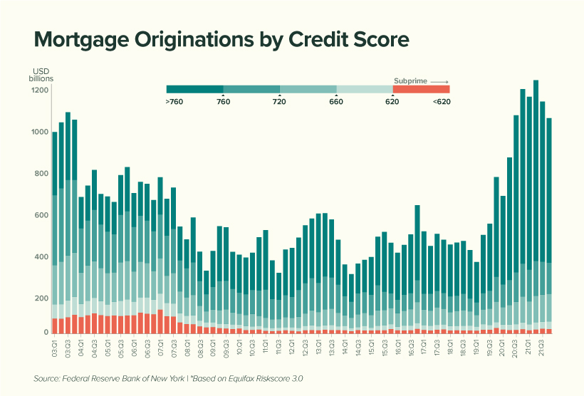
We can see that subprime borrowers represent very little (2%) of today’s total originations compared to the period between 2003 to 2007 (12%). This suggests that American homeowners are, on average, less likely to default on their mortgage.
Economists have also noted a decline in the household debt service ratio, which measures the percentage of disposable income that goes towards a mortgage. This is shown in the table below, along with the average 30-year fixed mortgage rate.
| Year | Mortgage Payments as a % of Disposable Income | Average 30-Year Fixed Mortgage Rate |
|---|---|---|
| 2000 | 12.0% | 8.2% |
| 2004 | 12.2% | 5.4% |
| 2008 | 12.8% | 5.8% |
| 2012 | 9.8% | 3.9% |
| 2016 | 9.9% | 3.7% |
| 2020 | 9.4% | 3.5% |
| 2021 | 9.3% | 3.2% |
Source: Federal Reserve
While it’s true that Americans are less burdened by their mortgages, we must acknowledge the decrease in mortgage rates that took place over the same period.
With the Fed now increasing rates to calm inflation, Americans could see their mortgages begin to eat up a larger chunk of their paycheck. In fact, mortgage rates have already risen for seven consecutive weeks.
Trends in Non-Housing Consumer Debt
The key stories in non-housing consumer debt are student loans and auto loans.
The former category of debt has grown substantially over the past two decades, with growth tapering off during the pandemic. This can be attributed to COVID relief measures which have temporarily lowered the interest rate on direct federal student loans to 0%.
Additionally, these loans were placed into forbearance, meaning 37 million borrowers have not been required to make payments. As of April 2022, the value of these waived payments has reached $195 billion.
Over the course of the pandemic, very few direct federal borrowers have made voluntary payments to reduce their loan principal. When payments eventually resume, and the 0% interest rate is reverted, economists believe that delinquencies could rise significantly.
Auto loans, on the other hand, are following a similar trajectory as mortgages. Both new and used car prices have risen due to the global chip shortage, which is hampering production across the entire industry.
To put this in numbers, the average price of a new car has climbed from $35,600 in 2019, to over $47,000 today. Over a similar timeframe, the average price of a used car has grown from $19,800, to over $28,000.


Markets
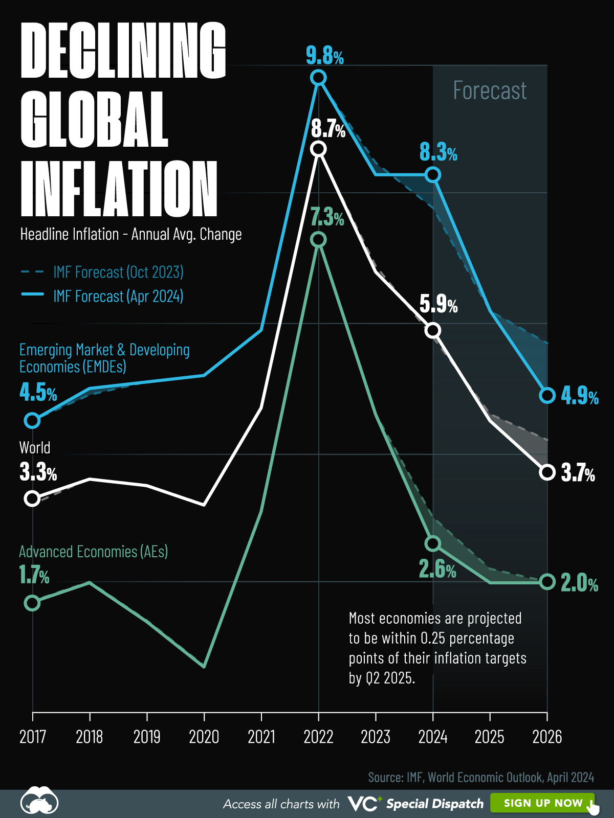
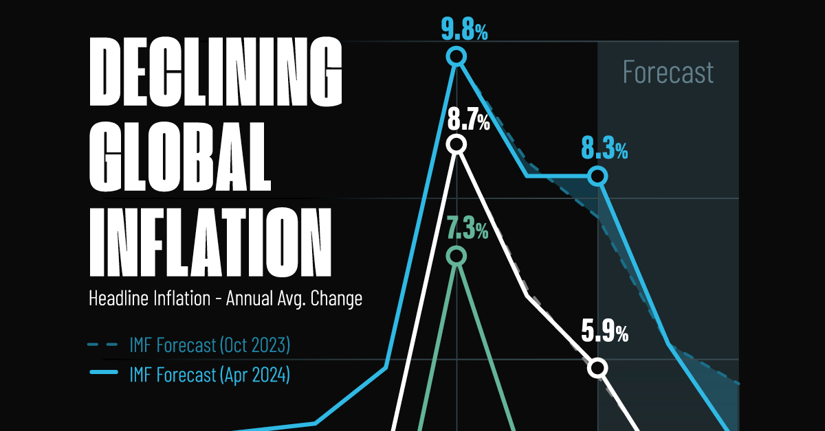
Visualizing Global Inflation Forecasts (2024-2026)
Here are IMF forecasts for global inflation rates up to 2026, highlighting a slow descent of price pressures amid resilient global growth.
Visualizing Global Inflation Forecasts (2024-2026)
Global inflation rates are gradually descending, but progress has been slow.
Today, the big question is if inflation will decline far enough to trigger easing monetary policy. So far, the Federal Reserve has held rates for nine months amid stronger than expected core inflation, which excludes volatile energy and food prices.
Yet looking further ahead, inflation forecasts from the International Monetary Fund (IMF) suggest that inflation will decline as price pressures ease, but the path of disinflation is not without its unknown risks.
This graphic shows global inflation forecasts, based on data from the April 2024 IMF World Economic Outlook.
Get the Key Insights of the IMF’s World Economic Outlook
Want a visual breakdown of the insights from the IMF’s 2024 World Economic Outlook report?
This visual is part of a special dispatch of the key takeaways exclusively for VC+ members.
Get the full dispatch of charts by signing up to VC+.
The IMF’s Inflation Outlook
Below, we show the IMF’s latest projections for global inflation rates through to 2026:
| Year | Global Inflation Rate (%) | Advanced Economies Inflation Rate (%) | Emerging Market and Developing Economies Inflation Rate (%) |
|---|---|---|---|
| 2019 | 3.5 | 1.4 | 5.1 |
| 2020 | 3.2 | 0.7 | 5.2 |
| 2021 | 4.7 | 3.1 | 5.9 |
| 2022 | 8.7 | 7.3 | 9.8 |
| 2023 | 6.8 | 4.6 | 8.3 |
| 2024 | 5.9 | 2.6 | 8.3 |
| 2025 | 4.5 | 2.0 | 6.2 |
| 2026 | 3.7 | 2.0 | 4.9 |
After hitting a peak of 8.7% in 2022, global inflation is projected to fall to 5.9% in 2024, reflecting promising inflation trends amid resilient global growth.
While inflation has largely declined due to falling energy and goods prices, persistently high services inflation poses challenges to mitigating price pressures. In addition, the IMF highlights the potential risk of an escalating conflict in the Middle East, which could lead to energy price shocks and higher shipping costs.
These developments could negatively affect inflation scenarios and prompt central banks to adopt tighter monetary policies. Overall, by 2026, global inflation is anticipated to decline to 3.7%—still notably above the 2% target set by several major economies.
Adding to this, we can see divergences in the path of inflation between advanced and emerging economies. While affluent nations are forecast to see inflation edge closer to the 2% target by 2026, emerging economies are projected to have inflation rates reach 4.9%—falling closer to their pre-pandemic averages.
Get the Full Analysis of the IMF’s Outlook on VC+
This visual is part of an exclusive special dispatch for VC+ members which breaks down the key takeaways from the IMF’s 2024 World Economic Outlook.
For the full set of charts and analysis, sign up for VC+.

-

 Money6 days ago
Charted: Which Country Has the Most Billionaires in 2024?
-

 Energy2 weeks ago
Ranked: The Top 10 EV Battery Manufacturers in 2023
-

 Countries2 weeks ago
Countries With the Largest Happiness Gains Since 2010
-

 Economy2 weeks ago
VC+: Get Our Key Takeaways From the IMF’s World Economic Outlook
-

 Demographics2 weeks ago
The Countries That Have Become Sadder Since 2010
-

 Money2 weeks ago
Charted: Who Has Savings in This Economy?
-

 Technology1 week ago
Visualizing AI Patents by Country
-

 Economy1 week ago
Economic Growth Forecasts for G7 and BRICS Countries in 2024