Demographics
Visualizing Two Centuries of U.S. Immigration
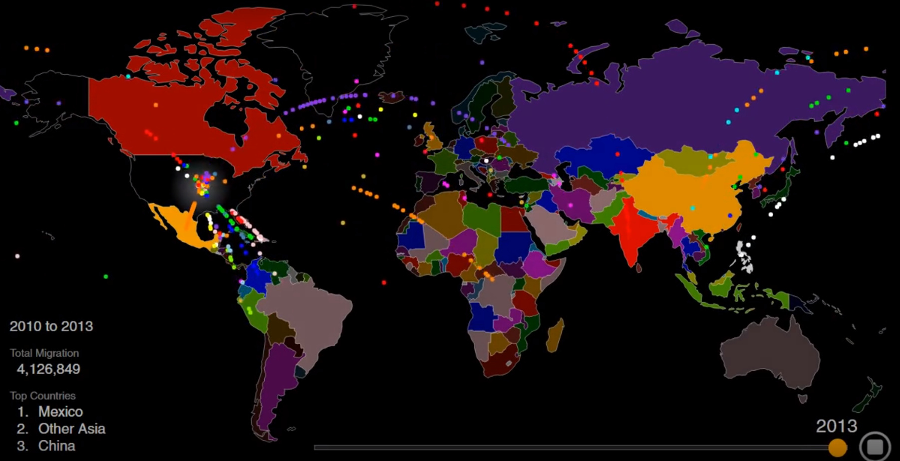
Animation: Visualizing Two Centuries of U.S. Immigration
America is a nation of immigrants, and though the country has seen a lot of new arrivals over the past two centuries, the rate of immigration has been far from steady.
War, famine, economic boom and bust, religious persecution, and government intervention have all caused wild swings in the rate of immigration from countries around the world.
Today’s striking animation, by Max Galka, is a great way to see changes in immigration over time. Inflows from specific countries rise and fall, and the top three countries of origin change numerous times over the years.
Below, is another way to look at the ebb and flow of American immigration since the early 1800s.
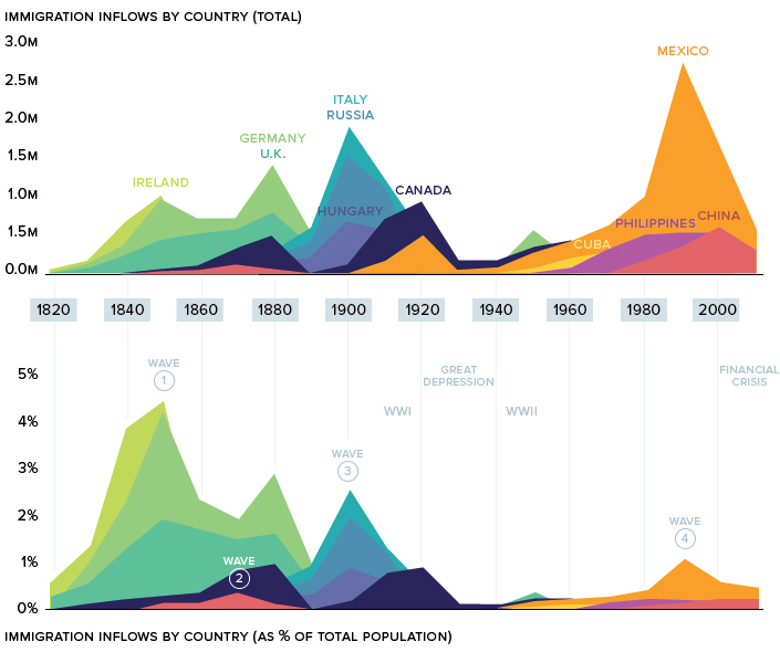
An important note. This data excludes forced migration (slavery) and illegal immigration.
Let’s look at the “waves” in more detail.
Wave one: The Old Immigration
From 1820 to 1870, over 7.5 million immigrants made their way over to the United States, effectively doubling the young country’s population in only half a decade.
Ireland, which was in the throes of the Potato Famine, saw half its population set sail for the U.S. during that time. This wave of immigration can still be seen in today’s demographics. There are now more Irish-Americans than there are Irish nationals.
The magnetic pull of the New World was profoundly felt in Germany as well. Growing public unrest in the region, caused by heavy taxation and political censorship, culminated in the German revolutions of 1848-49. Faced with severe hardship at home, millions of Germans made their way to America over the 1800s. It’s estimated that one-third of the total ethnic German population in the world now lives in the United States.
Wave Two: Gold Rush
Much of America’s early immigration was from various points in Europe, but there was one prominent exception: China.
The discovery of gold in California inspired Chinese workers to seek their fortune in America. After a crop failure in Southern China in 1852, tens of thousands of Chinese immigrants flooded into San Francisco.
Although the State of California was making millions of dollars off its Foreign Miners Tax, sentiment towards Chinese workers began to sour. Gold mines were being tapped out and white Californians blamed the Chinese for driving wages down.
Chinamen are getting to be altogether too plentiful in this country.
– John Bigler, Governor of California (1852-1856)
By 1882, the newly enacted the Chinese Exclusion Act had a chilling effect on Chinese immigration. The Exclusion Act has the dubious distinction of being the only American law barring a specific group from immigrating to the United States.
Wave Three: The New Immigration
The wave of immigration leading into the 20th century is referred to as The New Immigration.
In 1890, Ellis Island was designated as the main point of entry for newcomers entering the United States. In 1907 alone, Ellis Island processed a staggering 1,285,349 immigrants. To put this number in perspective, if all of those people settled in one place, they would’ve formed America’s fourth largest city almost overnight.
This massive influx of people into New York had profound implications on the city itself. In 1910, Manhattan’s population density was an astronomical 101,548 humans per square mile.
The immigrants arriving during this period – heavily represented by Italians, Hungarians, and Russians – were seeking religious freedom and economic opportunity. Certain industries, such as steel, meat-packing, and mining, were staffed by many new arrivals to the country.
During this time, one in four American workers were foreign-born.
The Great Depression
The National Origins Act’s quota system, which took effect in 1929, essentially slammed the door on most immigrants from Southern and Eastern Europe. Shortly after, the Great Depression further put a damper on immigration that would last well into the 20th century.
Wave Four: Mexico
After decades of sluggish immigration, the United States’ percentage of foreign-born citizens reached a low of 4.7% in 1970. But that was all about to change.
During the next decade, the number of states where Mexico was the top country of origin doubled in a single decade, and Mexicans became the dominant foreign-born population in the country. This migration was fueled by the Latin American debt crisis and later by NAFTA. The influx of cheap corn into Mexico caused hundreds of thousands of Mexicans from rural areas to search for more favorable economic opportunities. America was the obvious choice, particularly during the economic expansion of the 1990s.
This wave of immigration has shifted the country’s demographics considerably. Today, nearly one in five people in the United States are Hispanic.
Current Trends
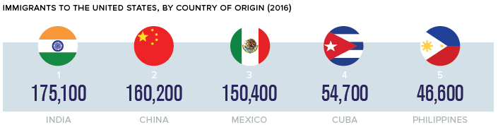
Immigration trends are continually evolving, and America’s newest immigrants are often more likely to come from China or India. In fact, both countries surpassed Mexico as countries of origin for immigrants arriving in the U.S. in 2013. Today, the trend is even more pronounced.
Recent immigration numbers indicate that Asian immigrants will continue to shift America’s demographics in a new direction. Perhaps a new wave in the making?


Demographics
The Countries That Have Become Sadder Since 2010
Tracking Gallup survey data for more than a decade reveals some countries are witnessing big happiness declines, reflecting their shifting socio-economic conditions.


The Countries That Have Become Sadder Since 2010
This was originally posted on our Voronoi app. Download the app for free on iOS or Android and discover incredible data-driven charts from a variety of trusted sources.
Can happiness be quantified?
Some approaches that try to answer this question make a distinction between two differing components of happiness: a daily experience part, and a more general life evaluation (which includes how people think about their life as a whole).
The World Happiness Report—first launched in 2012—has been making a serious go at quantifying happiness, by examining Gallup poll data that asks respondents in nearly every country to evaluate their life on a 0–10 scale. From this they extrapolate a single “happiness score” out of 10 to compare how happy (or unhappy) countries are.
More than a decade later, the 2024 World Happiness Report continues the mission. Its latest findings also include how some countries have become sadder in the intervening years.
Which Countries Have Become Unhappier Since 2010?
Afghanistan is the unhappiest country in the world right now, and is also 60% unhappier than over a decade ago, indicating how much life has worsened since 2010.
In 2021, the Taliban officially returned to power in Afghanistan, after nearly two decades of American occupation in the country. The Islamic fundamentalist group has made life harder, especially for women, who are restricted from pursuing higher education, travel, and work.
On a broader scale, the Afghan economy has suffered post-Taliban takeover, with various consequent effects: mass unemployment, a drop in income, malnutrition, and a crumbling healthcare system.
| Rank | Country | Happiness Score Loss (2010–24) | 2024 Happiness Score (out of 10) |
|---|---|---|---|
| 1 | 🇦🇫 Afghanistan | -2.6 | 1.7 |
| 2 | 🇱🇧 Lebanon | -2.3 | 2.7 |
| 3 | 🇯🇴 Jordan | -1.5 | 4.2 |
| 4 | 🇻🇪 Venezuela | -1.3 | 5.6 |
| 5 | 🇲🇼 Malawi | -1.2 | 3.4 |
| 6 | 🇿🇲 Zambia | -1.2 | 3.5 |
| 7 | 🇧🇼 Botswana | -1.2 | 3.4 |
| 8 | 🇾🇪 Yemen | -1.0 | 3.6 |
| 9 | 🇪🇬 Egypt | -1.0 | 4.0 |
| 10 | 🇮🇳 India | -0.9 | 4.1 |
| 11 | 🇧🇩 Bangladesh | -0.9 | 3.9 |
| 12 | 🇨🇩 DRC | -0.7 | 3.3 |
| 13 | 🇹🇳 Tunisia | -0.7 | 4.4 |
| 14 | 🇨🇦 Canada | -0.6 | 6.9 |
| 15 | 🇺🇸 U.S. | -0.6 | 6.7 |
| 16 | 🇨🇴 Colombia | -0.5 | 5.7 |
| 17 | 🇵🇦 Panama | -0.5 | 6.4 |
| 18 | 🇵🇰 Pakistan | -0.5 | 4.7 |
| 19 | 🇿🇼 Zimbabwe | -0.5 | 3.3 |
| 20 | 🇮🇪 Ireland | -0.5 | 6.8 |
| N/A | 🌍 World | +0.1 | 5.5 |
Nine countries in total saw their happiness score drop by a full point or more, on the 0–10 scale.
Noticeably, many of them have seen years of social and economic upheaval. Lebanon, for example, has been grappling with decades of corruption, and a severe liquidity crisis since 2019 that has resulted in a banking system collapse, sending poverty levels skyrocketing.
In Jordan, unprecedented population growth—from refugees leaving Iraq and Syria—has aggravated unemployment rates. A somewhat abrupt change in the line of succession has also raised concerns about political stability in the country.

-

 Energy1 week ago
The World’s Biggest Nuclear Energy Producers
-

 Money2 weeks ago
Which States Have the Highest Minimum Wage in America?
-

 Technology2 weeks ago
Ranked: Semiconductor Companies by Industry Revenue Share
-

 Markets2 weeks ago
Ranked: The World’s Top Flight Routes, by Revenue
-

 Demographics2 weeks ago
Population Projections: The World’s 6 Largest Countries in 2075
-

 Markets2 weeks ago
The Top 10 States by Real GDP Growth in 2023
-

 Demographics2 weeks ago
The Smallest Gender Wage Gaps in OECD Countries
-

 Economy2 weeks ago
Where U.S. Inflation Hit the Hardest in March 2024