Here's how all major commodities have done so far this year, as well as one chart that shows why they could still be very cheap for...
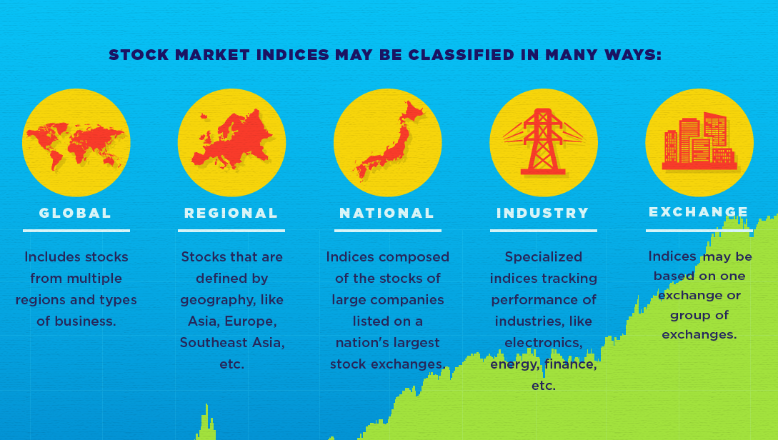
This infographic helps to explain the basics around what a stock market index is, and what it does.
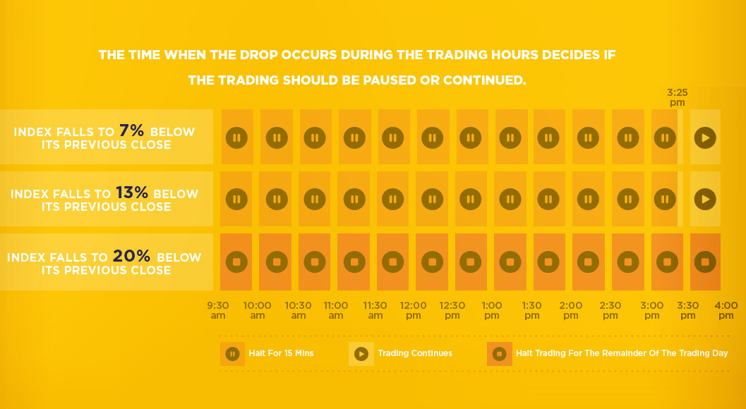
Here's how 'circuit breakers' in the stock market work, and how these pauses are supposed to prevent the next market crash from happening.
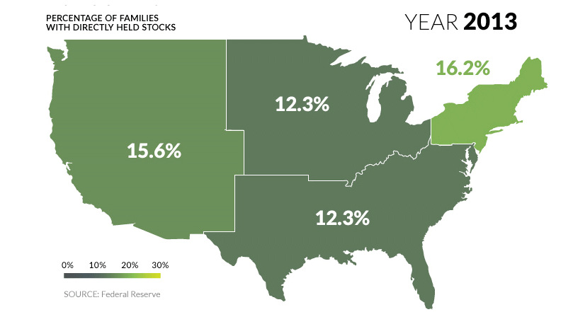
U.S. markets continue to hit all-time highs, but what percentage of population actually benefits? See stock ownership across the U.S. on this animated map.
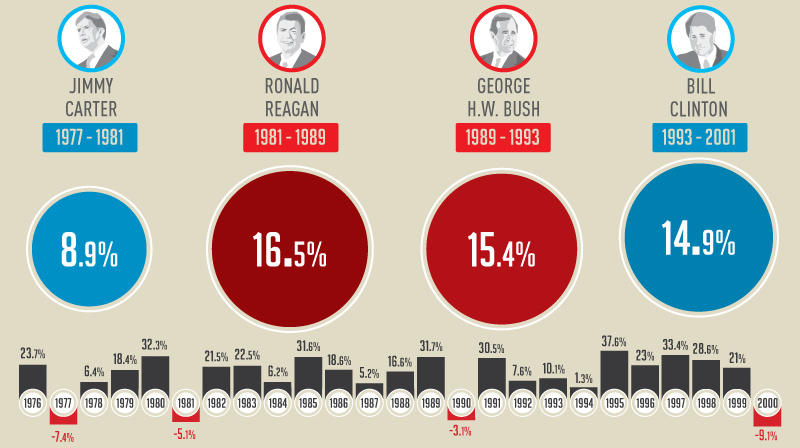
This infographic shows how the U.S. market performs in each year of a presidential term - and specifically, how the market does in election years.
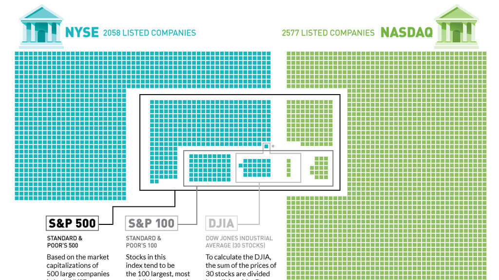
Plotting the 4,500+ companies on the NYSE and NASDAQ to show how the S&P 500, S&P 100, and Dow are derived.
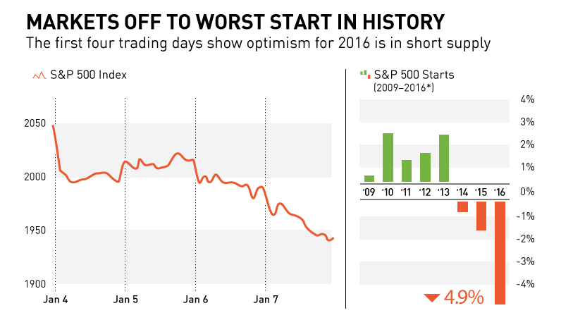
In this chart and post, we show why markets are off to their worst start in history. We also look at recent S&P 500 starts to...
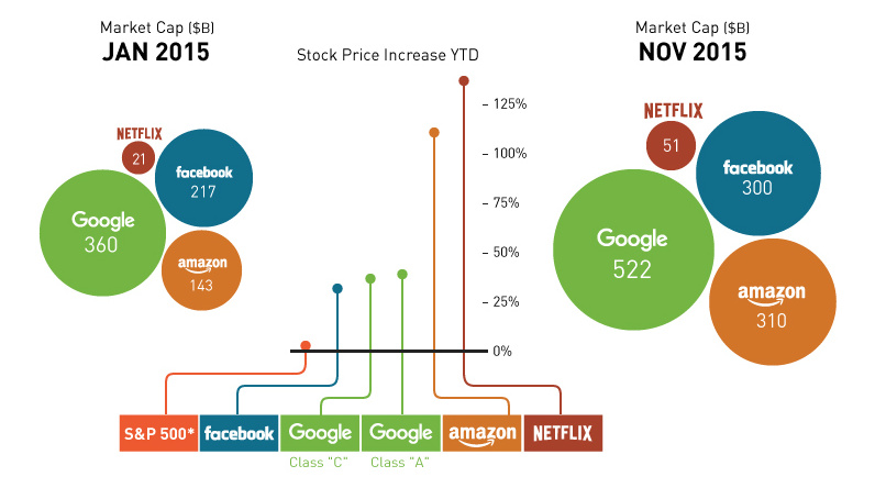
The FANG stocks (Facebook, Amazon, Netflix, and Google) are a group of tech companies that have carried the market this year, creating $440B in value YTD.
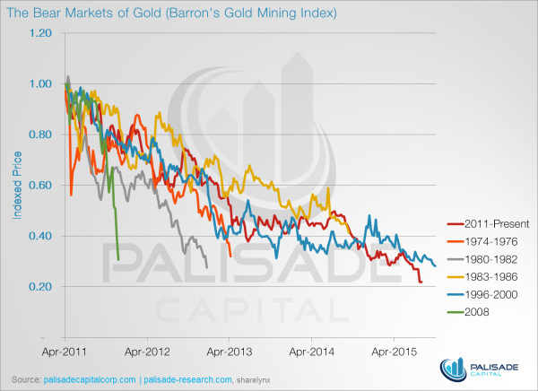
These five charts show why gold stocks have never been cheaper.
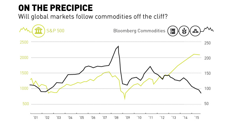
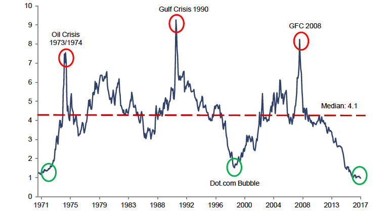
Commodities have fell off the cliff with oil and base metals getting crushed over the last year. Is the general market about to follow the same...


