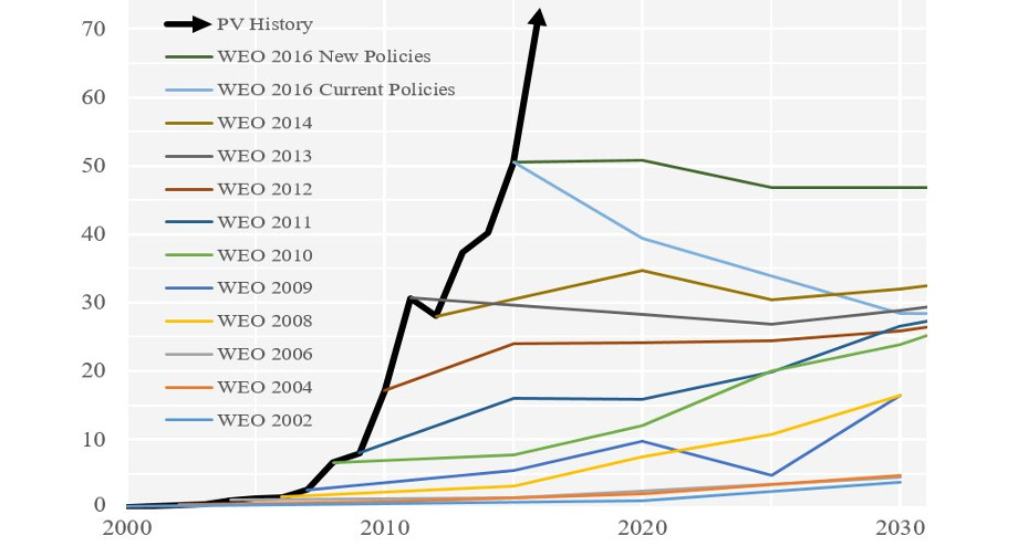
Forecasting the future of energy is not an easy task. These charts show how the experts have fared at forecasting solar over recent decades.
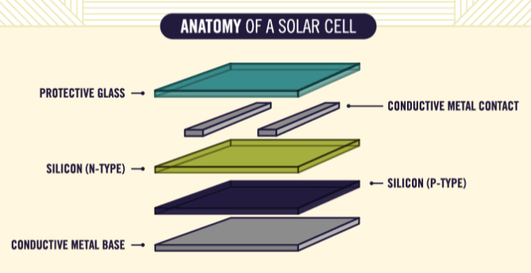
Ever wonder how solar panels work to generate electricity? This animated infographic explains the science behind it, making it easy to understand for anyone.
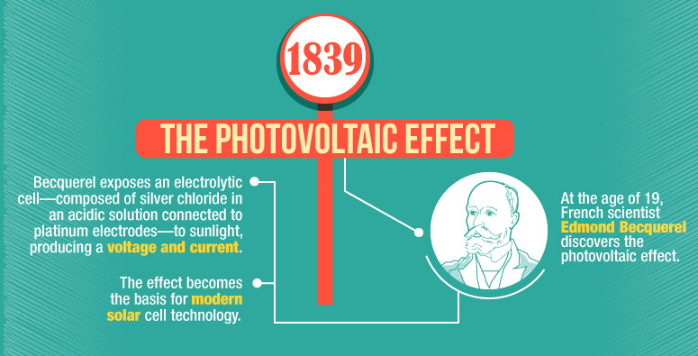
This infographic shows the many technological advances made throughout the history of solar energy - going all the way back to the Neolithic Era in China.
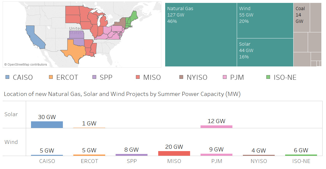
Nearly 100 GW of new power coming online is from solar and wind, making up 36% of new electrical capacity being added in these jurisdictions.
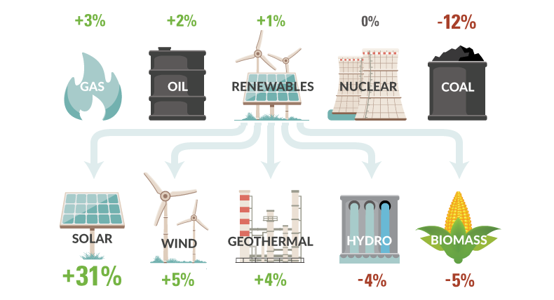
How is U.S. energy consumption shifting? This week's chart looks at the rate of change in the use of different energy sources, including future projections.
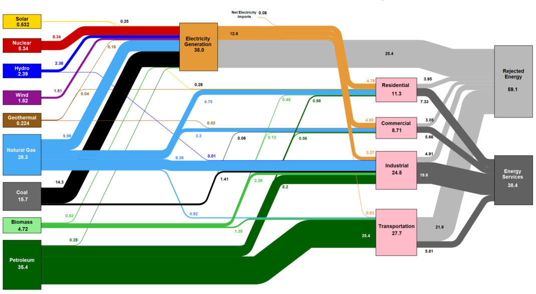
This massive diagram shows all energy created in the U.S., and where it goes. It's not sexy, but it gives a great 10,000 ft overview of...
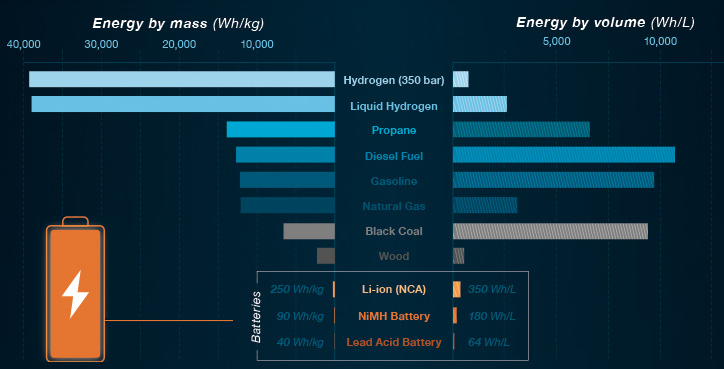
In Part 2 of the Battery Series, we show what batteries can and cannot do with today's technology. We also look at the ideal properties of...

This infographic highlights the top 10 emerging technologies that are finally ready for prime time in 2016.
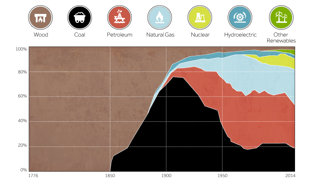
This chart shows the history of America's energy supply based on energy source. This brief history covers all from wood-powered locomotives to solar panels.
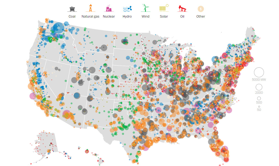
This series of data visualizations shows how the United States has generated its electricity so far in 2015 by energy source and size of each power...


