
How is the renewable energy shift unfolding? This exploration highlights the market and governmental forces in action.
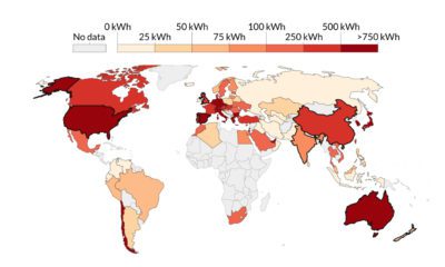

This visualization highlights the growth in solar energy consumption per capita over 54 years. Which countries are leading the way?


Long known as a precious metal, silver in solar and EV technologies will redefine its role and importance to a greener economy.

How is technology changing the global energy game? Here's a look at the challenges faced by the energy industry as they plan for the needs of...
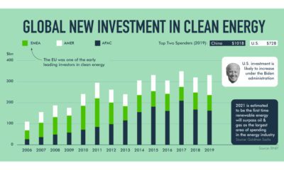
The race towards a fully green future is heating up. As declining prices drive up the adoption of renewable energy, which countries are investing the most?
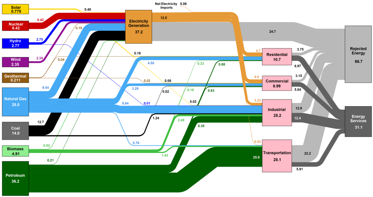
How is the country's energy generated, and how is it consumed? This nifty Sankey diagram shows U.S. energy consumption in a simple and understandable way.
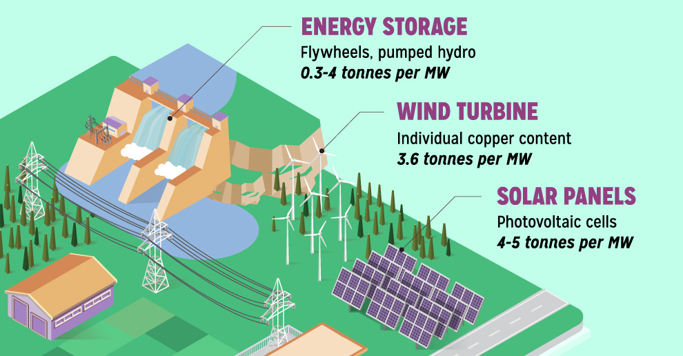
Renewable energy is set to fuel a new era of copper demand - here's how much copper is used in green applications from EVs to photovoltaics.
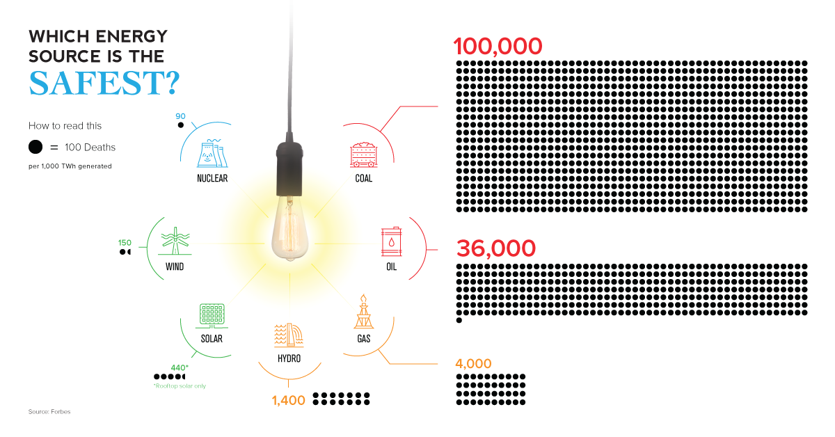
The empirical data on which energy source has led to the fewest human deaths may not be the one you expect.

In 2016, more net capacity was added for clean energy than all other types combined. Who's adding renewable capacity, and how much are they investing?
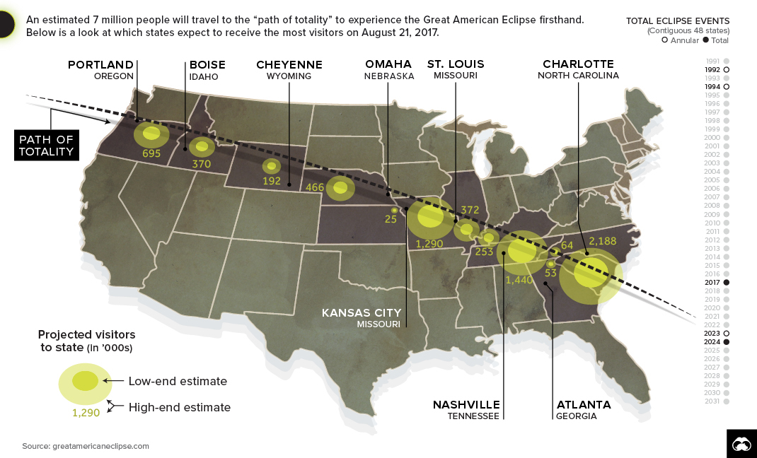
The Great American Eclipse will stretch over 12 states, and it’s being called the greatest temporary mass migration to see a natural event in U.S. history.


