Money
The Relationship Between Money and Happiness
Explore the full-size version of this chart by clicking here.
Charting the Relationship Between Money and Happiness
Today’s chart is best viewed full-screen. Explore the high resolution version by clicking here.
Can money buy you happiness?
It’s a longstanding question that has many different answers, depending on who you ask.
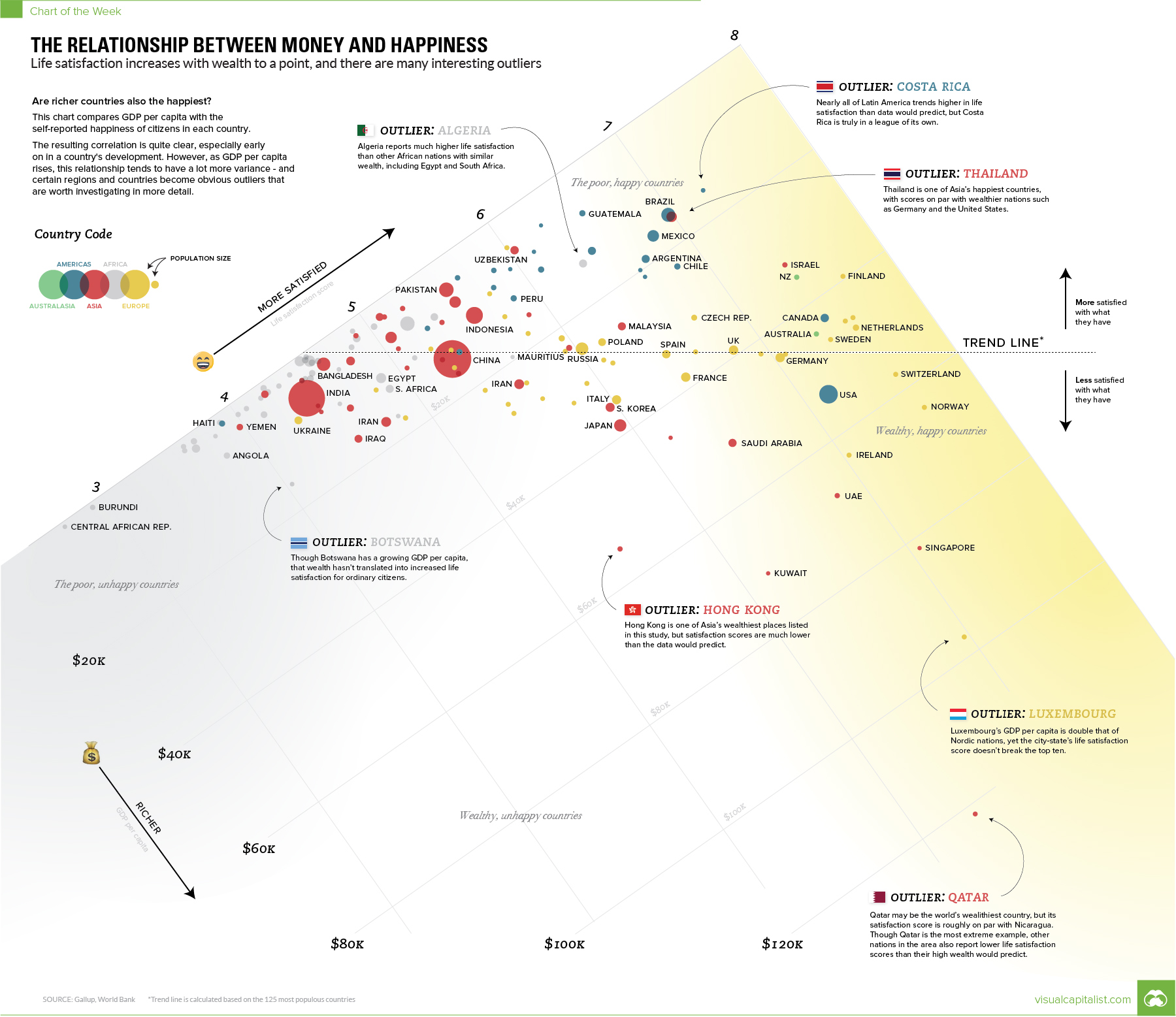
Today’s chart approaches this fundamental question from a data-driven perspective, and it provides one potential solution: money does buy some happiness, but only to a limited extent.
Money and Happiness
First, a thinking exercise.
Let’s say you have two hypothetical people: one of them is named Beff Jezos and he’s a billionaire, and the other is named Jill Smith and she has a more average net worth. Who do you think would be happiest if their wealth was instantly doubled?
Beff might be happy that he’s got more in the bank, but materially his life is unlikely to change much – after all, he’s a billionaire. On the flipside, Jill also has more in the bank and is likely able to use those additional resources to provide better opportunities for her family, get out of debt, or improve her work-life balance.
These resources translate to real changes for Jill, potentially increasing her level of satisfaction with life.
Just like these hypotheticals, the data tells a similar story when we look at countries.
The Data-Driven Approach
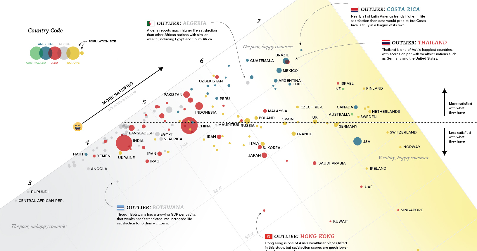
Today’s chart looks at the relationship between GDP per capita (PPP) and the self-reported levels of happiness of each country. Sources for data are the World Bank and the World Happiness Report 2017.
According to the numbers, the relationship between money and happiness is strong early on for countries. Then later, when material elements of Maslow’s hierarchy are met, the relationship gets harder to predict.
In general, this means that as a country’s wealth increases from $10k to $20k per person, it will likely slide up the happiness scale as well. For a double from $30k to $60k, the relationship still holds – but it tends to have far more variance. This variance is where things get interesting.
Outlier Regions
Some of the most obvious outliers can be found in Latin America and the Middle East:
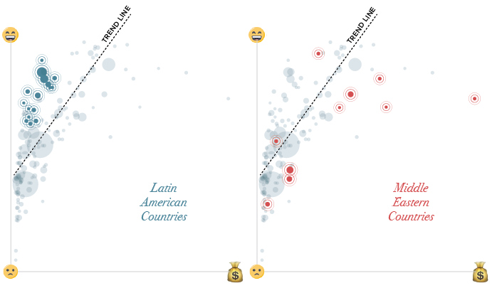
In Latin America, people self-report that they are more satisfied than the trend between money and happiness would predict.
Costa Rica stands out in particular here, with a GDP per capita of $15,400 and a 7.14 rating on the Cantril Ladder (which is a measure of happiness). Whether it’s the country’s rugged coastlines or the local culture that does the trick, Costa Rica has higher happiness ratings than the U.S., Belgium, or Germany – all countries with far higher levels of wealth.
In the Middle East, the situation is mostly reversed. Countries like Saudi Arabia, Qatar, Iran, Iraq, Yemen, Turkey, and the U.A.E. are all on the other side of the trend line.
Outlier Countries
Within regions, there is even plenty of variance.
We just mentioned the Middle East as a place where the wealth-happiness continuum doesn’t seem to hold up as well as it does in other places in the world.
Interestingly, in Qatar, which is actually the wealthiest country in the world on a per capita basis ($127k), things are even more out of whack. Qatar only scores a 6.37 on the Cantril Ladder, making it a big exception even within the context of the already-outlying Middle East.
Nearby Saudi Arabia, U.A.E., and Oman are all poorer than Qatar per capita, yet they are happier places. Oman rates a 6.85 on the satisfaction scale, with less than one-third the wealth per capita of Qatar.
There are other outlier jurisdictions on the list as well: Thailand, Uzbekistan, and Pakistan are all significantly happier than the trend line (or their regional location) would project. Meanwhile, places like Hong Kong, Ireland, Singapore, and Luxembourg are less happy than wealth would predict.


Money
Charted: Which City Has the Most Billionaires in 2024?
Just two countries account for half of the top 20 cities with the most billionaires. And the majority of the other half are found in Asia.


Charted: Which Country Has the Most Billionaires in 2024?
This was originally posted on our Voronoi app. Download the app for free on iOS or Android and discover incredible data-driven charts from a variety of trusted sources.
Some cities seem to attract the rich. Take New York City for example, which has 340,000 high-net-worth residents with investable assets of more than $1 million.
But there’s a vast difference between being a millionaire and a billionaire. So where do the richest of them all live?
Using data from the Hurun Global Rich List 2024, we rank the top 20 cities with the highest number of billionaires in 2024.
A caveat to these rich lists: sources often vary on figures and exact rankings. For example, in last year’s reports, Forbes had New York as the city with the most billionaires, while the Hurun Global Rich List placed Beijing at the top spot.
Ranked: Top 20 Cities with the Most Billionaires in 2024
The Chinese economy’s doldrums over the course of the past year have affected its ultra-wealthy residents in key cities.
Beijing, the city with the most billionaires in 2023, has not only ceded its spot to New York, but has dropped to #4, overtaken by London and Mumbai.
| Rank | City | Billionaires | Rank Change YoY |
|---|---|---|---|
| 1 | 🇺🇸 New York | 119 | +1 |
| 2 | 🇬🇧 London | 97 | +3 |
| 3 | 🇮🇳 Mumbai | 92 | +4 |
| 4 | 🇨🇳 Beijing | 91 | -3 |
| 5 | 🇨🇳 Shanghai | 87 | -2 |
| 6 | 🇨🇳 Shenzhen | 84 | -2 |
| 7 | 🇭🇰 Hong Kong | 65 | -1 |
| 8 | 🇷🇺 Moscow | 59 | No Change |
| 9 | 🇮🇳 New Delhi | 57 | +6 |
| 10 | 🇺🇸 San Francisco | 52 | No Change |
| 11 | 🇹🇭 Bangkok | 49 | +2 |
| 12 | 🇹🇼 Taipei | 45 | +2 |
| 13 | 🇫🇷 Paris | 44 | -2 |
| 14 | 🇨🇳 Hangzhou | 43 | -5 |
| 15 | 🇸🇬 Singapore | 42 | New to Top 20 |
| 16 | 🇨🇳 Guangzhou | 39 | -4 |
| 17T | 🇮🇩 Jakarta | 37 | +1 |
| 17T | 🇧🇷 Sao Paulo | 37 | No Change |
| 19T | 🇺🇸 Los Angeles | 31 | No Change |
| 19T | 🇰🇷 Seoul | 31 | -3 |
In fact all Chinese cities on the top 20 list have lost billionaires between 2023–24. Consequently, they’ve all lost ranking spots as well, with Hangzhou seeing the biggest slide (-5) in the top 20.
Where China lost, all other Asian cities—except Seoul—in the top 20 have gained ranks. Indian cities lead the way, with New Delhi (+6) and Mumbai (+3) having climbed the most.
At a country level, China and the U.S combine to make up half of the cities in the top 20. They are also home to about half of the world’s 3,200 billionaire population.
In other news of note: Hurun officially counts Taylor Swift as a billionaire, estimating her net worth at $1.2 billion.

-

 Education1 week ago
How Hard Is It to Get Into an Ivy League School?
-

 Technology2 weeks ago
Ranked: Semiconductor Companies by Industry Revenue Share
-

 Markets2 weeks ago
Ranked: The World’s Top Flight Routes, by Revenue
-

 Demographics2 weeks ago
Population Projections: The World’s 6 Largest Countries in 2075
-

 Markets2 weeks ago
The Top 10 States by Real GDP Growth in 2023
-

 Demographics2 weeks ago
The Smallest Gender Wage Gaps in OECD Countries
-

 Economy2 weeks ago
Where U.S. Inflation Hit the Hardest in March 2024
-

 Green2 weeks ago
Top Countries By Forest Growth Since 2001