Money
The Jump from Millionaire to Billionaire, and How Long That Takes
Some people say that making the first million is the hardest.
Others, like oil tycoon T. Boone Pickens have quipped that the first billion is a “helluva lot harder”.
Regardless of which is true, it’s interesting to examine how long it took the world’s wealthiest to reach the million and billion dollar benchmarks, as well as how many years were in between.
Millions to Billions
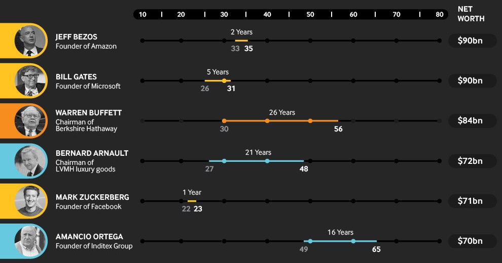
Today’s infographic comes to us from Betway, and it provides a study of the 100 wealthiest billionaires that topped the 2018 edition of the Forbes Rich List.

Based on the top 100 billionaires studied from the Rich List, the average age for hitting millionaire status is 37. Meanwhile, the billion dollar mark is hit on average at the age of 51.
This puts the average time period to go from millionaire to billionaire at 14 years.
Making the Jump, by Industry
Even with this small sample size, it’s clear that how fast this jump happens depends greatly on industry.
Tech entrepreneurs were by far the fastest on the list to go from millionaire to billionaire, with an average time of only 7.3 years. That number is averaged down by entrepreneurs such as Jeff Bezos, who has singlehandedly been able to amass an impressive empire of companies and assets in a very short period of time.
| Tech Entrepreneur | Millionaire (Age) | Billionaire (Age) | Difference |
|---|---|---|---|
| Jeff Bezos | 33 | 35 | 2 years |
| Bill Gates | 26 | 31 | 5 years |
| Mark Zuckerberg | 22 | 23 | 1 year |
| Larry Ellison | 42 | 49 | 7 years |
| Larry Page | 25 | 30 | 5 years |
| Sergey Brin | 26 | 31 | 5 years |
| Ma Huateng | 33 | 36 | 3 years |
| Jack Ma | 35 | 45 | 10 years |
| Steve Ballmer | 30 | 38 | 8 years |
Other industries don’t have the same luxuries as tech, where products can go from Zero to One at such high speeds.
In the automotive, construction, and real estate industries, for example, there are costly physical assets to deal with, as well as fiercer competition. At the same time, innovations are often more incremental, and companies cannot be scaled as fast.
Making the Jump, by Country
Interestingly, the jump from millionaire to billionaire took the longest in the United States, with a period of 14.1 years on average for self-made billionaires.
| Country | Time to go from $1M to $1B |
|---|---|
| Russia | 9.0 years |
| China | 9.9 years |
| Japan | 11.0 years |
| United States | 14.1 years |
While this may seem counter-intuitive, there are a couple of caveats worth mentioning.
For starters, the sample size is extremely small at just the top 100 billionaires, which means that a country like Russia has only so many in the mix. This low sample size can distort figures, and not be particularly representative of a true average.
Further, economies like Russia and China have recently transitioned from more controlled economies to more market-driven ones. This has allowed oligarchs and well-connected individuals to take advantage, while amassing new wealth at astonishing rates.


Money
How Debt-to-GDP Ratios Have Changed Since 2000
See how much the debt-to-GDP ratios of advanced economies have grown (or shrank) since the year 2000.


How Debt-to-GDP Ratios Have Changed Since 2000
This was originally posted on our Voronoi app. Download the app for free on Apple or Android and discover incredible data-driven charts from a variety of trusted sources.
Government debt levels have grown in most parts of the world since the 2008 financial crisis, and even more so after the COVID-19 pandemic.
To gain perspective on this long-term trend, we’ve visualized the debt-to-GDP ratios of advanced economies, as of 2000 and 2024 (estimated). All figures were sourced from the IMF’s World Economic Outlook.
Data and Highlights
The data we used to create this graphic is listed in the table below. “Government gross debt” consists of all liabilities that require payment(s) of interest and/or principal in the future.
| Country | 2000 (%) | 2024 (%) | Change (pp) |
|---|---|---|---|
| 🇯🇵 Japan | 135.6 | 251.9 | +116.3 |
| 🇸🇬 Singapore | 82.3 | 168.3 | +86.0 |
| 🇺🇸 United States | 55.6 | 126.9 | +71.3 |
| 🇬🇧 United Kingdom | 36.6 | 105.9 | +69.3 |
| 🇬🇷 Greece | 104.9 | 160.2 | +55.3 |
| 🇫🇷 France | 58.9 | 110.5 | +51.6 |
| 🇵🇹 Portugal | 54.2 | 104.0 | +49.8 |
| 🇪🇸 Spain | 57.8 | 104.7 | +46.9 |
| 🇸🇮 Slovenia | 25.9 | 66.5 | +40.6 |
| 🇫🇮 Finland | 42.4 | 76.5 | +34.1 |
| 🇭🇷 Croatia | 35.4 | 61.8 | +26.4 |
| 🇨🇦 Canada | 80.4 | 103.3 | +22.9 |
| 🇨🇾 Cyprus | 56.0 | 70.9 | +14.9 |
| 🇦🇹 Austria | 65.7 | 74.0 | +8.3 |
| 🇸🇰 Slovak Republic | 50.5 | 56.5 | +6.0 |
| 🇩🇪 Germany | 59.3 | 64.0 | +4.7 |
| 🇧🇪 Belgium | 109.6 | 106.8 | -2.8 |
| 🇮🇱 Israel | 77.4 | 56.8 | -20.6 |
| 🇮🇸 Iceland | 75.8 | 54.6 | -21.2 |
The debt-to-GDP ratio indicates how much a country owes compared to the size of its economy, reflecting its ability to manage and repay debts. Percentage point (pp) changes shown above indicate the increase or decrease of these ratios.
Countries with the Biggest Increases
Japan (+116 pp), Singapore (+86 pp), and the U.S. (+71 pp) have grown their debt as a percentage of GDP the most since the year 2000.
All three of these countries have stable, well-developed economies, so it’s unlikely that any of them will default on their growing debts. With that said, higher government debt leads to increased interest payments, which in turn can diminish available funds for future government budgets.
This is a rising issue in the U.S., where annual interest payments on the national debt have surpassed $1 trillion for the first time ever.
Only 3 Countries Saw Declines
Among this list of advanced economies, Belgium (-2.8 pp), Iceland (-21.2 pp), and Israel (-20.6 pp) were the only countries that decreased their debt-to-GDP ratio since the year 2000.
According to Fitch Ratings, Iceland’s debt ratio has decreased due to strong GDP growth and the use of its cash deposits to pay down upcoming maturities.
See More Debt Graphics from Visual Capitalist
Curious to see which countries have the most government debt in dollars? Check out this graphic that breaks down $97 trillion in debt as of 2023.

-

 Real Estate2 weeks ago
Visualizing America’s Shortage of Affordable Homes
-

 Technology1 week ago
Ranked: Semiconductor Companies by Industry Revenue Share
-

 Money1 week ago
Which States Have the Highest Minimum Wage in America?
-

 Real Estate1 week ago
Ranked: The Most Valuable Housing Markets in America
-

 Business2 weeks ago
Charted: Big Four Market Share by S&P 500 Audits
-

 AI2 weeks ago
The Stock Performance of U.S. Chipmakers So Far in 2024
-

 Misc2 weeks ago
Almost Every EV Stock is Down After Q1 2024
-

 Money2 weeks ago
Where Does One U.S. Tax Dollar Go?