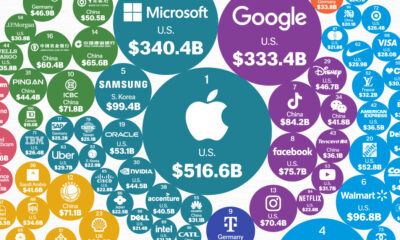
This graphic shows the world's most valuable brands, from big tech giants to battery makers powering green technology.


click for more →


Scan with your phone's camera or QR code app to view
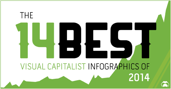
In this list, we count down the 14 best Visual Capitalist infographics of 2014.
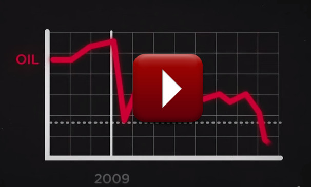
This infographic video shows the story behind oil's plunge through 2014.
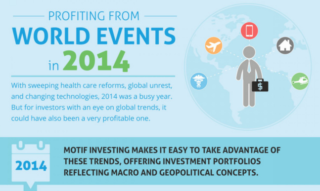
This infographic shows how investors could have profited off of certain world events in 2014.
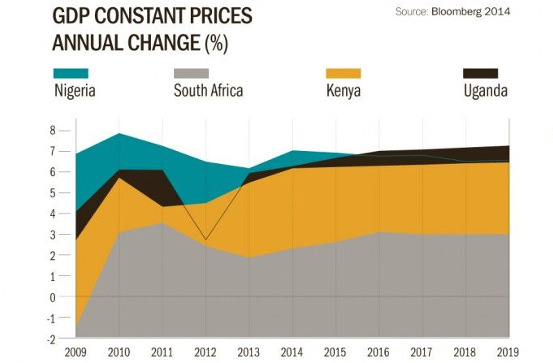
Despite declining commodity prices and the outbreak of Ebola, investors are still betting on Africa.

This infographic, Part 1 of 4, covers the properties and history of silver, with its use in monetary, health, and industrial areas.
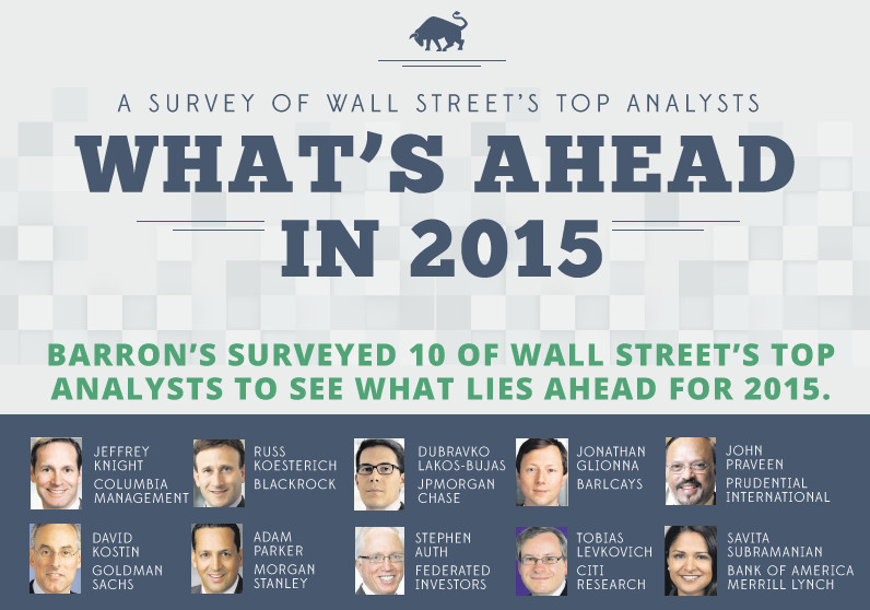
The results of Barron's poll of top Wall Street analyst predictions for 2015.
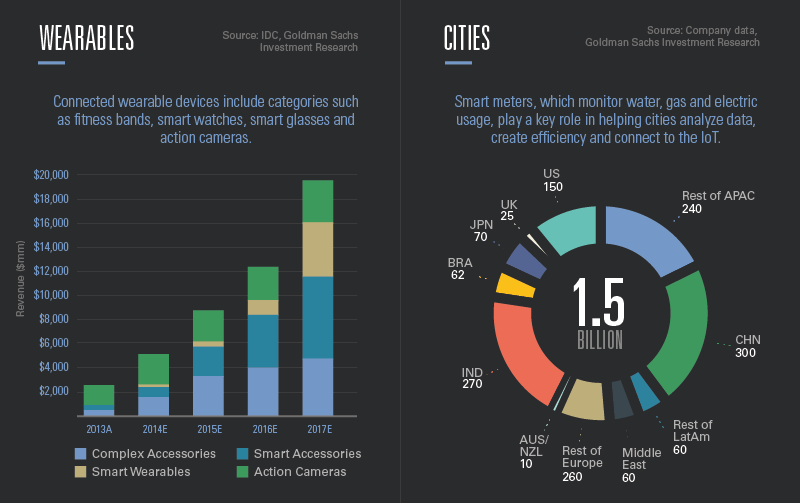
The present and future of the Internet of Things (IoT) technology macrotrend.

With gas prices as low as they have been since 2010, America's oil addiction is waning.
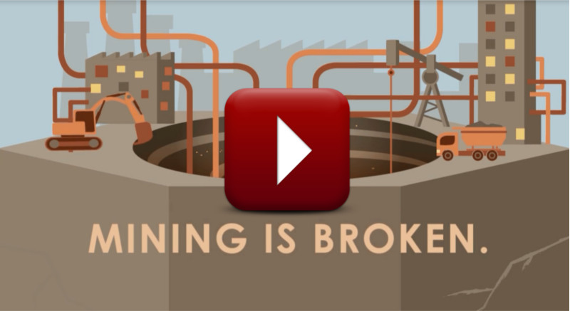
This motion graphic video details a vision of what the mining company of the future could look like.
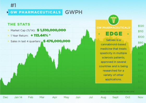
This infographic covers all you need to know on the US cannabis opportunity, as well as three stocks to watch.
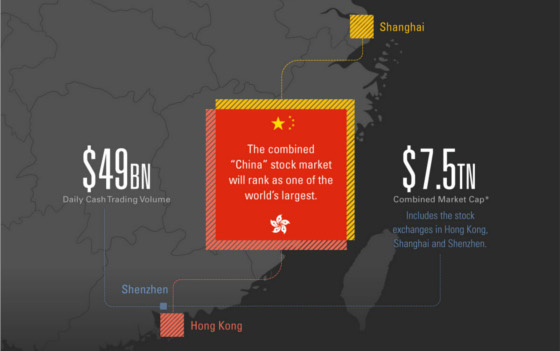
Explaining Shanghai-Hong Kong Stock Connect, a program connecting Mainland China's capital markets with Hong Kong.
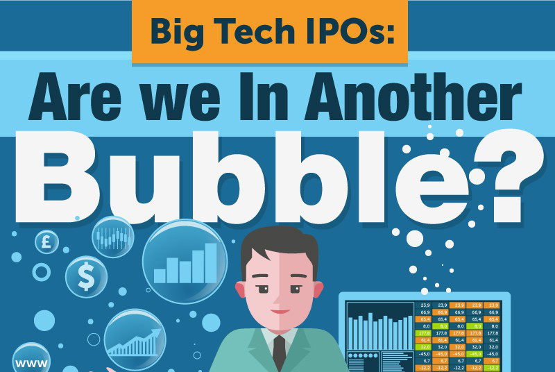
With Alibaba completing the biggest IPO ever and Uber reportedly worth $40 billion, is there a tech bubble?

A battle for space supremacy is taking place in the private sector.
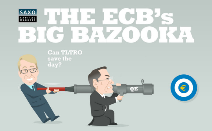
The ECB's big bazookas to combat stagnating European growth.
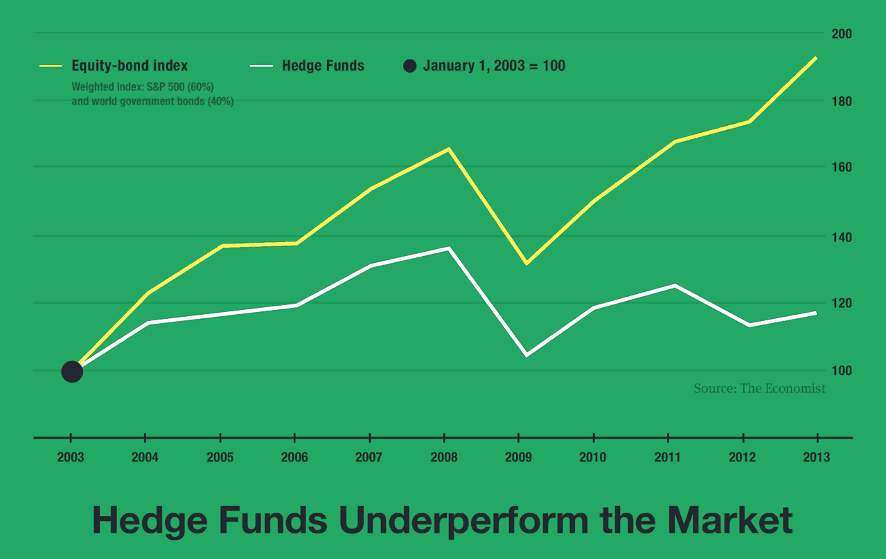
How often managed funds beat the market?
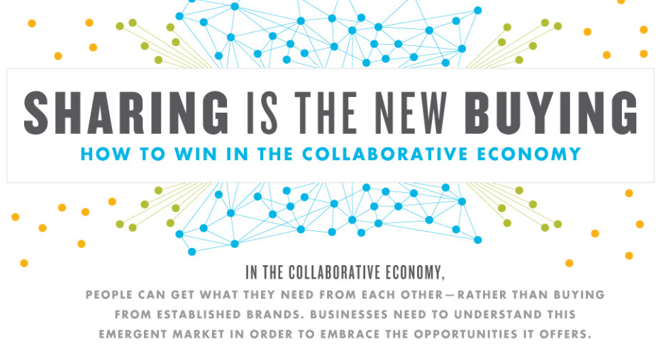
The impact, mindset, and customer base of the collaborative economy.
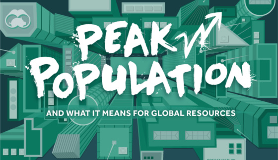
By 2100, our global population is to be between 9.6 and 12.3 billion. Here's what peak population looks like and its effects on resource consumption.