Mapped: Europe’s GDP Per Capita, by Country
The Growth of a $1,000 Equity Investment, by Stock Market
Mapped: The Most Valuable Company in Each Southeast Asian Country
Visualizing Global Inflation Forecasts (2024-2026)
The World’s Fastest Growing Emerging Markets (2024-2029 Forecast)
Countries With the Highest Rates of Crypto Ownership
Mapped: The Number of AI Startups By Country
All of the Grants Given by the U.S. CHIPS Act
Visualizing AI Patents by Country
How Tech Logos Have Evolved Over Time
Charted: What Frustrates Americans About the Tax System
Ranked: The Top 20 Countries in Debt to China
Charted: Which Country Has the Most Billionaires in 2024?
Charted: Which City Has the Most Billionaires in 2024?
Charted: Who Has Savings in This Economy?
Life Expectancy by Region (1950-2050F)
What Causes Preventable Child Deaths?
The Cost of an EpiPen in Major Markets
Charted: Global Tobacco Use by Country and Sex
Visualized: What Lives in Your Gut Microbiome?
Who’s Building the Most Solar Energy?
Mapped: The Age of Energy Projects in Interconnection Queues, by State
Ranked: The Top 10 EV Battery Manufacturers in 2023
The World’s Biggest Nuclear Energy Producers
The World’s Biggest Oil Producers in 2023
The Largest Earthquakes in the New York Area (1970-2024)
Mapped: Average Wages Across Europe
Mapped: Asia’s Population Patterns by Density
A Map of Global Happiness By Country in 2024
Mapped: Population Growth by Region (1900-2050F)
Visualizing Global Gold Production in 2023
Gold vs. S&P 500: Which Has Grown More Over Five Years?
Charted: The Value Gap Between the Gold Price and Gold Miners
Charted: Global Uranium Reserves, by Country
The Carbon Footprint of Major Travel Methods
Ranking the Top 15 Countries by Carbon Tax Revenue
Ranked: The Countries With the Most Air Pollution in 2023
Top Countries By Forest Growth Since 2001
Ranked: Top Countries by Total Forest Loss Since 2001
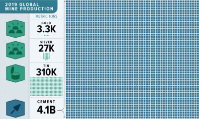
This massive infographic reveals the dramatic scale of 2019 non-fuel mineral global production.
Our solar system is a surprisingly crowded place. This incredible map shows the 18,000 asteroids, comets, planets and moons orbiting the Sun.
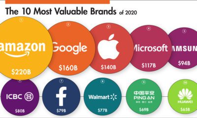
This infographic ranks some of the world’s biggest companies by brand value in 2020 and visualizes the movers and shakers over the past year.
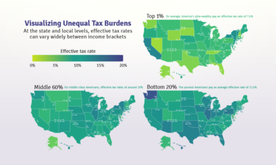
Poor families pay a higher share of their income towards state and local taxes than wealthy families. These maps show the inequitable tax burdens.
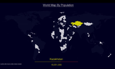
Watch countries appear one-by-one to form a cohesive world map, when they are ordered by population.
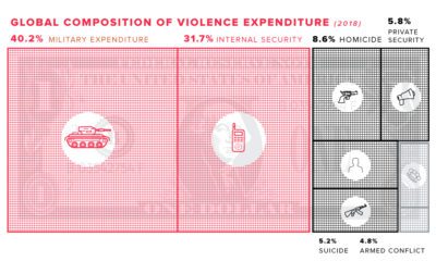
This graphic estimates the direct and indirect costs associated with violence, and explores how they are negatively impacting the global economy.
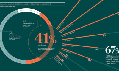
About 41% of CFOs spend the majority of their time on non-finance related activities. This infographic explores the expanding role of the CFO.
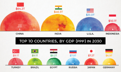
By 2030, the complexion of the global economy could look very different. This animation shows how the world's biggest economies will change over time.
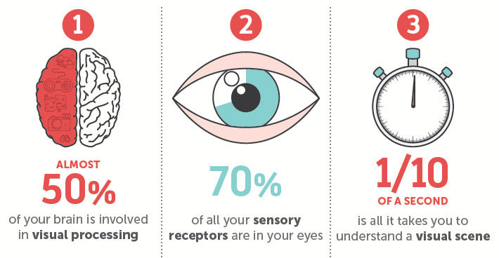
Why are our brains addicted to visually stimulating content such as infographics or charts? Here's the scientific evidence behind why we crave visuals.
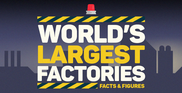
The world's largest factories are anything but ordinary. Built to mass-produce cruise ships, airplanes, and cars, some are the size of entire cities.