Green
Mapped: Air Pollution Levels Around the World in 2022
![]() Subscribe to the Elements free mailing list for more like this
Subscribe to the Elements free mailing list for more like this
Mapped: Air Pollution Levels Around the World
This was originally posted on Elements. Sign up to the free mailing list to get beautiful visualizations on natural resource megatrends in your email every week.
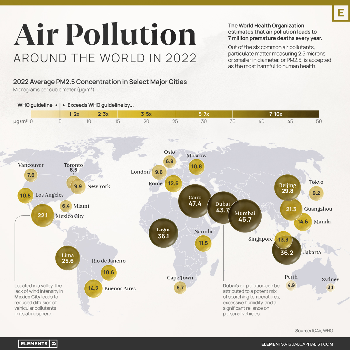
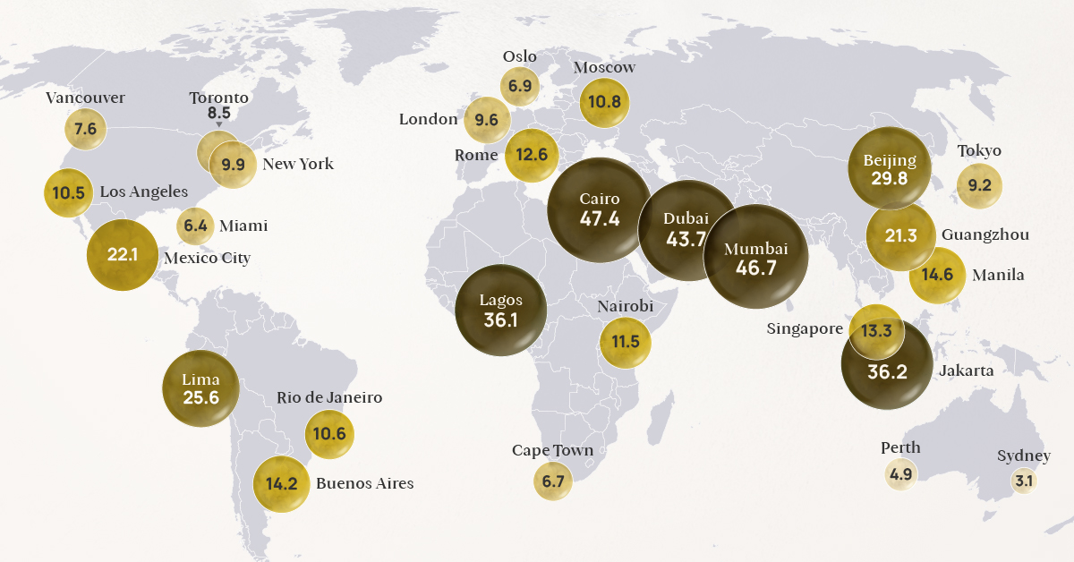
The World Health Organization (WHO) estimates that air pollution leads to 7 million premature deaths every year.
Out of the six common air pollutants, particulate matter measuring 2.5 microns or smaller in diameter, or PM2.5, is accepted as the most harmful to human health. This is due to its prevalence in the atmosphere and the broad range of adverse health effects associated with its exposure, such as heart disease, stroke, lung cancer and chronic respiratory diseases.
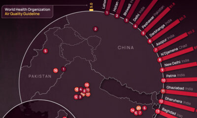
With that context in mind, this visualization uses IQAir’s World Air Quality Report to map out the 2022 average PM2.5 concentrations in select major cities around the globe, expressed in micrograms per cubic meter (μg/m³).
Understanding the WHO Air Pollution Guidelines
Did you know that in 2019, only 1% of the global population lived in places where WHO global air quality guidelines were met?
Designed to protect public health from the harmful effects of air pollution, the guidelines cover a range of air pollutants, including particulate matter, ozone, nitrogen dioxide, sulfur dioxide, and carbon monoxide.
The healthy limits for PM2.5 are set at an annual average of 0-5 μg/m³.
| WHO Classification | Annual Average PM2.5 Concentration (μg/m³) | % of countries within classification, 2022* |
|---|---|---|
| WHO Air Quality Guideline | 0 - 5 | 9.9% |
| Interim Target 4 | 5.1 - 10 | 18.3% |
| Interim Target 3 | 10.1 - 15 | 19.8% |
| Interim Target 2 | 15.1 - 25 | 28.2% |
| Interim Target 1 | 25.1 - 35 | 9.9% |
| Exceeds Target Levels | 35.1 - 50 | 7.6% |
| Exceeds Target Levels | > 50 | 6.1% |
*Percentages are calculated as a proportion of the 131 countries that had sufficient air quality data and were included in IQAir’s World Air Quality Report in 2022.
According to IQAir’s World Air Quality Report, only 13 countries or territories met the recommended concentration of PM2.5 in 2022. Among them were Australia, Finland, Puerto Rico, Iceland, Bermuda, and Guam.
Above this guideline, many countries fell within the four interim targets, while nearly 14% recorded air pollution levels that exceeded all target levels.
The Effects of Air Quality on Mortality
While it can be a little difficult to grasp what the above concentrations represent, thinking of them in terms of their effect on mortality can shed some light on their significance.
According to the WHO, non-accidental mortality rates multiply by 1.08 per 10 µg/m³ increase in PM2.5 concentration, but only up to 35 μg/m³. Above that, mortality growth rates may not be linear, resulting in many more deaths.
Here is an example to highlight what that means.
- Say that, for a population living within the WHO PM2.5 guideline, the non-accidental mortality rate is arbitrarily set to 100 deaths for a given period.
- If this area’s PM2.5 concentration goes up to 10 μg/m³, putting them at Interim Target 4, they would see 104 deaths in that same amount of time.
- At Interim Target 3, where their PM2.5 concentration would be 15 μg/m³, they would see 108 deaths.
- At Interim Target 2, they’d see 117.
- Finally, at Interim Target 1, they’d see 126.
Beyond Interim Target 1 (above 35 μg/m³), deaths would potentially grow much faster. As of 2022, around 14% of countries report levels above this threshold, including Chad, India, Pakistan, Qatar, and Nigeria.
The State of Air Pollution Around the World
While many cities in North America and Europe have seen steady and relatively lower PM2.5 concentrations during the last few years, many cities (especially those in Asia) have been making strides in lowering their air pollution levels.
Nonetheless, many of them still record PM2.5 concentrations that are more than six times the WHO guideline.
| City | 2022 annual average PM2.5 concentration (μg/m³) | 2018 annual average PM2.5 concentration (μg/m³) |
|---|---|---|
| 🇪🇬 Cairo, Egypt | 47.4 | N/A |
| 🇮🇳 Mumbai, India | 46.7 | 58.6 |
| 🇦🇪 Dubai, UAE | 43.7 | 55.3 |
| 🇮🇩 Jakarta, Indonesia | 36.2 | 45.3 |
| 🇳🇬 Lagos, Nigeria | 36.1 | N/A |
| 🇨🇳 Beijing, China | 29.8 | 50.9 |
| 🇵🇪 Lima, Peru | 25.6 | 28 |
| 🇲🇽 Mexico City, Mexico | 22.1 | 19.7 |
| 🇨🇳 Guangzhou, China | 21.3 | 33.2 |
| 🇵🇭 Manila, Philippines | 14.6 | N/A |
| 🇦🇷 Buenos Aires, Argentina | 14.2 | 12.4 |
| 🇸🇬 Singapore, Singapore | 13.3 | 14.8 |
| 🇮🇹 Rome, Italy | 12.6 | N/A |
| 🇰🇪 Nairobi, Kenya | 11.5 | N/A |
| 🇷🇺 Moscow, Russia | 10.8 | 10.1 |
| 🇧🇷 Rio de Janeiro, Brazil | 10.6 | N/A |
| 🇺🇸 Los Angeles, USA | 10.5 | 14.4 |
| 🇺🇸 New York, USA | 9.9 | N/A |
| 🇬🇧 London, UK | 9.6 | 12 |
| 🇯🇵 Tokyo, Japan | 9.2 | 13.1 |
| 🇨🇦 Toronto, Canada | 8.5 | 7.8 |
| 🇨🇦 Vancouver, Canada | 7.6 | N/A |
| 🇳🇴 Oslo, Norway | 6.9 | 8.2 |
| 🇿🇦 Cape Town, South Africa | 6.7 | N/A |
| 🇺🇸 Miami, USA | 6.4 | 7.8 |
| 🇦🇺 Perth, Australia | 4.9 | N/A |
| 🇦🇺 Sydney, Australia | 3.1 | 7.6 |
Most parts of the world did not meet the annual WHO recommendation for clean and healthy air in 2022.
However, the cost of inaction toward cleaner air is very high. In addition to the millions of premature deaths each year, the global cost of health damages associated with air pollution currently sits at $8.1 trillion.
Unfortunately, things that are integral to our quality of life, such as industrial activities, transportation, energy production, and agricultural practices, are also the leading causes of air pollution around the world.
As such, a multi-faceted approach to lowering pollution is essential to protect lives, especially to benefit those already more vulnerable to poor air quality, such as kids and the elderly.


Automotive
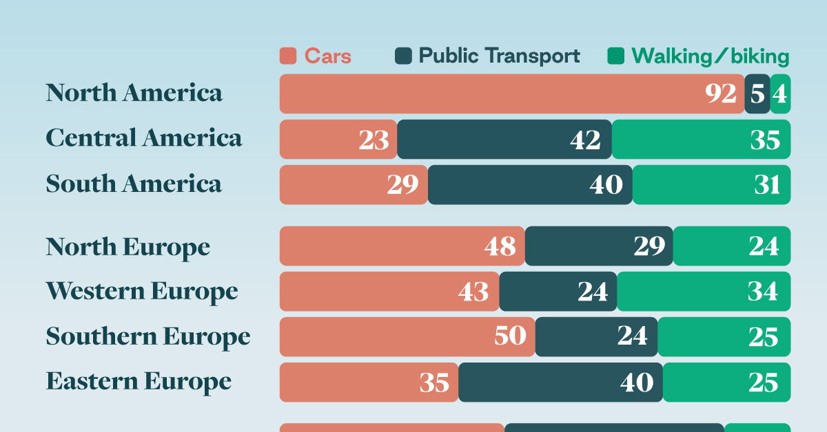
How People Get Around in America, Europe, and Asia
Examining how people get around using cars, public transit, and walking or biking, and the regional differences in usage.
How People Get Around in America, Europe, and Asia
This was originally posted on our Voronoi app. Download the app for free on iOS or Android and discover incredible data-driven charts from a variety of trusted sources.
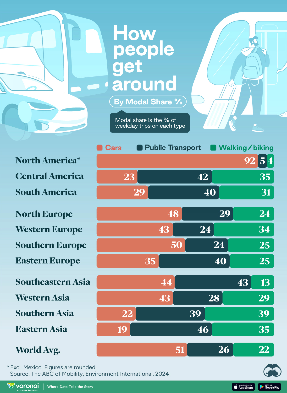
This chart highlights the popularity of different transportation types in the Americas, Europe, and Asia, calculated by modal share.
Data for this article and visualization is sourced from ‘The ABC of Mobility’, a research paper by Rafael Prieto-Curiel (Complexity Science Hub) and Juan P. Ospina (EAFIT University), accessed through ScienceDirect.
The authors gathered their modal share data through travel surveys, which focused on the primary mode of transportation a person employs for each weekday trip. Information from 800 cities across 61 countries was collected for this study.
North American Car Culture Contrasts with the Rest of the World
In the U.S. and Canada, people heavily rely on cars to get around, no matter the size of the city. There are a few exceptions of course, such as New York, Toronto, and smaller college towns across the United States.
| Region | 🚗 Cars | 🚌 Public Transport | 🚶 Walking/Biking |
|---|---|---|---|
| North America* | 92% | 5% | 4% |
| Central America | 23% | 42% | 35% |
| South America | 29% | 40% | 31% |
| Northern Europe | 48% | 29% | 24% |
| Western Europe | 43% | 24% | 34% |
| Southern Europe | 50% | 24% | 25% |
| Eastern Europe | 35% | 40% | 25% |
| Southeastern Asia | 44% | 43% | 13% |
| Western Asia | 43% | 28% | 29% |
| Southern Asia | 22% | 39% | 39% |
| Eastern Asia | 19% | 46% | 35% |
| World | 51% | 26% | 22% |
Note: *Excluding Mexico. Percentages are rounded.
As a result, North America’s share of public transport and active mobility (walking and biking) is the lowest amongst all surveyed regions by a significant amount.
On the other hand, public transport reigns supreme in South and Central America as well as Southern and Eastern Asia. It ties with cars in Southeastern Asia, and is eclipsed by cars in Western Asia.
As outlined in the paper, Europe sees more city-level differences in transport popularity.
For example, Utrecht, Netherlands prefers walking and biking. People in Paris and London like using their extensive transit systems. And in Manchester and Rome, roughly two out of three journeys are by car.

-

 Brands5 days ago
The Evolution of U.S. Beer Logos
-

 Culture2 weeks ago
The World’s Top Media Franchises by All-Time Revenue
-

 voronoi2 weeks ago
Best Visualizations of April on the Voronoi App
-

 Wealth2 weeks ago
Charted: Which Country Has the Most Billionaires in 2024?
-

 Business1 week ago
The Top Private Equity Firms by Country
-

 Markets1 week ago
The Best U.S. Companies to Work for According to LinkedIn
-

 Economy1 week ago
Ranked: The Top 20 Countries in Debt to China
-

 Politics1 week ago
Charted: Trust in Government Institutions by G7 Countries