Maps
Incredible Map of Pangea With Modern-Day Borders
View the full-size version of this infographic.
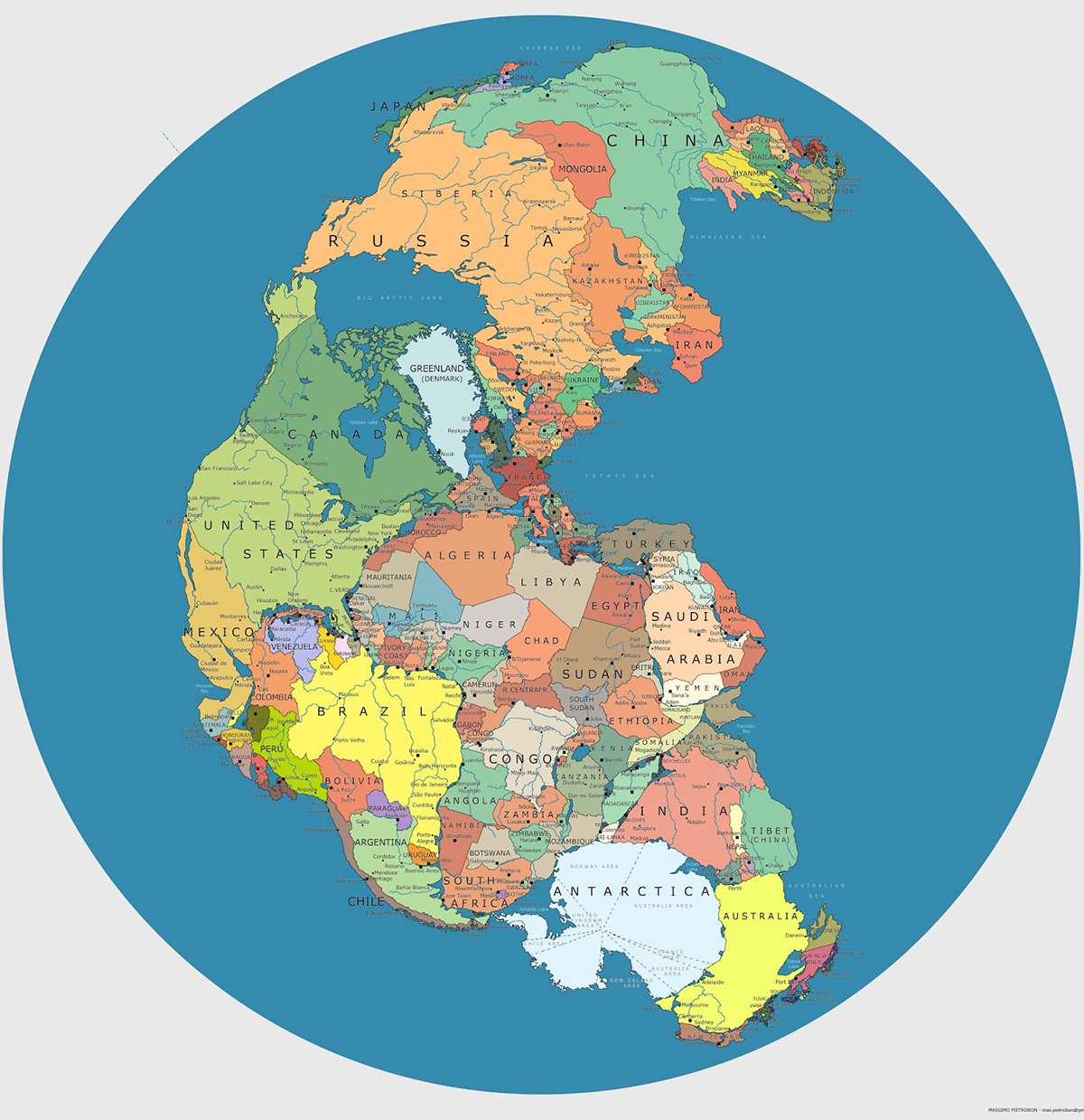
Incredible Map of Pangea With Modern-Day Borders
As volcanic eruptions and earthquakes occasionally remind us, the earth beneath our feet is constantly on the move.
Continental plates only move around 1-4 inches per year, so we don’t notice the tectonic forces that are continually reshaping the surface of our planet. But on a long enough timeline, those inches add up to big changes in the way landmasses on Earth are configured.
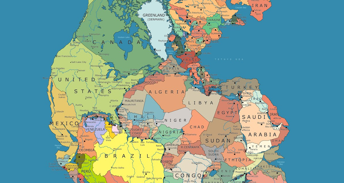
Today’s map, by Massimo Pietrobon, is a look back to when all land on the planet was arranged into a supercontinent called Pangea. Pietrobon’s map is unique in that it overlays the approximate borders of present day countries to help us understand how Pangea broke apart to form the world that we know today.
Pangea: The World As One
Pangea was the latest in a line of supercontinents in Earth’s history.
Pangea began developing over 300 million years ago, eventually making up one-third of the earth’s surface. The remainder of the planet was an enormous ocean known as Panthalassa.
As time goes by, scientists are beginning to piece together more information on the climate and patterns of life on the supercontinent. Similar to parts of Central Asia today, the center of the landmass is thought to have been arid and inhospitable, with temperatures reaching 113ºF (45ºC). The extreme temperatures revealed by climate simulations are supported by the fact that very few fossils are found in the modern day regions that once existed in the middle of Pangea. The strong contrast between the Pangea supercontinent and Panthalassa is believed to have triggered intense cross-equatorial monsoons.
By this unique point in history, plants and animals had spread across the landmass, and animals (such as dinosaurs) were able to wander freely across the entire expanse of Pangea.
Breaking Up is Hard to Do
Around 200 million years ago, magma began to swell up through a weakness in the earth’s crust, creating the volcanic rift zone that would eventually cleave the supercontinent into pieces. Over time, this rift zone would become the Atlantic Ocean. The most visible evidence of this split is in the similar shape of the coastlines of modern-day Brazil and West Africa.
Present-day North America broke away from Europe and Africa, and as the map highlights, Atlantic Canada was once connected to Spain and Morocco.
The concept of plate tectonics is behind some of modern Earth’s most striking features. The Himalayas, for example, were formed after the Indian subcontinent broke off the eastern side of Africa and crashed directly into Asia. Many of the world’s tallest mountains were formed by this process of plate convergence – a process that, as far as we know, is unique to Earth.
What the Very Distant Future Holds
Since the average continent is only moving about 1 foot (0.3m) every decade, it’s unlikely you’ll ever be alive to see an epic geographical revision to the world map.
However, for whatever life exists on Earth roughly 300 million years in the future, they may have front row seats in seeing the emergence of a new supercontinent: Pangea Proxima.
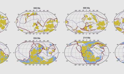
As the above video from the Paleomap Project shows, Pangea Proxima is just one possible supercontinent configuration that occurs in which Australia slams into Indonesia, and North and South America crash into Africa and Antarctica, respectively.
Interestingly, Pangea Proxima could have a massive inland sea, mainly made up of what is the Indian Ocean today. Meanwhile, the other oceans would combine into one superocean that would take up the majority of the Earth’s surface.

Maps
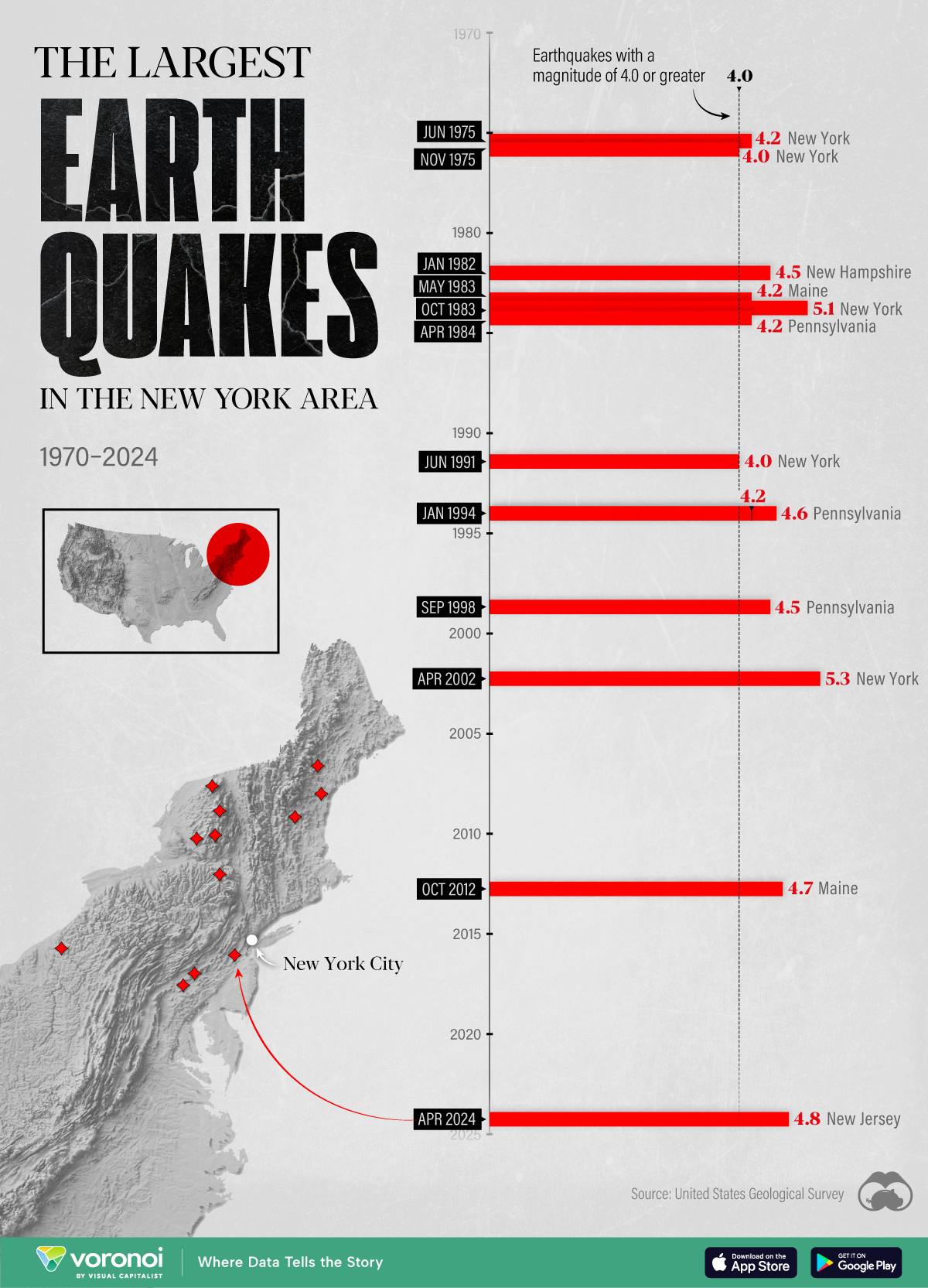
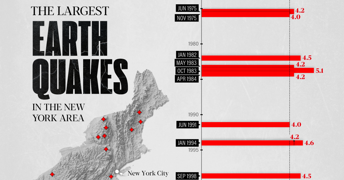
The Largest Earthquakes in the New York Area (1970-2024)
The earthquake that shook buildings across New York in April 2024 was the third-largest quake in the Northeast U.S. over the past 50 years.
The Largest Earthquakes in the New York Area
This was originally posted on our Voronoi app. Download the app for free on Apple or Android and discover incredible data-driven charts from a variety of trusted sources.
The 4.8 magnitude earthquake that shook buildings across New York on Friday, April 5th, 2024 was the third-largest quake in the U.S. Northeast area over the past 50 years.
In this map, we illustrate earthquakes with a magnitude of 4.0 or greater recorded in the Northeastern U.S. since 1970, according to the United States Geological Survey (USGS).
Shallow Quakes and Older Buildings
The earthquake that struck the U.S. Northeast in April 2024 was felt by millions of people from Washington, D.C., to north of Boston. It even caused a full ground stop at Newark Airport.
The quake, occurring just 5 km beneath the Earth’s surface, was considered shallow, which is what contributed to more intense shaking at the surface.
According to the USGS, rocks in the eastern U.S. are significantly older, denser, and harder than those on the western side, compressed by time. This makes them more efficient conduits for seismic energy. Additionally, buildings in the Northeast tend to be older and may not adhere to the latest earthquake codes.
Despite disrupting work and school life, the earthquake was considered minor, according to the Michigan Technological University magnitude scale:
| Magnitude | Earthquake Effects | Estimated Number Each Year |
|---|---|---|
| 2.5 or less | Usually not felt, but can be recorded by seismograph. | Millions |
| 2.5 to 5.4 | Often felt, but only causes minor damage. | 500,000 |
| 5.5 to 6.0 | Slight damage to buildings and other structures. | 350 |
| 6.1 to 6.9 | May cause a lot of damage in very populated areas. | 100 |
| 7.0 to 7.9 | Major earthquake. Serious damage. | 10-15 |
| 8.0 or greater | Great earthquake. Can totally destroy communities near the epicenter. | One every year or two |
The largest earthquake felt in the area over the past 50 years was a 5.3 magnitude quake that occurred in Au Sable Forks, New York, in 2002. It damaged houses and cracked roads in a remote corner of the Adirondack Mountains, but caused no injuries.
| Date | Magnitude | Location | State |
|---|---|---|---|
| April 20, 2002 | 5.3 | Au Sable Forks | New York |
| October 7, 1983 | 5.1 | Newcomb | New York |
| April 5, 2024 | 4.8 | Whitehouse Station | New Jersey |
| October 16, 2012 | 4.7 | Hollis Center | Maine |
| January 16, 1994 | 4.6 | Sinking Spring | Pennsylvania |
| January 19, 1982 | 4.5 | Sanbornton | New Hampshire |
| September 25, 1998 | 4.5 | Adamsville | Pennsylvania |
| June 9, 1975 | 4.2 | Altona | New York |
| May 29, 1983 | 4.2 | Peru | Maine |
| April 23, 1984 | 4.2 | Conestoga | Pennsylvania |
| January 16, 1994 | 4.2 | Sinking Spring | Pennsylvania |
| November 3, 1975 | 4 | Long Lake | New York |
| June 17, 1991 | 4 | Worcester | New York |
The largest earthquake in U.S. history, however, was the 1964 Good Friday quake in Alaska, measuring 9.2 magnitude and killing 131 people.

-

 Culture6 days ago
The World’s Top Media Franchises by All-Time Revenue
-

 Science2 weeks ago
Visualizing the Average Lifespans of Mammals
-

 Brands2 weeks ago
How Tech Logos Have Evolved Over Time
-

 Energy2 weeks ago
Ranked: The Top 10 EV Battery Manufacturers in 2023
-

 Countries2 weeks ago
Countries With the Largest Happiness Gains Since 2010
-

 Economy2 weeks ago
VC+: Get Our Key Takeaways From the IMF’s World Economic Outlook
-

 Demographics1 week ago
The Countries That Have Become Sadder Since 2010
-

 Money1 week ago
Charted: Who Has Savings in This Economy?