Misc
Visualizing the Power and Frequency of Earthquakes
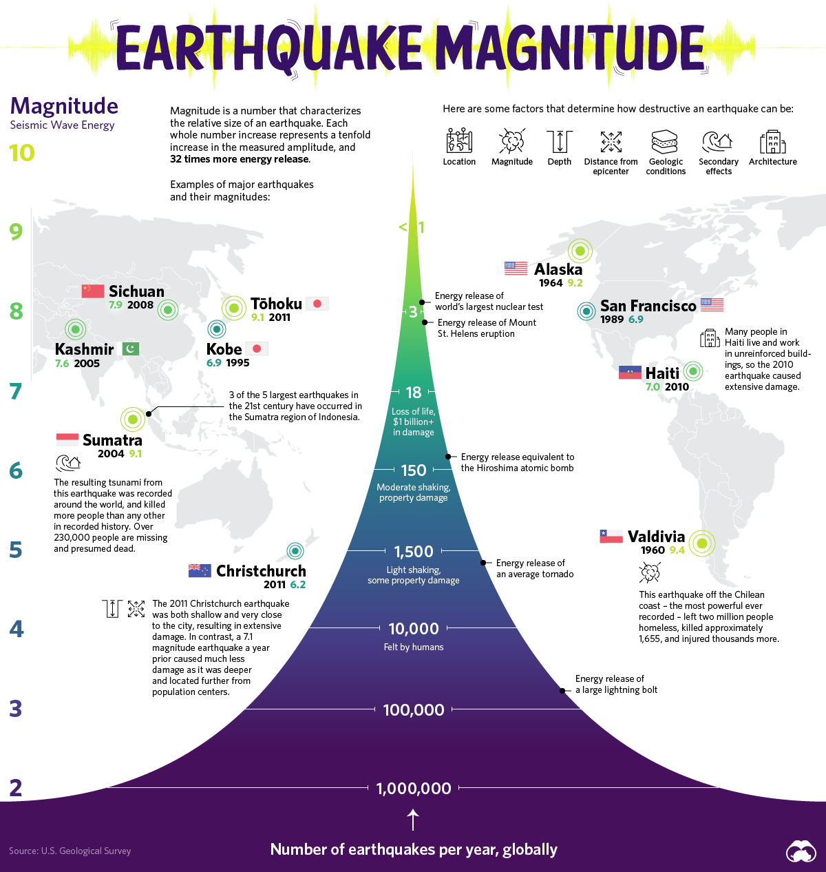


Visualizing the Power and Frequency of Earthquakes
The surface of our planet is in a constant state of creation and destruction as the plates of the Earth collide. It is this movement of the Earth’s crust that causes earthquakes, sending tremors throughout the world.
Today’s graphic is inspired by a classic USGS diagram that tracks the scale and frequency of earthquakes.
Shifting Foundations
Earthquakes occur because the crust of the Earth is made up of several plates. The boundaries of these plates create faults that can run into one another.
Earthquakes describe both the mechanism that causes a sudden stress release along plate boundaries and also the ensuing ground shaking.
They occur when stress builds up along a tectonic fault. This stress causes the two surfaces of the fault, which had previously been stuck together due to friction, to suddenly move, or slide, releasing energy in the form of seismic waves.
Measuring an Earthquake’s Impact
There are three factors to assess the impact of Earthquakes – magnitude, energy, and intensity.
Magnitude is a number most commonly associated with the Richter scale, describing the size of an Earthquake on a scale from 0 to 10 – the latter of which is the maximum motion recorded by a seismograph. Each increase by one on the scale represents a tenfold increase in the amplitude. There are over a million tremors around the planet each year, but it’s not until an earthquake reaches a magnitude of 4 that humans can typically feel it.
Another way to measure the size of an earthquake is by how much energy it releases. The amount of energy radiated by an earthquake is a measure of the potential for damage to man-made structures.
An earthquake releases energy at various frequencies, and in order to calculate accurately, you have to include all frequencies of shaking for the entire event. Some research suggests technology could harness this energy for power generation.
Intensity describes the severity of an earthquake with a qualitative evaluation of its effects on the Earth’s surface and on the built environment. An earthquake may have a high magnitude but if a city or landscape experiences little damage, it can be said that the intensity is low. The Modified Mercalli Intensity Scale measures this intensity.
The World’s Largest Earthquakes by Magnitude
Prior to the development and use of seismographs, around 1900, scientists could only estimate magnitudes, based on historical reports of the extent and severity of damage.
| Date | Location | Magnitude |
|---|---|---|
| May 22, 1960 | Valdivia, Chile | 9.4-9.6 |
| March 27, 1964 | Prince William Sound, Alaska | 9.2 |
| Dec. 26, 2004 | Indian Ocean, Sumatra, Indonesia | 9.1 |
| March 11, 2011 | Pacific Ocean, Tohoku Region, Japan | 9.1 |
| July 8, 1730 | Valparaiso, Chile | 9.1-9.3 (est.) |
| Nov. 4, 1952 | Kamchatka, Russia | 9 |
| Aug. 13, 1868 | Arica, Chile | 8.5-9.0 (est.) |
| January 26, 1700 | Pacific Coast, Modern Day British Columbia | 8.7-9.2 (est.) |
| April 2, 1762 | Chittagong, Bangladesh | 8.8 (est.) |
| Nov. 25, 1833 | Sumatra Indonesia | 8.8 (est.) |
Earthquakes are a fact of life on Earth and mark distinct moments in history. One would think given our knowledge of earthquakes, that humans would avoid these locations – however, the very faults of the Earth also create its greatest advantages.
Living with Your Faults
It’s extremely common to find human settlements along the fault lines where earthquakes occur most frequently. Some could say that this is because these decisions were made before a complete understanding of science enabled us to know the potential risks involved.
However, a recent scientific study reveals that there may be more to the pattern than previously thought. Tectonically active plates may have produced greater biodiversity, more food, and water for our human predecessors.
Certain landscape features formed by tectonic processes such as cliffs, river gorges, and sedimentary valleys create environments that support access to drinking water, shelter, and an abundant food supply.
This inherent problem reveals that humans are more connected to their environments than previously thought. It comes down to a question of how well humans can adapt their lifestyle and built environments to a dynamic planet.
Now let’s worry about the asteroids…


VC+
VC+: Get Our Key Takeaways From the IMF’s World Economic Outlook
A sneak preview of the exclusive VC+ Special Dispatch—your shortcut to understanding IMF’s World Economic Outlook report.

Have you read IMF’s latest World Economic Outlook yet? At a daunting 202 pages, we don’t blame you if it’s still on your to-do list.
But don’t worry, you don’t need to read the whole April release, because we’ve already done the hard work for you.
To save you time and effort, the Visual Capitalist team has compiled a visual analysis of everything you need to know from the report—and our VC+ Special Dispatch is available exclusively to VC+ members. All you need to do is log into the VC+ Archive.
If you’re not already subscribed to VC+, make sure you sign up now to access the full analysis of the IMF report, and more (we release similar deep dives every week).
For now, here’s what VC+ members get to see.
Your Shortcut to Understanding IMF’s World Economic Outlook
With long and short-term growth prospects declining for many countries around the world, this Special Dispatch offers a visual analysis of the key figures and takeaways from the IMF’s report including:
- The global decline in economic growth forecasts
- Real GDP growth and inflation forecasts for major nations in 2024
- When interest rate cuts will happen and interest rate forecasts
- How debt-to-GDP ratios have changed since 2000
- And much more!

Get the Full Breakdown in the Next VC+ Special Dispatch
VC+ members can access the full Special Dispatch by logging into the VC+ Archive, where you can also check out previous releases.
Make sure you join VC+ now to see exclusive charts and the full analysis of key takeaways from IMF’s World Economic Outlook.
Don’t miss out. Become a VC+ member today.
What You Get When You Become a VC+ Member
VC+ is Visual Capitalist’s premium subscription. As a member, you’ll get the following:
- Special Dispatches: Deep dive visual briefings on crucial reports and global trends
- Markets This Month: A snappy summary of the state of the markets and what to look out for
- The Trendline: Weekly curation of the best visualizations from across the globe
- Global Forecast Series: Our flagship annual report that covers everything you need to know related to the economy, markets, geopolitics, and the latest tech trends
- VC+ Archive: Hundreds of previously released VC+ briefings and reports that you’ve been missing out on, all in one dedicated hub
You can get all of the above, and more, by joining VC+ today.

-

 Mining1 week ago
Gold vs. S&P 500: Which Has Grown More Over Five Years?
-

 Markets2 weeks ago
Ranked: The Most Valuable Housing Markets in America
-

 Money2 weeks ago
Which States Have the Highest Minimum Wage in America?
-

 AI2 weeks ago
Ranked: Semiconductor Companies by Industry Revenue Share
-

 Markets2 weeks ago
Ranked: The World’s Top Flight Routes, by Revenue
-

 Countries2 weeks ago
Population Projections: The World’s 6 Largest Countries in 2075
-

 Markets2 weeks ago
The Top 10 States by Real GDP Growth in 2023
-

 Demographics2 weeks ago
The Smallest Gender Wage Gaps in OECD Countries