Datastream
Electricity from Renewable Energy Sources is Now Cheaper than Ever
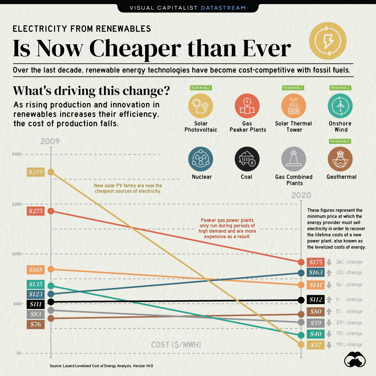


The Briefing
- Electricity from new solar photovoltaic (PV) plants and onshore wind farms is now cheaper than electricity from new coal-fired power plants
- The cost of electricity from solar PV plants has decreased by 90% since 2009
The Transition to Renewable Energy Sources
Renewable energy sources are at the center of the transition to a sustainable energy future and the fight against climate change.
Historically, renewables were expensive and lacked competitive pricing power relative to fossil fuels. However, this has changed notably over the last decade.
Renewables are the Cheapest Sources of New Electricity
Fossil fuel sources still account for the majority of global energy consumption, but renewables are not far off. The share of global electricity from renewables grew from 18% in 2009 to nearly 28% in 2020.
Renewable energy sources follow learning curves or Wright’s Law—they become cheaper by a constant percentage for every doubling of installed capacity. Therefore, the increasing adoption of clean energy has driven down the cost of electricity from new renewable power plants.
| Energy Source | Type | 2009 Cost ($/MWh) | 2020 Cost ($/MWh) | % Change in Cost |
|---|---|---|---|---|
| Solar Photovoltaic | Renewable | $359 | $37 | -90% |
| Onshore Wind | Renewable | $135 | $40 | -70% |
| Gas - Peaker Plants | Non-renewable | $275 | $175 | -36% |
| Gas - Combined Cycle Plants | Non-renewable | $83 | $59 | -29% |
| Solar thermal tower | Renewable | $168 | $141 | -16% |
| Coal | Non-renewable | $111 | $112 | +1% |
| Geothermal | Renewable | $76 | $80 | +5% |
| Nuclear | Non-renewable | $123 | $163 | +33% |
Solar PV and onshore wind power plants have seen the most notable cost decreases over the last decade. Furthermore, the price of electricity from gas-powered plants has declined mainly as a result of falling gas prices since their peak in 2008.
By contrast, the price of electricity from coal has stayed roughly the same with a 1% increase. Moreover, nuclear-powered electricity has become 33% more expensive due to increased regulations and the lack of new reactors.
When will Renewable Energy Sources Take Over?
Given the rate at which the cost of renewable energy is falling, it’s only a matter of time before renewables become the primary source of our electricity.
Several countries have committed to achieving net-zero carbon emissions by 2050, and as a result, renewable energy is projected to account for more than half of the world’s electricity generation by 2050.
Where does this data come from?
Source: Lazard Levelized Cost of Energy Analysis Version 14.0, Our World in Data
Details: Figures represent the mean levelized cost of energy per megawatt-hour. Lazard’s Levelized Cost of Energy report did not include data for hydropower. Therefore, hydropower is excluded from this article.


Datastream
Can You Calculate Your Daily Carbon Footprint?
Discover how the average person’s carbon footprint impacts the environment and learn how carbon credits can offset your carbon footprint.
The Briefing
- A person’s carbon footprint is substantial, with activities such as food consumption creating as much as 4,500 g of CO₂ emissions daily.
- By purchasing carbon credits from Carbon Streaming Corporation, you can offset your own emissions and fund positive climate action.
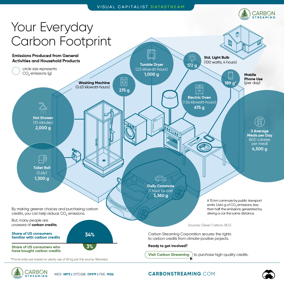
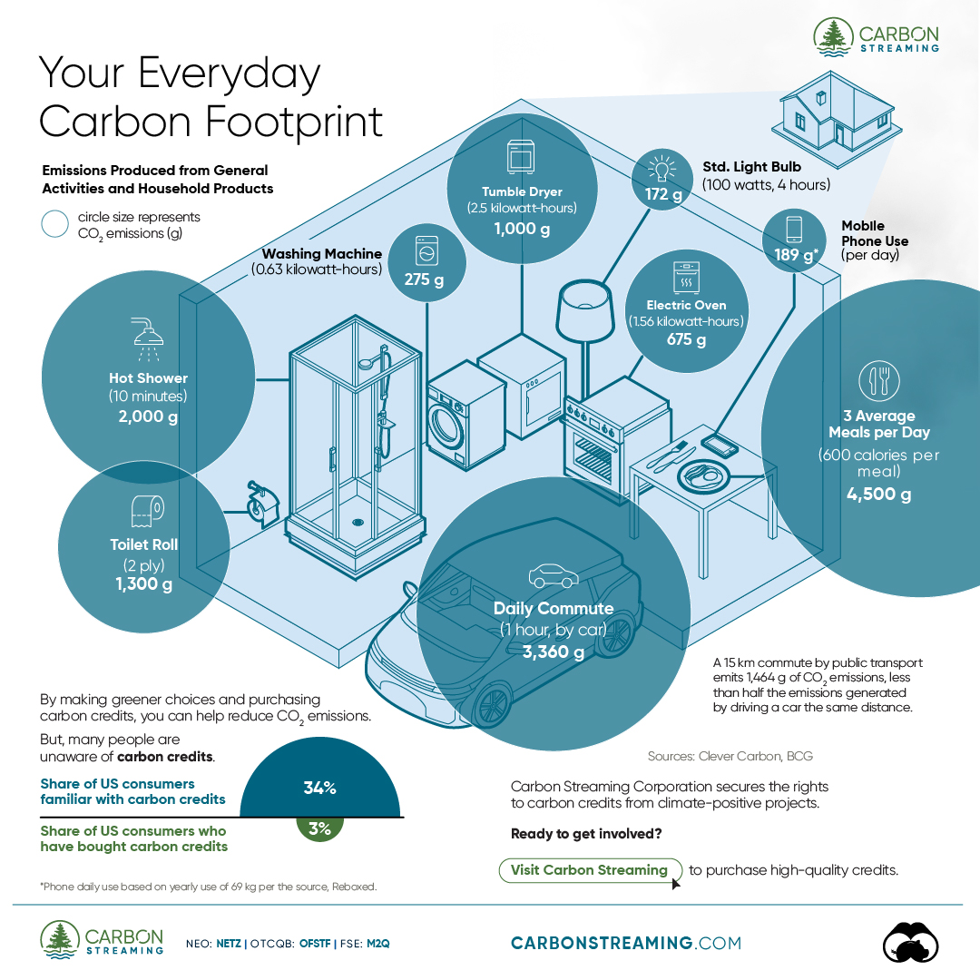
Your Everyday Carbon Footprint
While many large businesses and countries have committed to net-zero goals, it is essential to acknowledge that your everyday activities also contribute to global emissions.
In this graphic, sponsored by Carbon Streaming Corporation, we will explore how the choices we make and the products we use have a profound impact on our carbon footprint.
Carbon Emissions by Activity
Here are some of the daily activities and products of the average person and their carbon footprint, according to Clever Carbon.
| Household Activities & Products | CO2 Emissions (g) |
|---|---|
| 💡 Standard Light Bulb (100 watts, four hours) | 172 g |
| 📱 Mobile Phone Use (195 minutes per day)* | 189 g |
| 👕 Washing Machine (0.63 kWh) | 275 g |
| 🔥 Electric Oven (1.56 kWh) | 675 g |
| ♨️ Tumble Dryer (2.5 kWh) | 1,000 g |
| 🧻 Toilet Roll (2 ply) | 1,300 g |
| 🚿 Hot Shower (10 mins) | 2,000 g |
| 🚙 Daily Commute (one hour, by car) | 3,360 g |
| 🍽️ Average Daily Food Consumption (three meals of 600 calories) | 4,500 g |
| *Phone use based on yearly use of 69kg per the source, Reboxed | |
Your choice of transportation plays a crucial role in determining your carbon footprint. For instance, a 15 km daily commute to work on public transport generates an average of 1,464 g of CO₂ emissions. Compared to 3,360 g—twice the volume for a journey the same length by car.
By opting for more sustainable modes of transport, such as cycling, walking, or public transportation, you can significantly reduce your carbon footprint.
Addressing Your Carbon Footprint
One way to compensate for your emissions is by purchasing high-quality carbon credits.
Carbon credits are used to help fund projects that avoid, reduce or remove CO₂ emissions. This includes nature-based solutions such as reforestation and improved forest management, or technology-based solutions such as the production of biochar and carbon capture and storage (CCS).
While carbon credits offer a potential solution for individuals to help reduce global emissions, public awareness remains a significant challenge. A BCG-Patch survey revealed that only 34% of U.S. consumers are familiar with carbon credits, and only 3% have purchased them in the past.
About Carbon Streaming
By financing the creation or expansion of carbon projects, Carbon Streaming Corporation secures the rights to future carbon credits generated by these sustainable projects. You can then purchase these carbon credits to help fund climate solutions around the world and compensate for your own emissions.
Ready to get involved?
>> Learn more about purchasing carbon credits at Carbon Streaming

-

 Education1 week ago
How Hard Is It to Get Into an Ivy League School?
-

 Technology2 weeks ago
Ranked: Semiconductor Companies by Industry Revenue Share
-

 Markets2 weeks ago
Ranked: The World’s Top Flight Routes, by Revenue
-

 Demographics2 weeks ago
Population Projections: The World’s 6 Largest Countries in 2075
-

 Markets2 weeks ago
The Top 10 States by Real GDP Growth in 2023
-

 Demographics2 weeks ago
The Smallest Gender Wage Gaps in OECD Countries
-

 Economy2 weeks ago
Where U.S. Inflation Hit the Hardest in March 2024
-

 Green2 weeks ago
Top Countries By Forest Growth Since 2001