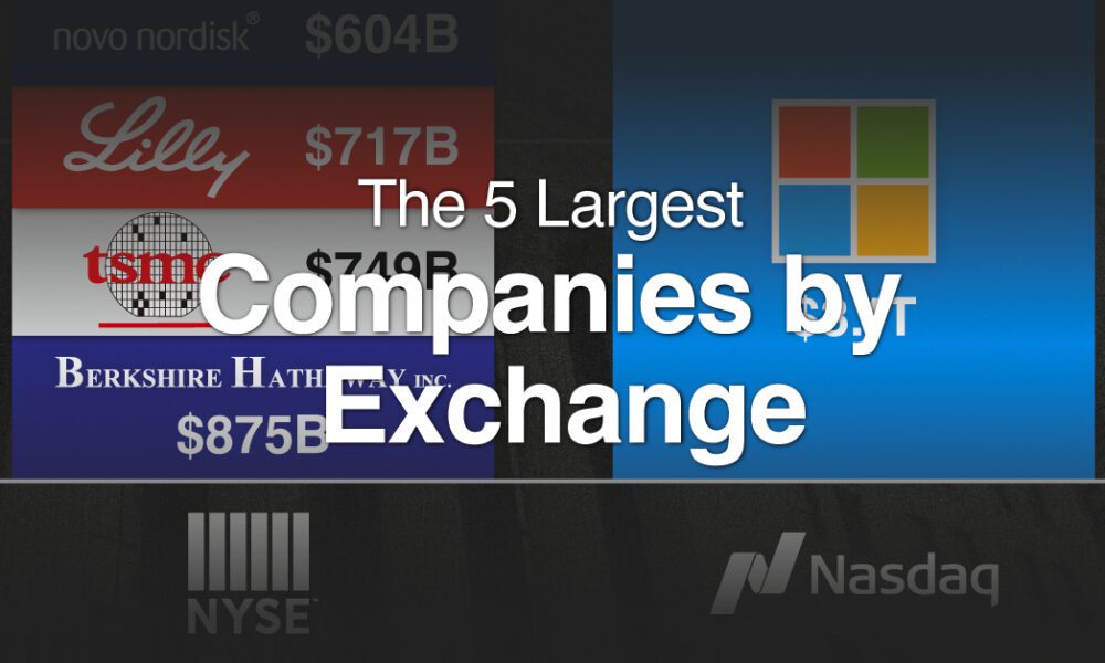
With trillion dollar valuations becoming more common, we've compared the five biggest companies by stock exchange.
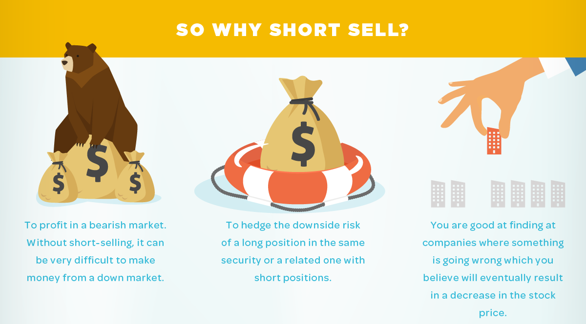
A look at the potential risks and added costs of short selling, but also an explanation where the practice may make sense for some investors.
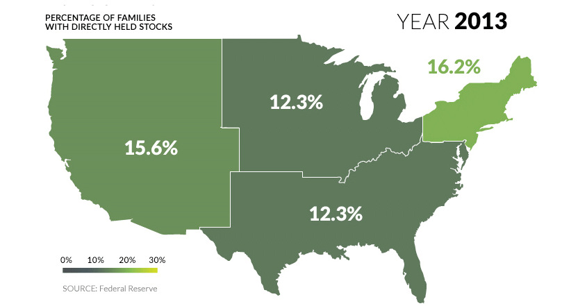
U.S. markets continue to hit all-time highs, but what percentage of population actually benefits? See stock ownership across the U.S. on this animated map.
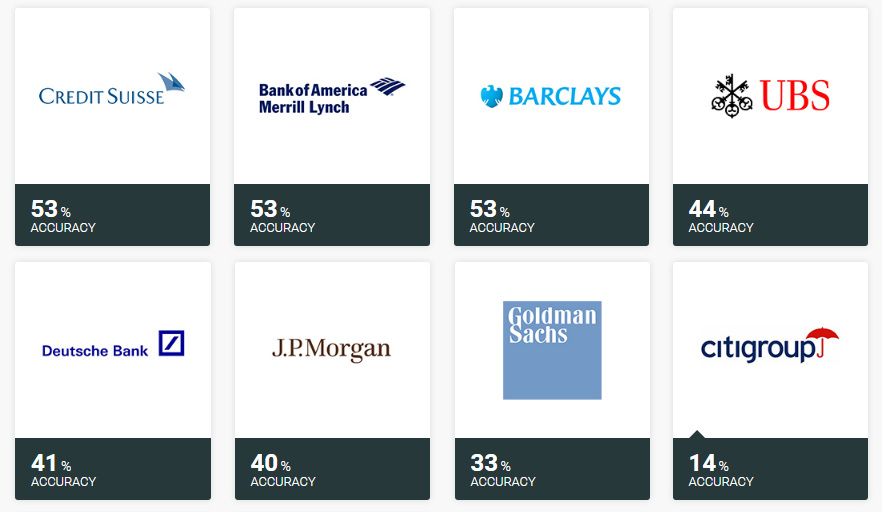
Ever wonder how accurate investment banks are with their stock picks? Here's the answer to that question, and it's not pretty.
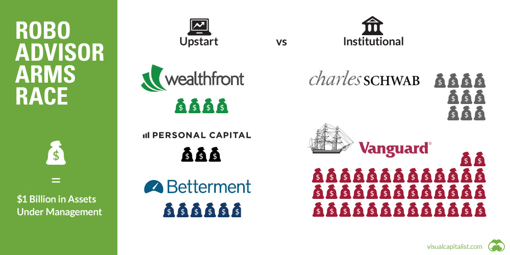
Can upstart robo-advisors compete against the scale of financial behemoths like Vanguard or Blackrock? See in this week's chart.
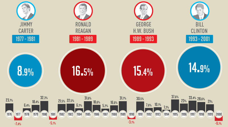
This infographic shows how the U.S. market performs in each year of a presidential term - and specifically, how the market does in election years.
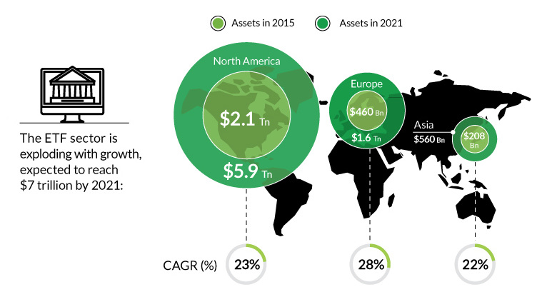
The rise of ETFs has been meteoric, and passive investing has been huge since the crisis. However, as a whole, passive has barely made a dent...
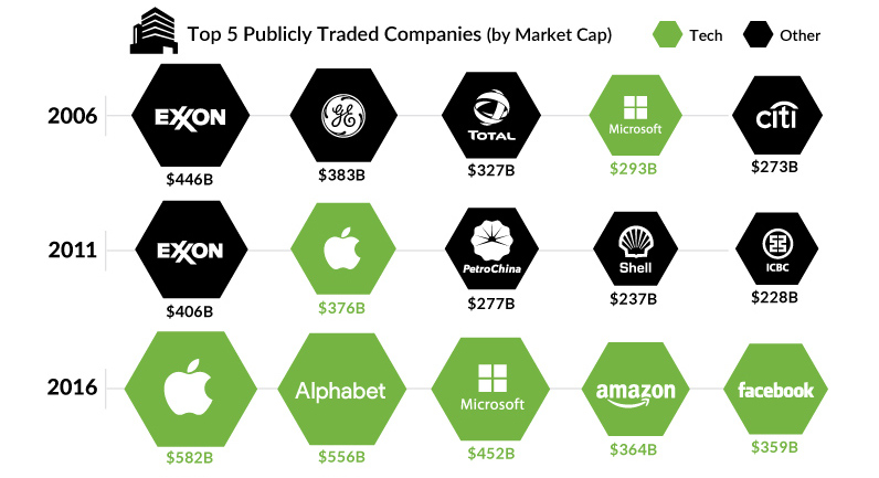
What are the largest companies by market cap, and how have they changed over the years? This chart shows them, while also presenting a broader narrative.
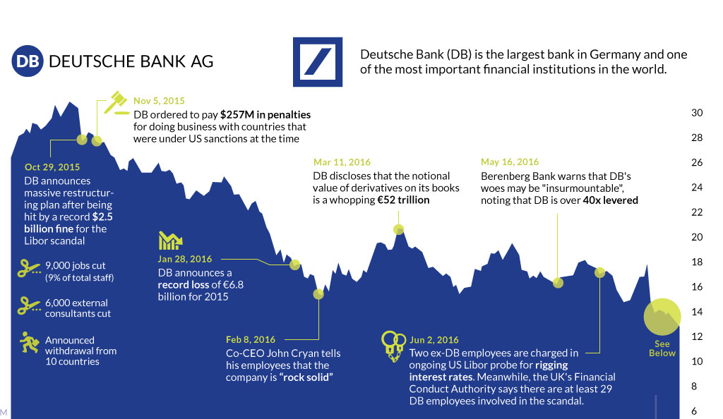
The fate of Germany's largest bank appears to be sealed. This timeline shows the fall of Deutsche Bank, one of Europe's most crucial financial institutions.
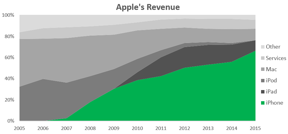
With iPhone sales making up over 60% of revenue, investors are becoming increasingly worried that Apple is a one trick pony.
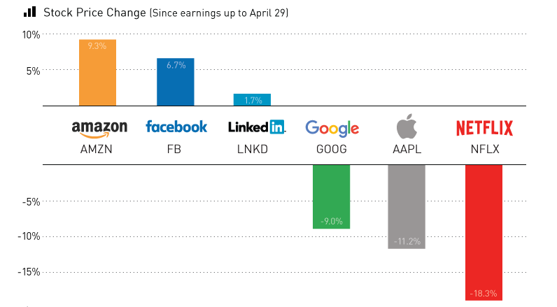
Earnings season has been a roller coaster for the world's biggest tech companies. We sum up the action in today's chart.


