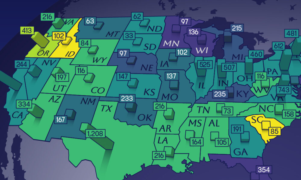
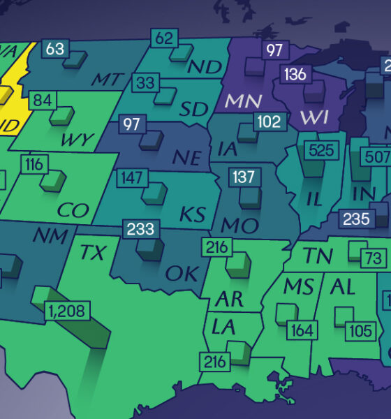
This map shows how many energy projects are in interconnection queues by state and how long these projects have been...
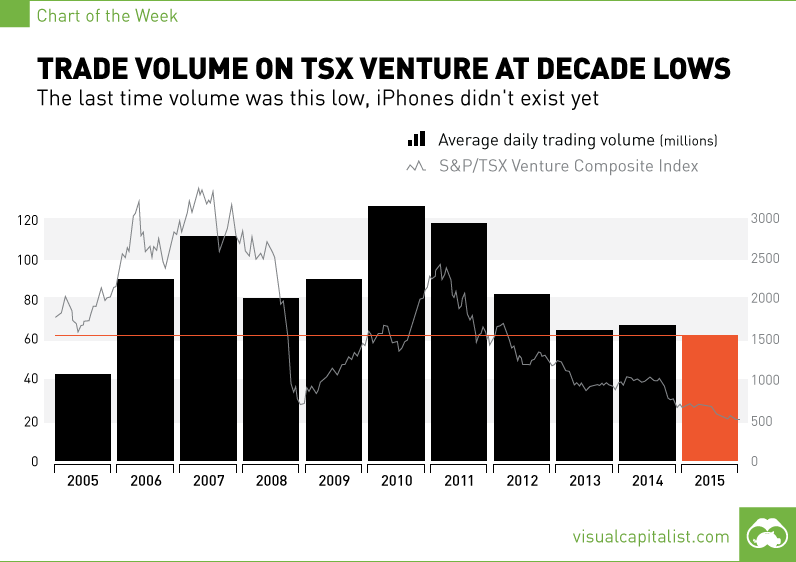
The last time volume was this low, the iPhone did not exist yet.
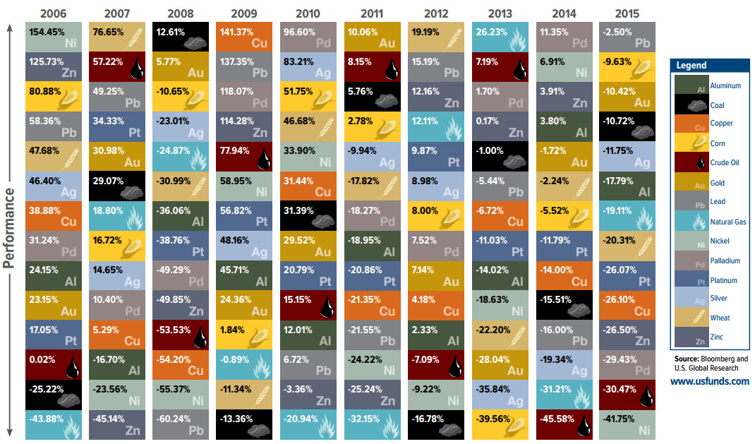
How investments in commodities have fared over the last decade, summarized in "The Periodic Table of Commodity Returns".
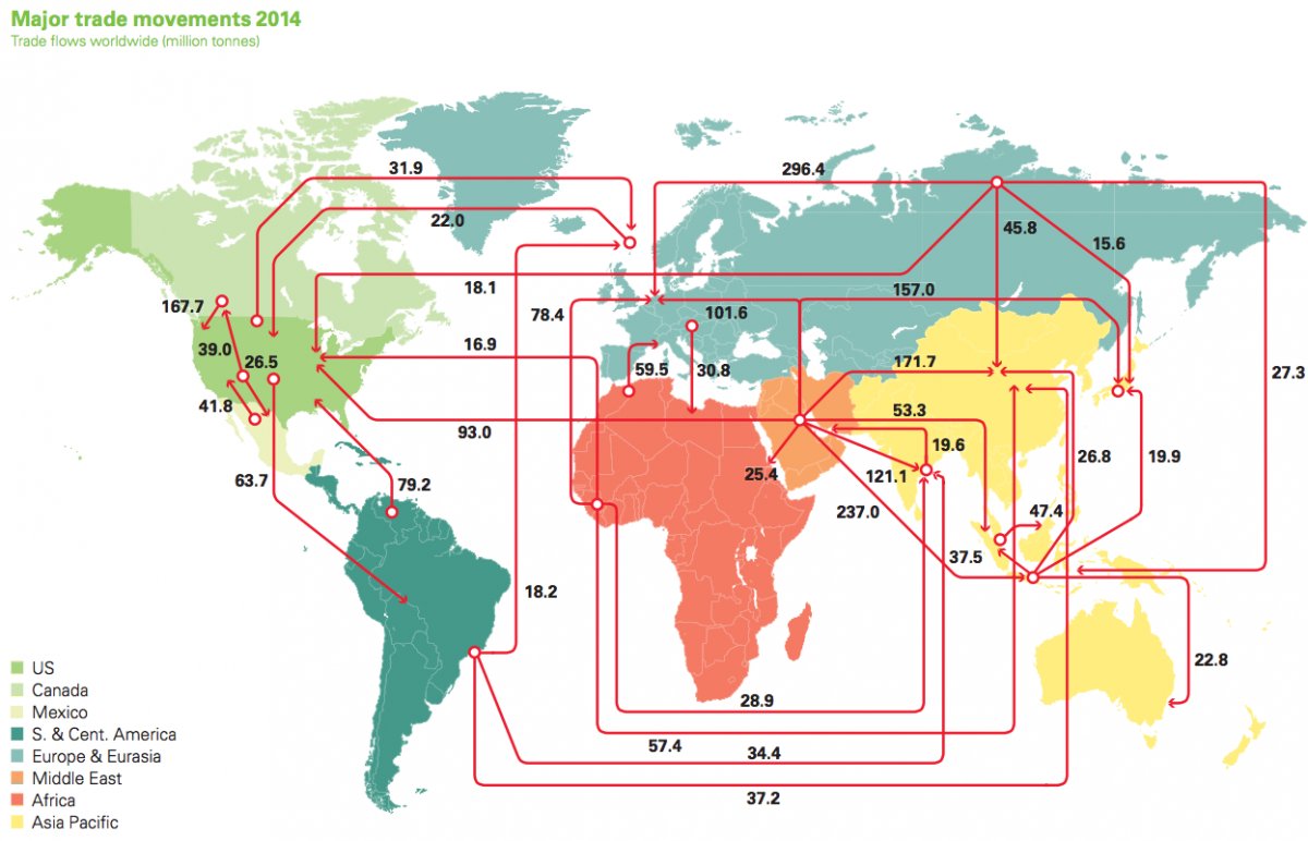
Every day, 93 million barrels of oil are consumed by the global economy. How does this oil change hands? This map visualizes the global oil trade.
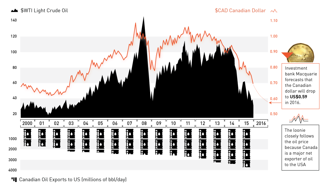
The oil plunge has wreaked havoc on the Canadian dollar. Now at 13-yr lows and expected to go lower, we explain the relationship between oil and...
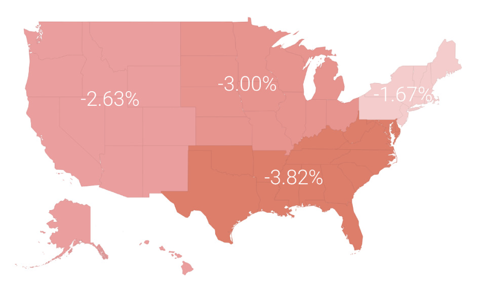
In a volatile market in 2015, the average investor lost 3.1%. In today's post, we break this performance down by region, profession, and age.
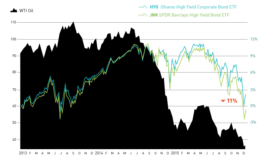
The month of December so far has seen a mini-meltdown in the junk bond market. The culprit? Fringe oil and gas producers that are struggling with...
The majority of the 391 nuclear reactors in global operation were built many years ago, and aging reactors are beginning to be a problem for the...
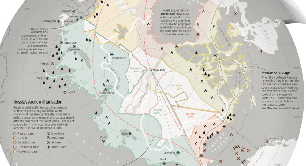
With Arctic ice thawing, the race for natural resources, shipping routes, and other territorial claims is heating up. The race for Arctic Domination is on.
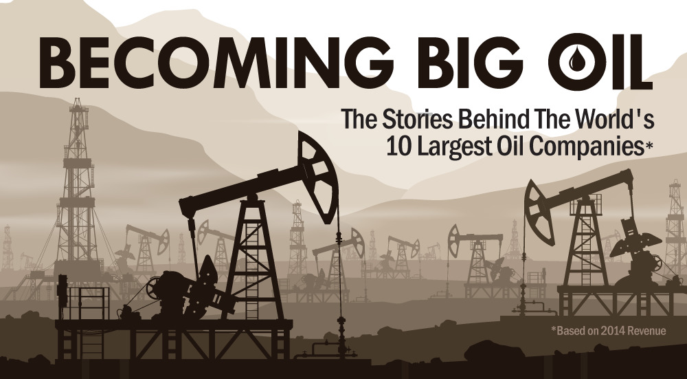
The 10 largest oil companies generated a massive $3.26 trillion in revenue last year. How did Big Oil come to be? This infographic takes a look.
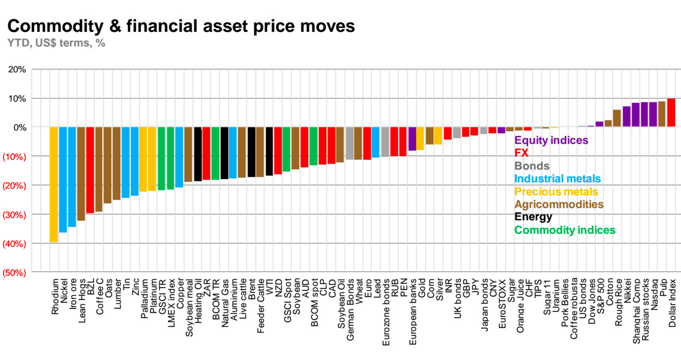
Today's chart from Macquarie shows all asset classes YTD, and gives perspective on the 2015 collapse of commodities.


