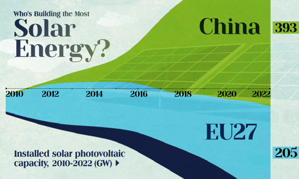
China's solar capacity triples USA, nearly doubles EU.
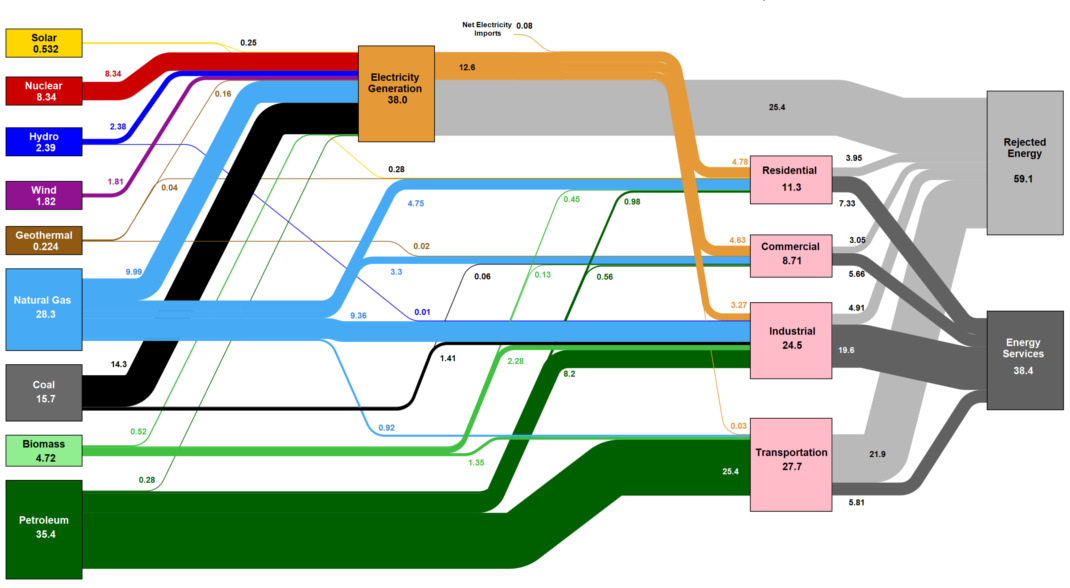
This massive diagram shows all energy created in the U.S., and where it goes. It's not sexy, but it gives a great 10,000 ft overview of...
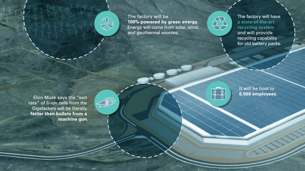
Tesla's giant production facility opens on July 29, and these 9 slides help to visualize the impact of the new Tesla Gigafactory.
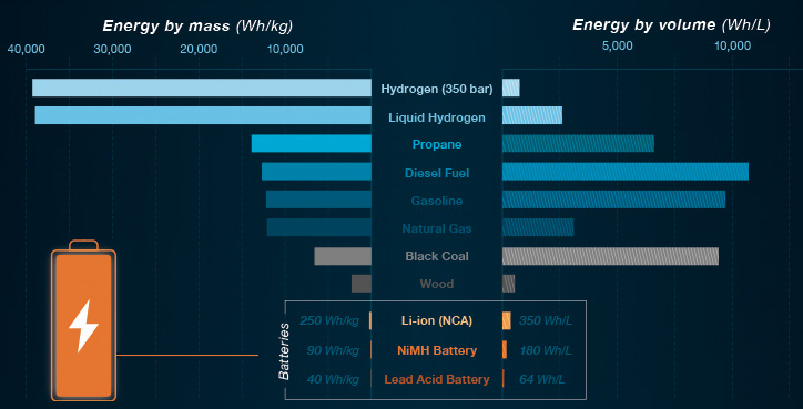
In Part 2 of the Battery Series, we show what batteries can and cannot do with today's technology. We also look at the ideal properties of...
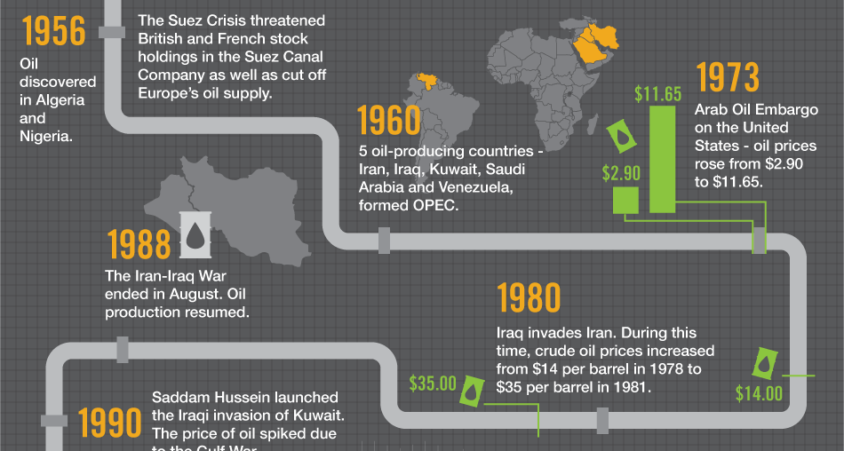
Oil is the world's most traded commodity and a staple for investors - this infographic shows the volatile history of crude oil markets.
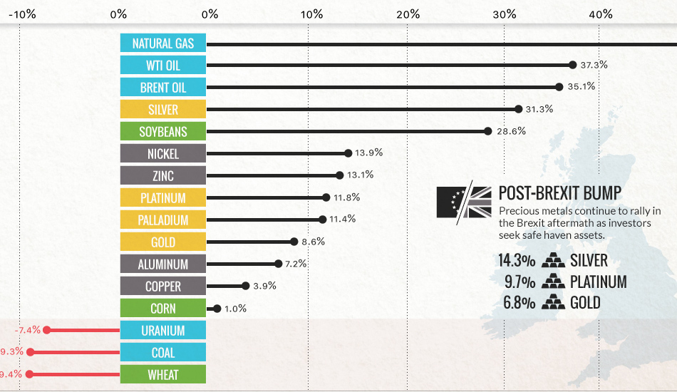
Commodities are back! Precious metals hit two-year highs post-Brexit, while oil and natural gas had their best quarter in years.
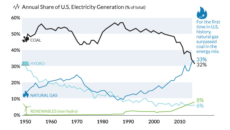
The decline of coal has been swift and unprecedented. We show in these three charts how it went from American energy hero to zero.

In Part 1 of our Battery Series, we look at battery basics, as well as the evolution of battery technology and how we got to today.
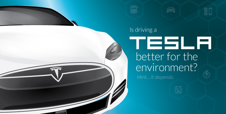
How do the emissions of electric and gas vehicles compare in your state? See if driving a Tesla is better for the environment in this in-depth...
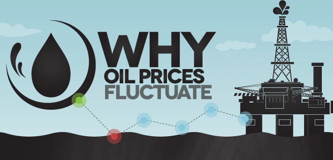
There are multiple factors that determine how oil prices fluctuate, and many of them are interconnected. Learn about them all in this infographic.
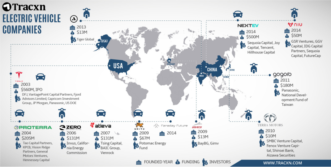
Imitation is the sincerest form of flattery. This infographic shows Tesla's rivals that are vying to unseat the current titan of electric vehicles.


