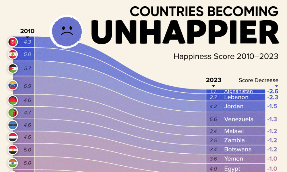
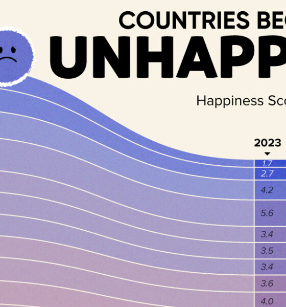
Tracking Gallup survey data for more than a decade reveals some countries are witnessing big happiness declines, reflecting their shifting...

What cities are the world's ultra-rich flocking to? This map looks at ultra high net worth individual (UHNWI) growth rates in cities around the world.

Women are better at saving money, but invest less of it - this infographic looks at the specific needs of women in investing and how to...
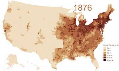

This animation shows the population density of U.S. counties between 1790 and 2010, showing the westward expansion of the country's population.
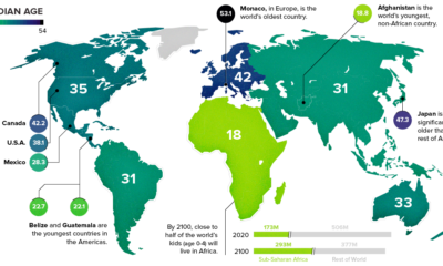

This chart takes a look at the median age of every continent, while also breaking down the youngest and oldest countries in the world.
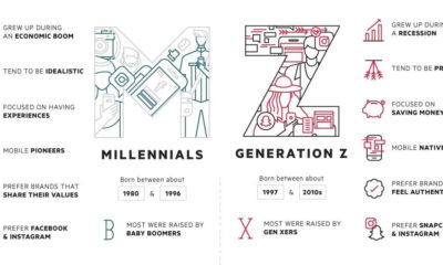

As Millennials enter their early-30s, the focus is now shifting to Generation Z - a group that is just starting to enter the workforce for the...
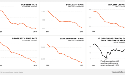

There's a persistent belief across America that crime is on the rise. This graphic amalgamates crime rate data from the FBI to show a very different...
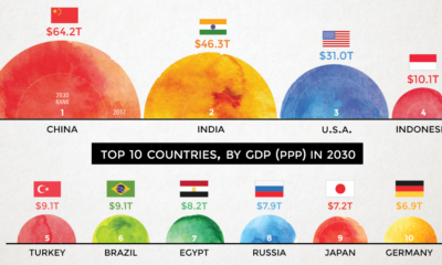

According to projections by a prominent multinational bank, 7 of the world's 10 largest economies will be in emerging markets in 2030.


A survey of 9,800 millennials reveals what investing habits will define a generation set to receive a $30 trillion wealth transfer in the coming years.
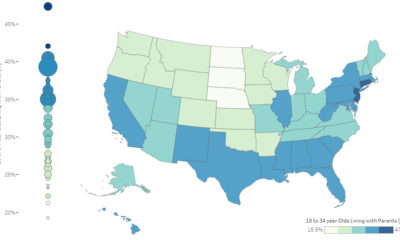

It's estimated that 34.5% of young adults (18-34 years old) in the U.S live at home with their parents. Here's how it varies by state, as...
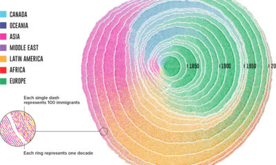

Since 1830, there have been four major waves of U.S. immigration - and this unique video depicts the influx of immigrants as rings in a tree...