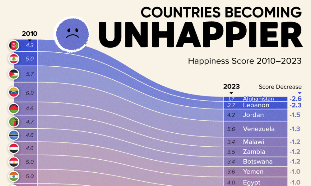
Tracking Gallup survey data for more than a decade reveals some countries are witnessing big happiness declines, reflecting their shifting...

What contributes to happiness? These charts break down global happiness scores - how does your country fare, and how has it changed over ten years?

Silicon Valley is no longer the only place to be for a career in tech. Here are the fastest growing tech markets across North America, and...
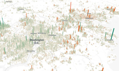

Cities are constantly evolving over time. These 3d graphics visualize both growth and decline with a focus on North American cities from 1990-2015.
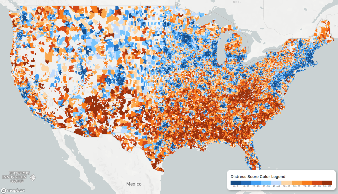
While the U.S. economic picture remains quite rosy, things change quickly when you zoom to the local level. This map shows the country's distressed communities.
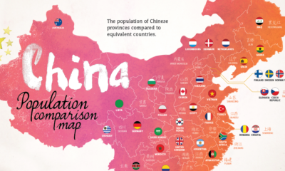

With 1.4 billion people living in the country's 33 distinct regions, each of China's provinces has a population that is equal to that of a major...
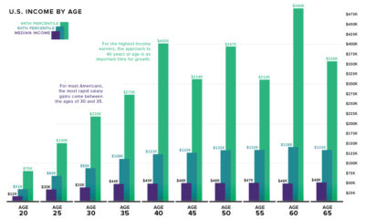

What is the relationship between age and income level? We visualize the data and compare it to commonly held beliefs on the topic.
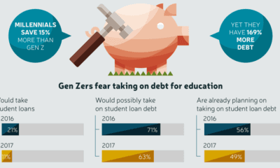

Gen Z saw their older friends take on massive amounts of debt, while struggling to secure stable jobs - and now they are learning from those...
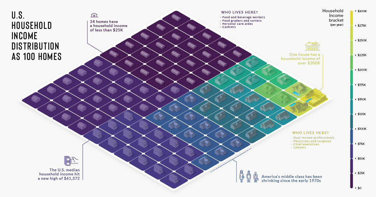
There are over 125 million households in the U.S., each with varying incomes. He's how they look distilled down into a visualization of 100 homes.
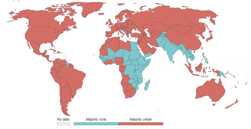
55% of the world lives in urban areas today. But what defines an urban population, and how will this big picture change by 2050?
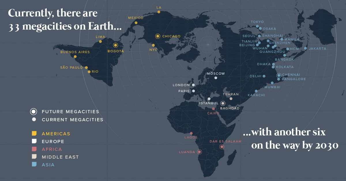
There are currently 33 megacities in the world with over 10 million inhabitants - but by 2030, there will be six new megacities, including one in...


