Money
Animation: The Collapse of the Middle Class in 20 Major U.S. Cities
When future historians look back at the beginning of the 21st century, they’ll note that we grappled with many big issues.
They’ll write about the battle between nationalism and globalism, soaring global debt, a dysfunctional healthcare system, societal concerns around automation and AI, and pushback on immigration. They will also note the growing number of populist leaders in Western democracies, ranging from Marine Le Pen to Donald Trump.
However, these historians will not view these ideas and events in isolation. Instead, they will link them all, at least partially, to an overarching trend that is intimately connected to today’s biggest problems: the “hollowing out” of the middle class.
Visualizing the Collapse of the Middle Class
The fact is many people have less money in their pockets – and understandably, this has motivated people to take action against the status quo.
And while the collapse of the middle class and income inequality are issues that receive a fair share of discussion, we thought that this particular animation from Metrocosm helped to put things in perspective.
The following animation shows the change in income distribution in 20 major U.S. cities between 1970 and 2015:
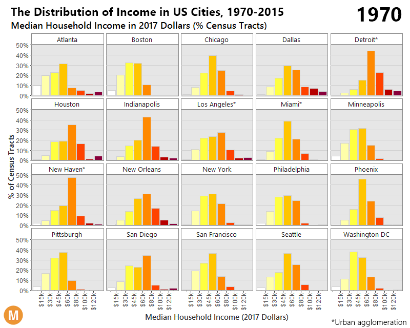
The differences between 1970 and 2015 are intense. At first, each distribution is more bell-shaped, with the majority of people in a middle income bracket – and by 2015, those people are “pushed” out towards the extremes as they either get richer or poorer.
A Broader Look at Income Inequality
This phenomenon is not limited to major cities, either.
Here’s another look at the change in income distribution using smaller brackets and the whole U.S. adult population:
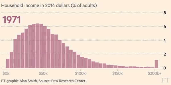
Courtesy of: FT (h/t Metrocosm)
It’s a multi-faceted challenge, because while a significant portion of middle class households are being shifted into lower income territory, there are also many households that are doing the opposite. According to Pew Research, the percentage of households in the upper income bracket has grown from 14% to 21% between 1971 and 2015.
The end result? With people being pushed to both ends of the spectrum, the middle class has decreased considerably in size. In 1971, the middle class made up 61% of the adult population, and by 2014 it accounted for less than 50%.
As this “core” of society shrinks, it aggravates the aforementioned problems. People and governments borrow more money to make up for a lack of middle class wealth, while backlashes against globalism, free trade, and open borders are fueled. The populists who can “fix” the broken system are elected, and so on.


Wealth
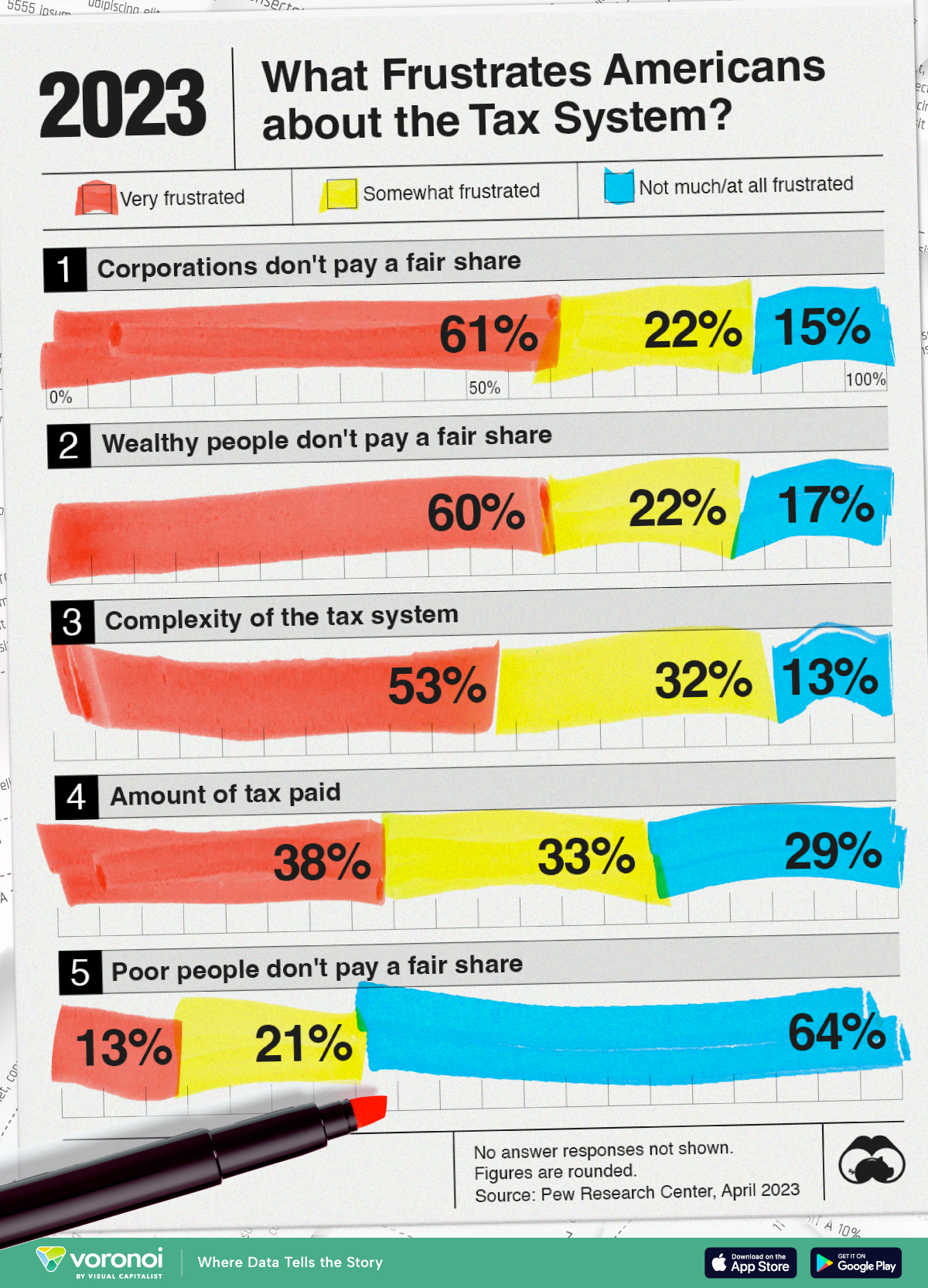
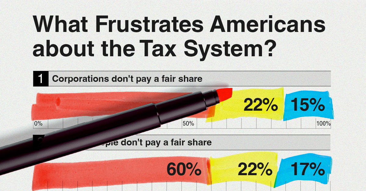
Charted: What Frustrates Americans About the Tax System
A survey during peak tax filing season reveals two big complaints that Americans have with the federal tax system.
What Frustrates Americans About the Tax System
This was originally posted on our Voronoi app. Download the app for free on Apple or Android and discover incredible data-driven charts from a variety of trusted sources.
In this visualization, we show Pew Research’s findings on what bothers Americans the most about the tax system.
This data was collected after surveying more than 5,000 American adults between the period of March 27-April 2, 2023.
The survey was weighted to be representative of the U.S. adult population. Visit Pew Research’s methodology page for more details.
Americans Want More Taxes for Some
Six in every 10 Americans feel that both corporations and the wealthy don’t pay their fair share in federal taxes.
Their sentiments are not entirely unfounded.
| Very frustrated | Somewhat frustrated | Not much/ at all frustrated |
|
|---|---|---|---|
| 🏦 Corporations don't pay a fair share | 61% | 22% | 15% |
| 💼 Wealthy people don't pay a fair share | 60% | 22% | 17% |
| 🤔 Complexity of the tax system | 53% | 32% | 13% |
| 💸 Amount of tax paid | 38% | 33% | 29% |
| 🧑🤝🧑 Poor people don't pay a fair share | 13% | 21% | 64% |
Note: No answer responses are not shown, thus percentages may not sum to 100.
A 2021 ProPublica investigation found some of the wealthiest Americans—also the wealthiest people in the world—did not pay a single penny in federal income taxes in some years.
A significant part of why this is possible is how taxes are collected depending on the source. Since much of the top 1% grow their wealth in equity and property, they are not subject to taxes until they make an actual transaction.
As this Brookings Institution article explains: most Americans make money through their wages, and wages are subject to heavier taxation than capital income. Thus, the tax share of America’s highest-income households is often lower than America’s middle-income households.
Finally, Pew Research noted that their findings were essentially unchanged since 2021.

-

 Markets6 days ago
Visualized: Interest Rate Forecasts for Advanced Economies
-

 Markets2 weeks ago
Economic Growth Forecasts for G7 and BRICS Countries in 2024
-

 Wealth2 weeks ago
Charted: Which City Has the Most Billionaires in 2024?
-

 Technology2 weeks ago
All of the Grants Given by the U.S. CHIPS Act
-

 Green2 weeks ago
The Carbon Footprint of Major Travel Methods
-

 United States1 week ago
Visualizing the Most Common Pets in the U.S.
-

 Culture1 week ago
The World’s Top Media Franchises by All-Time Revenue
-

 voronoi1 week ago
Best Visualizations of April on the Voronoi App