Money
Millionaire Migrants: Countries That Rich People Are Flocking To
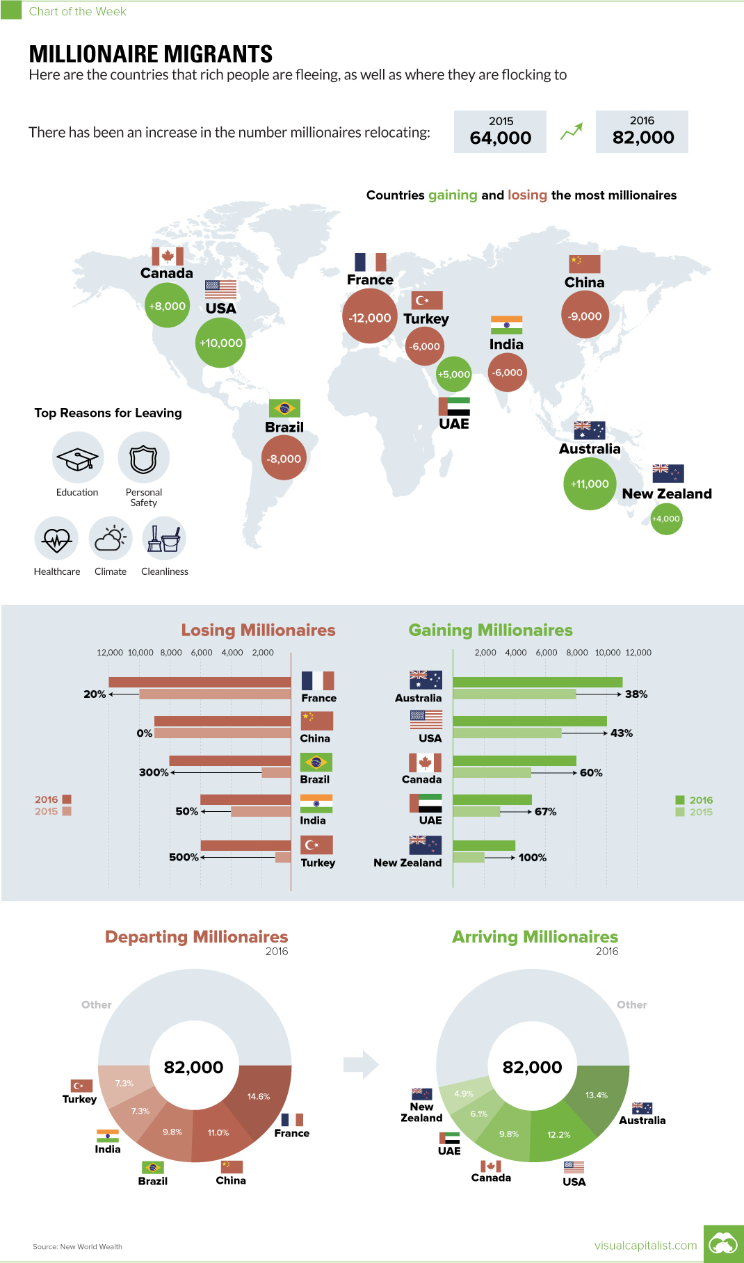
Millionaire Migrants: Countries That Rich People Are Flocking To
The Chart of the Week is a weekly Visual Capitalist feature on Fridays.
Money may not buy happiness, but it does buy the ultimate flexibility for making financial and lifestyle decisions.
For many of the world’s millionaires, money provides a highly effective means to escape their home country when times get tough. They can pack their bags, and move their family and capital to a location that will provide superior opportunities for prosperity.
According to a new report by New World Wealth, this couldn’t have been truer for 2016, as the amount of millionaire migrants increased by 28% from the previous year.
Human and Capital Flight
In 2016, there were a total of 82,000 millionaire migrants that left for greener pastures.
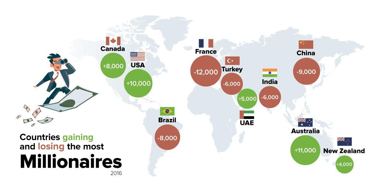
The Top Five Countries (Net Outflows)
| Country | 2016 | 2015 | Change | |
|---|---|---|---|---|
| 1 | France | -12,000 | -10,000 | 20% |
| 2 | China | -9,000 | -9,000 | 0% |
| 3 | Brazil | -8,000 | -2,000 | 300% |
| 4 | India | -6,000 | -4,000 | 50% |
| 5 | Turkey | -6,000 | -1000 | 500% |
France tops the list for a second straight year, as rich people dodge conditions that they consider to be adverse. France has rising religious tensions and populism, but it also has a tax system that is not particularly friendly to the ultra rich. The International Business Times calls the ongoing problem a “Millionaire Exodus”.
China and India both continue to have net outflows of millionaires, but two of the more interesting countries on this list are Brazil and Turkey.
Brazil continues to be deep in economic crisis, with its worst-ever recession likely continuing into its eighth-straight quarter in Q4 2016. The country also recently impeached Dilma Rousseff in August 2016. On the other hand, the Washington Post describes Turkey as a country that is in a “permanent state of crisis”. This may be a fair criticism, since in 2016 there was the assassination of a Russian ambassador, a currency crisis, an economic crisis, and also an attempted military coup.
Like most people, millionaires don’t like uncertainty – and they have the wherewithal and conviction to get out of places that have ongoing issues.
The Top Five Countries (Net Inflows)
| Country | 2016 | 2015 | Increase | |
|---|---|---|---|---|
| 1 | Australia | +11,000 | +8,000 | 38% |
| 2 | USA | +10,000 | +7,000 | 43% |
| 3 | Canada | +8,000 | +5,000 | 60% |
| 4 | UAE | +5,000 | +3,000 | 67% |
| 5 | New Zealand | +4,000 | +2,000 | 100% |
In 2016, Australia was the number one destination for millionaire migrants, with the United States and Canada being close behind.
New Zealand also had the amount of net inflows double, while the UAE remained a popular location for the wealthy in the Middle East.


Money
Charted: Which City Has the Most Billionaires in 2024?
Just two countries account for half of the top 20 cities with the most billionaires. And the majority of the other half are found in Asia.


Charted: Which Country Has the Most Billionaires in 2024?
This was originally posted on our Voronoi app. Download the app for free on iOS or Android and discover incredible data-driven charts from a variety of trusted sources.
Some cities seem to attract the rich. Take New York City for example, which has 340,000 high-net-worth residents with investable assets of more than $1 million.
But there’s a vast difference between being a millionaire and a billionaire. So where do the richest of them all live?
Using data from the Hurun Global Rich List 2024, we rank the top 20 cities with the highest number of billionaires in 2024.
A caveat to these rich lists: sources often vary on figures and exact rankings. For example, in last year’s reports, Forbes had New York as the city with the most billionaires, while the Hurun Global Rich List placed Beijing at the top spot.
Ranked: Top 20 Cities with the Most Billionaires in 2024
The Chinese economy’s doldrums over the course of the past year have affected its ultra-wealthy residents in key cities.
Beijing, the city with the most billionaires in 2023, has not only ceded its spot to New York, but has dropped to #4, overtaken by London and Mumbai.
| Rank | City | Billionaires | Rank Change YoY |
|---|---|---|---|
| 1 | 🇺🇸 New York | 119 | +1 |
| 2 | 🇬🇧 London | 97 | +3 |
| 3 | 🇮🇳 Mumbai | 92 | +4 |
| 4 | 🇨🇳 Beijing | 91 | -3 |
| 5 | 🇨🇳 Shanghai | 87 | -2 |
| 6 | 🇨🇳 Shenzhen | 84 | -2 |
| 7 | 🇭🇰 Hong Kong | 65 | -1 |
| 8 | 🇷🇺 Moscow | 59 | No Change |
| 9 | 🇮🇳 New Delhi | 57 | +6 |
| 10 | 🇺🇸 San Francisco | 52 | No Change |
| 11 | 🇹🇭 Bangkok | 49 | +2 |
| 12 | 🇹🇼 Taipei | 45 | +2 |
| 13 | 🇫🇷 Paris | 44 | -2 |
| 14 | 🇨🇳 Hangzhou | 43 | -5 |
| 15 | 🇸🇬 Singapore | 42 | New to Top 20 |
| 16 | 🇨🇳 Guangzhou | 39 | -4 |
| 17T | 🇮🇩 Jakarta | 37 | +1 |
| 17T | 🇧🇷 Sao Paulo | 37 | No Change |
| 19T | 🇺🇸 Los Angeles | 31 | No Change |
| 19T | 🇰🇷 Seoul | 31 | -3 |
In fact all Chinese cities on the top 20 list have lost billionaires between 2023–24. Consequently, they’ve all lost ranking spots as well, with Hangzhou seeing the biggest slide (-5) in the top 20.
Where China lost, all other Asian cities—except Seoul—in the top 20 have gained ranks. Indian cities lead the way, with New Delhi (+6) and Mumbai (+3) having climbed the most.
At a country level, China and the U.S combine to make up half of the cities in the top 20. They are also home to about half of the world’s 3,200 billionaire population.
In other news of note: Hurun officially counts Taylor Swift as a billionaire, estimating her net worth at $1.2 billion.

-

 Debt1 week ago
How Debt-to-GDP Ratios Have Changed Since 2000
-

 Markets2 weeks ago
Ranked: The World’s Top Flight Routes, by Revenue
-

 Countries2 weeks ago
Population Projections: The World’s 6 Largest Countries in 2075
-

 Markets2 weeks ago
The Top 10 States by Real GDP Growth in 2023
-

 Demographics2 weeks ago
The Smallest Gender Wage Gaps in OECD Countries
-

 United States2 weeks ago
Where U.S. Inflation Hit the Hardest in March 2024
-

 Green2 weeks ago
Top Countries By Forest Growth Since 2001
-

 United States2 weeks ago
Ranked: The Largest U.S. Corporations by Number of Employees