Money
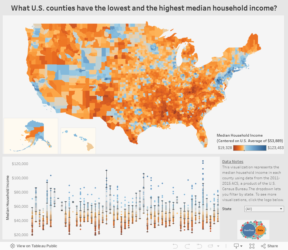
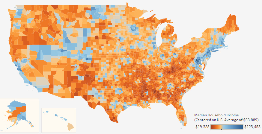
Interactive: Visualizing Median Income For All 3,000+ U.S. Counties
var divElement = document.getElementById(‘viz1503420628886’); var vizElement = divElement.getElementsByTagName(‘object’)[0]; if ( divElement.offsetWidth > 800 ) { vizElement.style.width=’954px’;vizElement.style.height=’869px’;} else if ( divElement.offsetWidth > 500 ) { vizElement.style.width=’954px’;vizElement.style.height=’869px’;} else { vizElement.style.width=’100%’;vizElement.style.height=’1136px’;} var scriptElement = document.createElement(‘script’); scriptElement.src = ‘https://public.tableau.com/javascripts/api/viz_v1.js’; vizElement.parentNode.insertBefore(scriptElement, vizElement);
Interactive: Visualizing Median Income for All 3,000+ U.S. Counties
When thinking about the United States and its economy, we often think in terms of maps.
That’s why we have previously visualized the country’s $18 trillion economy by comparing specific regions to similarly sized countries. It’s also why we have shown the extreme variance in population distribution across counties, or highlighted the average income of the “Top 1%” throughout the country.
But there is perhaps nothing more telling or interesting to explore than the “granddaddy” of all economic maps: an interactive visualization of median household income.
That’s why today’s fantastic interactive map from Overflow Data is such a treat. It covers all 3,007 U.S. counties using color coding to show the richest and poorest counties based on median income, and it also allows users to drill down to the stats on counties at the state level.
Coasts, Mountains, and Oil
While the areas around coastal cities like San Francisco, Los Angeles, New York City, Boston, or Washington, D.C. are often thought of as the wealthier parts of the country, this map helps reveal two other “belts” in the country with median incomes well above the national average of $53,889.
The first is in the mountains through states like Utah, Colorado, Wyoming and even parts of Nevada – where there is a cluster of more than 40 counties with median incomes of $60,000 or above. Aside from upscale ski areas in places like Summit County, UT or Jackson, WY, the counties in this belt also feature cities like Boulder, CO, or Salt Lake City, UT.
Areas that are rich in natural resources, such as parts of Alaska, Texas, and North Dakota, also tend to have more counties with above average median incomes. For example, Williams County, ND, is in the middle of the Bakken oilfield – and the median household income there is $88,013.
In Alaska, the northernmost county of North Slope Borough has less than 8,000 residents, but they boast a median household income of $72,576.
Tougher Times
On this map, the less wealthy areas are also very evident – and they tend to be most concentrated in the Southeast region of the country.
Many states, including ones like Kentucky, Alabama, Mississippi, Montana, Louisiana, Missouri, New Mexico, Arkansas, Texas, West Virginia, North Carolina, South Carolina, and South Dakota, all have some counties that are at the very low end of median income spectrum.
More specifically, there are only two counties in the country that have income levels below $20,000: Sumter County, AL, and McCreary County, KY.


Money
Charted: Which City Has the Most Billionaires in 2024?
Just two countries account for half of the top 20 cities with the most billionaires. And the majority of the other half are found in Asia.


Charted: Which Country Has the Most Billionaires in 2024?
This was originally posted on our Voronoi app. Download the app for free on iOS or Android and discover incredible data-driven charts from a variety of trusted sources.
Some cities seem to attract the rich. Take New York City for example, which has 340,000 high-net-worth residents with investable assets of more than $1 million.
But there’s a vast difference between being a millionaire and a billionaire. So where do the richest of them all live?
Using data from the Hurun Global Rich List 2024, we rank the top 20 cities with the highest number of billionaires in 2024.
A caveat to these rich lists: sources often vary on figures and exact rankings. For example, in last year’s reports, Forbes had New York as the city with the most billionaires, while the Hurun Global Rich List placed Beijing at the top spot.
Ranked: Top 20 Cities with the Most Billionaires in 2024
The Chinese economy’s doldrums over the course of the past year have affected its ultra-wealthy residents in key cities.
Beijing, the city with the most billionaires in 2023, has not only ceded its spot to New York, but has dropped to #4, overtaken by London and Mumbai.
| Rank | City | Billionaires | Rank Change YoY |
|---|---|---|---|
| 1 | 🇺🇸 New York | 119 | +1 |
| 2 | 🇬🇧 London | 97 | +3 |
| 3 | 🇮🇳 Mumbai | 92 | +4 |
| 4 | 🇨🇳 Beijing | 91 | -3 |
| 5 | 🇨🇳 Shanghai | 87 | -2 |
| 6 | 🇨🇳 Shenzhen | 84 | -2 |
| 7 | 🇭🇰 Hong Kong | 65 | -1 |
| 8 | 🇷🇺 Moscow | 59 | No Change |
| 9 | 🇮🇳 New Delhi | 57 | +6 |
| 10 | 🇺🇸 San Francisco | 52 | No Change |
| 11 | 🇹🇭 Bangkok | 49 | +2 |
| 12 | 🇹🇼 Taipei | 45 | +2 |
| 13 | 🇫🇷 Paris | 44 | -2 |
| 14 | 🇨🇳 Hangzhou | 43 | -5 |
| 15 | 🇸🇬 Singapore | 42 | New to Top 20 |
| 16 | 🇨🇳 Guangzhou | 39 | -4 |
| 17T | 🇮🇩 Jakarta | 37 | +1 |
| 17T | 🇧🇷 Sao Paulo | 37 | No Change |
| 19T | 🇺🇸 Los Angeles | 31 | No Change |
| 19T | 🇰🇷 Seoul | 31 | -3 |
In fact all Chinese cities on the top 20 list have lost billionaires between 2023–24. Consequently, they’ve all lost ranking spots as well, with Hangzhou seeing the biggest slide (-5) in the top 20.
Where China lost, all other Asian cities—except Seoul—in the top 20 have gained ranks. Indian cities lead the way, with New Delhi (+6) and Mumbai (+3) having climbed the most.
At a country level, China and the U.S combine to make up half of the cities in the top 20. They are also home to about half of the world’s 3,200 billionaire population.
In other news of note: Hurun officially counts Taylor Swift as a billionaire, estimating her net worth at $1.2 billion.

-

 Science1 week ago
Visualizing the Average Lifespans of Mammals
-

 Demographics2 weeks ago
The Smallest Gender Wage Gaps in OECD Countries
-

 United States2 weeks ago
Where U.S. Inflation Hit the Hardest in March 2024
-

 Green2 weeks ago
Top Countries By Forest Growth Since 2001
-

 United States2 weeks ago
Ranked: The Largest U.S. Corporations by Number of Employees
-

 Maps2 weeks ago
The Largest Earthquakes in the New York Area (1970-2024)
-

 Green2 weeks ago
Ranked: The Countries With the Most Air Pollution in 2023
-

 Green2 weeks ago
Ranking the Top 15 Countries by Carbon Tax Revenue