Misc
Visualized: Who Americans Spend Their Time With
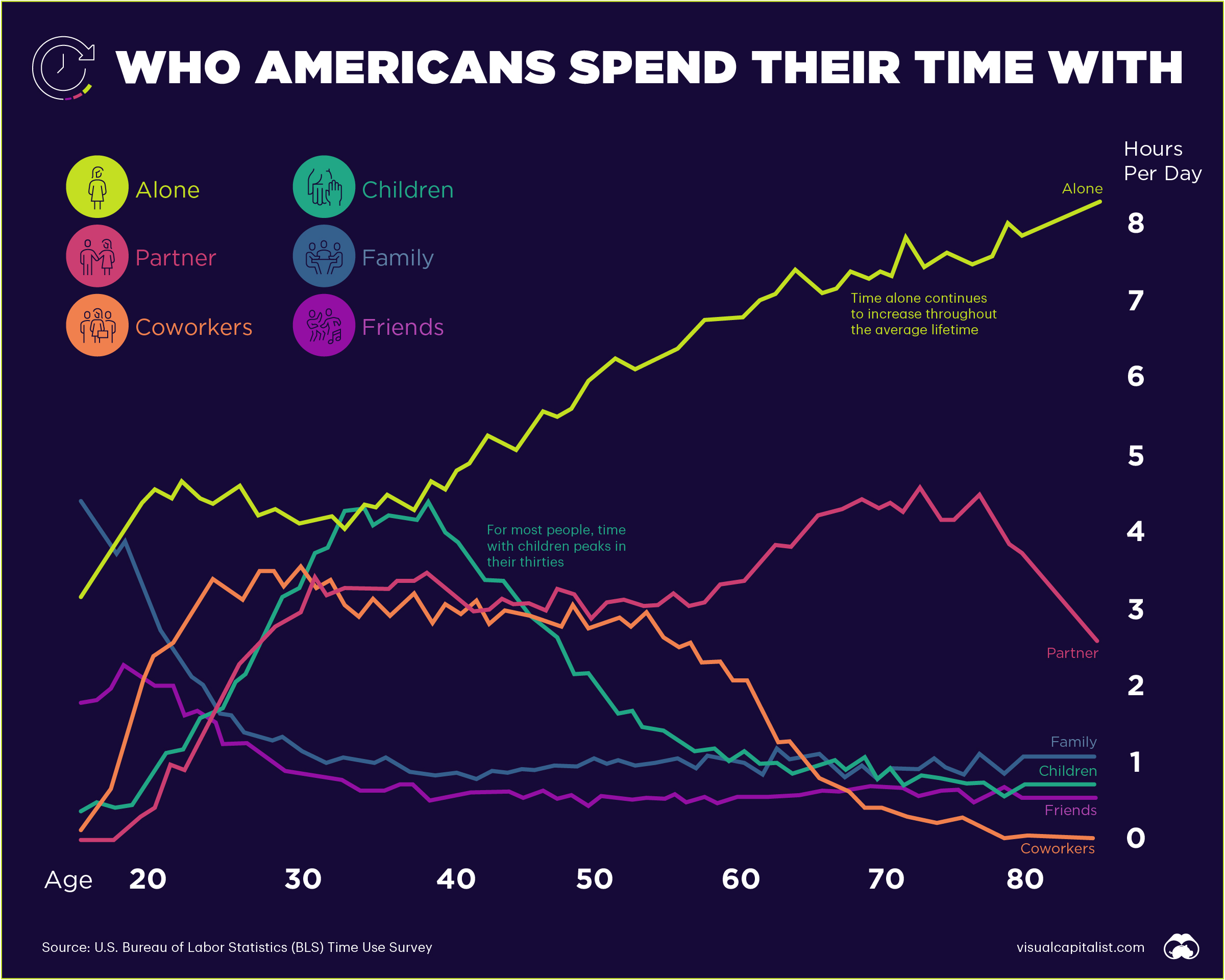


Who Americans Spend Their Time With
Throughout history, humans have relied on cooperation and social relationships to thrive. Of course, who we spend time with evolves throughout our lifetime.
Using insights from the American Time Use Survey and Our World in Data, we look at who Americans spend the most time with at various ages of their life.
Adolescence to Adulthood
In the average American’s teenage years, they spend most of their time alone and with their family. This makes sense, as the majority of people under 18 still live in a home with their nuclear family unit, meaning parents and siblings. Not surprisingly, adolescence is also when time spent with friends reaches its peak.
Jumping forward to a person’s early adulthood, 25-year-olds spend an average of 275 minutes per day alone, and 199 minutes with coworkers. This aligns with people in their twenties beginning to enter the workforce.
By age 35, people are still spending the most time with themselves, at 263 minutes per day. However, time spent combined with children and partners, the runner-ups, adds up to 450 minutes or around 7.5 hours a day.
| Age | Most Time Spent | Second | Third |
|---|---|---|---|
| 15 | Family - 267 Minutes | Alone - 193 Minutes | Friends - 109 Minutes |
| 25 | Alone - 275 Minutes | Coworkers - 199 Minutes | Partner - 121 Minutes |
| 35 | Alone - 263 Minutes | Children - 249 Minutes | Partner - 198 Minutes |
Although people are spending more time with kids and partners as they grow older, this trend may shift, as women are having fewer children. More women today are obtaining an education and are entering the workforce, causing them to delay or entirely put off having children.
Middle to Old Age
Upon turning 45, the average person spends 309 minutes a day alone, and in second place, 199 minutes with children. Time with coworkers remains relatively steady throughout someone’s forties, which coincides with the middle of career for most people in the workforce.
By age 55, time spent alone still takes top spot, but time spent with a partner goes up to 184 minutes, and time with coworkers also moves up, pushing out time spent with children.
| Age | Most Time Spent | Second | Third |
|---|---|---|---|
| 45 | Alone - 309 Minutes | Children - 199 Minutes | Partner - 184 Minutes |
| 55 | Alone - 384 Minutes | Partner - 184 Minutes | Coworkers - 163 Minutes |
| 65 | Alone - 444 Minutes | Partner - 243 Minutes | Family - 65 Minutes |
| 75 | Alone - 463 Minutes | Partner - 253 Minutes | Family - 56 Minutes |
Typically, time spent with children during the mid-fifties tends to see a sharp decline as children enter adulthood and begin to move out or spend more time out of the house.
Today, more children are staying at home longer or even moving back home. 52% of adult children in the U.S. today are living with their parents.
As people get closer to old age, around 65-years-old, they spend increasingly less time with coworkers as they begin to retire, and much more time alone or with a spouse. Then, from age 65-75, people consistently spend the most time alone, then with a partner and family.
Alone and Lonely?
One of the most significant trends on the chart is increased time spent alone.
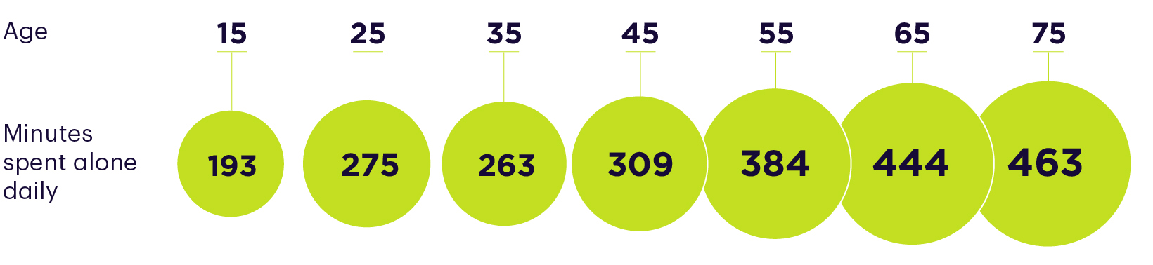
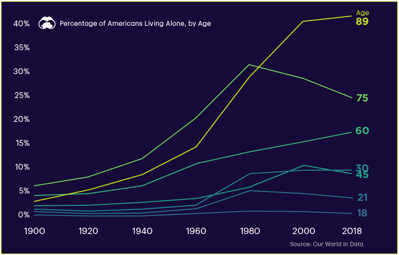
By the time someone reaches 80, their daily minutes alone goes up to 477. This can be a problematic reality. As the population continues to age in many countries around the world, more elderly people are left without resources or social connection.
Additionally, while one quarter of elderly Americans live alone, the trend of solo living is going up across nearly every age group, and this trend applies to a number of mature economies around the world.
A natural conclusion would be that increasing alone time has negative impacts on people, however, being alone does not necessarily equate to loneliness. Our World in Data found that there was no direct correlation between living alone and reported feelings of loneliness.
One final consideration is the role technology plays in our social interactions. Thanks to smartphones and social platforms, time alone doesn’t necessarily equal isolation.
It is not just the amount of time spent with others, but the quality and expectations, that reduce loneliness.
Where does this data come from?
Source: U.S. Bureau of Labor Statistics American Time Use Survey, accessed on Our World in Data.
Notes: While respondents to the Time Use Survey are tracking their activity, they indicate who was present during each activity recorded. This results in the data used in this article. It’s worth noting that individuals can be counted twice, since people from various categories can be present at the same time.


VC+
VC+: Get Our Key Takeaways From the IMF’s World Economic Outlook
A sneak preview of the exclusive VC+ Special Dispatch—your shortcut to understanding IMF’s World Economic Outlook report.

Have you read IMF’s latest World Economic Outlook yet? At a daunting 202 pages, we don’t blame you if it’s still on your to-do list.
But don’t worry, you don’t need to read the whole April release, because we’ve already done the hard work for you.
To save you time and effort, the Visual Capitalist team has compiled a visual analysis of everything you need to know from the report—and our VC+ Special Dispatch is available exclusively to VC+ members. All you need to do is log into the VC+ Archive.
If you’re not already subscribed to VC+, make sure you sign up now to access the full analysis of the IMF report, and more (we release similar deep dives every week).
For now, here’s what VC+ members get to see.
Your Shortcut to Understanding IMF’s World Economic Outlook
With long and short-term growth prospects declining for many countries around the world, this Special Dispatch offers a visual analysis of the key figures and takeaways from the IMF’s report including:
- The global decline in economic growth forecasts
- Real GDP growth and inflation forecasts for major nations in 2024
- When interest rate cuts will happen and interest rate forecasts
- How debt-to-GDP ratios have changed since 2000
- And much more!

Get the Full Breakdown in the Next VC+ Special Dispatch
VC+ members can access the full Special Dispatch by logging into the VC+ Archive, where you can also check out previous releases.
Make sure you join VC+ now to see exclusive charts and the full analysis of key takeaways from IMF’s World Economic Outlook.
Don’t miss out. Become a VC+ member today.
What You Get When You Become a VC+ Member
VC+ is Visual Capitalist’s premium subscription. As a member, you’ll get the following:
- Special Dispatches: Deep dive visual briefings on crucial reports and global trends
- Markets This Month: A snappy summary of the state of the markets and what to look out for
- The Trendline: Weekly curation of the best visualizations from across the globe
- Global Forecast Series: Our flagship annual report that covers everything you need to know related to the economy, markets, geopolitics, and the latest tech trends
- VC+ Archive: Hundreds of previously released VC+ briefings and reports that you’ve been missing out on, all in one dedicated hub
You can get all of the above, and more, by joining VC+ today.

-

 Mining1 week ago
Gold vs. S&P 500: Which Has Grown More Over Five Years?
-

 Markets2 weeks ago
Ranked: The Most Valuable Housing Markets in America
-

 Money2 weeks ago
Which States Have the Highest Minimum Wage in America?
-

 AI2 weeks ago
Ranked: Semiconductor Companies by Industry Revenue Share
-

 Markets2 weeks ago
Ranked: The World’s Top Flight Routes, by Revenue
-

 Demographics2 weeks ago
Population Projections: The World’s 6 Largest Countries in 2075
-

 Markets2 weeks ago
The Top 10 States by Real GDP Growth in 2023
-

 Demographics2 weeks ago
The Smallest Gender Wage Gaps in OECD Countries