Energy
What is a Commodity Super Cycle?
Visualizing the Commodity Super Cycle
Since the beginning of the Industrial Revolution, the world has seen its population and the need for natural resources boom.
As more people and wealth translate into the demand for global goods, the prices of commodities—such as energy, agriculture, livestock, and metals—have often followed in sync.
This cycle, which tends to coincide with extended periods of industrialization and modernization, helps in telling a story of human development.
Why are Commodity Prices Cyclical?
Commodity prices go through extended periods during which prices are well above or below their long-term price trend. There are two types of swings in commodity prices: upswings and downswings.
Many economists believe that the upswing phase in super cycles results from a lag between unexpected, persistent, and positive trends to support commodity demand with slow-moving supply, such as the building of a new mine or planting a new crop. Eventually, as adequate supply becomes available and demand growth slows, the cycle enters a downswing phase.
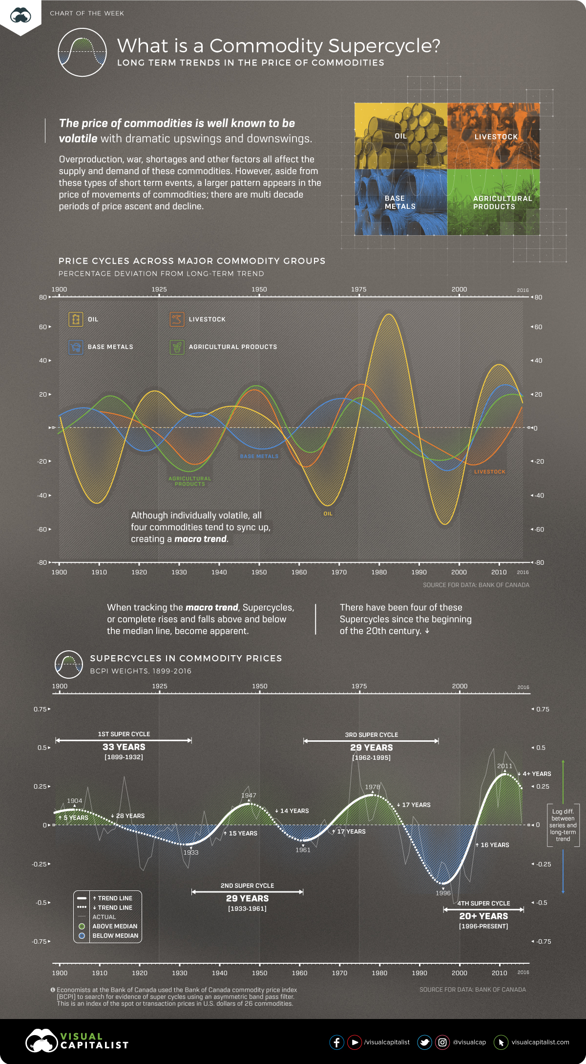
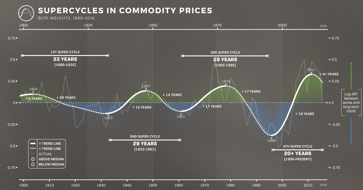
While individual commodity groups have their own price patterns, when charted together they form extended periods of price trends known as “Commodity Super Cycles” where there is a recognizable pattern across major commodity groups.
How can a Commodity Super Cycle be Identified?
Commodity super cycles are different from immediate supply disruptions; high or low prices persist over time.
In our above chart, we used data from the Bank of Canada, who leveraged a statistical technique called an asymmetric band pass filter. This is a calculation that can identify the patterns or frequencies of events in sets of data.
Economists at the Bank of Canada employed this technique using their Commodity Price Index (BCPI) to search for evidence of super cycles. This is an index of the spot or transaction prices in U.S. dollars of 26 commodities produced in Canada and sold to world markets.
- Energy: Coal, Oil, Natural Gas
- Metals and Minerals: Gold, Silver, Nickel, Copper, Aluminum, Zinc, Potash, Lead, Iron
- Forestry: Pulp, Lumber, Newsprint
- Agriculture: Potatoes, Cattle, Hogs, Wheat, Barley, Canola, Corn
- Fisheries: Finfish, Shellfish
Using the band pass filter and the BCPI data, the chart indicates that there are four distinct commodity price super cycles since 1899.
- 1899-1932:
The first cycle coincides with the industrialization of the United States in the late 19th century. - 1933-1961:
The second began with the onset of global rearmament before the Second World War in the 1930s. - 1962-1995:
The third began with the reindustrialization of Europe and Japan in the late 1950s and early 1960s. - 1996 – Present:
The fourth began in the mid to late 1990s with the rapid industrialization of China
What Causes Commodity Cycles?
The rapid industrialization and growth of a nation or region are the main drivers of these commodity super cycles.
From the rapid industrialization of America emerging as a world power at the beginning of the 20th century, to the ascent of China at the beginning of the 21st century, these historical periods of growth and industrialization drive new demand for commodities.
Because there is often a lag in supply coming online, prices have nowhere to go but above long-term trend lines. Then, prices cannot subside until supply is overshot, or growth slows down.
Is This the Beginning of a New Super Cycle?
The evidence suggests that human industrialization drives commodity prices into cycles. However, past growth was asymmetric around the world with different countries taking the lion’s share of commodities at different times.
With more and more parts of the world experiencing growth simultaneously, demand for commodities is not isolated to a few nations.
Confined to Earth, we could possibly be entering an era where commodities could perpetually be scarce and valuable, breaking the cycles and giving power to nations with the greatest access to resources.
Each commodity has its own story, but together, they show the arc of human development.


Energy
Mapped: The Age of Energy Projects in Interconnection Queues, by State
This map shows how many energy projects are in interconnection queues by state and how long these projects have been queued up, on average.
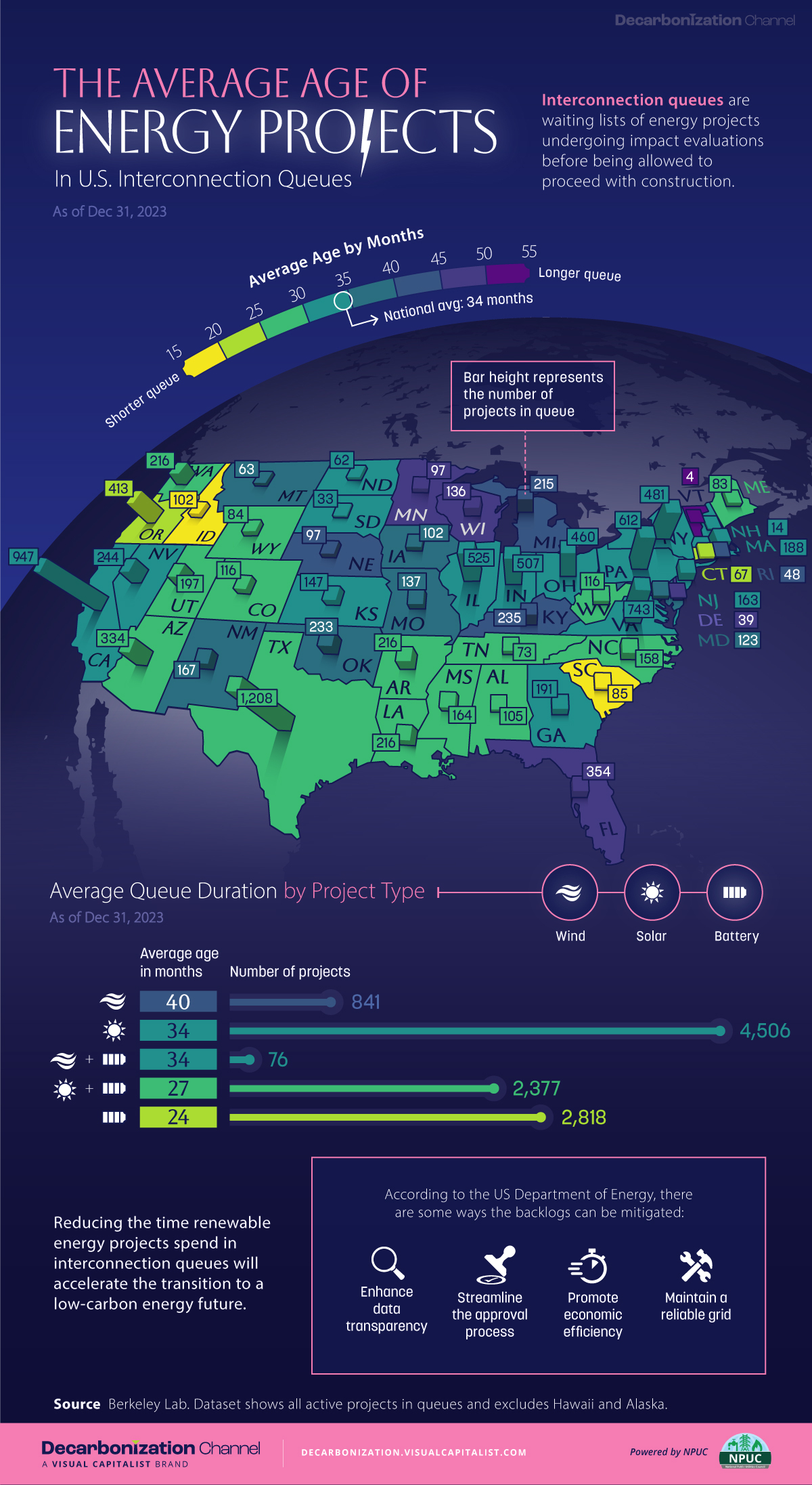
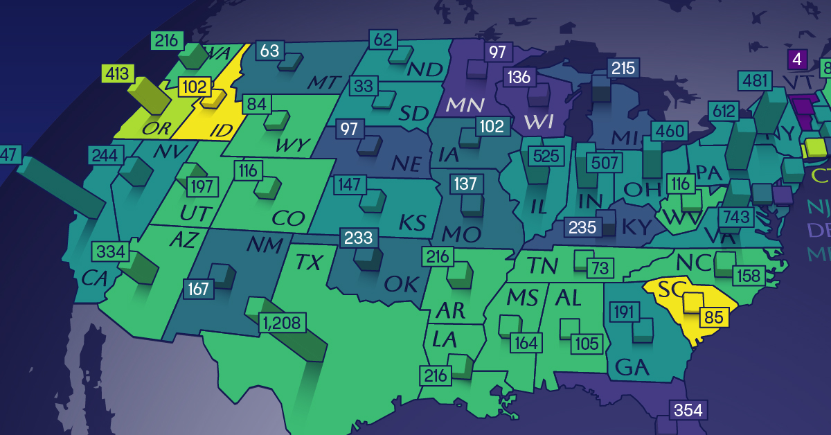
Age of Energy Projects in Interconnection Queues, by State
This was originally posted on our Voronoi app. Download the app for free on iOS or Android and discover incredible data-driven charts from a variety of trusted sources.
By the end of 2023, more than 11,000 energy projects were in interconnection queues in the United States, waiting for a green-light from regional grid operators to proceed with construction.
This map, created in partnership with the National Public Utilities Council, maps out the average age of active energy projects in interconnection queues by state, using data from Berkeley Lab.
Interconnection Queues, Explained
Interconnection queues are lists of energy projects that have made interconnection requests to their regional grid operators. Once submitted, these requests formally initiate the impact study process that each project goes through before grid connection, forming waiting lists for approval known as interconnection queues.
In recent years, both the number and generation capacity of queued projects have surged in the United States, along with the length of time spent in queue.
According to Berkeley Lab, the amount of generation capacity entering queues each year has risen by more than 550% from 2015 to 2023, with average queue duration rising from 3 years to 5 years the same period.
As a result of the growing backlog, a large proportion of projects ultimately withdraw from queues, leading to only 19% of applications reaching commercial operations.
The Backlog: Number of Projects and Average Wait Times
Of the 11,000 active projects in U.S. queues at the end of 2023, Texas, California, and Virginia had the most in queue; 1,208, 947, and 743, respectively.
When looking at the average ages of these projects, all three states hovered around the national average of 34 months (2.83 years), with Texas sporting 28 months, California 33, and Virginia 34.
Vermont, Minnesota, Wisconsin, and Florida, on the other hand, had the highest average queue durations; 54, 49, 47, and 46 months, respectively.
Average Queue Duration by Project Type
At the end of 2023, more than 95% of the generation capacity in active interconnection queues was for emission-free resources. The table below provides a breakdown.
| Project Type | Average Queue Duration (As of 12/31/2023) | Number of Projects in Queue |
|---|---|---|
| Wind | 40 months | 841 |
| Solar | 34 months | 4,506 |
| Wind+Battery | 34 months | 76 |
| Solar+Battery | 27 months | 2,377 |
| Battery | 24 months | 2,818 |
Wind projects had the highest wait times at the end of 2023 with an average age of 40 months (3.33 years). Solar projects, on the other hand, made up more than 40% of projects in queue.
Overall, reducing the time that these renewable energy projects spend in queues can accelerate the transition to a low-carbon energy future.
According to the U.S. Department of Energy, enhancing data transparency, streamlining approval processes, promoting economic efficiency, and maintaining a reliable grid are some of the ways this growing backlog can be mitigated.

-

 Technology7 days ago
All of the Grants Given by the U.S. CHIPS Act
-

 Misc2 weeks ago
How Hard Is It to Get Into an Ivy League School?
-

 Debt2 weeks ago
How Debt-to-GDP Ratios Have Changed Since 2000
-

 Sports2 weeks ago
The Highest Earning Athletes in Seven Professional Sports
-

 Science2 weeks ago
Visualizing the Average Lifespans of Mammals
-

 Brands1 week ago
How Tech Logos Have Evolved Over Time
-

 Energy1 week ago
Ranked: The Top 10 EV Battery Manufacturers in 2023
-

 Demographics1 week ago
Countries With the Largest Happiness Gains Since 2010