Energy
Visualizing U.S. Energy Use in One Giant Chart
Visualizing U.S. Energy Use in One Giant Chart
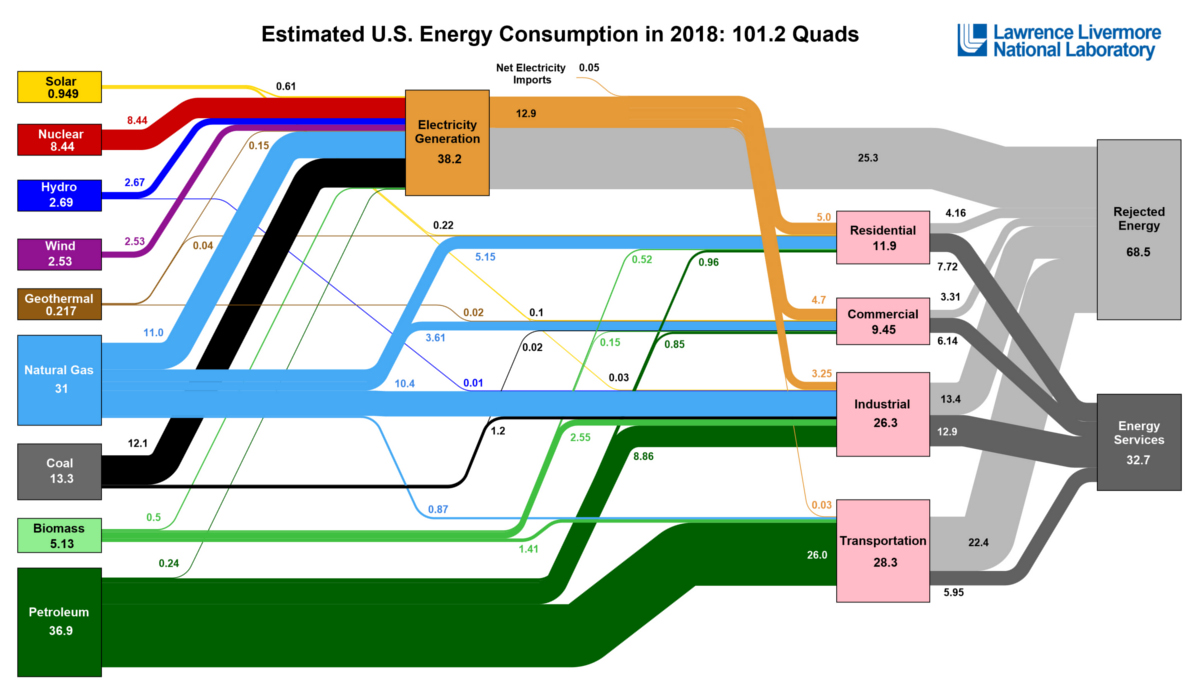
If you feel like you’ve seen this diagram before, you probably have.
Every year, it’s assembled by the Lawrence Livermore National Laboratory, a research center founded by UC Berkeley and funded primarily by the U.S. Department of Energy.
The ambitious aim is to chart all U.S. energy use in one Sankey diagram, including the original energy source (i.e. nuclear, oil, wind, etc.) as well as the ultimate end use (i.e. residential, commercial, etc.) for the energy that was generated.
U.S. Energy Use in 2018
According to the research center’s most recent published version of the diagram, U.S. energy use totaled 101.2 quads in 2018.
In case you are wondering, a single quad is equal to 1 quadrillion BTUs, with each quad being roughly equivalent to 185 million barrels of crude oil, 8 billion gallons of gasoline, or 1 trillion cubic feet of natural gas.
Here is how the recent figure compares to previous years:
| Year | U.S. Energy Consumption | % Fossil Fuels in Mix |
|---|---|---|
| 2018 | 101.2 quads | 80.2% |
| 2017 | 97.7 quads | 80.0% |
| 2016 | 97.3 quads | 80.8% |
| 2015 | 97.2 quads | 81.6% |
| 2014 | 98.3 quads | 81.6% |
As you can see in the table, U.S. energy use has been generally increasing, eventually topping 100 quads per year by 2018. During this time, the total percentage of fossil fuels in the mix has dropped, but only from 81.6% to 80.2%.
Taking a closer look at the data, we can see that the largest percentage increases in the mix have come from solar and wind sources:
| Source | 2014 | 2015 | 2016 | 2017 | 2018 | Change ('14-'18) |
|---|---|---|---|---|---|---|
| Solar | 0.427 | 0.426 | 0.587 | 0.775 | 0.949 | +122% |
| Wind | 1.73 | 1.78 | 2.11 | 2.35 | 2.53 | +46% |
Energy use measured in quads (1 quadrillion BTUs)
Solar use has increased 122% since 2014, while wind jumped 46% over the same timeframe. Not surprisingly, energy derived from coal has fallen by 26%.
Dealing With the Rejects
One interesting thing about the diagram is that it also shows rejected energy, which represents the energy that actually gets wasted due to various inefficiencies. In fact, 68% of all energy generated is not harnessed for any productive use.
This makes sense, since gasoline engines are usually only about 20-40% efficient, and even electric engines are 85-90% efficient. Put another way, a certain percentage of energy is always released as heat, sound, light, or other forms that are hard for us to harness.
As electric cars rise in popularity and as modern gas-powered engines also get more efficient, there is hope that the amount of this rejected energy will decrease over time.


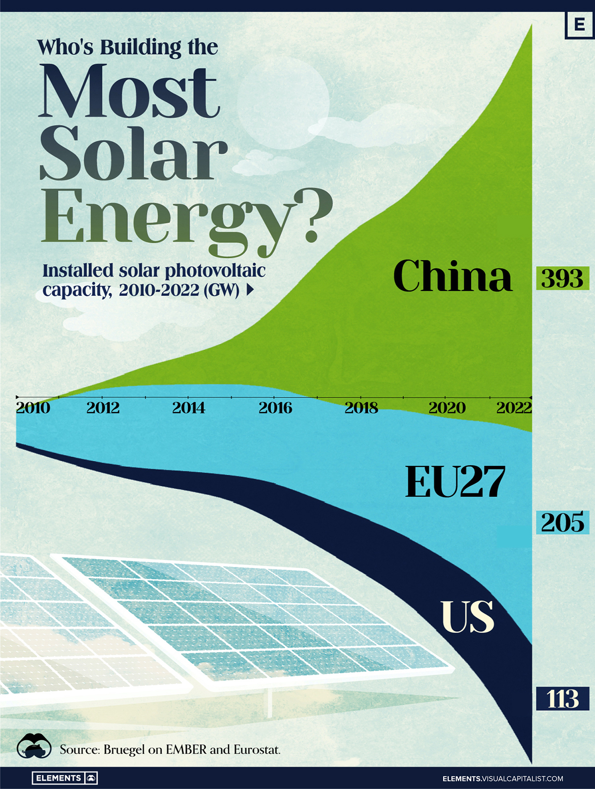
Who’s Building the Most Solar Energy?
This was originally posted on our Voronoi app. Download the app for free on iOS or Android and discover incredible data-driven charts from a variety of trusted sources.
In 2023, solar energy accounted for three-quarters of renewable capacity additions worldwide. Most of this growth occurred in Asia, the EU, and the U.S., continuing a trend observed over the past decade.
In this graphic, we illustrate the rise in installed solar photovoltaic (PV) capacity in China, the EU, and the U.S. between 2010 and 2022, measured in gigawatts (GW). Bruegel compiled the data..
Chinese Dominance
As of 2022, China’s total installed capacity stands at 393 GW, nearly double that of the EU’s 205 GW and surpassing the USA’s total of 113 GW by more than threefold in absolute terms.
| Installed solar capacity (GW) | China | EU27 | U.S. |
|---|---|---|---|
| 2022 | 393.0 | 205.5 | 113.0 |
| 2021 | 307.0 | 162.7 | 95.4 |
| 2020 | 254.0 | 136.9 | 76.4 |
| 2019 | 205.0 | 120.1 | 61.6 |
| 2018 | 175.3 | 104.0 | 52.0 |
| 2017 | 130.8 | 96.2 | 43.8 |
| 2016 | 77.8 | 91.5 | 35.4 |
| 2015 | 43.6 | 87.7 | 24.2 |
| 2014 | 28.4 | 83.6 | 18.1 |
| 2013 | 17.8 | 79.7 | 13.3 |
| 2012 | 6.7 | 71.1 | 8.6 |
| 2011 | 3.1 | 53.3 | 5.6 |
| 2010 | 1.0 | 30.6 | 3.4 |
Since 2017, China has shown a compound annual growth rate (CAGR) of approximately 25% in installed PV capacity, while the USA has seen a CAGR of 21%, and the EU of 16%.
Additionally, China dominates the production of solar power components, currently controlling around 80% of the world’s solar panel supply chain.
In 2022, China’s solar industry employed 2.76 million individuals, with manufacturing roles representing approximately 1.8 million and the remaining 918,000 jobs in construction, installation, and operations and maintenance.
The EU industry employed 648,000 individuals, while the U.S. reached 264,000 jobs.
According to the IEA, China accounts for almost 60% of new renewable capacity expected to become operational globally by 2028.
Despite the phasing out of national subsidies in 2020 and 2021, deployment of solar PV in China is accelerating. The country is expected to reach its national 2030 target for wind and solar PV installations in 2024, six years ahead of schedule.

-

 Economy6 days ago
The Most Valuable Companies in Major EU Economies
-

 Wealth2 weeks ago
Charted: Which City Has the Most Billionaires in 2024?
-

 Technology2 weeks ago
All of the Grants Given by the U.S. CHIPS Act
-

 Green2 weeks ago
The Carbon Footprint of Major Travel Methods
-

 United States1 week ago
Visualizing the Most Common Pets in the U.S.
-

 Culture1 week ago
The World’s Top Media Franchises by All-Time Revenue
-

 voronoi1 week ago
Best Visualizations of April on the Voronoi App
-

 Wealth1 week ago
Charted: Which Country Has the Most Billionaires in 2024?