Misc
U.S. Interstate Highways, as a Transit Map
View the full-sized version of this infographic
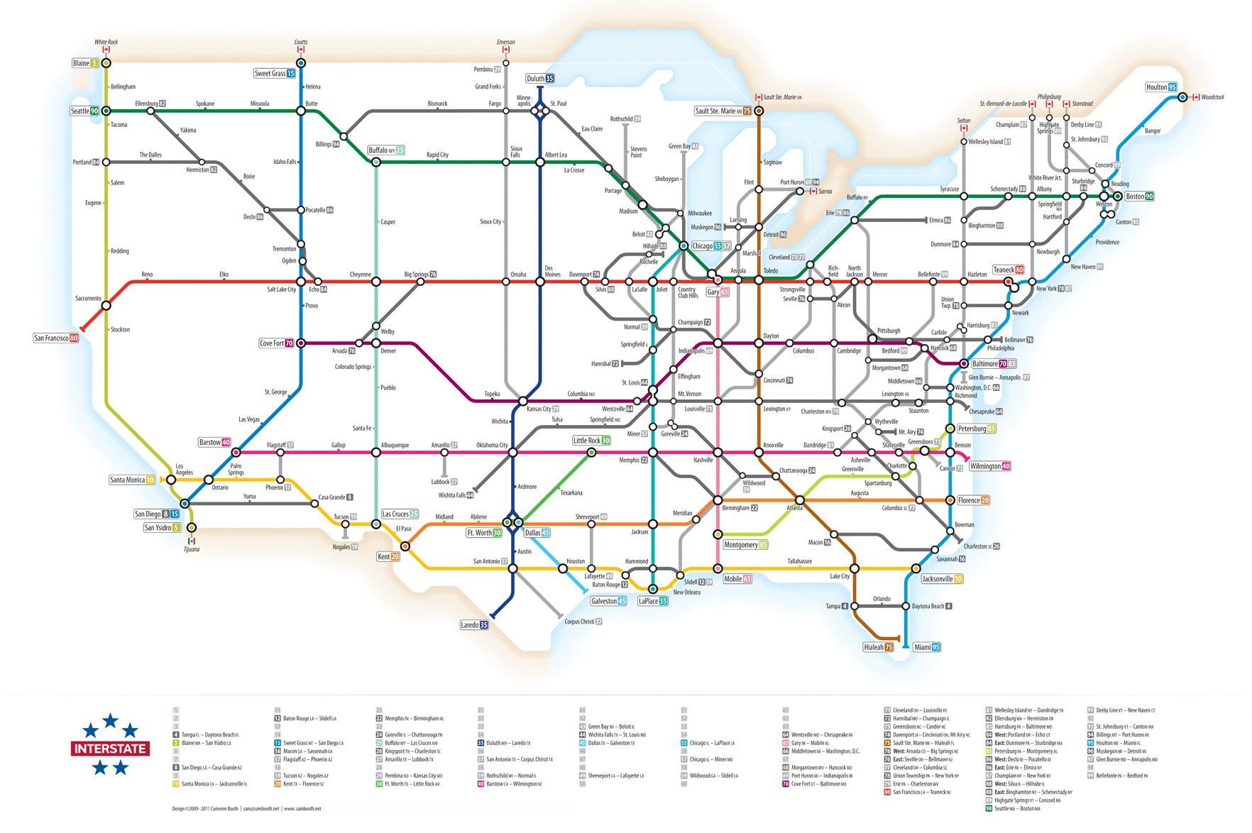
U.S. Interstate Highways, as a Transit Map
View the high-resolution infographic to see the most legible version.
Transit style maps are sort of a “rite of passage” for any upstart information designer.
People tend to be obsessed with them, and for good reason. What the maps lack in attention to fine details, they make up in their sheer ease of use, organization, and ability to reduce complex geography to simple, elegant shapes. They show the big picture in way that’s easy to follow, even for seemingly unrelated topics like the extensive road network of the Roman Empire.
Today’s infographic fits in with this theme, coming from designer Cameron Booth. Showcasing the network of Interstate Highways in the United States, it puts the transit map style to good use.
Note: The design shown is from about five years ago, but here’s an updated 2017 version in poster form.
The Interstate Highway System
You may know the network of roads simply as “the Interstate”, but it actually has a much longer and official sounding title: The Dwight D. Eisenhower National System of Interstate and Defense Highways. That’s because it was championed by President Eisenhower in the 1950s during his first term in office, after he saw the logistical effectiveness of the new Reichsautobahn in Germany.
Here are some facts about the Interstate Highway System that you may not know:
- Part of the justification of building the system was to have a means to evacuate citizens from major cities during nuclear attacks.
- The system was designed so that in an evacuation situation, traffic could be directed to move in all lanes in one direction.
- In today’s dollars, the cost of construction was approximately $526 billion.
- Activists got frustrated with the construction, and stopped highways in New York, Baltimore, Washington D.C., and New Orleans. As a result, some urban routes ended up as “roads to nowhere”.
- In a mile of highway, there are about 3 million tons of concrete. In comparison there are 6.6 million tons of concrete in the Hoover Dam.
- Roughly 374,000 vehicles travel on the I-405 in Los Angeles every day – no wonder it’s the city with the most traffic in the world.
Today, there are now approximately 47,856 miles (77,017 km) of highway in the system – about 6,000 miles (9,700 km) more than originally planned. Meanwhile, the Interstate Highway System accounts for one-quarter of all vehicle miles driven in the country.


VC+
VC+: Get Our Key Takeaways From the IMF’s World Economic Outlook
A sneak preview of the exclusive VC+ Special Dispatch—your shortcut to understanding IMF’s World Economic Outlook report.

Have you read IMF’s latest World Economic Outlook yet? At a daunting 202 pages, we don’t blame you if it’s still on your to-do list.
But don’t worry, you don’t need to read the whole April release, because we’ve already done the hard work for you.
To save you time and effort, the Visual Capitalist team has compiled a visual analysis of everything you need to know from the report—and our VC+ Special Dispatch is available exclusively to VC+ members. All you need to do is log into the VC+ Archive.
If you’re not already subscribed to VC+, make sure you sign up now to access the full analysis of the IMF report, and more (we release similar deep dives every week).
For now, here’s what VC+ members get to see.
Your Shortcut to Understanding IMF’s World Economic Outlook
With long and short-term growth prospects declining for many countries around the world, this Special Dispatch offers a visual analysis of the key figures and takeaways from the IMF’s report including:
- The global decline in economic growth forecasts
- Real GDP growth and inflation forecasts for major nations in 2024
- When interest rate cuts will happen and interest rate forecasts
- How debt-to-GDP ratios have changed since 2000
- And much more!

Get the Full Breakdown in the Next VC+ Special Dispatch
VC+ members can access the full Special Dispatch by logging into the VC+ Archive, where you can also check out previous releases.
Make sure you join VC+ now to see exclusive charts and the full analysis of key takeaways from IMF’s World Economic Outlook.
Don’t miss out. Become a VC+ member today.
What You Get When You Become a VC+ Member
VC+ is Visual Capitalist’s premium subscription. As a member, you’ll get the following:
- Special Dispatches: Deep dive visual briefings on crucial reports and global trends
- Markets This Month: A snappy summary of the state of the markets and what to look out for
- The Trendline: Weekly curation of the best visualizations from across the globe
- Global Forecast Series: Our flagship annual report that covers everything you need to know related to the economy, markets, geopolitics, and the latest tech trends
- VC+ Archive: Hundreds of previously released VC+ briefings and reports that you’ve been missing out on, all in one dedicated hub
You can get all of the above, and more, by joining VC+ today.

-

 Energy1 week ago
The World’s Biggest Nuclear Energy Producers
-

 Money2 weeks ago
Which States Have the Highest Minimum Wage in America?
-

 Technology2 weeks ago
Ranked: Semiconductor Companies by Industry Revenue Share
-

 Markets2 weeks ago
Ranked: The World’s Top Flight Routes, by Revenue
-

 Demographics2 weeks ago
Population Projections: The World’s 6 Largest Countries in 2075
-

 Markets2 weeks ago
The Top 10 States by Real GDP Growth in 2023
-

 Demographics2 weeks ago
The Smallest Gender Wage Gaps in OECD Countries
-

 Economy2 weeks ago
Where U.S. Inflation Hit the Hardest in March 2024