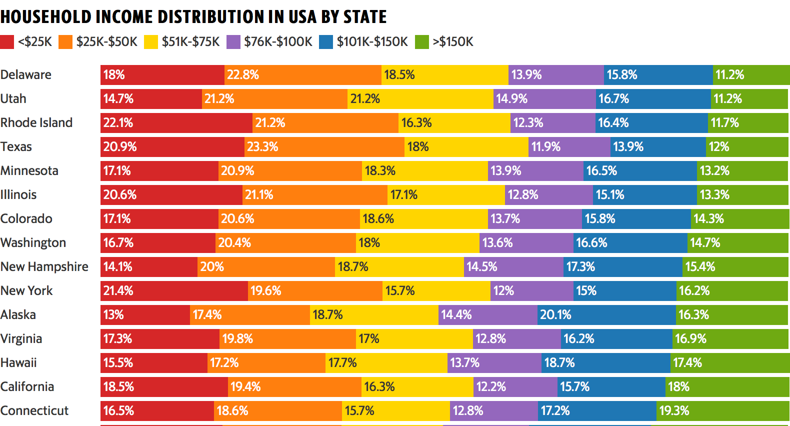
This colorful data visualization breaks down the household income of each U.S. state into six income brackets.
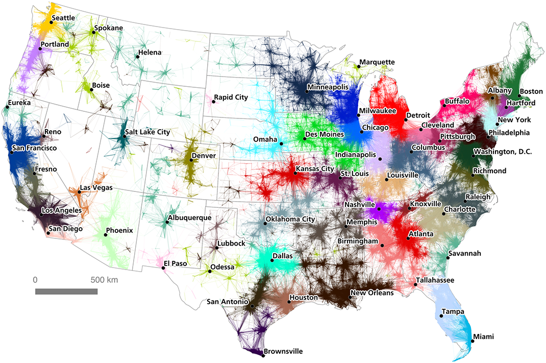
A massive commuter dataset and algorithmic approach have created a unique, new map of America's megaregions.
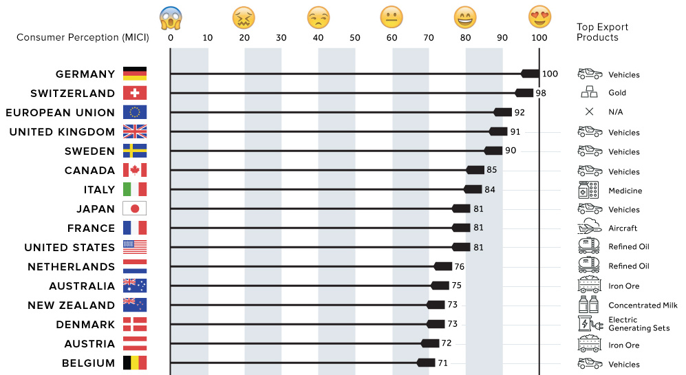
Which countries have the best reputations for the goods they produce? We look at survey results of 43,000 consumers on products with a country of origin.
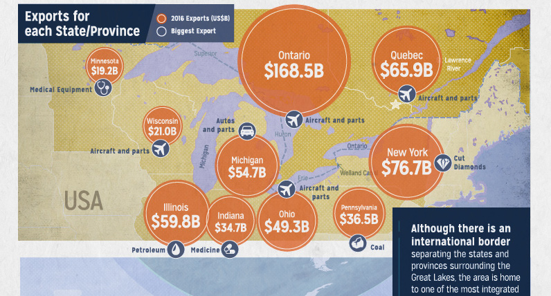
Despite having an international border, the Great Lakes area is tightly integrated - a necessity to compete in the competitive and borderless global economy.
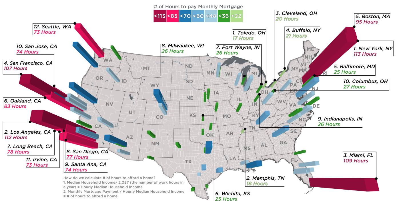
Every month, the average New Yorker needs 113.5 hours of work to pay down a mortgage, while in Memphis it's just 18.4 hours.
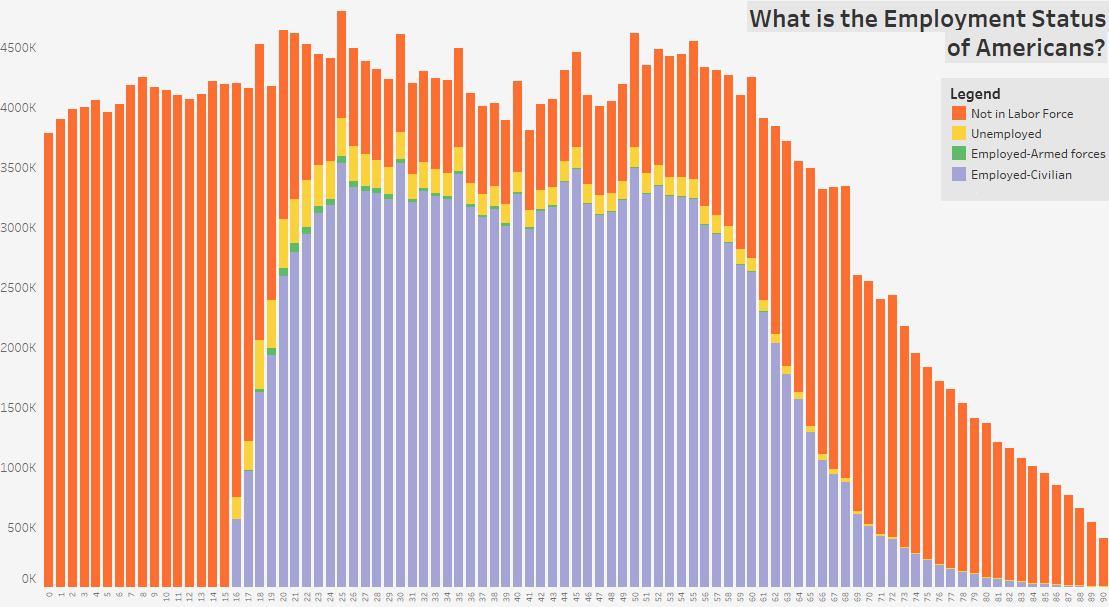
These three charts show the age distribution of the U.S. population, further broken down by employment status, education, and marital status.

See the routes of U.S. Interstate Highways plotted in an intuitive and elegant fashion, in this transit-styled map.
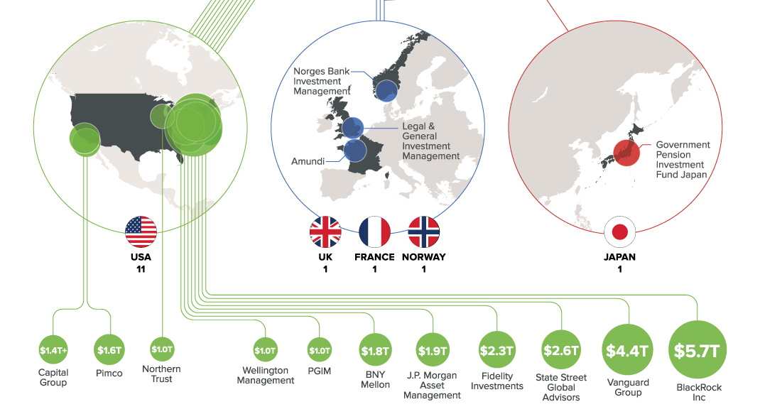
Only 15 companies hold more than $1 trillion in assets under management (AUM) - and the vast majority of them are based in the U.S.
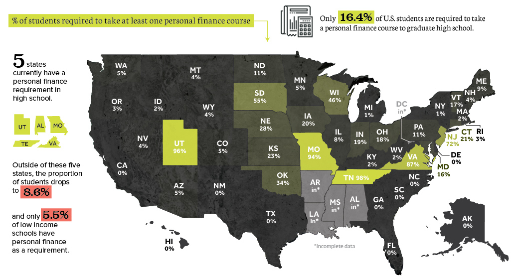
A new study finds that very few U.S. students have guaranteed access to a personal finance course in high school - raising concerns about financial literacy.
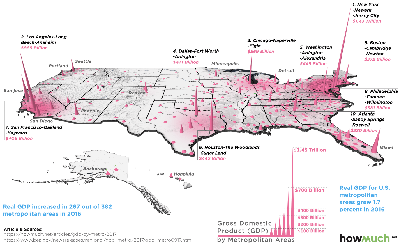
Which cities have the highest economic production in the country? This 3d map highlights GDP by metro area based on recent data.


