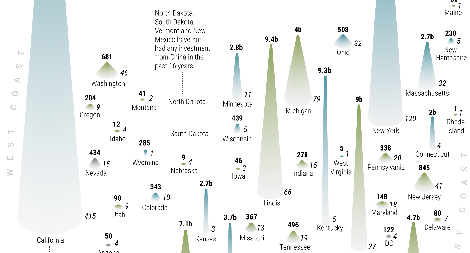
China has invested over $1 trillion overseas in the last decade, with the U.S. being the top destination. See the states and industries that cashed in.
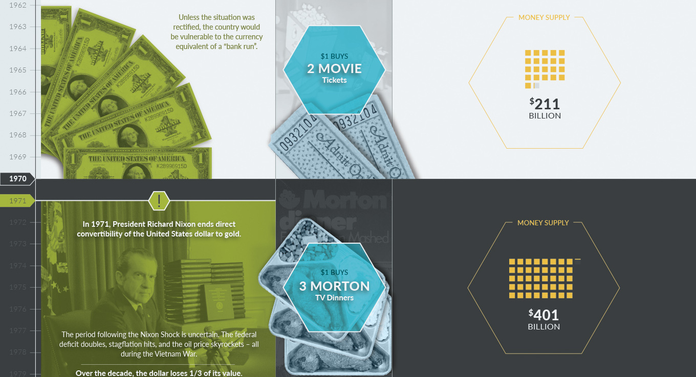
A timeline of U.S. monetary history shows the major events, the changing money supply, and the falling buying power of the U.S. dollar over time.
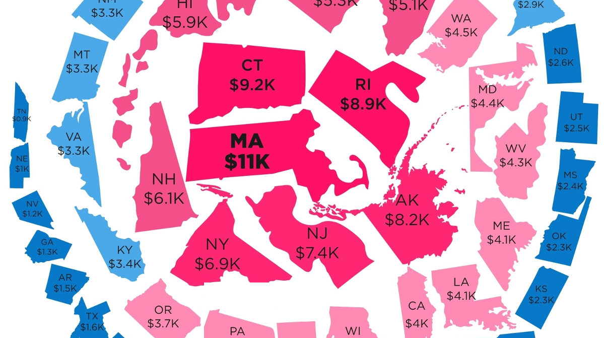
In addition to federal debt, states and municipalities also incur debt on your behalf. Here are the states with the most and least state debt per...
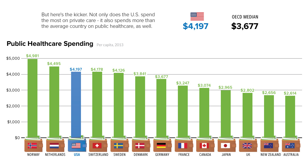
Even with a healthcare system that leans heavily on the private sector, the U.S. government actually spends more money on public healthcare than most countries.
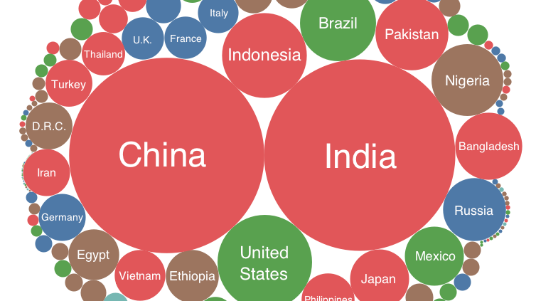
Every country is represented in this deceptively simple visualization. We then show all U.S. counties using a similar method, which might make you feel small!
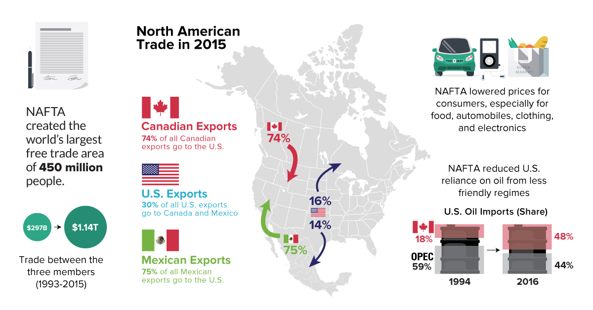
Everything you need to know about NAFTA, including a comparison of economic numbers before and since the agreement was signed in 1994.
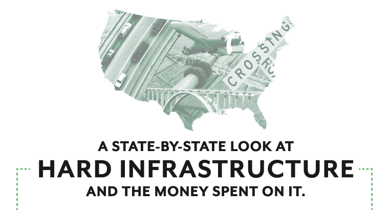
The American Society of Civil Engineers says that if the growing infrastructure gap is not closed, it will create a $4 trillion drag on U.S. GDP...
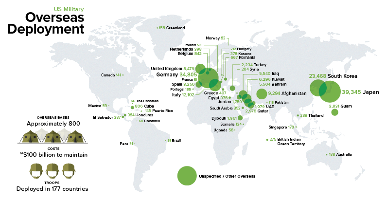
The U.S. spends more on defense than the next 7 countries combined. Part of that money goes to supporting 200,000 troops abroad in 177 countries.
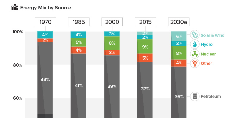
See how America's energy mix has evolved from 1970 until today, as well as a projection for the energy sources to be used in the year...
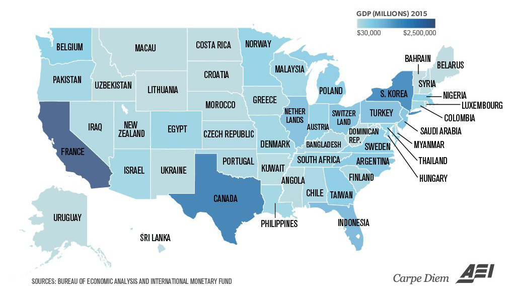
Texas is the size of Canada, and California is similar to France. Even tiny Vermont is comparable to a country's GDP (Bahrain).


