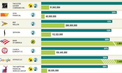

Which U.S. companies use the most green energy as a percentage of total energy used? Here are the 50 highest ranked companies according to the EPA.
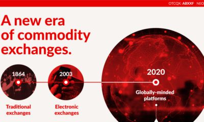

This infographic explores the evolution of commodity trading and exchanges as the world transitions to clean energy.
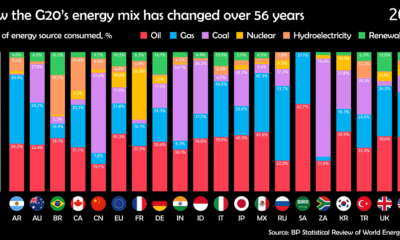

Watch how the energy mix of G20 countries has evolved over the last 50+ years.
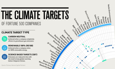

A growing number of companies are taking climate action, but when will they meet their goals? This timeline provides a holistic overview.
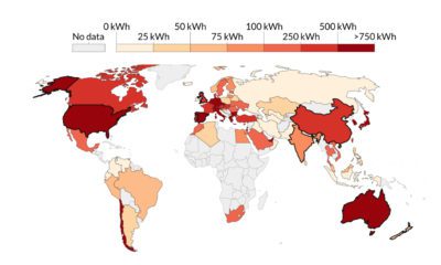

This visualization highlights the growth in solar energy consumption per capita over 54 years. Which countries are leading the way?


Long known as a precious metal, silver in solar and EV technologies will redefine its role and importance to a greener economy.
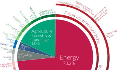

World emissions have reached almost 50 billion tonnes of greenhouse gases (GHGs) and counting. Which major sectors do they originate from?
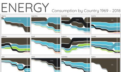

For the last 50 years, fossil fuels have dominated energy consumption. This chart looks at how the energy mix is changing in over 60+ countries.
Which countries are turning to nuclear energy, and which are turning away? Mapping and breaking down the world’s nuclear reactor landscape.
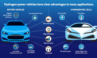

Here are six reasons why hydrogen and fuel cells can be a fit for helping with the transition to a lower-emission energy mix.


