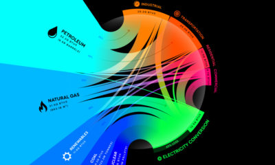

From renewables to fossil fuels, we've visualized the diverse mix of energy sources that powered U.S. energy consumption in 2020.
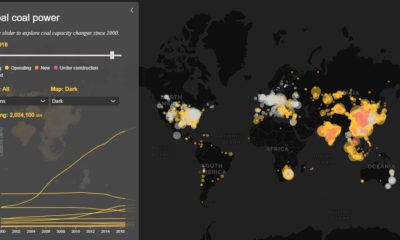

Today’s interactive map shows all of the world's coal power plants, plotted by capacity and carbon emissions from 2000 until 2018.
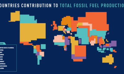

These four animated cartograms show the nations leading the world in fossil fuel production, in terms of oil, gas, coal, and total hydrocarbons.
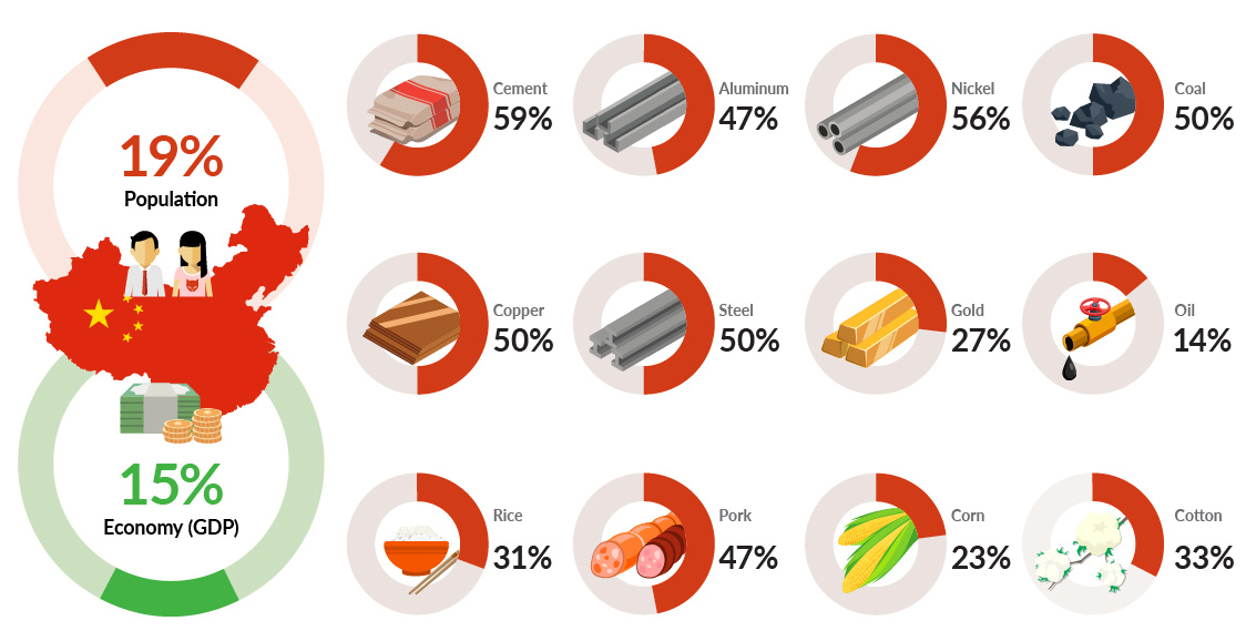
China uses more steel, cement, copper, nickel, and coal than the rest of the world combined. This chart shows China's incredible demand for commodities.
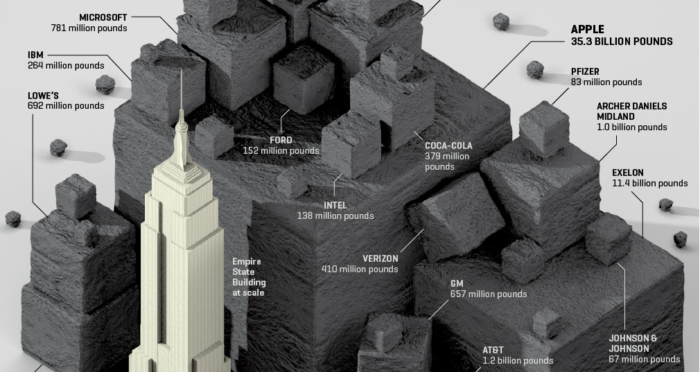
Visualizing the CO2 emissions saved by 56 of the Fortune 100 companies, expressed using the quantity of coal not burned.
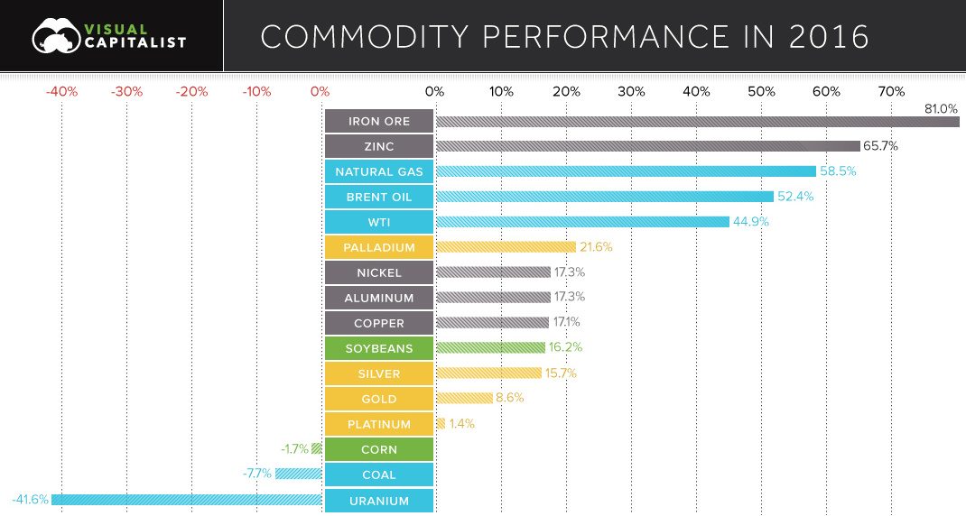
See the winning and losing commodities for 2016 in this chart.
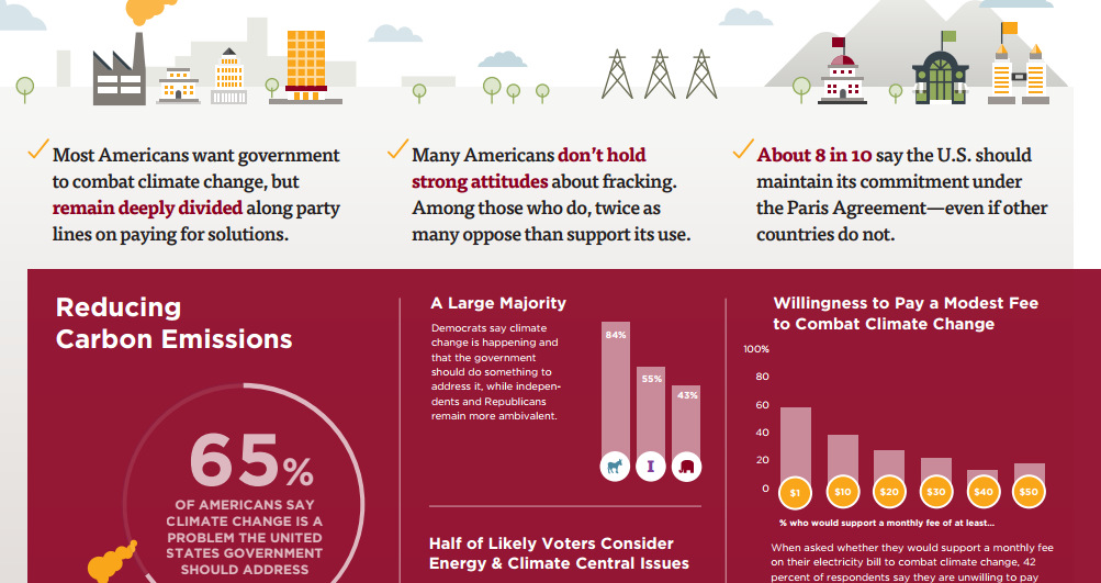
This survey of over 1,000 Americans tells you what people actually believe about fracking, coal, climate change, and other hot button energy issues in the U.S.
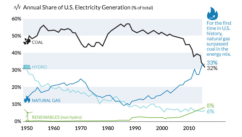
The decline of coal has been swift and unprecedented. We show in these three charts how it went from American energy hero to zero.
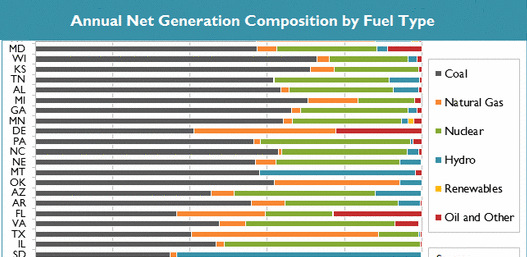
See in this .gif animation how much the U.S. electricity grid has evolved over the last two decades.
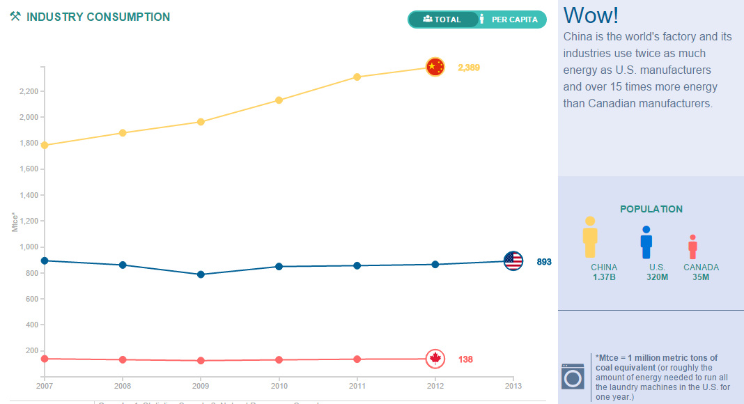
Compare the United States, China, and Canada side-by-side to see the differences in how these energy titans consume, produce, and import/export energy.


