Misc
Infection Trajectory: See Which Countries are Flattening Their COVID-19 Curve
NOTE: This chart updates daily with new data. Also, the search button in the lower–left corner allows filtering of specific countries.
At the outset of 2020, the world looked on as China grappled with an outbreak that seemed be spiraling out of control.
Two months later, the situation is markedly different. After aggressive testing and quarantine efforts, China’s outbreak of Novel Coronavirus (COVID-19) appears to be leveling off.
Now, numerous countries around the world are in the beginning stages of managing their own outbreaks. March 15th, 2020, marked a significant statistical milestone for this, as confirmed cases of COVID-19 outside of China surpassed the Chinese total.
The tracker above, by Our World in Data, charts the trajectory of the growing number of countries with more than 100 confirmed cases of COVID-19. As the number of new infections reported around the world continues to grow, which countries are winning the battle against COVID-19, and which are still struggling to slow the rate of infection?
What’s Your National Infection Trajectory?
As of publishing time, 39 countries have passed the threshold of 100 confirmed cases, with many more countries on the cusp. By comparing infection trajectories from the 100 case mark, we’re able to see a clearer picture of how quickly the virus is spreading within various countries.
A rapid “doubling rate” can spell big trouble, as even countries with advanced healthcare systems can become overwhelmed by the sheer number of cases. This was the case in the Lombardy region of Italy, where hospitals were overloaded and an increasing number of medical staff are under quarantine after testing positive for the virus. Nearly 10% of COVID-19 patients in Lombardy required intensive care, which stretched resources to their breaking point.
Other countries are looking to avoid this situation by “flattening the curve” of the pandemic. In other words, preventing and delaying the spread of the virus so that large portions of the population aren’t sick at the same time.
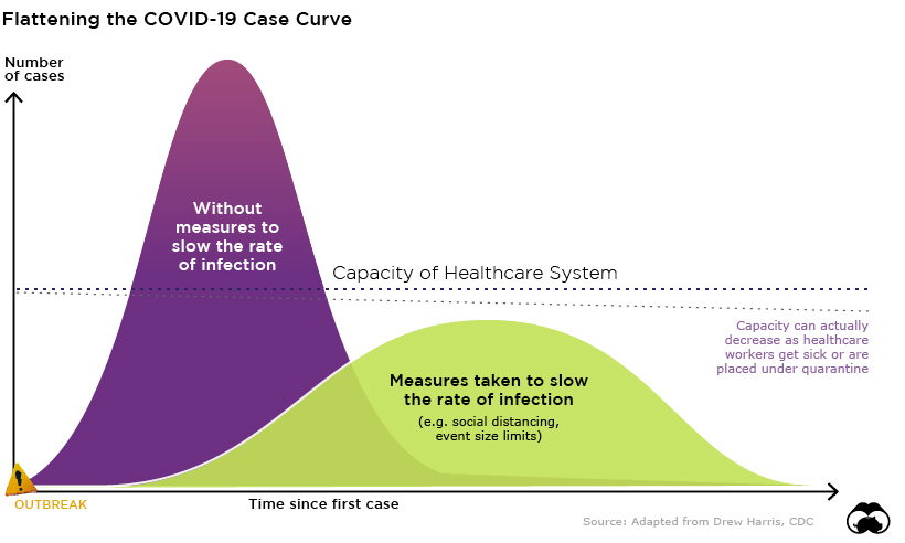
Original concept by Drew Harris
Everything’s Canceled
While all the countries on this tracker are united behind a common goal – stamping out COVID-19 as soon as possible – each country has its own approach and unique challenges when it comes to keeping their population safe. Of course, countries that are just beginning to experience exponential growth in case numbers have the benefit of learning from mistakes made elsewhere, and adopting ideas that are proving successful at slowing the rate of infection.
Many jurisdictions are implementing some or all of these measures to help flatten the curve:
- Quarantining
- Encouraging social distancing
- Encouraging working from home
- Closing schools and other institutions
- Placing hard limits on the size of crowds at events
The following chart explains why this last measure is critical to limiting the spread of the virus.
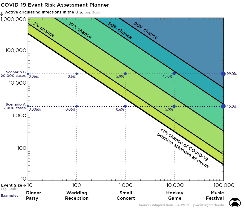
View the interactive Event Risk Assessment Tool here.
In scenario B above, which assumes just 20,000 active cases of COVID-19 in the U.S., there’s nearly a 50% chance an infected person will be attending a 10,000 person conference or sporting event. This is precisely the reason why temporary limits on crowd size are popping up in many jurisdictions around the world.
Direct losses due to canceled tech conferences alone, such as SXSW and the Electronic Entertainment Expo, have already surpassed the $1 billion mark, but despite the short-term economic pain of cancellations and decreased entertainment spending, the costs of business-as-usual could be incalculable.


Demographics
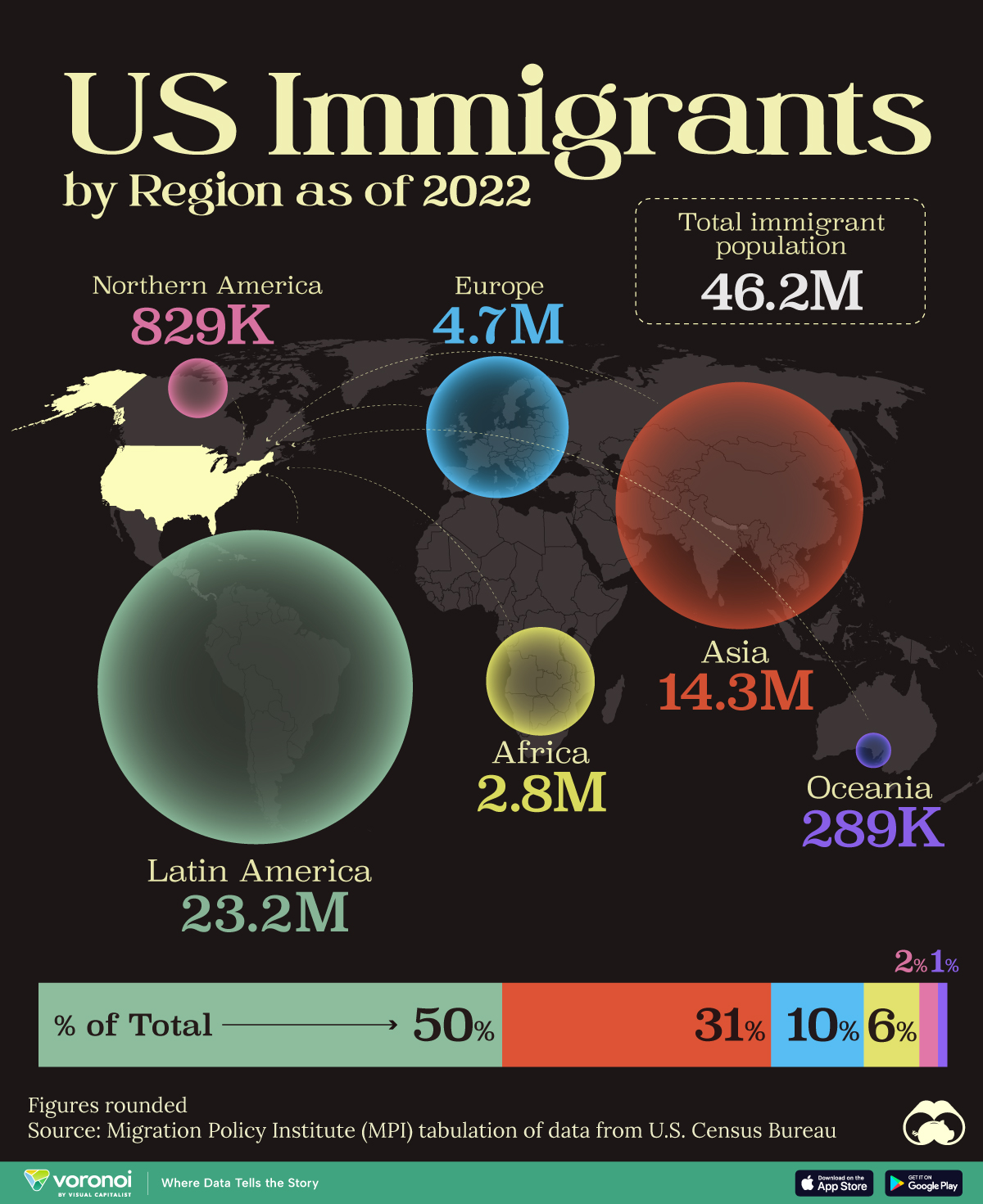
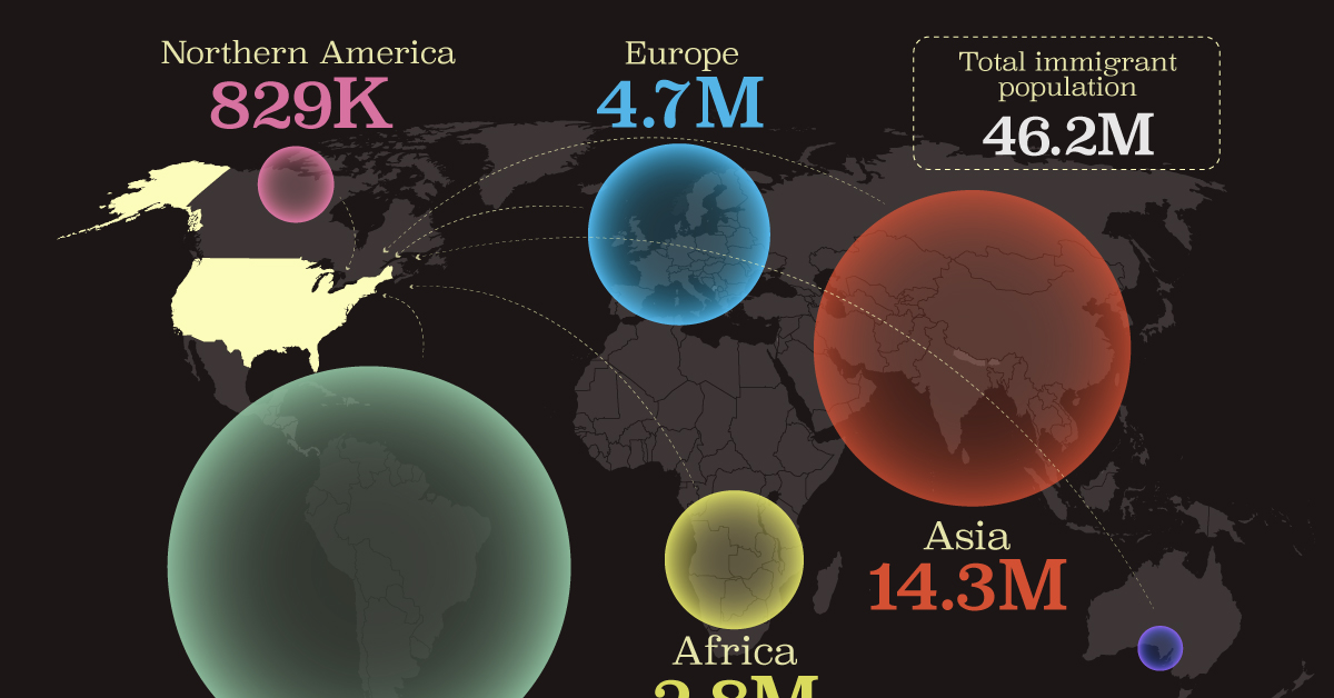
Mapped: U.S. Immigrants by Region
This map shows which regions U.S. immigrants came from, highlighting Asia and Latin America as the biggest sources.
Breaking Down America’s Immigrant Population
This was originally posted on our Voronoi app. Download the app for free on iOS or Android and discover incredible data-driven charts from a variety of trusted sources.
The United States is home to more immigrants than any other nation, surpassing the combined totals of the next four countries: Germany, Saudi Arabia, Russia, and the United Kingdom.
To add context to this impressive fact, we’ve illustrated the regions from which U.S. immigrants originated. “Immigrants” in this context refers to individuals who are residing in the United States but were not U.S. citizens at birth.
These statistics were sourced from the Migration Policy Institute, which analyzed data from the U.S. Census Bureau’s 2022 American Community Survey (ACS).
U.S. Immigrants by Region
From this graphic, we can see that Asia and Latin America emerge as the primary sources of immigration, collectively accounting for 81% of America’s 46.2 million immigrants.
| Region | # of Immigrants | % of Total |
|---|---|---|
| Europe | 4,728,948 | 10 |
| Asia | 14,349,080 | 31 |
| Africa | 2,752,965 | 6 |
| Oceania | 288,560 | 1 |
| Northern America | 828,702 | 2 |
| Latin America | 23,233,834 | 50 |
| Total | 46,182,089 | 100 |
Latin America alone contributes half of the immigrant population. Mexico stands out as the largest contributor to U.S. immigration, with 10.7 million immigrants, attributable to its geographical proximity and historical ties.
Economic factors, including wage disparity and employment opportunities, drive many Mexicans to seek better prospects north of the border.
From Asia, the two largest country sources are China (2.2 million) and India (2.8 million).
Learn More About U.S. Immigration From Visual Capitalist
If you enjoyed this post, be sure to check out Why Do People Immigrate to the U.S.? This visualization shows the different reasons why immigrants chose to come to America in 2021.

-

 Healthcare4 days ago
What Causes Preventable Child Deaths?
-

 voronoi2 weeks ago
Best Visualizations of April on the Voronoi App
-

 Wealth2 weeks ago
Charted: Which Country Has the Most Billionaires in 2024?
-

 Markets1 week ago
The Top Private Equity Firms by Country
-

 Jobs1 week ago
The Best U.S. Companies to Work for According to LinkedIn
-

 Economy1 week ago
Ranked: The Top 20 Countries in Debt to China
-

 Politics1 week ago
Charted: Trust in Government Institutions by G7 Countries
-

 Energy1 week ago
Mapped: The Age of Energy Projects in Interconnection Queues, by State