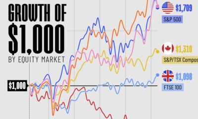
Markets
Visualizing the Global Share of U.S. Stock Markets


Visualizing the Global Share of U.S. Stock Markets
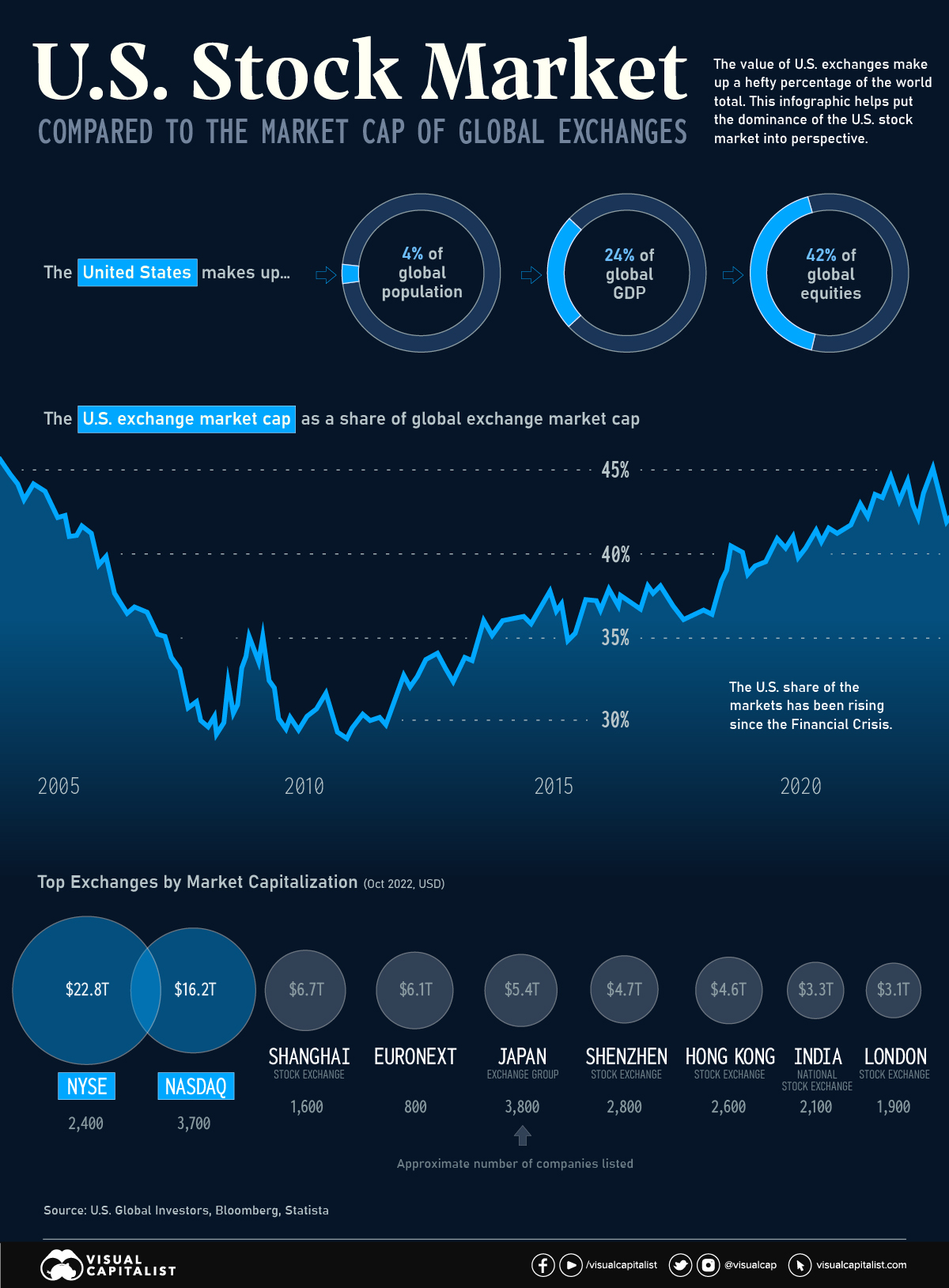
One of the most potent symbols of American financial dominance is the combined market capitalization of the country’s two biggest stock exchanges—the New York Stock Exchange (NYSE) and NASDAQ.
These two major listing hubs dwarf all other exchanges around the world. In fact, the NYSE on its own is larger than the Shanghai, Shenzhen, Japan, and Euronext exchanges put together.
| Rank | Exchange | Market Cap (Oct '22) | Location | Approx. # of companies |
|---|---|---|---|---|
| #1 | NYSE | $22.8T | United States 🇺🇸 | 2,400 |
| #2 | NASDAQ | $16.2T | United States 🇺🇸 | 3,700 |
| #3 | Shanghai Stock Exchange | $6.7T | China 🇨🇳 | 1,600 |
| #4 | EuroNext | $6.1T | Europe 🇪🇺 | 800 |
| #5 | Japan Exchange Group | $5.4T | Japan 🇯🇵 | 3,800 |
| #6 | Shenzhen Stock Exchange | $4.7T | China 🇨🇳 | 2,800 |
| #7 | Hong Kong Stock Exchange | $4.6T | Hong Kong SAR 🇭🇰 | 2,600 |
| #8 | National Stock Exchange of India | $3.3T | India 🇮🇳 | 2,100 |
| #9 | London Stock Exchange | $3.1T | UK 🇬🇧 | 1,900 |
| #10 | Toronto Stock Exchange | $2.7T | Canada 🇨🇦 | 1,500 |
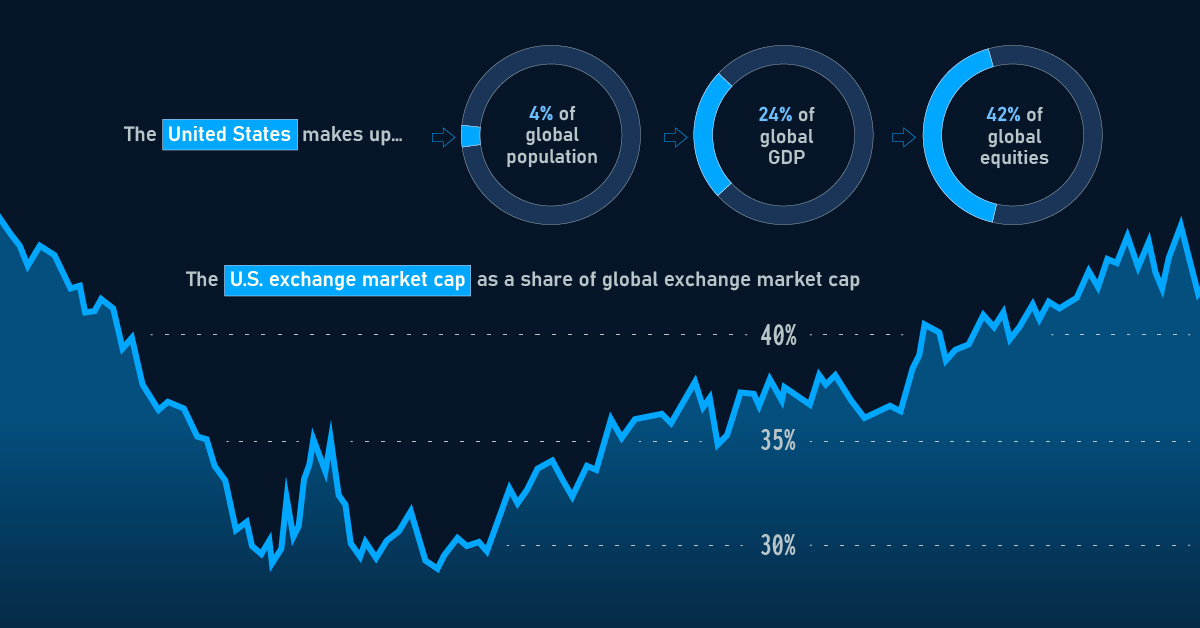
One of the key reasons for this dominance is the sheer size of the U.S. economy. With a GDP of over $25 trillion, the U.S. economy is the largest in the world, and American exchanges are home to some of the world’s largest and most valuable companies, including tech giants like Apple, Amazon, and Microsoft.
As of January 2023, the value of stocks listed on U.S. exchanges made up 42% of the global total. How does this total stack up, historically?
The U.S. Share Over Time
For much of the 1970s, the U.S. made up more than half of global stock market value. Over the course of the 1980s, the U.S. share of the global total began to dip, driven in part by the asset price bubble in Japan.
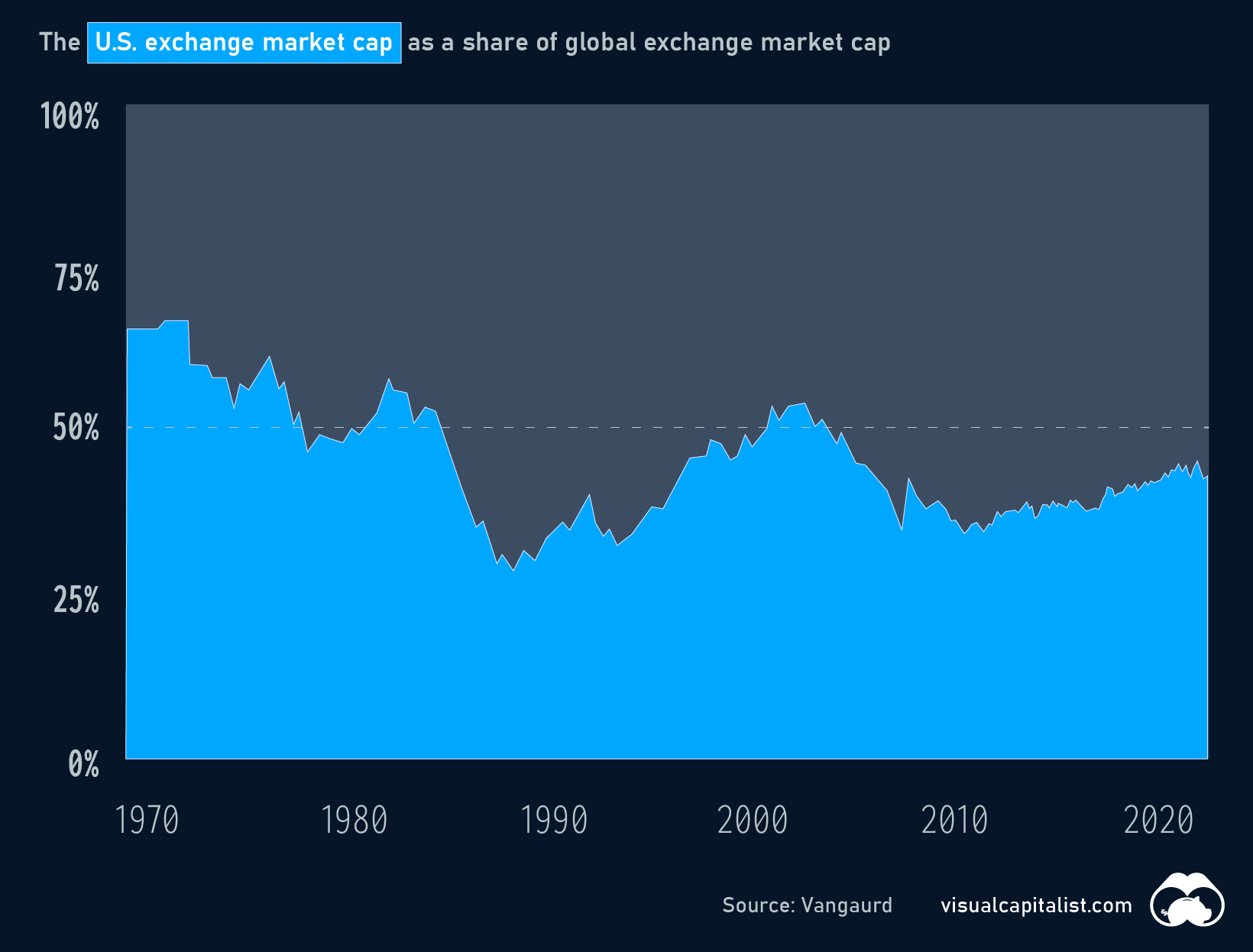
More recently, the U.S. slice of the equities pie bottomed out temporarily around the time of the Financial Crisis, but has been steadily rising ever since.
Will U.S. Exchanges Ever Be Surpassed?
U.S. stock exchanges have several advantages that make them attractive to investors, including strong regulatory oversight, a stable political and economic environment, and a diverse pool of well-known companies to invest in. The U.S. stock exchanges also have a long history of innovation and technological advancement, which has helped to maintain their position as leading global exchanges.
In 2018, PwC surveyed hundreds of capital market participants on the future of stock exchanges. Respondents felt that, by 2030, many of today’s top exchanges would remain popular choices for companies looking to go public.
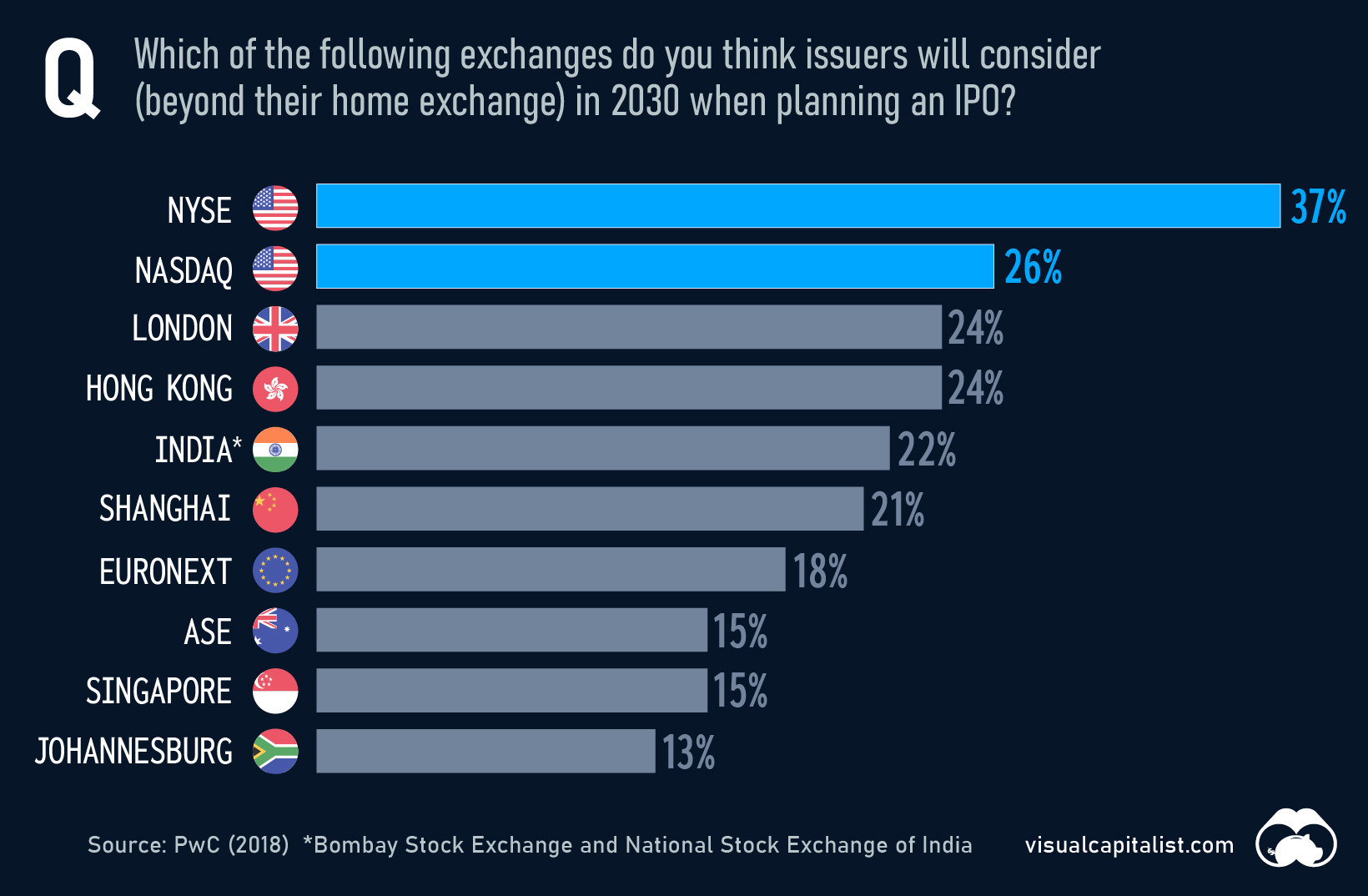
Despite obvious advantages, U.S. exchanges do face plenty of competition, especially in emerging markets like China and India. The Shanghai Stock Exchange, for example, has seen significant growth in recent years and is now the world’s third-largest exchange by market capitalization.
Even as other markets continue to grow, U.S. exchanges are likely to remain a preferred destination for investors around the world for years to come.


Markets
Mapped: Europe’s GDP Per Capita, by Country
Which European economies are richest on a GDP per capita basis? This map shows the results for 44 countries across the continent.
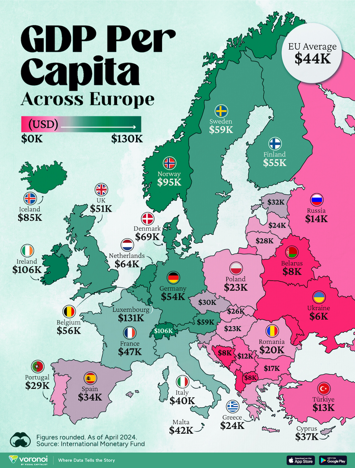
Mapped: Europe’s GDP Per Capita, by Country (2024)
This was originally posted on our Voronoi app. Download the app for free on iOS or Android and discover incredible data-driven charts from a variety of trusted sources.
Europe is home to some of the largest and most sophisticated economies in the world. But how do countries in the region compare with each other on a per capita productivity basis?
In this map, we show Europe’s GDP per capita levels across 44 nations in current U.S. dollars. Data for this visualization and article is sourced from the International Monetary Fund (IMF) via their DataMapper tool, updated April 2024.
Europe’s Richest and Poorest Nations, By GDP Per Capita
Luxembourg, Ireland, and Switzerland, lead the list of Europe’s richest nations by GDP per capita, all above $100,000.
| Rank | Country | GDP Per Capita (2024) |
|---|---|---|
| 1 | 🇱🇺 Luxembourg | $131,380 |
| 2 | 🇮🇪 Ireland | $106,060 |
| 3 | 🇨🇭 Switzerland | $105,670 |
| 4 | 🇳🇴 Norway | $94,660 |
| 5 | 🇮🇸 Iceland | $84,590 |
| 6 | 🇩🇰 Denmark | $68,900 |
| 7 | 🇳🇱 Netherlands | $63,750 |
| 8 | 🇸🇲 San Marino | $59,410 |
| 9 | 🇦🇹 Austria | $59,230 |
| 10 | 🇸🇪 Sweden | $58,530 |
| 11 | 🇧🇪 Belgium | $55,540 |
| 12 | 🇫🇮 Finland | $55,130 |
| 13 | 🇩🇪 Germany | $54,290 |
| 14 | 🇬🇧 UK | $51,070 |
| 15 | 🇫🇷 France | $47,360 |
| 16 | 🇦🇩 Andorra | $44,900 |
| 17 | 🇲🇹 Malta | $41,740 |
| 18 | 🇮🇹 Italy | $39,580 |
| 19 | 🇨🇾 Cyprus | $37,150 |
| 20 | 🇪🇸 Spain | $34,050 |
| 21 | 🇸🇮 Slovenia | $34,030 |
| 22 | 🇪🇪 Estonia | $31,850 |
| 23 | 🇨🇿 Czech Republic | $29,800 |
| 24 | 🇵🇹 Portugal | $28,970 |
| 25 | 🇱🇹 Lithuania | $28,410 |
| 26 | 🇸🇰 Slovakia | $25,930 |
| 27 | 🇱🇻 Latvia | $24,190 |
| 28 | 🇬🇷 Greece | $23,970 |
| 29 | 🇭🇺 Hungary | $23,320 |
| 30 | 🇵🇱 Poland | $23,010 |
| 31 | 🇭🇷 Croatia | $22,970 |
| 32 | 🇷🇴 Romania | $19,530 |
| 33 | 🇧🇬 Bulgaria | $16,940 |
| 34 | 🇷🇺 Russia | $14,390 |
| 35 | 🇹🇷 Türkiye | $12,760 |
| 36 | 🇲🇪 Montenegro | $12,650 |
| 37 | 🇷🇸 Serbia | $12,380 |
| 38 | 🇦🇱 Albania | $8,920 |
| 39 | 🇧🇦 Bosnia & Herzegovina | $8,420 |
| 40 | 🇲🇰 North Macedonia | $7,690 |
| 41 | 🇧🇾 Belarus | $7,560 |
| 42 | 🇲🇩 Moldova | $7,490 |
| 43 | 🇽🇰 Kosovo | $6,390 |
| 44 | 🇺🇦 Ukraine | $5,660 |
| N/A | 🇪🇺 EU Average | $44,200 |
Note: Figures are rounded.
Three Nordic countries (Norway, Iceland, Denmark) also place highly, between $70,000-90,000. Other Nordic peers, Sweden and Finland rank just outside the top 10, between $55,000-60,000.
Meanwhile, Europe’s biggest economies in absolute terms, Germany, UK, and France, rank closer to the middle of the top 20, with GDP per capitas around $50,000.
Finally, at the end of the scale, Eastern Europe as a whole tends to have much lower per capita GDPs. In that group, Ukraine ranks last, at $5,660.
A Closer Look at Ukraine
For a broader comparison, Ukraine’s per capita GDP is similar to Iran ($5,310), El Salvador ($5,540), and Guatemala ($5,680).
According to experts, Ukraine’s economy has historically underperformed to expectations. After the fall of the Berlin Wall, the economy contracted for five straight years. Its transition to a Western, liberalized economic structure was overshadowed by widespread corruption, a limited taxpool, and few revenue sources.
Politically, its transformation from authoritarian regime to civil democracy has proved difficult, especially when it comes to institution building.
Finally, after the 2022 invasion of the country, Ukraine’s GDP contracted by 30% in a single year—the largest loss since independence. Large scale emigration—to the tune of six million refugees—is also playing a role.
Despite these challenges, the country’s economic growth has somewhat stabilized while fighting continues.

-
 Energy5 days ago
Who’s Building the Most Solar Energy?
-

 Wealth2 weeks ago
Charted: Which Country Has the Most Billionaires in 2024?
-

 Business2 weeks ago
The Top Private Equity Firms by Country
-

 Markets2 weeks ago
The Best U.S. Companies to Work for According to LinkedIn
-

 Economy1 week ago
Ranked: The Top 20 Countries in Debt to China
-

 Politics1 week ago
Charted: Trust in Government Institutions by G7 Countries
-

 Energy1 week ago
Mapped: The Age of Energy Projects in Interconnection Queues, by State
-

 Mining1 week ago
Visualizing Global Gold Production in 2023