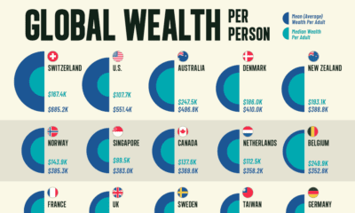
Demographics
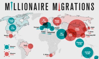
Mapping the Global Migration of Millionaires
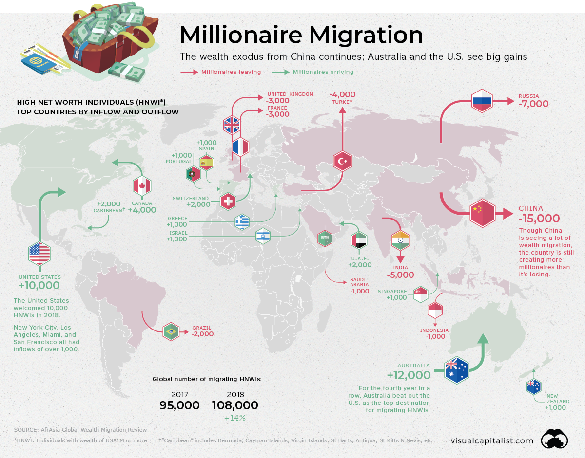
The world’s wealthiest people are also the most mobile.
High net worth individuals (HNWIs) – persons with wealth over US$1 million – may decide to pick up and move for a number of reasons. In some cases they are attracted by jurisdictions with more favorable tax laws, or less pollution and crime. Sometimes, they’re simply looking for a change of scenery.
Today’s graphic, using data from the annual Global Wealth Migration Review, maps the migration of the world’s millionaires, and clearly shows which countries are magnets for the world’s rich, and which countries are seeing a wealth exodus.
The Flight of the Millionaires
It’s no secret that China has been a wealth creation machine over the past two decades. Although the country is still making a number of its citizens very wealthy, over 15,000 Chinese HNWIs still chose to migrate to other countries in 2018 – the most significant migration of any country.
Here’s a look at the top countries by HNWI outflows:
| Country | Net Outflow of NHWIs (2018) | % of HNWIs lost |
|---|---|---|
| 🇨🇳 China | 15,000 | 2% |
| 🇷🇺 Russia | 7,000 | 6% |
| 🇮🇳 India | 5,000 | 2% |
| 🇹🇷 Turkey | 4,000 | 10% |
| 🇫🇷 France | 3,000 | 1% |
| 🇬🇧 United Kingdom | 3,000 | 0% |
| 🇧🇷 Brazil | 2,000 | 1% |
| 🇸🇦 Saudi Arabia | 1,000 | 2% |
| 🇮🇩 Indonesia | 1,000 | 2% |
Figures rounded to nearest 1000.
Unlike the middle class, wealthy citizens have the means to pick up and leave when things start to sideways in their home country. An uptick in HNWI migration from a country can often be a signal of negative economic or societal factors influencing a country.
This is the case in Turkey, which has been rocked by instability, mass protests, and an inflation rate estimated to be in the triple-digits by some sources.
For the third straight year, Turkey lost more than 4,000 millionaires. An estimated 10% of Turkey’s HNWIs fled in 2018, which is concerning because unlike China and India, the country is not producing new millionaires in any significant number.
Millionaire Magnets
Time-honored locations – such as Switzerland and the Cayman Islands – continue to attract the world’s wealthy, but no country is experiencing HNWI inflows quite like Australia.
The Land Down Under has a number of attributes that make it an attractive destination for migrating millionaires. The country has a robust economy, and is perceived as being a safe place to raise a family. Even better, Australia has no inheritance tax and a lower cost of health care, which can make it an attractive alternative to the U.S.
In 2018, Australia jumped ahead of both Canada and France to become the seventh largest wealth market in the world.
Here’s a look at HNWI inflows around the world:
| Country | Net Inflow of HNWIs (2018) | % of HNWI Gained |
|---|---|---|
| 🇦🇺 Australia | 12,000 | 3% |
| 🇺🇸 United States | 10,000 | 0% |
| 🇨🇦 Canada | 4,000 | 1% |
| 🇨🇭 Switzerland | 3,000 | 1% |
| 🇦🇪 United Arab Emerates | 2,000 | 2% |
| 🇧🇲 Caribbean* | 2,000 | 3% |
| 🇳🇿 New Zealand | 1,000 | 1% |
| 🇸🇬 Singapore | 1,000 | 0% |
| 🇮🇱 Israel | 1,000 | 1% |
| 🇵🇹 Portugal | 1,000 | 2% |
| 🇬🇷 Greece | 1,000 | 2% |
| 🇪🇸 Spain | 1,000 | 1% |
Figures rounded to nearest 1000. *Bermuda, Cayman Islands, Virgin Islands, St Barts, Antigua, St Kitts & Nevis, etc
Greece, which was one of the worst performing wealth markets of the last decade, is finally seeing a modest inflow of millionaires again.


Demographics
The Countries That Have Become Sadder Since 2010
Tracking Gallup survey data for more than a decade reveals some countries are witnessing big happiness declines, reflecting their shifting socio-economic conditions.


The Countries That Have Become Sadder Since 2010
This was originally posted on our Voronoi app. Download the app for free on iOS or Android and discover incredible data-driven charts from a variety of trusted sources.
Can happiness be quantified?
Some approaches that try to answer this question make a distinction between two differing components of happiness: a daily experience part, and a more general life evaluation (which includes how people think about their life as a whole).
The World Happiness Report—first launched in 2012—has been making a serious go at quantifying happiness, by examining Gallup poll data that asks respondents in nearly every country to evaluate their life on a 0–10 scale. From this they extrapolate a single “happiness score” out of 10 to compare how happy (or unhappy) countries are.
More than a decade later, the 2024 World Happiness Report continues the mission. Its latest findings also include how some countries have become sadder in the intervening years.
Which Countries Have Become Unhappier Since 2010?
Afghanistan is the unhappiest country in the world right now, and is also 60% unhappier than over a decade ago, indicating how much life has worsened since 2010.
In 2021, the Taliban officially returned to power in Afghanistan, after nearly two decades of American occupation in the country. The Islamic fundamentalist group has made life harder, especially for women, who are restricted from pursuing higher education, travel, and work.
On a broader scale, the Afghan economy has suffered post-Taliban takeover, with various consequent effects: mass unemployment, a drop in income, malnutrition, and a crumbling healthcare system.
| Rank | Country | Happiness Score Loss (2010–24) | 2024 Happiness Score (out of 10) |
|---|---|---|---|
| 1 | 🇦🇫 Afghanistan | -2.6 | 1.7 |
| 2 | 🇱🇧 Lebanon | -2.3 | 2.7 |
| 3 | 🇯🇴 Jordan | -1.5 | 4.2 |
| 4 | 🇻🇪 Venezuela | -1.3 | 5.6 |
| 5 | 🇲🇼 Malawi | -1.2 | 3.4 |
| 6 | 🇿🇲 Zambia | -1.2 | 3.5 |
| 7 | 🇧🇼 Botswana | -1.2 | 3.4 |
| 8 | 🇾🇪 Yemen | -1.0 | 3.6 |
| 9 | 🇪🇬 Egypt | -1.0 | 4.0 |
| 10 | 🇮🇳 India | -0.9 | 4.1 |
| 11 | 🇧🇩 Bangladesh | -0.9 | 3.9 |
| 12 | 🇨🇩 DRC | -0.7 | 3.3 |
| 13 | 🇹🇳 Tunisia | -0.7 | 4.4 |
| 14 | 🇨🇦 Canada | -0.6 | 6.9 |
| 15 | 🇺🇸 U.S. | -0.6 | 6.7 |
| 16 | 🇨🇴 Colombia | -0.5 | 5.7 |
| 17 | 🇵🇦 Panama | -0.5 | 6.4 |
| 18 | 🇵🇰 Pakistan | -0.5 | 4.7 |
| 19 | 🇿🇼 Zimbabwe | -0.5 | 3.3 |
| 20 | 🇮🇪 Ireland | -0.5 | 6.8 |
| N/A | 🌍 World | +0.1 | 5.5 |
Nine countries in total saw their happiness score drop by a full point or more, on the 0–10 scale.
Noticeably, many of them have seen years of social and economic upheaval. Lebanon, for example, has been grappling with decades of corruption, and a severe liquidity crisis since 2019 that has resulted in a banking system collapse, sending poverty levels skyrocketing.
In Jordan, unprecedented population growth—from refugees leaving Iraq and Syria—has aggravated unemployment rates. A somewhat abrupt change in the line of succession has also raised concerns about political stability in the country.

-

 Mining1 week ago
Gold vs. S&P 500: Which Has Grown More Over Five Years?
-

 Markets2 weeks ago
Ranked: The Most Valuable Housing Markets in America
-

 Money2 weeks ago
Which States Have the Highest Minimum Wage in America?
-

 AI2 weeks ago
Ranked: Semiconductor Companies by Industry Revenue Share
-

 Markets2 weeks ago
Ranked: The World’s Top Flight Routes, by Revenue
-

 Countries2 weeks ago
Population Projections: The World’s 6 Largest Countries in 2075
-

 Markets2 weeks ago
The Top 10 States by Real GDP Growth in 2023
-

 Demographics2 weeks ago
The Smallest Gender Wage Gaps in OECD Countries