Markets
Mapped: Distribution of Global GDP by Region
Mapped: The Distribution of Global GDP by Region
Gross domestic product (GDP) measures the value of goods and services that an economy produces in a given year, but in a global context, it is typically shown using country-level data.
As a result, we don’t often get to see the nuances of the global economy, such as how much specific regions and metro areas contribute to global GDP.
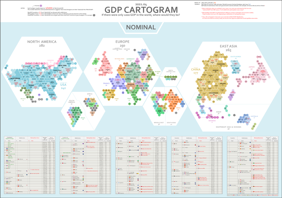
In these cartograms, global GDP has been normalized to a base number of 1,000 in order to show a more regional breakdown of economic activity. Created by Reddit user /BerryBlue_Blueberry, the two maps show the distribution in different ways: by nominal GDP and by GDP adjusted for purchasing power parity (PPP).
Methodology
Before diving in, let us give you some context on how these maps were designed. Each hexagon on the two maps represents 0.1% of the world’s overall GDP.
The number below each region, country or metropolitan area represents the number of hexagons covered by that entity. So in the nominal GDP map, the state of New York represents 20 hexagons (i.e. 2.0% of global GDP), while Munich’s metro area is 3 hexagons (0.3%).
Countries are further broken down based on size. Countries that make up more than 0.95% of global GDP are broken down into subdivisions, while countries that are smaller than 0.1% of GDP are grouped together. Metro areas that account for over 0.25% of global GDP are featured.
Finally, it should be noted that to account for some outdated subdivision participation data, the map creator calculated 2021 estimates for this using the formula: national GDP (2021) x % of subdivision participation (2017-2020).
Nominal vs. PPP
The above map is using nominal data, while the below map accounts for differences in purchasing power (PPP).
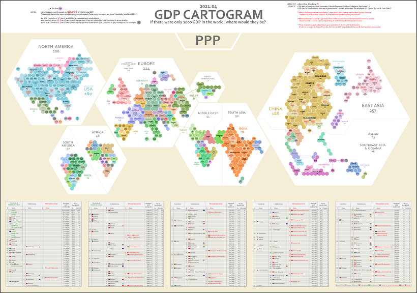
Adjusting for PPP takes into account the relative value of currencies and purchasing power in countries around the world. For example, $100 (or its exchange equivalent in Indian rupees) is generally going to be able to buy more in India than it is in the United States.
This is because goods and services are cheaper in India, meaning you can actually purchase more there for the same amount of money.
Anomalies in Global GDP Distribution
Breaking down global GDP distribution into cartograms highlights some interesting anomalies worth considering:
- North America, Europe, and East Asia, with a combined GDP of nearly $75 trillion, make up 80% of the world’s GDP in nominal terms.
- The U.S. State of California accounts for 3.7% of the world’s GDP by itself, which ranks higher than the United Kingdom’s total contribution of 3.3%.
- Canada as a country accounts for 2% of the world’s GDP, which is comparable to the GDP contribution of the Greater Tokyo Area at 2.2%.
- With a GDP of $3 trillion, India’s contribution overshadows the GDP of the whole African continent ($2.6 trillion).
- This visualization highlights the economic might of cities better than a conventional map. One standout example of this is in Ontario, Canada. The Greater Toronto Area completely eclipses the economy of the rest of the province.
Inequality of GDP Distribution
The fact that certain countries generate most of the world’s economic output is reflected in the above cartograms, which resize countries or regions accordingly.
Compared to wealthier nations, emerging economies still account for just a tiny sliver of the pie.
India, for example, accounts for 3.2% of global GDP in nominal terms, even though it contains 17.8% of the world’s population.
That’s why on the nominal map, India is about the same size as France, the United Kingdom, or Japan’s two largest metro areas (Tokyo and Osaka-Kobe)—but of course, these wealthier places have a far higher GDP per capita.


Markets
Mapped: Europe’s GDP Per Capita, by Country
Which European economies are richest on a GDP per capita basis? This map shows the results for 44 countries across the continent.
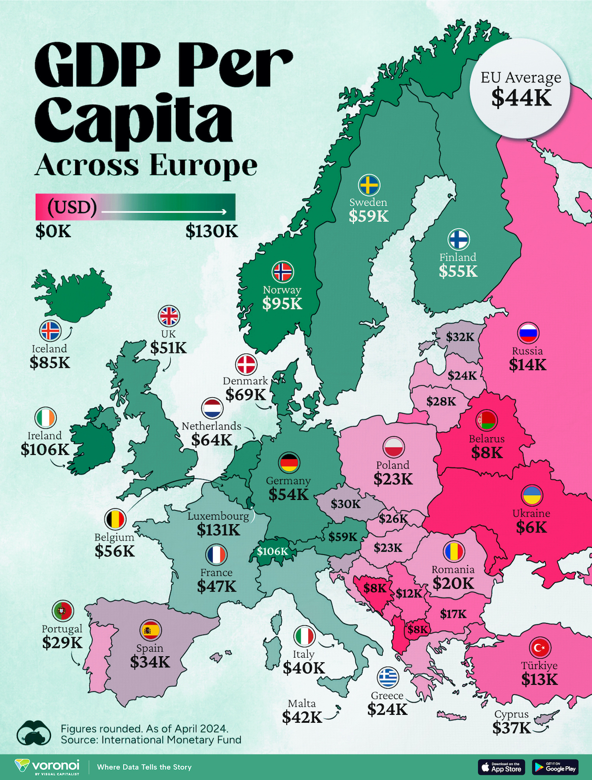
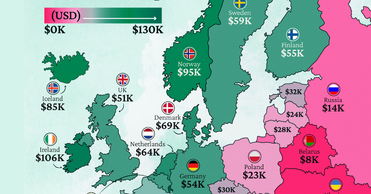
Mapped: Europe’s GDP Per Capita, by Country (2024)
This was originally posted on our Voronoi app. Download the app for free on iOS or Android and discover incredible data-driven charts from a variety of trusted sources.
Europe is home to some of the largest and most sophisticated economies in the world. But how do countries in the region compare with each other on a per capita productivity basis?
In this map, we show Europe’s GDP per capita levels across 44 nations in current U.S. dollars. Data for this visualization and article is sourced from the International Monetary Fund (IMF) via their DataMapper tool, updated April 2024.
Europe’s Richest and Poorest Nations, By GDP Per Capita
Luxembourg, Ireland, and Switzerland, lead the list of Europe’s richest nations by GDP per capita, all above $100,000.
| Rank | Country | GDP Per Capita (2024) |
|---|---|---|
| 1 | 🇱🇺 Luxembourg | $131,380 |
| 2 | 🇮🇪 Ireland | $106,060 |
| 3 | 🇨🇭 Switzerland | $105,670 |
| 4 | 🇳🇴 Norway | $94,660 |
| 5 | 🇮🇸 Iceland | $84,590 |
| 6 | 🇩🇰 Denmark | $68,900 |
| 7 | 🇳🇱 Netherlands | $63,750 |
| 8 | 🇸🇲 San Marino | $59,410 |
| 9 | 🇦🇹 Austria | $59,230 |
| 10 | 🇸🇪 Sweden | $58,530 |
| 11 | 🇧🇪 Belgium | $55,540 |
| 12 | 🇫🇮 Finland | $55,130 |
| 13 | 🇩🇪 Germany | $54,290 |
| 14 | 🇬🇧 UK | $51,070 |
| 15 | 🇫🇷 France | $47,360 |
| 16 | 🇦🇩 Andorra | $44,900 |
| 17 | 🇲🇹 Malta | $41,740 |
| 18 | 🇮🇹 Italy | $39,580 |
| 19 | 🇨🇾 Cyprus | $37,150 |
| 20 | 🇪🇸 Spain | $34,050 |
| 21 | 🇸🇮 Slovenia | $34,030 |
| 22 | 🇪🇪 Estonia | $31,850 |
| 23 | 🇨🇿 Czech Republic | $29,800 |
| 24 | 🇵🇹 Portugal | $28,970 |
| 25 | 🇱🇹 Lithuania | $28,410 |
| 26 | 🇸🇰 Slovakia | $25,930 |
| 27 | 🇱🇻 Latvia | $24,190 |
| 28 | 🇬🇷 Greece | $23,970 |
| 29 | 🇭🇺 Hungary | $23,320 |
| 30 | 🇵🇱 Poland | $23,010 |
| 31 | 🇭🇷 Croatia | $22,970 |
| 32 | 🇷🇴 Romania | $19,530 |
| 33 | 🇧🇬 Bulgaria | $16,940 |
| 34 | 🇷🇺 Russia | $14,390 |
| 35 | 🇹🇷 Türkiye | $12,760 |
| 36 | 🇲🇪 Montenegro | $12,650 |
| 37 | 🇷🇸 Serbia | $12,380 |
| 38 | 🇦🇱 Albania | $8,920 |
| 39 | 🇧🇦 Bosnia & Herzegovina | $8,420 |
| 40 | 🇲🇰 North Macedonia | $7,690 |
| 41 | 🇧🇾 Belarus | $7,560 |
| 42 | 🇲🇩 Moldova | $7,490 |
| 43 | 🇽🇰 Kosovo | $6,390 |
| 44 | 🇺🇦 Ukraine | $5,660 |
| N/A | 🇪🇺 EU Average | $44,200 |
Note: Figures are rounded.
Three Nordic countries (Norway, Iceland, Denmark) also place highly, between $70,000-90,000. Other Nordic peers, Sweden and Finland rank just outside the top 10, between $55,000-60,000.
Meanwhile, Europe’s biggest economies in absolute terms, Germany, UK, and France, rank closer to the middle of the top 20, with GDP per capitas around $50,000.
Finally, at the end of the scale, Eastern Europe as a whole tends to have much lower per capita GDPs. In that group, Ukraine ranks last, at $5,660.
A Closer Look at Ukraine
For a broader comparison, Ukraine’s per capita GDP is similar to Iran ($5,310), El Salvador ($5,540), and Guatemala ($5,680).
According to experts, Ukraine’s economy has historically underperformed to expectations. After the fall of the Berlin Wall, the economy contracted for five straight years. Its transition to a Western, liberalized economic structure was overshadowed by widespread corruption, a limited taxpool, and few revenue sources.
Politically, its transformation from authoritarian regime to civil democracy has proved difficult, especially when it comes to institution building.
Finally, after the 2022 invasion of the country, Ukraine’s GDP contracted by 30% in a single year—the largest loss since independence. Large scale emigration—to the tune of six million refugees—is also playing a role.
Despite these challenges, the country’s economic growth has somewhat stabilized while fighting continues.

-

 Markets5 days ago
Mapped: The Most Valuable Company in Each Southeast Asian Country
-

 Markets2 weeks ago
The Top Private Equity Firms by Country
-

 Jobs2 weeks ago
The Best U.S. Companies to Work for According to LinkedIn
-

 Economy2 weeks ago
Ranked: The Top 20 Countries in Debt to China
-

 Misc1 week ago
Charted: Trust in Government Institutions by G7 Countries
-

 Energy1 week ago
Mapped: The Age of Energy Projects in Interconnection Queues, by State
-

 Mining1 week ago
Visualizing Global Gold Production in 2023
-

 Markets1 week ago
Visualized: Interest Rate Forecasts for Advanced Economies