population
Mapped: Which States Californians Moved To (2020-2021)
Article/Editing:
!function(){“use strict”;window.addEventListener(“message”,(function(a){if(void 0!==a.data[“datawrapper-height”]){var e=document.querySelectorAll(“iframe”);for(var t in a.data[“datawrapper-height”])for(var r=0;r<e.length;r++)if(e[r].contentWindow===a.source){var i=a.data["datawrapper-height"][t]+"px";e[r].style.height=i}}}))}();
Mapped: Where Californians Moved Between 2020–2021
Californians have had a hard time with it in recent years. Because of the state’s ballooning cost of living, many residents—particularly from middle and low income families—have departed for more affordable states.
But where did they go?
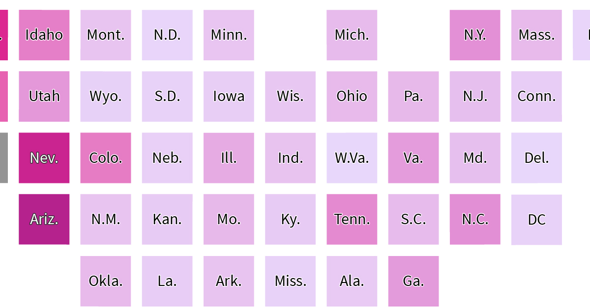
USAFacts tracked data from the U.S. Census Bureau’s population estimates, and visualized the states with the highest number of Californian transplants between 2020–21. The interactive heat map colors states by popularity—the darker the shade, the more Californians moved there.
Ranked: States with Highest Californian Transplants
More than 100,000 Californians moved to Texas between 2020–21, well ahead of second place Arizona (63,000 Californians) and third ranked Nevada (55,000).
Texas has recently emerged as a popular destination, not just for Californians, but Americans from all regions. No state income tax and lower cost of living, along with a growing tech hub is pulling in Americans from all income brackets. Meanwhile, Arizona and Nevada offer similar tax and affordability benefits as well.
Here’s the full ranking of which state Californians moved to in the first full year of the pandemic.
| Rank | State | Californian Transplants (2020–21) |
|---|---|---|
| 1 | Texas | 105,434 |
| 2 | Arizona | 63,097 |
| 3 | Nevada | 54,740 |
| 4 | Washington | 46,677 |
| 5 | Florida | 40,730 |
| 6 | Oregon | 32,906 |
| 7 | Colorado | 26,911 |
| 8 | New York | 21,700 |
| 9 | Idaho | 26,233 |
| 10 | Tennessee | 23,403 |
| 11 | North Carolina | 21,961 |
| 12 | Utah | 19,930 |
| 13 | Georgia | 18,713 |
| 14 | Virginia | 18,441 |
| 15 | Illinois | 13,919 |
| 16 | Massachusetts | 9,568 |
| 17 | Pennsylvania | 10,072 |
| 18 | Hawaii | 10,743 |
| 19 | Ohio | 9,596 |
| 20 | Michigan | 9,190 |
| 21 | Missouri | 9,928 |
| 22 | New Jersey | 8,091 |
| 23 | Oklahoma | 9,815 |
| 24 | Maryland | 7,988 |
| 25 | South Carolina | 8,838 |
| 26 | New Mexico | 6,427 |
| 27 | Indiana | 7,046 |
| 28 | Minnesota | 6,239 |
| 29 | Montana | 6,563 |
| 30 | Wisconsin | 5,417 |
| 31 | Arkansas | 6,554 |
| 32 | Alabama | 4,876 |
| 33 | Kansas | 4,588 |
| 34 | Kentucky | 4,585 |
| 35 | Connecticut | 3,932 |
| 36 | Louisiana | 3,810 |
| 37 | Iowa | 3,598 |
| 38 | Washington, DC | 2,381 |
| 39 | Nebraska | 3,032 |
| 40 | Wyoming | 2,607 |
| 41 | Alaska | 2,273 |
| 42 | South Dakota | 2,484 |
| 43 | Mississippi | 2,423 |
| 44 | Maine | 1,965 |
| 45 | New Hampshire | 1,877 |
| 46 | Rhode Island | 1,343 |
| 47 | North Dakota | 1,367 |
| 48 | Vermont | 1,092 |
| 49 | Delaware | 961 |
| 50 | West Virginia | 884 |
On opposite corners of the country Washington (47,000) and Florida (41,000) round out the top five destinations for Californian expats.
On the other hand West Virginia and Delaware were the least popular spots for Californians to move to, with both attracting fewer than 1,000 people.
Ranked: Californian Net Migration
As startling as these numbers seem, it’s also useful to remember that many people also move to California, which is the biggest economic hub in the U.S.
Below we have California’s net migration numbers, accounting for those moving to the state, where a negative number implies that California lost more residents than it gained from a particular state.
| State | Californian Net Migration 2020–21 |
|---|---|
| Texas | -69,342 |
| Arizona | -37,825 |
| Nevada | -30,386 |
| Idaho | -21,558 |
| Florida | -20,867 |
| Washington | -18,762 |
| Tennessee | -18,201 |
| Oregon | -17,109 |
| Colorado | -12,618 |
| Utah | -11,964 |
| North Carolina | -11,681 |
| Georgia | -8,872 |
| Oklahoma | -6,137 |
| South Carolina | -5,034 |
| Missouri | -4,920 |
| Montana | -4,813 |
| Virginia | -4,524 |
| Arkansas | -4,428 |
| New Mexico | -2,505 |
| Alabama | -2,502 |
| Indiana | -2,444 |
| Kentucky | -2,362 |
| Ohio | -2,217 |
| Hawaii | -2,201 |
| Kansas | -1,712 |
| Wyoming | -1,669 |
| South Dakota | -1,669 |
| Pennsylvania | -1,607 |
| Michigan | -1,344 |
| Iowa | -1,255 |
| Wisconsin | -1,189 |
| Maine | -1,122 |
| Nebraska | -1,033 |
| Minnesota | -984 |
| Maryland | -910 |
| New Hampshire | -865 |
| Mississippi | -584 |
| Vermont | -539 |
| Connecticut | -442 |
| West Virginia | -365 |
| Delaware | -310 |
| Alaska | -277 |
| Louisiana | -229 |
| North Dakota | -210 |
| Rhode Island | -191 |
| Washington, DC | +161 |
| Massachusetts | +537 |
| New Jersey | +1,311 |
| Illinois | +1,978 |
| New York | +6,031 |
Unsurprisingly, California lost the most net residents to Texas, Arizona, and Nevada. However Idaho jumps past Florida and Washington, with California losing 21,000 more residents than gained from the Gem State.
In fact, both Idaho and Nevada had the highest proportion of incoming Californians to their 2021 populations, at more than 1.38%.
On the other hand, California gained more residents than it lost from four states (New York, Illinois, New Jersey, Massachusetts) and Washington D.C.
Why Are Californians Leaving?
A key driver of migration is the state’s continuing affordability challenges where housing costs have pushed home ownership out of many Californians’ reach. It is also one of the most difficult states to retire in, where $1 million can last as little as eight years.
Separately, the rise of remote work in 2020 allowed many Californians to move out of their more expensive state to cross into regions with a lower cost of living while maintaining their economic opportunities.
Within the state itself, the more rural, less populous parts have seen, proportionally, the most outward bound migration—a phenomenon occurring across America.
These sustained levels of outward migration, combined with slower population growth, has consequences. California already lost a seat in the House of Representatives after the 2020 Census (Texas gained two and Florida gained one) which results in one fewer vote in the Electoral College and proportionally lower census-guided federal spending.
At the same time however, while domestic outward migration continues, the Golden State is still successfully attracting international immigrants who are more than filling up the gaps.
Where Does This Data Come From?
Source: USAFacts.
Note: USAFacts sources their data from IRS tax returns which has information on tax filers who moved at county, state, and international levels. However, it misses low-income residents who choose not to file taxes. Please view their website for more details.

This article was published as a part of Visual Capitalist's Creator Program, which features data-driven visuals from some of our favorite Creators around the world.


population
Mapped: North America Population Patterns by Density
Nearly half a billion people live on the third-largest continent. We take a closer look in this population map of North America.

Mapped: North America Population Patterns by Density
This was originally posted on our Voronoi app. Download the app for free on iOS or Android and discover incredible data-driven charts from a variety of trusted sources.
From the icy expanses of the Arctic to the warm Caribbean sea, the North American continent covers nearly 25 million square kilometers, or about 15% of the Earth’s land area. Populating this vast region are nearly half a billion people, spread out from coast to valley, along the edges of arid scrublands and rainforests.
We visualize a map of North America population patterns, including Central America and the Caribbean, with spikes illustrating densely populated areas.
Data for this map is sourced from Statistics Canada, the World Bank, and WorldPop—a research group based out of the University of Southampton that tracks population growth and movement across the globe.
Ranked: Countries and Territories by Population Density
Deep in the Atlantic, seen as a small dot near Haiti on the map, the island state of Bermuda is the most densely populated jurisdiction on the continent. Measuring just 53 km² in area, and home to 65,000 people, results in an average population density of 1,266 people per km².
Also in the Caribbean, Barbados ranks second with an average population density 642 people/km², followed by Aruba, ranked third-highest at 550 people/km².
| Rank | Country/Territory | Average Population Density (per km²) | Area (km²) |
|---|---|---|---|
| 1 | 🇧🇲 Bermuda | 1,226 | 53 |
| 2 | 🇧🇧 Barbados | 642 | 439 |
| 3 | 🇦🇼 Aruba | 550 | 193 |
| 4 | 🇭🇹 Haiti | 423 | 27,750 |
| 5 | 🇵🇷 Puerto Rico | 360 | 8,897 |
| 6 | 🇲🇶 Martinique | 325 | 1,130 |
| 7 | 🇸🇻 El Salvador | 303 | 21,040 |
| 8 | 🇱🇨 Saint Lucia | 292 | 617 |
| 9 | 🇻🇮 Virgin Islands | 285 | 346 |
| 10 | 🇻🇨 Saint Vincent & the Grenadines | 267 | 389 |
| 11 | 🇯🇲 Jamaica | 257 | 10,992 |
| 12 | 🇬🇵 Guadeloupe | 252 | 1,628 |
| 13 | 🇩🇴 Dominican Republic | 234 | 48,442 |
| 14 | 🇧🇶 Netherlands Antilles | 229 | 800 |
| 15 | 🇹🇹 Trinidad & Tobago | 212 | 5,128 |
| 16 | 🇦🇬 Antigua & Barbuda | 214 | 440 |
| 17 | 🇻🇬 British Virgin Islands | 206 | 153 |
| 18 | 🇰🇳 Saint Kitts & Nevis | 176 | 269 |
| 19 | 🇦🇮 Anguilla | 175 | 91 |
| 20 | 🇰🇾 Cayman Islands | 168 | 264 |
| 21 | 🇬🇹 Guatemala | 165 | 108,889 |
| 22 | 🇨🇷 Costa Rica | 101 | 51,100 |
| 23 | 🇨🇺 Cuba | 102 | 109,884 |
| 24 | 🇭🇳 Honduras | 94 | 112,492 |
| 25 | 🇩🇲 Dominica | 91 | 750 |
| 26 | 🇲🇸 Montserrat | 91 | 103 |
| 27 | 🇹🇨 Turks & Caicos Islands | 75 | 616 |
| 28 | 🇲🇽 Mexico | 65 | 1,972,550 |
| 29 | 🇵🇦 Panama | 60 | 74,177 |
| 30 | 🇳🇮 Nicaragua | 54 | 130,370 |
| 31 | 🇺🇸 U.S. | 35 | 9,834,000 |
| 32 | 🇧🇸 The Bahamas | 29 | 13,880 |
| 33 | 🇵🇲 Saint-Pierre & Miquelon | 24 | 242 |
| 34 | 🇧🇿 Belize | 17 | 22,966 |
| 35 | 🇨🇦 Canada | 4 | 9,984,670 |
| 36 | 🇬🇱 Greenland | 0 | 2,166,086 |
| 37 | 🇺🇸 Navassa Island | 0 | 5 |
Naturally the largest countries on the continent—Canada, the U.S., and Mexico—have some of the lowest average population densities compared to other nations in the region.
However, thanks to their size, their overall population distribution is more apparent on a map of this scale. In Canada, the Greater Toronto Area is home to one-fifth the country’s entire population. In stark contrast, the rest of the country seems almost empty—averaging just 4 people/km².
Major U.S. cities—New York, Chicago, and San Francisco—also stand out, though the more regular dispersion of Americans, particularly in the Northeast, South, and Midwest can also be seen.
Interestingly, Monterrey in Mexico jumps out on the map; the city is built at the foot of Cerro de la Silla, and several districts are densely populated as a result.
Ranked: Continents by Population Density
How does North America compare to the other continents by population density?
Unsurprisingly, thanks to its large land area, as well as comparatively smaller population, North America is one of the least densely populated continents in the world, beaten only by Oceania, which averages 5 people/km², and Antarctica.
| Rank | Continent | Average Population Density (per/km²) |
|---|---|---|
| 1 | Asia | 149 |
| 2 | Africa | 49 |
| 3 | Europe | 32 |
| 4 | South America | 25 |
| 5 | North America | 25 |
| 6 | Oceania | 5 |
| 7 | Antarctica | 0 |
Source: World Population Review.
In comparison, Asia, while being the largest continent, is also home to 60% of the global population, and averages 149 people/km².

-

 Science1 week ago
Visualizing the Average Lifespans of Mammals
-

 Markets2 weeks ago
The Top 10 States by Real GDP Growth in 2023
-

 Demographics2 weeks ago
The Smallest Gender Wage Gaps in OECD Countries
-

 United States2 weeks ago
Where U.S. Inflation Hit the Hardest in March 2024
-

 Green2 weeks ago
Top Countries By Forest Growth Since 2001
-

 United States2 weeks ago
Ranked: The Largest U.S. Corporations by Number of Employees
-

 Maps2 weeks ago
The Largest Earthquakes in the New York Area (1970-2024)
-

 Green2 weeks ago
Ranked: The Countries With the Most Air Pollution in 2023