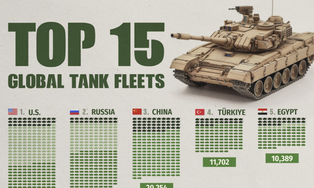
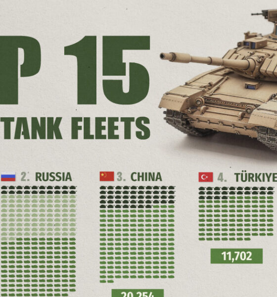
Heavily armed and armored, the modern tank is a versatile and mobile weapons platform, and a critical piece of contemporary...
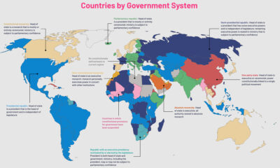

The political regimes of the world's countries have changed over centuries. This map charts the nine government systems that rule the world today.
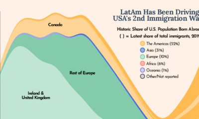

The U.S. is built on immigration and this chart shows how Latin America has been one of the biggest drivers of U.S. immigration in the last...
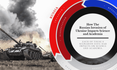

What is the impact of war on science and academia? We examine how nations and the scientific community have responded to the conflict
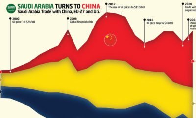

This graphic charts Saudi Arabia’s trading history with the EU, the U.S., and it's new largest trading partner — China.
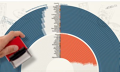

How strong is your passport? This ranking showcases the most and least powerful passports based on their ease of access to countries globally.
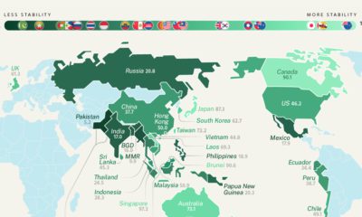

Prior to invading Ukraine, Russia had one of the highest levels of geopolitical risk. How does geopolitical uncertainty vary around the world?
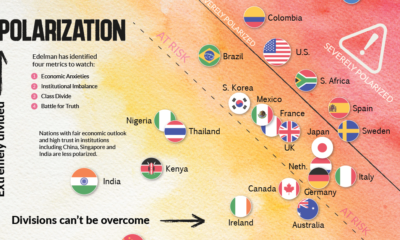

This chart plots polarization for various countries based on the Edelman Trust Institute's annual survey of 32,000+ people.
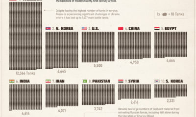

The tank remains the backbone of modern twenty-first century armies. This infographic shows what countries have the largest combat fleets.
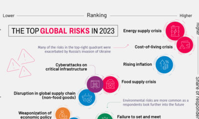

This year's Global Risks Report highlights ongoing economic issues, such as inflation, as well as existential threats like biological weapons
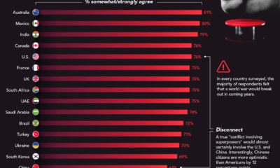

In every single country surveyed, the majority of respondents believed a global conflict would break out between superpowers in coming years


 Creator Program