
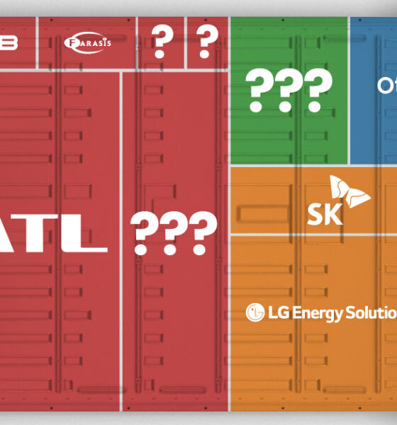
Asia dominates this ranking of the world's largest EV battery manufacturers in 2023.

Company Snapshot infographic for Entrée Gold, a Canadian mineral exploration company balancing opportunity and risk with key assets in Nevada and Mongolia.
Jade has been revered in China for thousands of years. See the history of this gemstone and why people are willing to pay high prices for...
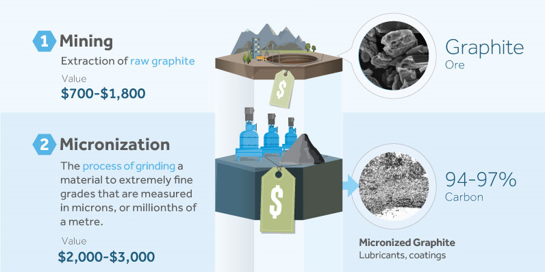
This Company Snapshot covers Great Lakes Graphite, an industrial minerals company focused on bringing value-added carbon products to a well-defined market.
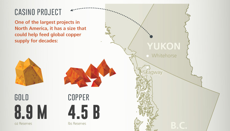
This company snapshot infographic highlights Western Copper and Gold, a company developing Canada's premiere copper and gold mine.
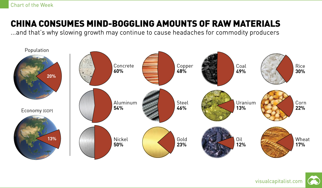
The 1.4 billion people living in China account for 13% of global GDP, but this chart shows that for commodity producers, the country means so much...
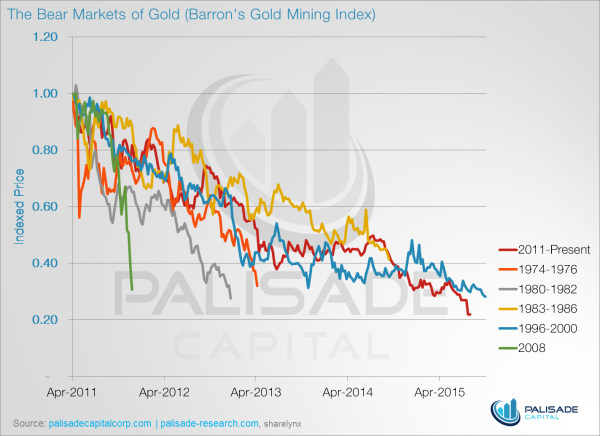

These five charts show why gold stocks have never been cheaper.
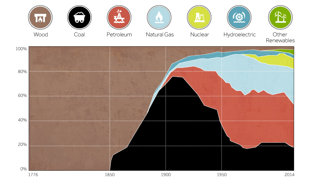
This chart shows the history of America's energy supply based on energy source. This brief history covers all from wood-powered locomotives to solar panels.

In the finale of our four part infographic series of silver, we look at the case for holding silver as an asset.
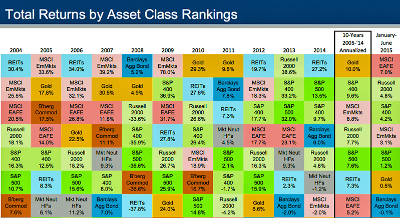
Chart showing historical returns by asset class from 2004-2014. How do investments in bonds, equities, real estate, gold, and commodities compare over time?

In Part 3 of the Silver Series, we cover the world's growing demand for silver. One of the most versatile metals, demand for silver stems from...